How UI design affects conversion

The effect of UI on conversion has been proven by numerous A / B tests and analysis of a large amount of data collected by various companies. In this article, we will talk about current research results and ways to measure the impact of design on conversion on your site.
To begin, let’s look at 7 obvious UI errors that reduce conversions:
- Non-adaptive design. Smartphones and tablets are already the predominant way to go online - about 60% of views any project is already coming from mobile devices. Therefore, you need to configure all the ui elements of your site for adaptation to mobile devices.
- Difficult navigation, ignoring the “three-click rule” and “59-second rule”. The simpler and more convenient for the user, the more the description and headlines match the pages and the content in them, the higher the conversion will be as a result.
- No motivated CTA buttons. Or the wrong font, color, size, location of these buttons and other ui elements.
- Stock photos instead of unique images. The presence of non-unique photos signals to users that the owners The site is indifferent to its business and customers.
- Lack of Social Proofs. More and more attention is being paid to customer feedback. Often they are the key to the visitor’s decision to purchase.
- Low download speed. A download delay of 1 second reduces conversions by 1% and affects site ranking in search engines.
- Inconvenient functionality that makes the client strain. The more difficult it is for the client to navigate and achieve their goals, the more the higher the risk that he will just leave the site.
To correct each of these errors, there are unique templates of UI solutions, which in the professional community are called UI patterns (or UI patterns). Since the term is borrowed, we will use it as is customary in English literature.
UI patterns as a way to guarantee conversion
The general idea of UI patterns is to gather repetitive experience and provide some guaranteed convenience and, as a result, guaranteed conversion. Many companies have been researching UI patterns in order to bring out the most successful ones UI templates to increase conversions.
For example, the Good UI project has collected on one platform a set of templates checked by means of A / B tests that at redesign site customers could immediately choose those templates that will benefit them more.
The subjects were companies that agreed to provide the necessary data. As of March 2019, it was held 197 tests and found 102 templates that affect the conversion. It is expected to replenish 5 or more new tests per month more accurate result. The results themselves reflect both successful and unsuccessful models, and those whose use has no effect in principle.
The project consists of a list of evidence and patterns. What are the patterns we will discuss a little below, and the evidence is verified and the figures of the influence of patterns on user behavior are studied.
If you are interested in learning more, the evidence based on 112 tests can be viewed at the link. Patterns, divided into groups according to categories (analysis of pages, tags, metrics), you can see here. More about UI patterns and about how to look for them, read in our article “UI patterns: how to find relevant templates for UI design”.
Analysis of templates of perception of sites by visitors
UX researchers have derived certain patterns of user behavior - actions that they somehow perform on the site or in the application. Behavior patterns also include how users see information. Understanding these patterns helps properly place content blocks on the site (make the right grid - ui grid) and at least somehow ensure that the information will be seen and read.
F-pattern
Relevant for websites, but not for their mobile versions. Describes user behavior well only in the case of texts or content placed on a monotonous grid.

For maximum effect, the text should be placed so that even when you glance at the page the user has received basic information. To do this, use the following techniques:
-
The title should be catchy and reflect the content of the text on the page (also good for SEO)
-
basic information should fit in the first 2 paragraphs of the text
-
it is better to group other information in small paragraphs with prominent headings and division into lists, arranging them along the axis of the F-pattern.
Z-pattern
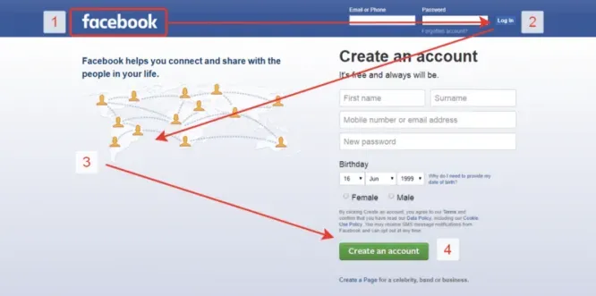
Based on research by UI / UX expert Jacob Nielsen. Its essence is that the user’s view when visiting first the page screen moves sequentially through specific points. On the graph, these points are represented by numbers 1,2,3 and 4.

The main attention is paid to sectors 1, 2 and 3, which is confirmed by the data from the thermal map.
Gutenberg diagram
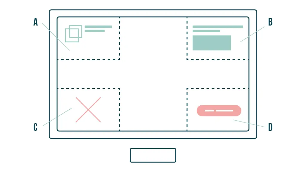
Also divides the screen into four conditional zones on the principle of a square.

- Upper left corner. The user always looks here. Here it is best to place the company name and logo. And also drums two or three words of the title.
- Upper right corner. Second priority area of attention and additional information: contacts, call order form and other important ui elements. And also another part of the title.
- Lower left corner. An area where almost no look. It makes no sense to post important information here.
- Lower right zone. Decision or exit area. This is where it is important to place an order button to push user before purchase.
A well-crafted UI design template takes into account all these patterns. And in connection with quality content significantly increases conversion.
How do I measure the impact of UI design on my site’s conversion?
To most accurately measure the impact of design on the conversion of your site, it’s a good idea to combine several tools:
- Use a heat map to analyze user behavior on your site to understand how it responds to certain other design elements, whether they are comfortable for him.
- Conduct A / B testing or automatic UI testing to compare the conversion of the previous version of the site and its new version.
- Analyze the results of Google Analytics (or another service that measures conversions, goal achievement, and other metrics user behavior on your site). This will allow you to understand at what stage of interaction with the site users have there are difficulties and why.
- Use the Simplereach service, which allows you to track the behavior of site visitors in real time: how much time takes registration or search for the desired product, how convenient for them the structure of the site.
The combined indicators of these resources will show how convenient it is for users to navigate in the design of your site, to find need buttons, perform targeted actions - and bring you a conversion.
So what do you need to create a conversion design based on a template?
Yes and no. On the one hand, there is a huge amount of experience already gained in the industry based on needs and tastes users, formed by millions of projects, and it simply can not be ignored.
On the other hand, tastes change very quickly, and what was relevant a few years ago may look strong today obsolete. It is checked that the design needs to be updated every 3-5 years. Read more about this in our article “Why you need to update the UI every 5 years”
In fact, a good conversion design should be individual, because each client has its own target audience and its own the person he focuses on. You can’t just copy someone else’s UI or follow tips like “10 principles to build a conversion web ».
And to create an individual design will require deep work with the designer and a deep understanding of the task.
