What is UI Kit and why does your company need it

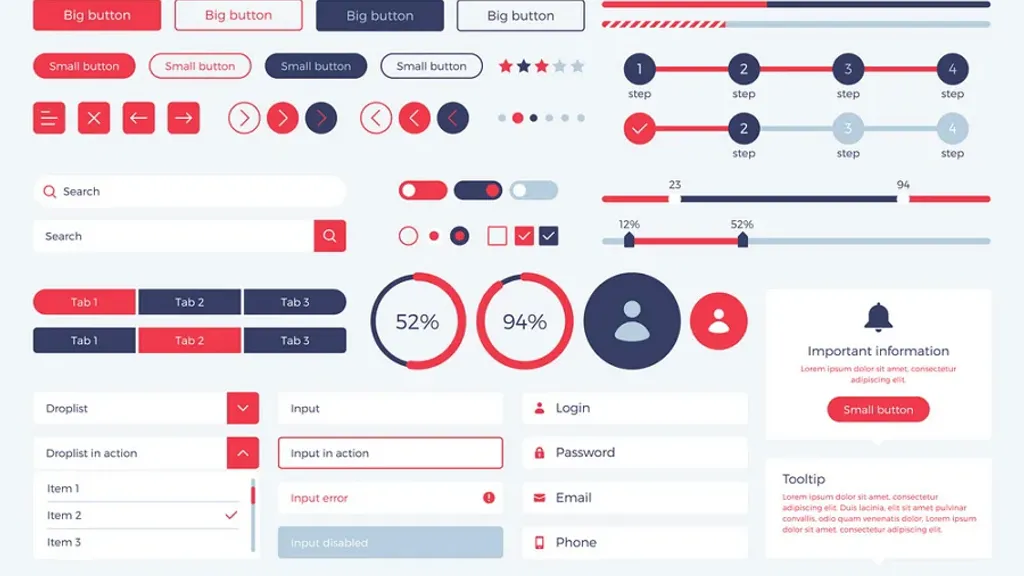
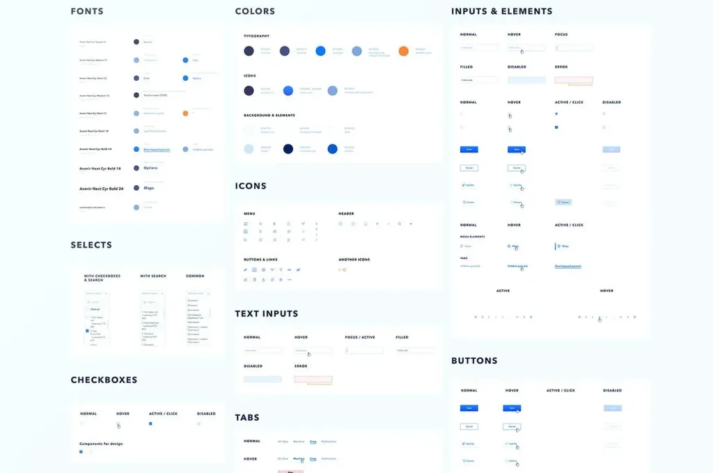
UI Kit – this is a set of all elements on which the UI of your site (interface elements) will work. In essence, this is a visualization each of the elements at any stage of user interaction with the interface.
User interface kit use for simplification, unification and an integrated approach to creating large projects. He can’t just create every next page so quickly using components and a sample previous, but are also the main design documents of the project, which report all: designers, layout designers, developers at each stage of work on the project.
While reviewing the important features of the UI-kit, it is also necessary to pay attention to the following concepts: interface elements, guideline, design system, asset management.
UI elements – all the items that the user sees on your resource.
These include: buttons, icons, checkboxes, radio button, menu, “bread crumbs”, panel, preview, slider, preloader, tooltip, status bar, links, forms, lists, tables - all the content of the site, including how it will look on it pictures / photos.
UI/UX-guidelines – a kind of summary of criteria and rules for further development of the interface, a detailed description of all elements, their compatibility and rules of use.
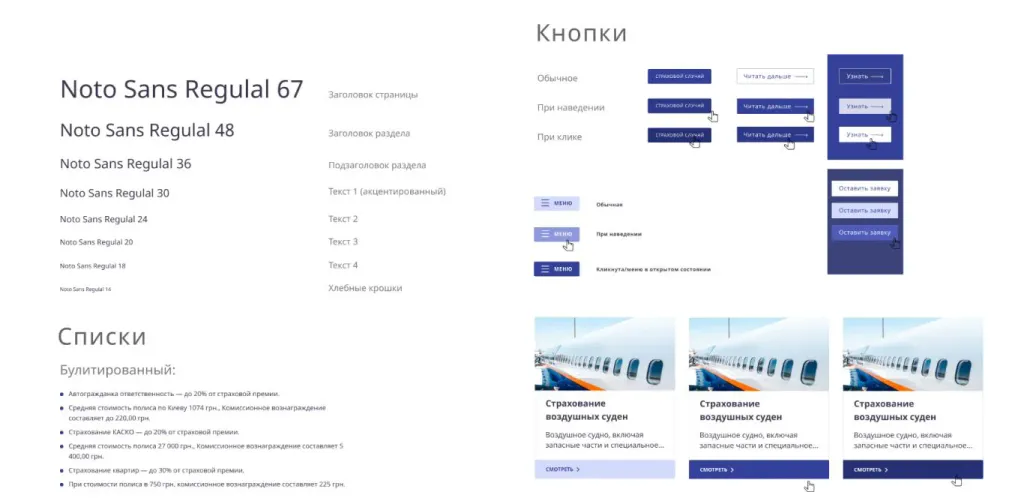
Guideline describes approved hierarchies, accents, contrasts, rhythm of element use, fonts and header sizes, and how they will be combined with the texts. Using a guideline will help create a recognizable corporate style.
How the UI Kit helps in creating a UI site and application
The user loves when it’s beautiful. He likes to enjoy what he sees and what he touches. And the user loves when he understands. Unified elements on all pages allow the potential customer to understand their function on any page of your resource at any time while on the site.
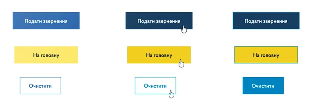
Each UIKit element can be reused on any page of the site, portal, application. The more pages on your site, the greater the need to create a UI Kit. It is necessary that all elements looked harmoniously. If not use the UI-kit, your interface will look like a vinaigrette of different buttons and styles, and the user will not have a single understanding what this or that element means. So, his reaction to your site will be something like this:
- Hmm, it’s a button. - picture for example.
- And this is not a button. - picture for example.
- And this is the button again. But they are different. - picture for example.
- Is this a button or not? Why are they all different? - picture for example.
- Does this button work not as a button, but as a switch? - picture for example.

When the UI Kit does not help when creating a site: since the UI is the next step after a quality UX, it can only fix which works well. But if the design logic is broken, if the user is confused what good buttons don’t do, they don’t will fall in love with your resource and will not help to make a purchase.
What is component design and what is the UI Kit for?
Component design - the gradual creation of a design.
This means that first the individual components (buttons, shapes, blocks) are made, then the whole design consists of them. Such the approach is needed for large systems, not to create 100 different types of buttons, but to limit them to the required number.
As in practice: when creating elements for additional pages of a large resource (where 200+ pages) it turns out that they contradict the previous elements. Moreover, it often happens that the appearance of the elements is refined In process. And as a result, until you finish the design of the whole project, it turns out that the elements at the beginning and end of the design are not coincide.

It also often happens that the actual layout of the pages has a completely different look, because in practice the layout of the pages elements that were not in the UI-kit are used - they simply were not thought out at that time.
Component design = unification of all elements of your design. And its essence is that if necessary, create each a new element, it must first be painted in UI Kits.
What is asset management in design
Asset management – element management system and notification of any changes to any design element.
Thanks to her when making changes to any of the design elements, all designers / layout designers working on the site, it becomes known that the changes were made and by whom.
This is done with the help of design tokens, which are a set of variable visual elements that are automatically transmitted to any component framework. Thanks to them there is an automation of all changes of appearance of elements.
The asset management system completely removes the problem when one designer has already thought through the changes and uploaded them to a folder, but forgot to notify others and reset the update. Or when the second designer can’t find the changes made by the first, because of which the work stops.
The system allows you to automatically change all the elements on all pages of the portal. In essence, the designer enters the admin panel, changes the stroke on one element on one page, and the same stroke changes on all such elements on all resource pages. The system also allows multiple designers to work on a document, such as when working with google docks.
Design system and its connection with UI Kit
When you change the UI of a site or add pages or new products to existing resources, you need to make sure that all of them UI elements remained in the same style and worked as one mechanism. There are design systems for this.
Design system - a certain electronic catalog, which stores all the elements of the UI-kit required for use in the work, stacked and ready to use.
If a new person comes to the company, for example, she does not need to look for a long time for the button to be inserted on the site - she is already has in a huge document a design system that can be used by all employees with a certain level of access.
The design system has another advantage - team communication. With its help you can create a product many times faster, after all each participant in the process knows exactly what and how to do it: the developer knows the patterns of creating a prototype for your resource, the designer and developer can implement the components together, and the project manager can always specify which element to follow change and why.
Design systems are developed for large corporations like Microsoft, Apple, where many different products, more than 100 pages of the resource and it is necessary that they all combine with each other and look intact. Its use is especially important in cases when not one, but many designers work on products. And it is necessary that all the changes they make to the site, combined with each other and looked the same.

It would seem that the UI Kit is the smallest component of all the products described here. However, it is basic. The UI-kit is the first and mandatory element of creating any quality UI-design. In addition, it helps save on new design elements. After all, a quality UI-kit can be created once and use it as long as there is a site, SAAS-platform or any another resource.
Need a UI design that combines all the components of your resource into a single semantic whole? Contact us, our designers will pass with you all the way from creating a quality UI to a site design that will be envied by all competitors. See finished projects of Behance.
