10 graphic design trends in 2019
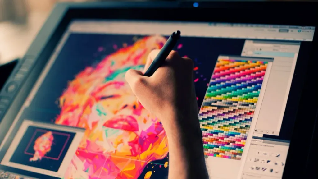
Design helps us understand the world around us, and trends determine the time in which we are. General design direction this year is a conflict. Whether you work as a designer or work with a designer, understand how changing and evolving styles, makes your work high quality and competitive. We have selected 10 trends that will help improve your style.
3D design and typography
In the last few years, three-dimensional images are among the trends, so you can safely expect 3D graphics after 2019. The popularity of this style is possible in different types of graphic design: drawings, printed images, web design, advertising etc. The depth of the image creates a sense of reality of the drawn object. Therefore, you can realize anything, which is used by futuristic and science fiction designers.
Three-dimensional typography changes the perception of design and gives the work character. 3D text will be popular for at least a few more years. It allows the designer to improvise, to give the text a personal style.

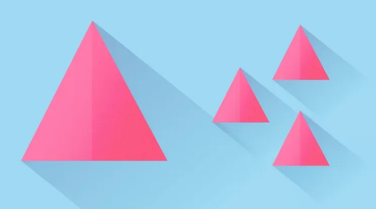
Asymmetric design
Today, designers strive to create products more individual and alive. Asymmetry in design - a fairly common technique, creating an asymmetric balance allows:
- first focus on important things
- to facilitate the perception of graphic information
- use free space more efficiently and profitably
Art Deco
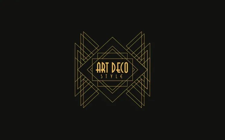
The main features of this style are geometric shapes, noticeable colors, sharp curves and curves, strict vertical lines, active trajectories and glare. That is why art deco is widely used in the manufacture of logos. Artists and designers who work in this style, in their works seek to convey energy, glamor, extravagance and luxury.
Medieval Art Nouveau
Why is this trend still popular? The answer is in the nuances of this style: it cultivates eternal images that they love to work with designers. Color palettes allow you to create easy-to-understand illustrations. Such images evoke feelings peace and trust in the brand.
Duotone (Duplex) and gradient
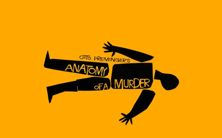
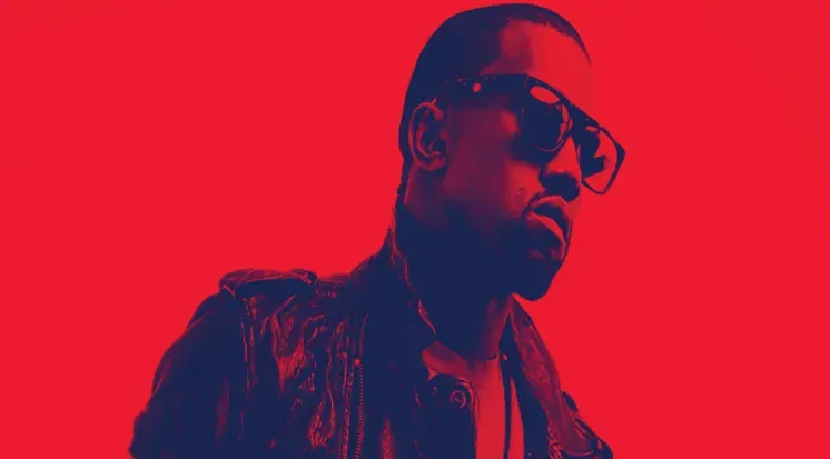
Option of image reproduction, when in addition to 2 primary colors there are halftones. This allows you to combine colors, which in its pure form are not compatible. This trend demonstrates the possibility of using combinations of different colors. Works look modern, create the right atmosphere and attract attention.
Warm, pastel tones: less brightness and color
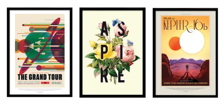
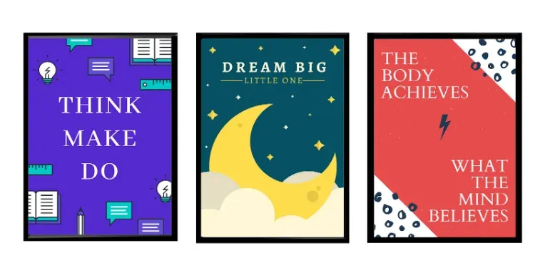
Warm colors are more active and emotionally charged. These shades are reminiscent of retro times, when cameras could not capture everything color depth. In general, warm tones are less common than cold tones, so an image that has even a small “burst” warm color, will already stand out. The poster store gives the following examples
Maximalism / delicate lines
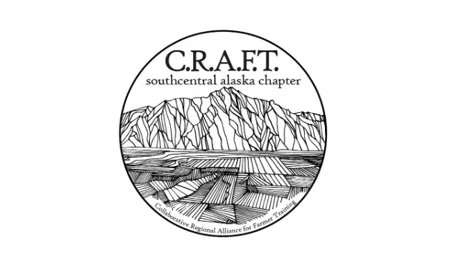
Complex drawings always looked ‘hard’ on the packaging. But if these images are made in light colors, thin lines and on textured paper, they will be soft and pleasing to the eye. Adding premium materials such as foil and embossing, provide a balance between maximalism and simplicity.
Open compositions
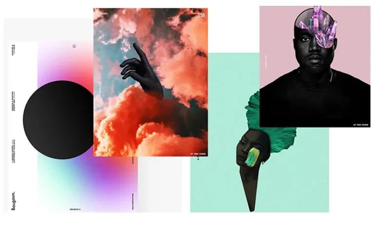
Such compositions cover free space and avoid a clear hierarchy. The elements in these compositions are felt freely tied to each other. Often the open style seems chaotic, broken and cut, but the placement of each element is not random.
Isometric design
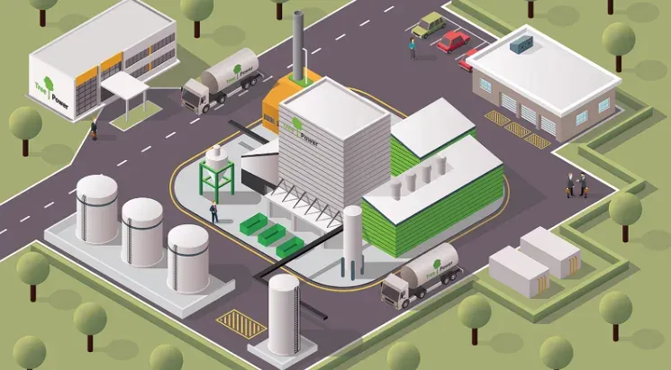
Isometry creates entire universes in small spaces. Isometric design is a method of drawing a 3D object in two dimensions. The picture is simple and clean, but has a volume that cannot compete with a flat design. The trend is actively used when creating icons. Icons look more noticeable. And an image file takes up much less space than a 3D illustration.
Serif fonts
Designers promise to please with a wide variety of serif fonts. Enhanced fonts make text more convincing, convey demanding and splendor. Already now this tendency is allocated by the popularity due to serifs of various length, shape and type. Motivational posters have many examples of this font in their captions.
Exciting things happen when designers use conflict, allowing space for inspiration to impress from all sides. Art in non-traditional forms, a combination of new trends and boundless imagination will make your work the best.
