Brand identity
Imagine a world where everything is the same.
The same people live in a world of the same trees, the same houses, the same flowers. They do the same things, they create the same songs, the same pictures. Discuss the same books, the same events. They give birth to and raise the same children. Even freckles and the amount of hair is the same! And any difference is illegal and severely punished.
Sounds like some kind of anti-utopia? It’s good that we’re not in the world of clones, because differences are great.
From time immemorial, “branded” goods have been given a certain status. People always try to emphasize the peculiarities inherent because they create. And “consumers” will always choose what they know best, that is, recognize. Back in the Middle Ages artisans marked the machines with stamps, the owners of the workshops had “trademarks” and this was a kind of guarantee of quality.
It is clear that with the development of marketing, the concept of branding is changing. But that’s branding in any of its own, even primitive, form will always exist - obviously.
So: brand identity is a set of visual limitations.
Not, of course, as in the world of clones … but still, restrictions. Which make you special!
These restrictions apply to the 5 components (components of brand identity) that need to be fixed:
- logo
- colors
- fonts
- accommodation
- graphics
Logotype
Record its size and placement in your pictures.
If you are still without a logo - let’s talk about a few myths that prevent the creation of the only ideal for your organization logotype.
Myth 1: The logo should tell about everything we do
It always seems important for the organization to show the occupation in the logo. In fact, it is a bad practice. If we do computers - we draw computers. By cars - we draw cars. And so on. And the more you want to tell - the less you remember.
But the truth is that other people need to know - how you differ from others, from your competitors in particular.
For example, the Levis brand logo was created in 1873. He tries to explain as much as possible why workers should buy these jeans. Because they do not tear, which is reflected in the logo.
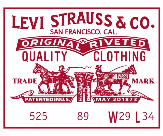
This logo told a whole story. And then it was changed, and now it looks like this:
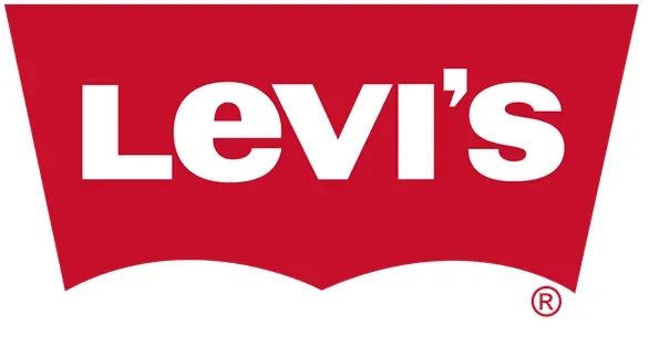
It was the same with Nike. Initially, the logo told about the occupation. And today - a completely abstract identity, which helps to better recognize the brand.
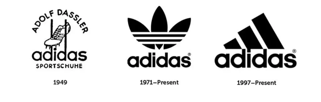
It is not difficult to draw a conclusion about which one is better to remember. With these three strips you can design the whole products, brand it.
So you don’t have to tell people in the logo about everything you do. People will see it anyway. Help them first turn to remember you.
Myth 2: I love the planet, let’s draw a planet
Very often in the development of corporate identity you / your team are guided by individual preferences. And as a result - a compromise between a designer who understands properly and a customer who “likes” something else. Але брендинг вашої організації не повинен від цього страждати. Бо це не про смаки.
So the advice: do not start from personal tastes. You are not a project. A project is something that benefits other people.
Myth 3: The logo should be so simple that it can be placed on the handle
It used to be at least thought so. But today the logo can be a photo or even a programmed one (as it did Ministry of Foreign Affairs of Finland), ie to change according to the programmed conditions: time, sound, etc. Today, programmed logos are not such a novelty. The world of design is very technology-driven, everything is changing very fast.
In Norway, for example, the meteorological center has released a logo with six dots connected by lines. Depending from the weather for today - the points change their coordinates and color. If it is hot - they turn red, and if it is cooler - change to shades of blue. And so on. This logo is generated by the program and constantly looks new.
There are many logos that fit on the handle, but frankly, they are awful.
Myth 4: The logo should be positive and liked by everyone
As practice shows, “Logos that everyone likes - no one likes”
These are the logos that have been agreed upon for a long time between the designer and a large number of people who “know exactly how best.” Such a designer is not working on a logo, but rather on a compromise solution.
That is why in Ukraine they do not know how to do design competitions. This often takes the form of open online voting. However, you should immediately trust a professional designer.
Myth 5: The logo should always be the same
Recently, the branding agency Madcats has developed a constantly changing logo for Planet Cinema.
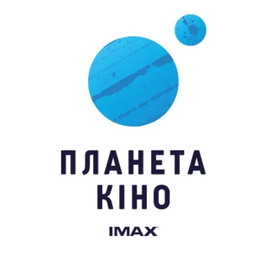
The logo simply consists of large and small planets. And further - here it is possible to enter any forms. Here are fixed fonts, placement of elements, and the form is modified and adapted to certain tasks.
This is called dynamic identity. Today, there are many examples where the logo may look different but holds basic form.
This variability will be convenient for organizations with multiple projects. So they look different, but recognizability is maintained.
Myth 6: logo - and there is an identity
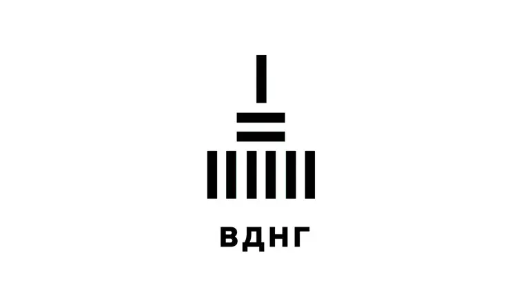
For example, the logo of ENEA. It consists of “sticks”, which are convenient to design any materials. And not necessarily “decorate” each picture with the same logo. It is enough to use its elements that will be recognizable.
So if you are still in the process of creating a logo - think about whether you are under the influence of one of these myths. And most importantly - trust a professional designer and you will succeed.
Colors
They also need to be recorded. Logo is not the whole style. So you have a limited set of colors that you can use.
There are brands in which the strongest part of the brand is not even a logo or corporate graphics, but color.
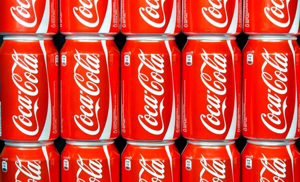
Coca-Cola is a very bright representative. They are so strongly entrenched in red with white that even if once they change their corporate identity, the colors will stay the same.
But to retain only one color, you need to be Coca-Cola. It is necessary for a certain color to be associated with you communicate very persistently. So most likely you will have a logo and a set of colors. You can try to lock only one color. But if you do not have one project, it will be more difficult.
Tip: Make yourself a color-coded palette.
Selected colors (blue, yellow, green) should look good both in the “ruler” and on their own.
If you have yellow, then it should be one yellow among, for example, seventeen that exist.
You can also pin individual colors to individual “themes” in your organization. This way, your corporate identity will be recognizable due to a clear set of colors, and at the same time - your themes or headings will differ, having the color / shade.
Fonts
Capturing fonts is sacred!
You won’t believe it, but your font can also be an identity. For example, as in The New Yorker.
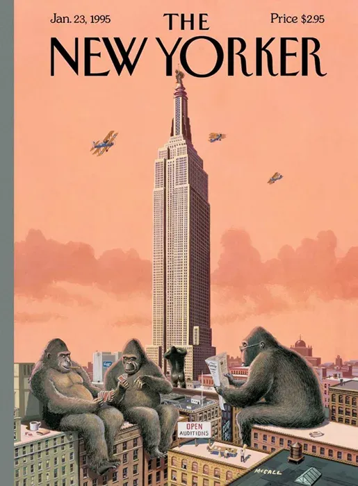
The New Yorker font is used both on the site and in advertising, everywhere. In fact, they make their identity a font. He is unusual, “with character.”
So if you suddenly decide to design a special font for your organization, you don’t even have to create a logo. After all, if your font is unique and has its own “character” - it will be everything, including the logo.
And another example where identity is just a font:
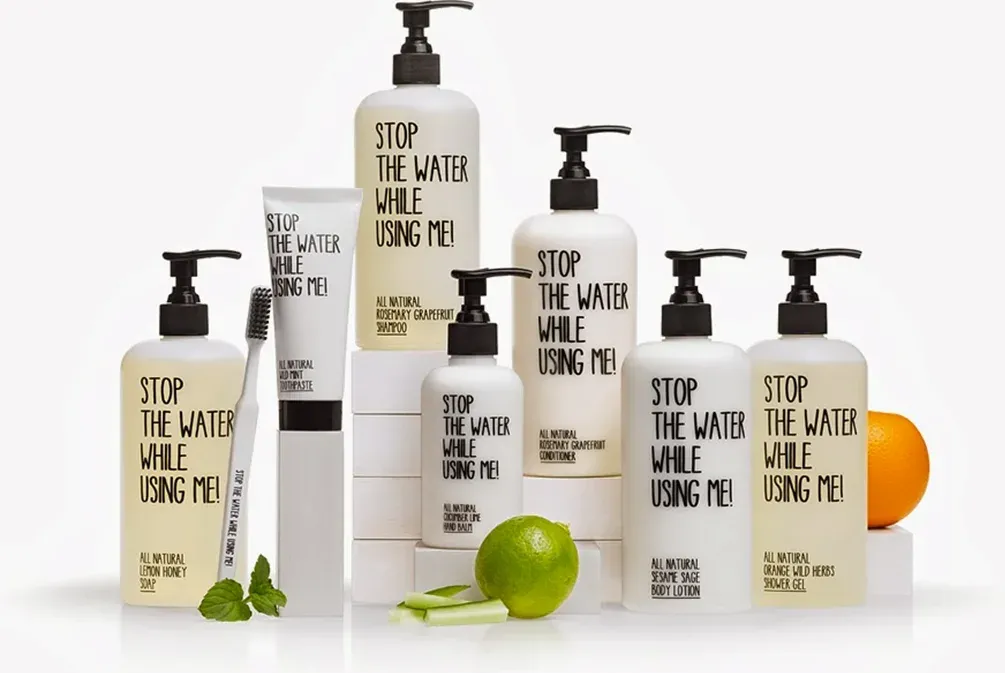
This is a series of cosmetics, the philosophy of which is built around ecology: “turn off the water when you use me!” In this case - the font is both a logo and conveys the meaning - the key message. And besides, it’s not expensive to design, but looks strongly. Here the design is inseparable from copywriting. And all together are designed to solve a social problem.
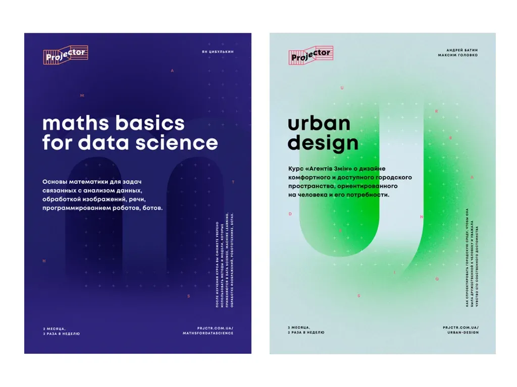
Accommodation in space
You can even restrict placement in space. That is, clearly fix the logo, placement of text, fonts, pictures, etc. It also reflects your identity.
The logo is always in one place, in one size, with the same white beach.
Graphics
Branded graphics allow companies to look holistic, but at the same time diverse. For example, very often logos are folded of various figured elements. So feel free to use these smaller figures to decorate the materials, changing the ratio with each other or location.
There is also a very common technique of creating branded graphics - it is the development of elements that can then be used in design and different placement. It looks different every time. But having one style - integrity and recognizability stored.
Such figures can be decorated with anything and anything.
Well, just a few restrictions, and your organization is recognizable, it increases the audience and the number of good deeds
- grows exponentially :)
Make life easier for yourself and others. Make your organization recognizable!