Trends 2019 UI / UX design

The number one trend in modern design is context. Everything happens in context and everything is interconnected.
UI & UX design is no exception. We understand the trends in user interfaces one by one.
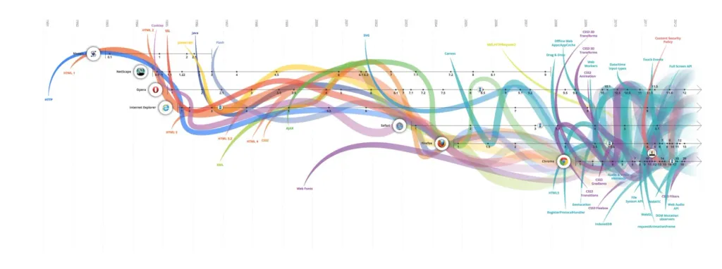
Every day, browsers become faster, more powerful and more attractive.
- Power tests show a significant increase in performance of most popular browsers.
- Increases page loading speed. Mozilla reports that the new compiler will be 10-15 times faster, than the previous one.
- All modern browsers support WebGL 2, which allows you to get a whole new level of 3D texture, object rendering and depths of fragments.
Animation
New browser features have opened the door to animation. And it’s not just about the movement of elements. A discipline known as motion design, includes many aspects of design and also intersects with psychology and anatomy.
We see that animation in 2019 will be explored even more deeply. Movements give a lot of information that is different case would be lost.
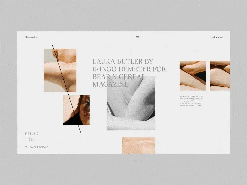
Involving the customer to a deeper level means staying with him every second of his interaction with the interface. Designers use this feature before marketing reaches the user.
Motion design goes beyond filling in the gaps. Now it is built into branding. However, logos are like totems. Our imagination and experience revive them. Why not pay enough attention to this imagination and direct it in the right direction?
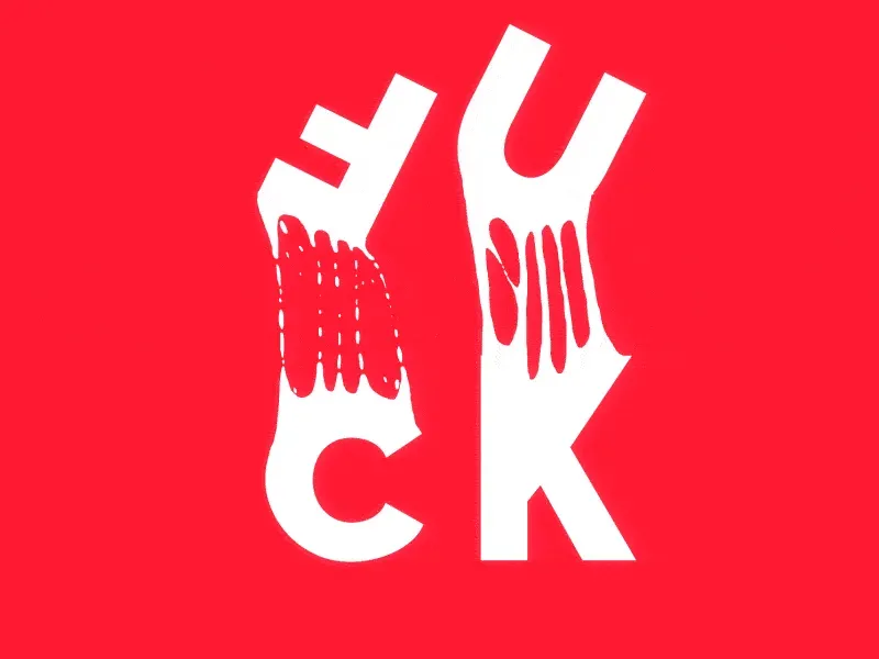
If you haven’t thought about what your logo is made of, how it feels and sounds, it’s time to think.
Movement speaks better than lighting, positioning and matter. The movement tells a story. If you can make a logo part of your story, giving it extra meaning, I support you.

Context exists for everything, including animation. What you see as a designer is not exactly what the customer sees. In some products, we can’t afford animation, even if it’s meaningful. If there is an emotional contradiction, it is necessary to maintain neutrality.
Do not animate thoughtlessly.
3D interfaces and flat design recesses
3D-rendering and computer graphics using footage to create augmented reality are already familiar to us. To increase speed, productivity and accessibility, designers had to avoid complex 3D models user interfaces. Then the best browsers turned this luxury into an affordable feature. High-performance VFX (visual effects) make scenes similar to movies, but in the field of websites.
3D graphics in the interfaces combine reality and digital animation.
This trend is especially useful for manufacturers with processes that are difficult to visualize. Using 3D visualization, you can touch any process and get to a deeper level of immersion.

Combined with 3D animation, it becomes a powerful design tool. The mobile industry with new powerful chips has allowed not only reproduce 3D objects, but also use them in interfaces. Smaller screens are ideal for this.
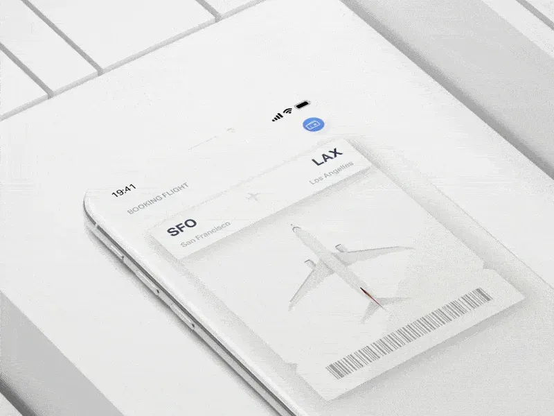
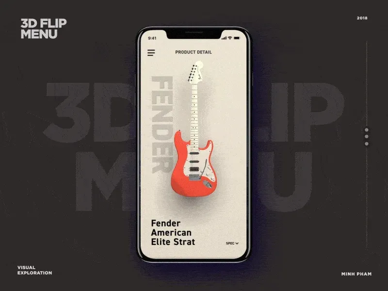
Flat design has been the dominant trend for 5 years and has not really changed. Recently, we have witnessed the addition depth to flat design, and its main idea does not change.
Users appreciated the interaction of three-dimensional models combined with computer graphics to create realistic objects. Flat design is also able to do this in a unique and not yet cluttered form. This is called pseudo 3D. Together flat layers create a sense of three-dimensionality. The main qualities that are added to the flat design are shadows, light and reflection.
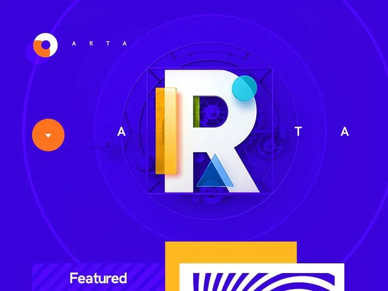
Fake 3D is also on the rise when conventional design tools like Principle and After Effects are used.
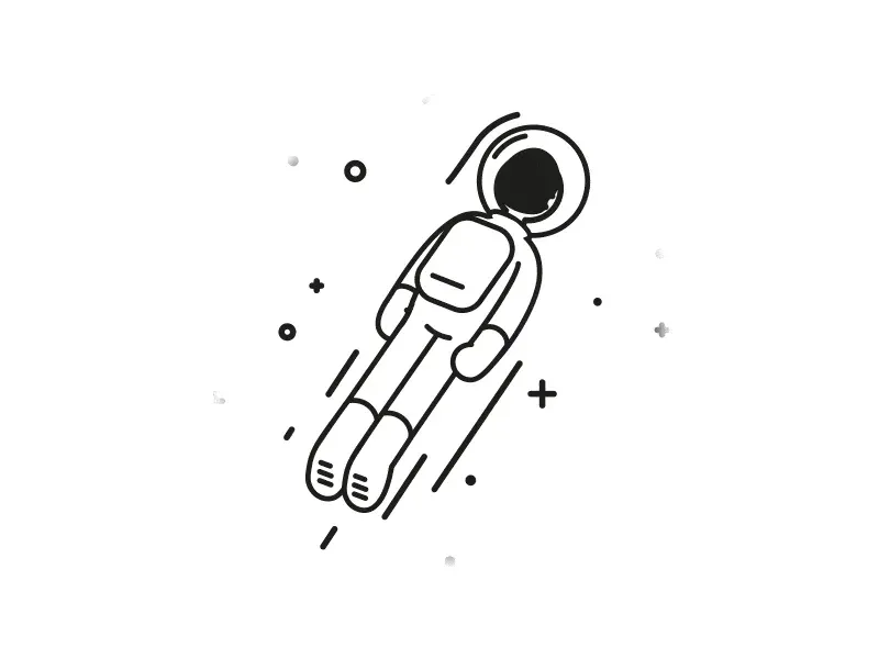
In 2019, we can even see a return to the fashion of skevomorphism. If the plane can be deep, then it can be isometric. Preserving flat symbolism with the addition of realism is also a trend worth looking at.
The downside is that over time, the options will run out. There is no definite direction in which three-dimensional interfaces move. They go in both directions - simplification and sophistication. Although in order to impress us, it is necessary extra technological effort, it takes as much courage to trade complexity into a crazy concept. However, if the most complex interfaces do not make sense, all efforts will be in vain.
We can make impressive images. It is time to fill them with meaning for humanity and solve deeper problems.
Surreal design
All the possibilities of 3D and motion design that come with the improvement of technology mean nothing if they are not capable affect emotions. Ironically, you do not need complexity to influence the feelings as much as possible.
Some of the biggest redesign campaigns and related illustrations are very playful:
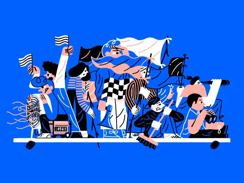
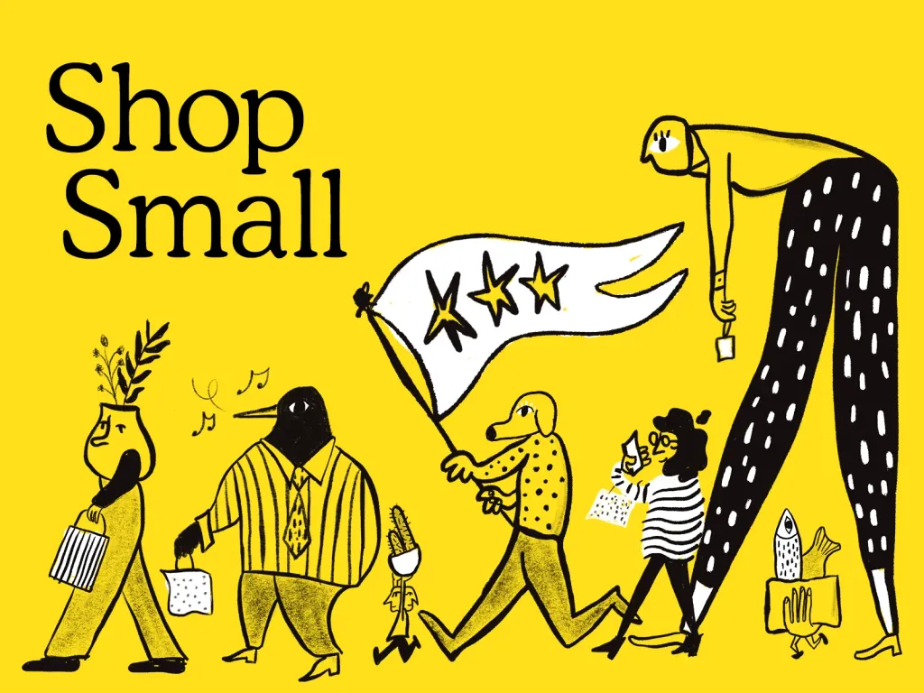
This cartoon style of illustration has one purpose - to maintain the freshness of the look. Sometimes you can surround your brand continuous hum. No matter who this style speaks to, it should be weird or even ugly. Expect more avant-garde and surreal design in 2019.
Not all companies and products can afford arrogance. The larger the audience, the more neutral they try to make design. Although this principle is appropriate for brands with some credibility, smaller companies to stay on market, must play by their rules, adhering to common features with the giants of the market.
Gradient 2.0, glowing colors and darkness
The new screens have a fantastic color rendition. They are even able to show it through standard screensavers. Designers study accessibility limits and impressive gradients in user interfaces.
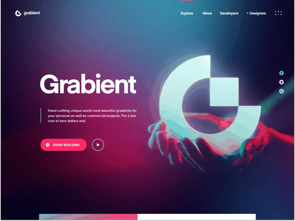
Gradient 2.0 is sleek and simple. It does not use conflicting colors. Bright colors do not go anywhere. We will see more combined colors and layers. In fact, even a monochrome palette will give a certain visual aesthetics due to the depth and volume.
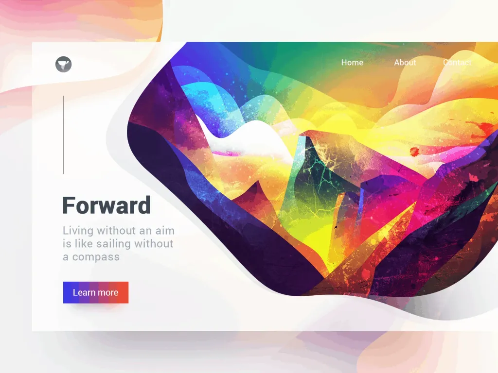
We lack trust and optimism. Burning colors promote positivity. You would trust a cryptocurrency application if did he look like that?
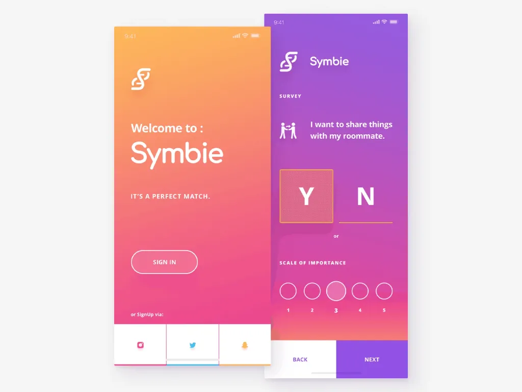
Bright colors and gradients stand out better on a dark background. Dark themes remain and only improve. Those of you who will be able to find a balance between the availability of a dark interface and the emotionality of bright colors will be at the top next year.
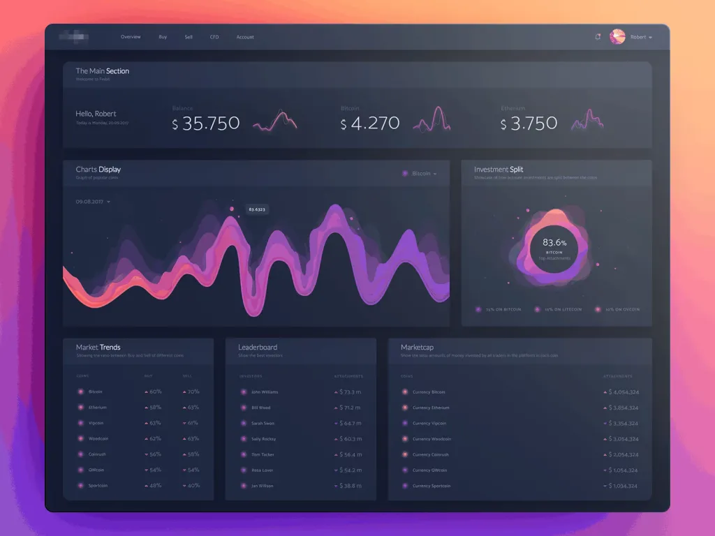
Accessibility is not the only problem with gradients, colors and gloomy themes. Bright colors are traditionally used to provide accents. When everything is colored, how can you emphasize the necessary? Not all users have access to OLED screens. Some of the gradients may be lost. Too much contrast causes the user to defocus. Dark themes do not work on a sunny day outdoors. But it can be just a positive moment.
Variable fonts
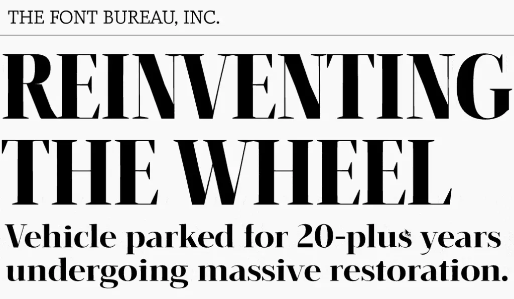
Traditionally, fonts are perceived as static objects with a limited set of parameters. Designers and writers should consider the legibility of the text in the context of height, width and other characteristics of the letters.
With variable fonts, you only need one file, because variable or generative fonts provide infinite number of fonts.
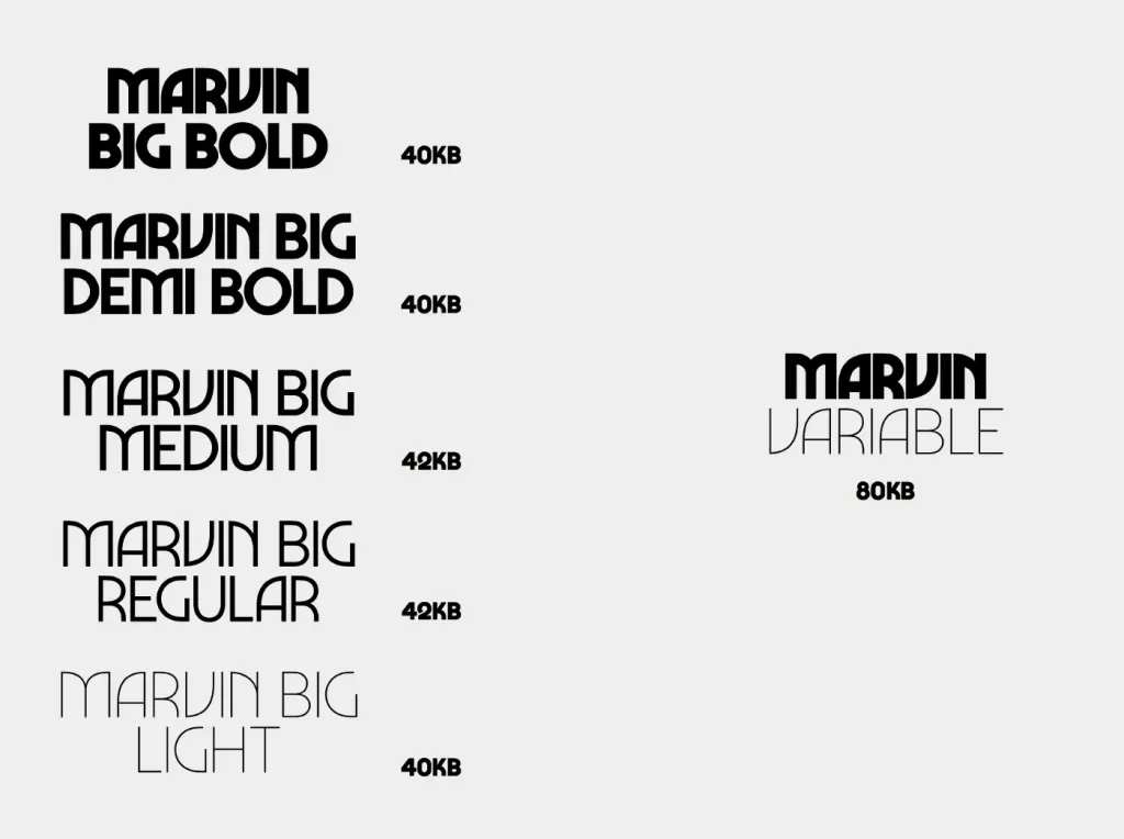
Variable fonts thrive on responsive design and when localization is required. They are especially on time when designers try not to burn the brains by adapting the text to smaller screens without losing its features, or stretching it under another language with fewer characters.
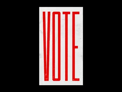
When web fonts were introduced, they just lacked sensitivity. Insufficient flexibility has led to reading problems and design inconsistencies. Variable fonts are quite recent, and they help to transfer fonts to the web and optimize the development process as a whole.
Figma
Today, we increasingly ask the question: “Should designers code?”, And then: “Do developers need knowledge of UX-design?”. The meaning is simple - avoid pain and contradictions when implementing the design. So when it comes to purpose, it should be ways to get to it.
Learning code is a logical option. If you are the one who implements your own design, you avoid many problems. Tim however, the amount of knowledge that needs to be maintained by a good designer and a powerful developer is exceptional. You can to do it? Then good. For those who can’t, there should be other options.
One way to achieve this is to use and promote the best tools. Figma is one of them. Before her appearance designers had to consider many variables, such as operating systems, integrations, plugins, storage, synchronization, collaboration and finally ways to bring it all together in one place. Those who developed the workflow deserve great respect. But we want less stress.
Figma does everything that Sketch and Adobe XD do, but more and better. Importantly, Figma aims to create what will be implemented. Each Figma component can be converted to a React component using the API and implemented in the front end. Today, Figma beats the competition in terms of cost, speed, productivity of cooperation, exchange, support, etc. Figma is still evolving and in 2019 there will be more.
Voice UI
Design should not be just visual or seem functional. With experience, we understand that tools are not very important, if the user experience is not tactile. Designing logic means operational psychology. Creating voice control - it is the processing of natural language.
Voice UI implements the concept of no UI at the highest level. This process is internal and concerns writing, creation context and data synthesis more than the actual design. However, designers are enthusiastically looking for ways to present voice interface. This is mainly due to the impressive interface and animations.
In most cases, they have nothing to do with the reality of voice interfaces, but prepare users for the absence of controls and teach them how to handle technology in which they are absent.
In 2019, we hope to witness a deepening of knowledge about the voice interface, as more and more designers have moved to a conscious experience from a simple visual design aesthetic.
The biggest problem with voice user interfaces is, ironically, not human-machine interaction, and in human-to-human interaction, a technology that needs to be smarter than the two of them. We live globally unbalanced society. We struggle with understanding each other on many parameters, including technology. Phones, cars and houses with voice control can only increase the gap between us.
As designers, we must always consider the well-being of humanity as our priority. Technology, even beautifully designed, cannot serve one people at the expense of others. But it happens.
UX texts & UX editing
Prose writers and technical writers, fans of the epistolary genre and journalists gained access to related knowledge industry. One caused the other and here we defined the role of texts in design:
You need to control how your business speaks to your customers.
Companies suffered from a lack of clear, simple and convincing wording that could be used with their audience.
UX writing is based on two simple principles: be polite and be helpful. Everything else comes out of this. Be wordless means respecting people enough to value their time more than yours. You have to die for the text, not the user.
Being clear means avoiding ambiguity, protecting against negative experiences, and being helpful. To be expressive means to be true and do not hide flaws. Always focus on helping the user first, do not expose your own eloquence and never use marketing clichés - that’s enough.
In 2018, we witnessed a significant increase in voice and tone design in large companies. They stopped seek ingenuity and focus on customer values. In 2019, we will still see that UX editing is design discipline.
There is a difference between UX texts and UX editing. UX writers create texts for the user. UX editors analyze transform any copy to turn it into simple humane text. There is no accelerated UX editing course. It is experience, observation and kindness.
Every major redesign campaign in 2019 will need a UX editor.
Each trend goes through a number of stages. The first is skepticism, then charm, and then boredom. The charm is the most dangerous because it often gets out of control. This can turn an idea into a caricature and distort value. UX writing is no different. To put it simply, it can be mistaken for stupidity. Rectilinearity for impudence, and persuasiveness turns into indulgence.
There is still room for creative writing in product design. But not where the product meets the user. For example, Nike and Boeing pays science fiction writers to predict their future.
Product designer as a separate specialization
UX design is a very broad term. This is part of the service design, which is cross-industrial. As a result, designers and design firms collect large portfolios of projects, ranging from simple utilitarian applications to complex FinTech platforms.
Service design is like a blanket that can cover all industries and apply what works universally.
Service designers can have their own style that can be applied to any product. This is what they became famous for, and enterprises are ready to pay for it. It’s like buying spare parts from a reputable supplier.
However, most companies are manufacturers and they may need a deeper level of understanding from the designer. These companies we need a product developer who is deeply integrated into the team, has all the available data and all the tools to influence on the system as a whole.
Product design has a significant advantage over service design. This is access to analytics and the ability to test design live solution.
Product designers have the ability to focus on the specifics of the product they are associated with and let go of everything else. They are deeply aware of the demographics of the users for whom they are developing and have real data to work with, in contrast to the assumptions that most service developers have to deal with.
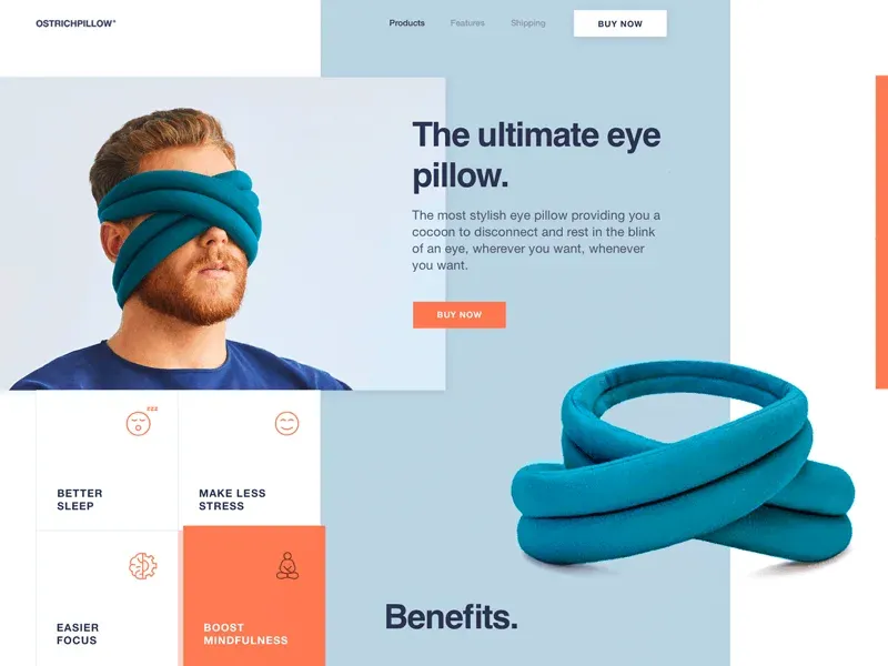
The transition to product design requires vigorous effort. At the risk of immersing ourselves in a particular industry or product, we make a choice from which we will never return. This must be taken into account. We must take into account the viability of the industry and prospects professional development in it.
Success favors the bold and in 2019 we will see how even more dedicated designers will bet on specialization and sacrifice their universal skills. Time will show.
Finally, the biggest trend we are beginning to notice is a gradual shift towards sincerity. You can only resort to tricks. Nothing compares to good intentions, which are based on a good idea.
