TOP-8 tendencies of typographic design in 2019

2018 is long gone, it’s time to look to the future. Graphic design trends are rarely long-lasting, so it’s hard to predict exactly what will be popular in typography in 2019. Popular font styles don’t usually come out of nowhere, so we can guess which niche favorites will take center stage this year.
Handwritten fonts
This type of font was relevant in 2018, so it is expected that handwritten fonts will be popular in 2019. Free and Human handwriting can make your small business less rigorous, corporate and more affordable. Shopper, will most likely perceive you as an individual rather than as a business, which can be helpful if you are trying to create a hospitable and traditional mood. In most cases, such fonts are not suitable for large organizations, but for small companies, who want to establish a closer relationship with their clientele, will be just right.
Vintage fonts
As in the case of handwritten fonts, vintage printing is becoming increasingly popular due to the emotional connection that arises when viewing it. Classical typography is familiar to everyone and can cause nostalgia.
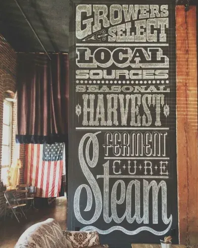
This font is ideal for small businesses that make references to a person’s past or childhood. A similar connection with someone - a great way to encourage them to become a customer.
Cutouts and Overlays
More and more web designers are taking advantage of such fonts. Ability to add layers to the page design, drawing or text makes the object more interesting.
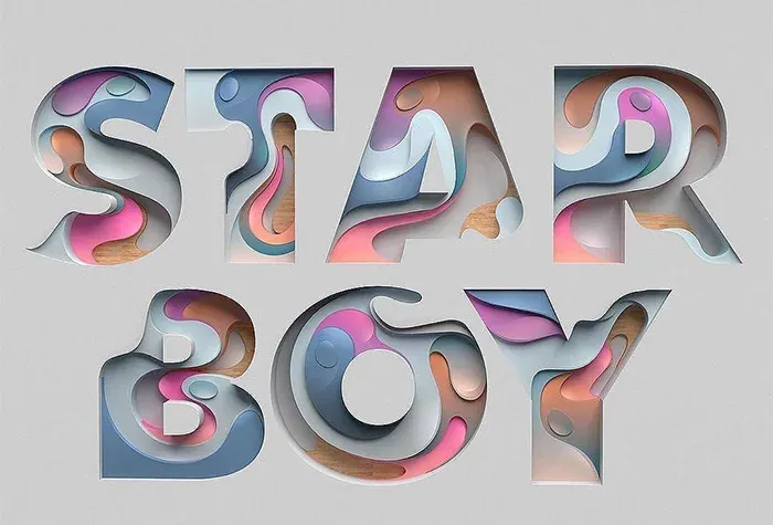
This is a great way to add images or interesting templates to overlay text. In addition, they give design three-dimensional effect without having to do something too complicated.
Variable fonts
Standard fonts can restrict the design of a web page or logo. A trend that we expect to thrive in 2019 - the use of variable fonts. They use dynamic settings when it comes to width, heights and other attributes that cannot be adjusted more precisely when working with a standard headset.
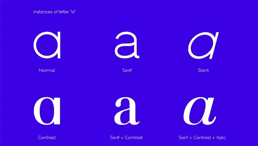
Variable fonts are, in fact, many fonts in one, and they can be easily edited and changed to thinner, thicker, bold, etc. They are responsive, so suitable for any device.
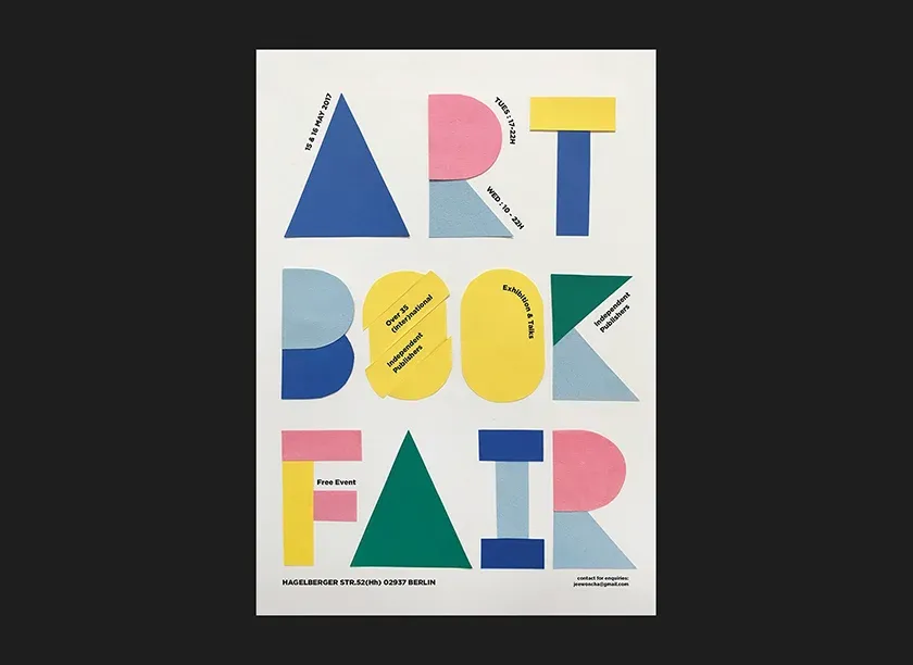
Opposites are attracted
Whether large and small, black and white or contrasting elements, they can be a great success when it comes to printing. Large text attracts attention, and small font provides the necessary information. This is far from a revolutionary idea, suffice it to mention such an exciting “SALE”. It’s a creative way to focus on something important and really get attention.
Repetition
Repeating the same word or phrase is a simple but effective way to make sure your message is marked. The designers of Kanye West’s album The Life of Pablo used this approach when creating its cover. But such an approach is becoming increasingly popular for both small businesses and artists.
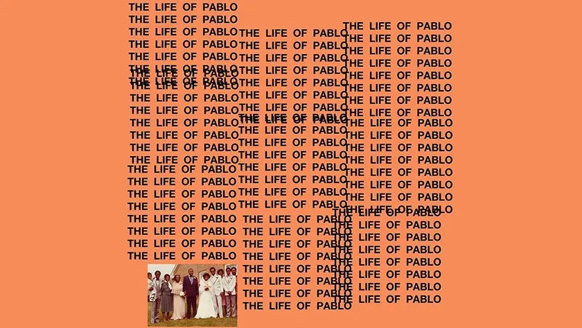
Most likely, such typography will be in the greatest demand at the small art enterprises aspiring interest their customers.
Font mix
This font is difficult to work with, but when done correctly, the object looks creative and attractive. Play with different fonts and see which ones match each other. There is a fine line between art and chaos, so keep that on mind you if you don’t want your message to be difficult to read or understand.
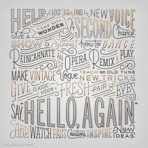
This example is a real mashup, but it gives you a general idea of what to look for. Different styles and fonts go well together, creating an attractive design. Also remember that the combination of words and fonts should be relevant and appropriate.
Colorful fonts
If you are a beginner and an energetic businessman who is fond of everything new and unusual, then a color font can really demonstrate your personality to potential customers. In 2019, we expect brands to move away from traditional ones black fonts and will use all the colors of the rainbow.
Choose colors that will help you stand out, but at the same time best reflect you as a business. But do not overdo it stick - too bright, intrusive and clumsy color combinations can repel customers.