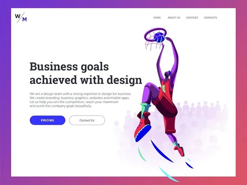
Visual hierarchy

The visual hierarchy is the foundation of a successful digital product. This helps to organize the elements of the user interface effective to make the content easy to understand and enjoyable to see.
The presentation of visual elements has a great impact on the user experience. If the components are organized well, then the users
So what forms a powerful visual hierarchy? Of course, different types of products require different methods, but there are some common solutions that help organize the content of the user interface.
Don’t forget about business goals
The digital product is often backed by business goals. To achieve them, designers need to figure out which elements of the interface users are important, and most importantly determine their priority according to business goals.
For example, all elements on e-commerce websites perform tasks at different levels. Images of objects like as a rule, are the main attractive elements, as they should encourage customers to consider the product. Title goes after the image, explaining what it is, and the next important step is the CTA (call to action) button, which calls people to buy goods.
By considering the business and marketing goals set for a website or application, a designer can effectively prioritize visual content and make the product visible to competitors.

Follow the scan schemes
In our previous articles, we mentioned that before reading a web page, people actually scan it very quickly to understand if they are interested. Various studies have identified several popular scanning models, including “F” and “Z”.
The F-template appears mainly on digital pages or screens with a lot of content, such as blogs, news platforms, etc.
The eyes of users move on the form F:
they scan a horizontal line at the top of the screen and then move down the page reading a little shorter a horizontal line ending with a vertical line at the bottom left of the text where people search for keywords in initial sentences of paragraphs.
Z-shaped images are available on pages that aren’t as focused on text, or that don’t require scrolling:
People first scan the head of the page, starting from the upper left corner, looking for basic information, and then move on to the opposite corner diagonally, ending with a horizontal line at the bottom of the page from left to right.
Knowing these templates, designers organize content that contains the basic elements of the user interface to the fullest scanned places to attract attention.
First functionality
The external hierarchy cannot be focused only on aesthetic aspects. First of all, by structuring and organizing Visual elements designers need to make sure that the product is easy to use and the navigation works properly.
A visual hierarchy based solely on aesthetics cannot work effectively. User interface with bad structured content leads to bad UX. Therefore, when creating a visual hierarchy, designers need consider the functions of user interface elements and the role they play in the navigation process.

Negative space is also a visual element
Negative space or minus space is not just the space between design elements, it is actually the main component of each visual composition.
This tool is able to make all elements of the UI visible to users. Designers can group or separate components interface to create an effective layout. In addition, the negative space helps to emphasize the individual elements that need deep attention of users.
Negative space is an effective tool for creating a visual hierarchy, so designers must work on it balanced use.
