How to choose a color for the site

Color design can be an effective marketing tool
By directly affecting the subconscious of the user of the site, the color in web design can form a positive attitude towards the product, trust, evoke positive emotions that force a person to make a purchase.
According to surveys, 94% of users do not trust a site with a bad design.
When a person first gets to the site, he intuitively perceives the picture as a whole and within the next 1-2 seconds takes the decision of whether to stay and explore the resource further or close the tab and return to the search. If color design site is selected and implemented competently, the user remains on the page, which results in increased conversions and low cost of attracting ice.
In other words, the choice of color for site design is one of the key points in the development and requires special attention.
Let’s understand how to choose the right shades and what to consider in the process of making this choice.
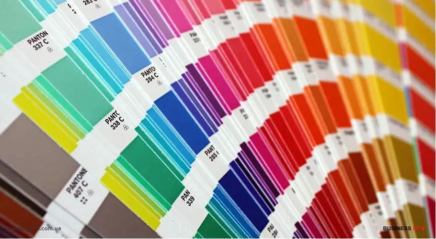
What you need to know about color combinations
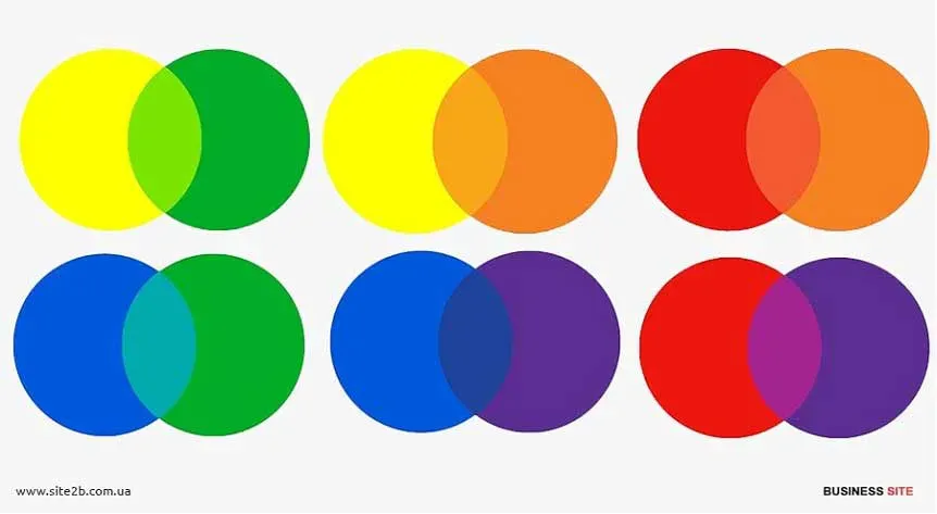
The principles of color combination originate from Newton’s color ring. Of the three primary colors by mixing intermediates are born, which are located in adjacent segments of the ring. To choose colors for a website, one of seven schemes is used:
- Monochromatic. One basic color is chosen for registration, and additional are formed from its shades (saturation, brightness is regulated).
- Complementary. In this case, the selection of color for the website begins with the selection of two contrasting tones, which are supplemented by several more derived shades.
- Split. This pattern is similar to the complementary one, but one of the contrasting colors is replaced by two similar segments of the circle.
- Analog. According to this scheme, 3 colors are selected for the site from neighboring segments: one is used as the main, and the other two play the role of additional.
- Triad. The designer takes three colors, equally spaced from each other, and on their basis forms a color palette.
- Rectangle. Here, four colors come into play, and each pair is selected on the principle of contrast.
- Square. The scheme resembles the previous one, but all colors are equally spaced.
In addition to color schemes, color models are taken into account when designing the site:
RGB is based on three main colors: red, green, blue. All other shades are formed by mixing these colors. In HTML, shades are encoded with characters from 00 to FF, preceded by the character #.
CMYK is based on four basic colors: blue, magenta, yellow, black and includes the shades formed by them connection. This model is mainly used in the press and printing. This combination of colors in web-design looks bright and unusual, attracts attention. We can see this on the example of the site mirkleya.com.ua.
What color to choose for the site
When developing the color scheme of the site should not be guided solely by their own preferences. After all, the site is created, primarily for users. Regardless of its type, whether it is an informational, presentation, or commercial site any other. How to choose the right color for the site is a matter of understanding the psychological aspect of the influence of colors and the use of this knowledge in accordance with the objectives. The choice should be based on three aspects, which we will consider in detail below.
-
Corporate identity. If your product has a corporate identity and / or logo that is already in people’s memory, become recognizable, or you plan to do so - it makes sense to decorate the site in the appropriate colors. But it is necessary take into account how the selected colors are combined with each other, how they will look in the design of the site. In some cases colors from the logo can be replaced with similar shades by adjusting the intensity, stiffness and other color parameters.
-
Subject. The colors for the design of the site should correspond to its theme or the product / services to which it is dedicated. For example, for perfumes traditionally choose shades of purple, a site about healthy food is difficult to imagine without the use green in design.
-
Target audience. Who are your customers, for whom is the site created? If it is men, it is better to prefer dark or neutral shades. For women, it is best to choose pastel tones, gentle color combinations for site design. Children’s the theme traditionally does not do without juicy colors and bright colors.
Colors and psychological features of their perception
Perception of color - the value is not constant. How a man reacts to the same color depends on many factors: place of residence, features of culture, religious affiliation, sex, age, even emotional state and mood in this moment of time. But still, before choosing a color for the site, you need to study the typical associations for each color, characteristic of most people.
- Red. Associated with aggression, power, passion, love. Emphasizes attention, causes feelings of anxiety and danger. This color is ideal for highlighting triggers, calls to action, functional elements of the site. But when decorating you need to be careful, such a rich and expressive color can not play in your favor.
- Orange. This color for the site is associated with youth, friendliness, positivity, bright positive emotions, energy and drive. Awakens creativity. It is often used for youth style design as well giving the site dynamism. Orange looks good in the design of accents: with the right extras shades it will emphasize the important.
- Yellow. The color of joy, childhood, happiness, the influx of vitality. Sometimes associated with solidity, status, authority. The nuances of perception depend to a greater extent on the chosen shade: temperature, saturation, the presence of light and shadow. You can confidently use yellow colors for a business site, and you can - for a children’s store. This is universal the color is suitable for different subjects, amplifying each specific message.
- Blue. This choice of color for site design will be justified if you need to gain the trust of the user, to inspire him with calm and confidence, to create a feeling of reliability and to convince in the professionalism. In addition, deep blue looks luxurious and aesthetically pleasing in the design of the site, which is appropriate in the field of design, floristics, jewelry jewelry, etc.
- Violet. The color of luxury, sophistication, choice. Associated with romance, mysticism, mystery. Suitable for sites mystical orientation, shops selling exclusive goods. Purple is justified in cases where the target the audience is mostly women.
- White. Purity, space, freedom, good. This color is often used as a background. This solution is optimal for online stores, as it allows you to focus on the goods. With a lot of content, a white background allows visually structure the information and get rid of the feeling of congestion. Used to create a trend minimalist design.
- Black. Sophistication, tension, dominance, minimalism. You should be careful with this color. It can capture the user a combination of minimalism and luxury, and can cause a negative reaction, irritation.
How many colors should you choose for decoration?
The site, decorated with a great variety of colors, is perceived as difficult and even repulsive: getting on it, the user will soon want to click on the cross in this tab. If there are not enough colors - the site can look monotonous, and the user’s attention will be distracted. The optimal work palette for a designer is 3-4 colors, including:
- Basic. The basic color in the design, which highlights the main content on the pages.
- Additional. The color for highlighting secondary information, which is advantageously combined with the main, complements it.
- Background. A calm shade on which the main and additional colors are not lost.
- Accentuated. Contrasting the main color, which draws the visitor’s attention to the key elements of the site.
Before choosing a color for the site, you should take into account the purpose of the resource.
For example, a corporate website should always be designed in corporate colors, match the logo. For a creative and creative site, any bold combinations are welcome, including the use of black and red colors. When it comes to site color for sale, it’s best to prefer a neutral or white background, allowing advertised goods and services to fully capture the attention of users.
The best colors for the design of the site can be selected independently or use ready-made solutions of services: colourlovers.com, color.romanuke.com, paletton.com, flatuicolorpicker.com and others.
However, this will not guarantee that the site will appeal to the target audience and will recoup the development costs.
Design issues should definitely be decided by professionals. Landing design, online store, corporate site, business cards, as well as turnkey site development - all this can be ordered in the web studio “Redstone”. Make sure the professionalism of the web studio team: examples of our work are presented in the portfolio.