What was web design like in 2020?
Quality design also remains in trend, and this is the main thing.
In early 2020, everyone shouted that this is a year of bright colors, lush gradients and poisonous solutions, but what do we see in fact? All the same neat design, calm tones (mostly white, gray, beige) large typography, interesting composition, unusual presentation of content. It is impossible to say that such a design is outdated, looks unstylish and outdated. Good design is always in fashion.

Colors
Bright colors still were. And when they met, they stood out against everything else, even if it was simple colorful inserts. Sometimes there were just crazy bursts of paint, but made very professionally and pleasing to the eye. Working with many bright colors is always more difficult than plain designs, but in the end it is very pleasing to the eye.
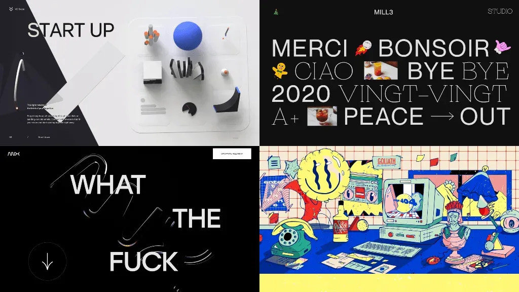
Typography
This year, designers have become even more active in experimenting with typography, fonts and text placement. Especially stands out asymmetrical layout and contrasting combination of opposite fonts. This works well when you need to emphasize attention to the text and make a nice composition. Although sometimes it is difficult to perceive such information, and they say that such sites are made “not for everyone”.
Also often this year there was a reception with the placement of images inside the text block. It looks interesting and helps it is better to convey the meaning of what is read.
If you’re a big fan of something, UX or UI, then you’re not doing a good design, you’re pretending to be a good designer.
3D and other innovative technologies
3D was used in websites even more often. Creation and implementation technologies have become more accessible, more designers and illustrators have been mastered by 3D editors, whether Blender, 3DMax or Cinema4D. And it doesn’t matter how the 3D actually gets to the site - with WebGL, Lottie Animation, Sequence, in the form of a video or a simple picture with parallax - it looks cool. Not everyone can afford augmented reality technologies, motion capture and game techniques. But they are actively tested and are gradually being implemented, especially in applications.
I advise you to look towards technology, even if you do not use them in your work yet. Keep your hand on your pulse. I would recommend studying them and understanding 3D editors and Shark AR.

Minimalism
“Minimalism”, “mini-minimalism”, “ultra-minimalism”, “multi-minimalism”. It is enough to present “minimalism” as a trend. These have long been familiar things for a normal neat design.
That saves time and money
It often happens that a static picture has a clear and workable appearance, but in practice does not work. Because the human brain does not can hold a large amount of information and perfectly think through complex processes. In 2020/2021, the designer is required to own skills that will help him to liven up his interfaces, test and identify problems before everything is implemented, and the company or customer will spend the money. Figma, Sketch, Framer X, Origami Studio, InVision, After Effects, Principle - to your attention.
Unusually exciting content
Oh yes, users are too spoiled. People have become much more picky, and the creative economy is struggling for attention user, it shakes even more. It is worth learning to create unusual content that is interesting to view and study. Creative ideas, experiments with unusual associations, a combination of incompatible, different poses, shapes and angles. What’s weirder and the more daring, the more noticeable. Well, it’s been a long time to spend on quality content.
It is very interesting to watch how designers experiment, create something unusual. But many of these unusual sites users do not understand. These vytrebenki often interfere, and it is good if the user “well it is normal”. It’s a curse of surprise designers, as well as the desire to do cooler than last time or better than others. It is worth trying to do cool and do for people. If there is a desire to become better, you need to take on what you do not know how to do and solve problems that require new knowledge. Developing and learning something new is the best trend of any year.