10 typography trends
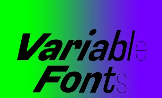
Variable fonts
With the release of OpenType 1.8, there are many new opportunities to use fonts on websites. Variable fonts can be changed beyond recognition: letter size, width, volume. The size of the file will remain the same. Variable fonts are quite flexible, easy to work with and create unique inscriptions.
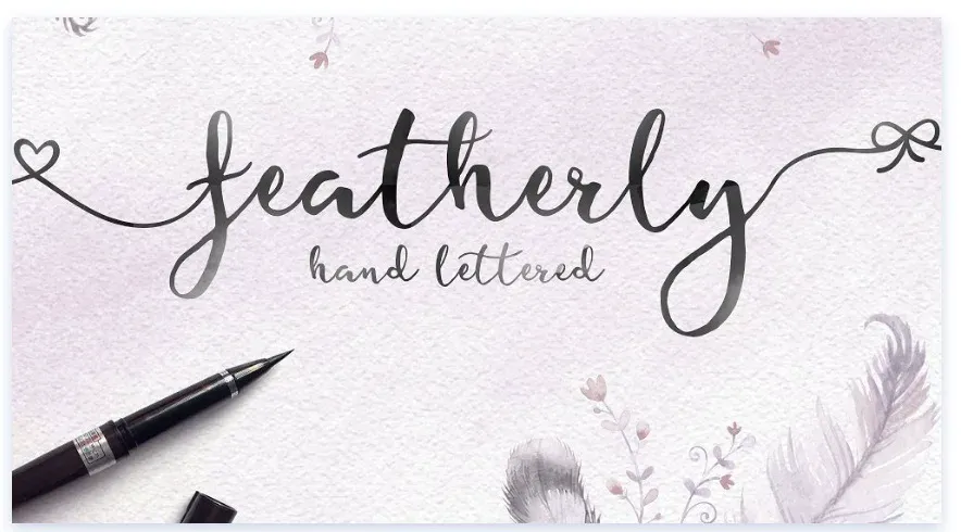
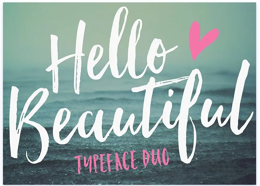
Handwritten fonts
Such fonts allow you to create truly stylish projects. Fashionable calligraphy will be a real icing on the cake. Such fonts look very attractive on Instagram, in personal blogs, websites or even on the pages of printed publications. Elements that look like they were created by themselves, arouse a variety of feelings in the audience. For example, text from curls on the beauty blog, creates a warm atmosphere and attracts a large number of readers, mostly women.
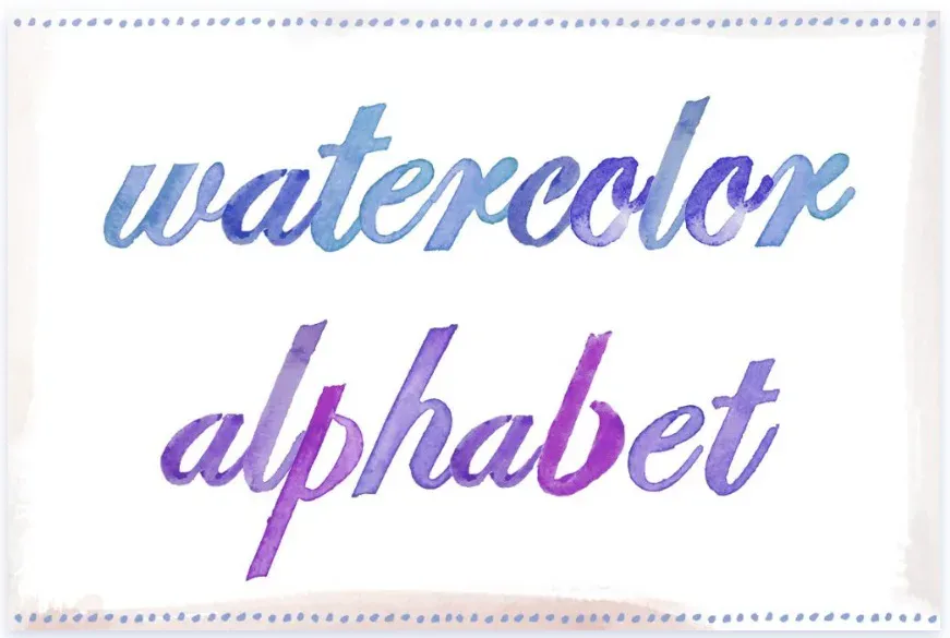
Watercolor fonts
Watercolor design is more of a creative tool for those who want to stand out. This is a great kind of typography that evokes a sense of comfort and increases the degree of trust of users. This type of font is great for posting Instagram, logo, site design. Moreover, watercolor calligraphy is very suitable for greeting cards. By using such fonts can create unique designs.
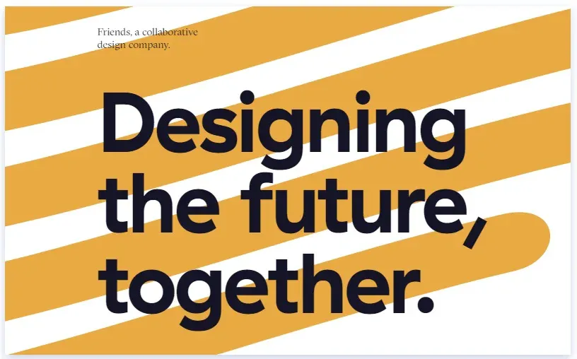
Large and visible fonts
Bold is a good way to emphasize an important piece of text. If you want to convey an idea, you have a chance make it more noticeable. Enlarged and highlighted text is a great example of an eye-catching element. But it’s worth it Remember, it is very important to keep a balance: you should leave more free space next to the text blocks. Here is an example of how the designers of Friends effectively used this technique on the main page of the site.
Fonts to order
Custom printing will provide you with incredible freedom of action. Of course, creating such a font takes time and finances, but the result is worth it. Using this font, you emphasize the image of your brand. If you need individuality and you want to highlight all the features of your business, use this option to create a font under specific project.
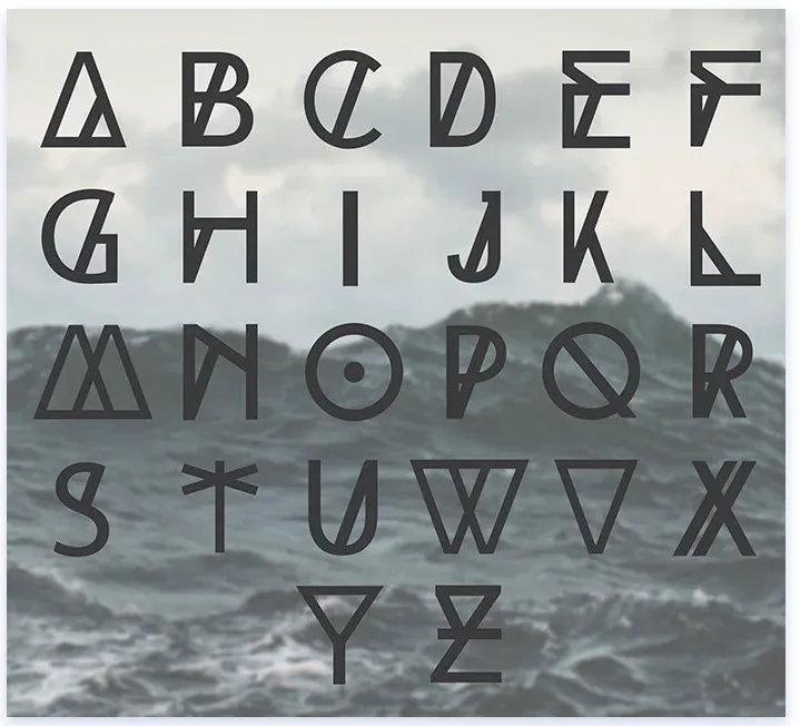
Geometric fonts
Geometric fonts are a great option not only for sites and posts on Instagram, they also fit the covers albums or movie posters. The geometric shape of the letters resembles runes and resembles a futuristic design. If you want to add intrigue to your project, use this type of font.
Mixed or combined fonts
It is normal to use only one font for a site and not to compose it with anything else. It is the choice of those who believe that there is nothing better than minimalist projects. But for creative individuals, this approach may seem boring. Try it break the rules and combine different fonts. Combining several types of fonts is a powerful tool that allows make a stunning visual image of the brand.
Text in the image
The concept of the text in the image looks quite simple. You choose photos with the help of special tools add the required text or slogan at the top. This classic way of combining an image with text increases efficiency message and contrasts with the general content of the site. Just before that, make sure you choose the appropriate color scheme.
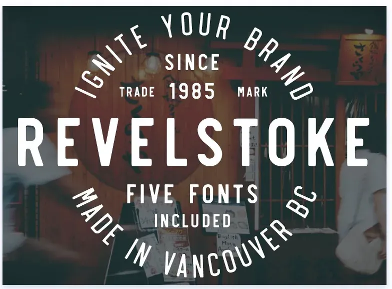
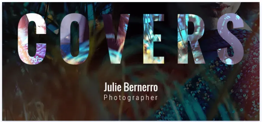
Image on top of text
Image overlay is popular with graphic designers, photographers and web studios. This is visual the object is created by adding a double exposure. This method allows you to show the image directly inside the text. Content will now be memorized quickly. This will be one of those decisions that play an important role role in the perception of the project in general.