A brief history of color theory
One of the first known theories of color is set out in a short treatise “On Color”, written in ancient Greece. The text was originally attributed to Aristotle, but today it is believed that most likely the text was written by peripatetics - disciples of Aristotle. Based on observations of the behavior of color in nature, the treatise states that all colors exist in the spectrum between light and darkness, and that the four primary colors are derived from the four elements: fire, air, water, and land. Today, this statement seems naive, but, in general, these observations are not meaningless: plants green above the soil surface, their roots are white, so the color comes from the sun. Also, the color is dried plants lose brightness, so water also determines color. Despite the fallacy of the theory, the treatise “On color” contains a number of important observations, such as “darkness is not color, but the absence of light” - the discovery, encountered by the observation of clouds, it becomes darker as their thickness increases.
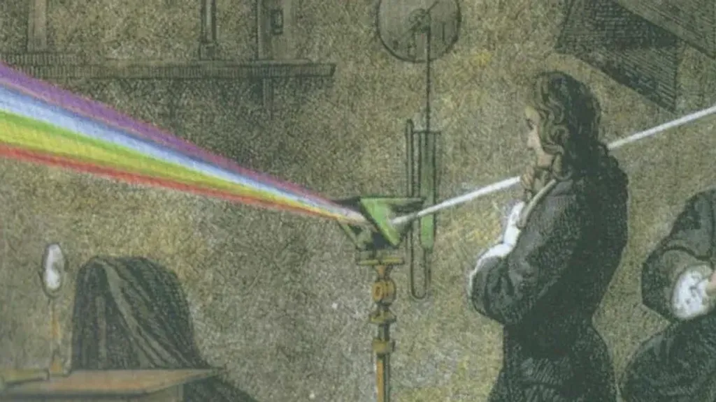
As in many other fields of science, Isaac Newton completely overturned traditional theories of the behavior of light when published the first edition of “Optics” in 1704. Newton discovered that white sunlight is a combination of all visible colors of the spectrum, rather than colorless as previously thought. The basis of his experiment was a well-known phenomenon: when white light passes through a prism, it splits into all colors of the spectrum. Newton found that he could recombine these colors and get white light again.
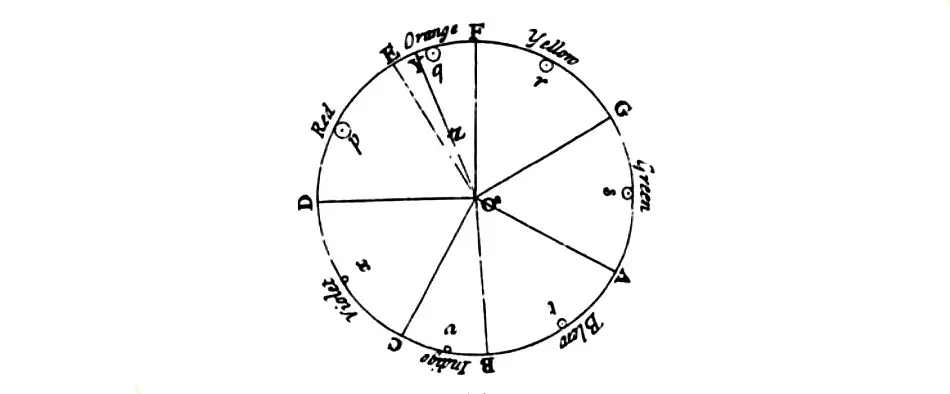
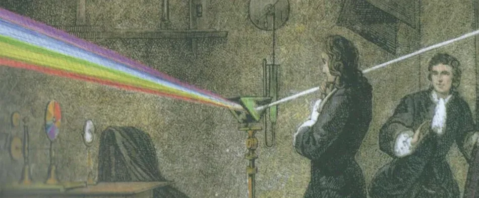
Newtonian color wheel based on the musical octave
Newton also found that if you mix the first color of the visible spectrum (red) and the last (purple), you can get extraspectral purple, which you will not see in the rainbow. Mixing the first and last colors prompted it unfolded the color spectrum in a circle, which marked the beginning of the tradition of using shapes to demonstrate color patterns. Newton liked that the circle made it easy to predict the result of mixing colors by simply choosing a space between them. The size of the color segments Newton made proportional to the intensity of each color in the spectrum, and the number primary colors chosen by analogy with the musical octave, which has seven intervals.
While Newton was interested in the scientific explanation of color, the German poet, thinker and naturalist Wolfgang von Goethe devoted his book The Theory of Color (1810) to human-oriented analysis of color perception. After a series In experiments in which he measured the reaction of the eye to certain colors, Goethe created perhaps the most famous color wheel. There are three main colors on the circle - purple, yellow and blue - from which, as he believed, you can get all the other colors.
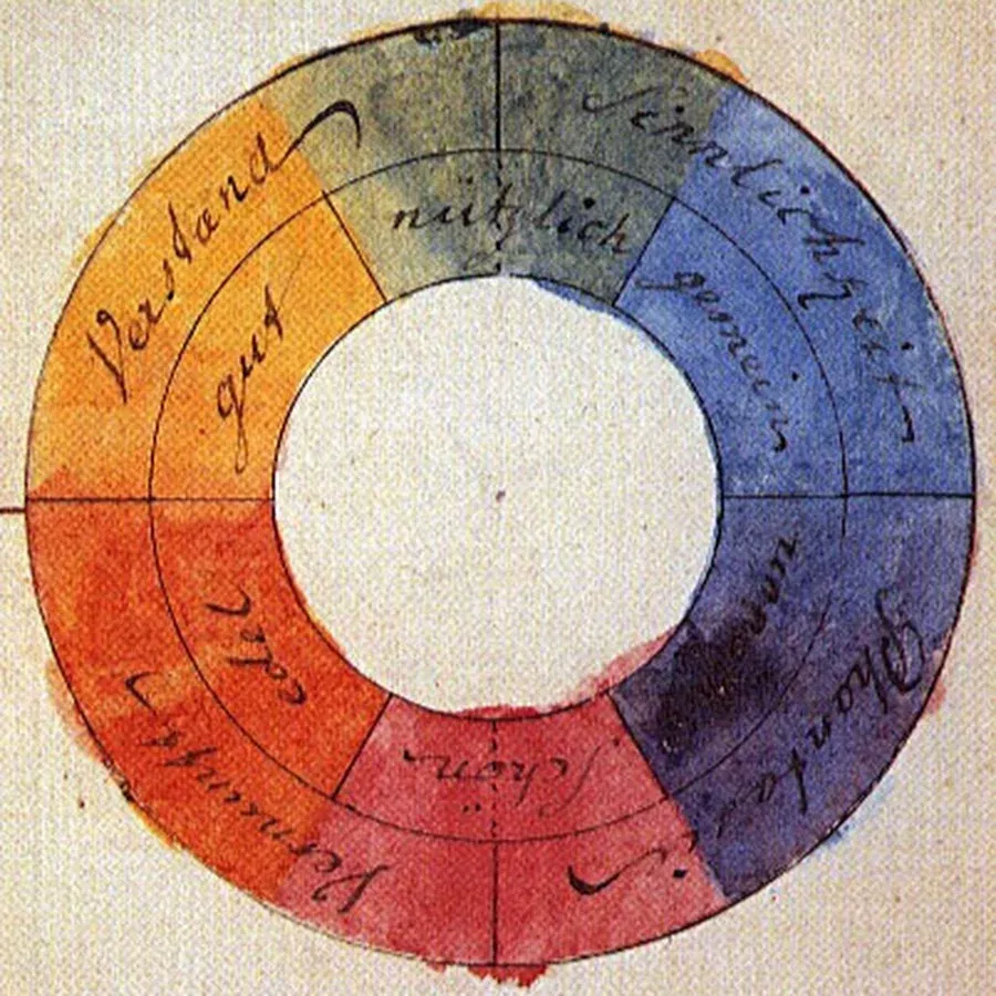
Goethe’s color wheel with three basic colors - purple, yellow and blue
Goethe’s “theory of color” in many ways contradicts Newton’s theory, as Goethe believed, for example, that the creation of color the prism itself is responsible, not the light that passes through it, and that darkness is not the absence of light. Although Newton eventually won the controversy about the nature of color, Goethe’s work is important to us because it focuses on cognitive the effect that color makes on a person. His study of the effects of residual images and optical illusions is particularly interesting, as it involves later works by Johannes Itten and Joseph Albers.
Although Newton’s and Goethe’s color circles contradict each other, in some ways they are both true because they reflect behavior colors in different environments. Newton describes how spectral colors form all visible shades, including white, with positions of additive mixing of light: combining different shades of light, we end up with a white light. Goethe describes as its three primary colors form all visible shades, including black, and this is also true because the pigments are mixed subtractive - on the principle of subtraction: mixing paints of different colors, we eventually get black paint.
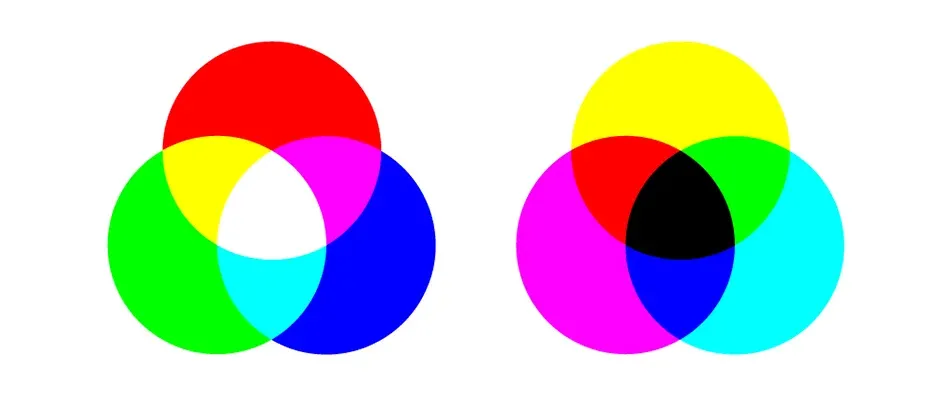
Additive RGB and subtractive CMY color models
Trying to create a single system for color, such as conventional musical notation, artists soon became depict the color spectrum in the form of three-dimensional shapes. A typical example is the color triangles of Tobias Mayer, described in his book “Commentary on the Kinship of Flowers”, published posthumously in 1775. Mayer sought to pinpoint the number of shades that the human eye can distinguish, and this required the addition of an additional dimension to reflect the change brightness of each color. Mayer placed in the corners of the triangle three traditional basic colors for painting - red, yellow and blue - and filled the space between the corners, mixing opposite colors. In contrast to the color wheel, he depicted many triangles of different brightness and arranged them on top of each other. Thus, the color was determined by the position in three-dimensional space, and this method is still used today. Mayer ultimately failed to create models with a uniform step, as he had no idea about the peculiarities of color perception by the human eye.
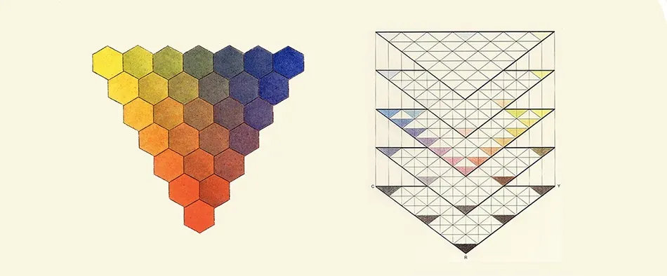
Colored triangles by Tobias Mayer
German artist Philipp Otto Runge used a similar approach in creating his spherical representation of color spectrum described in his manuscript “Color Sphere”, published in 1810. There were white and black poles in Runge’s sphere with colored belts located between them. However, like other color models before it, the sphere did not make a difference between brightness and color saturation. As a result, such a model described only a small gradient in color intensity. As in Mayer’s triangles, the color change in the Runge sphere was uneven.
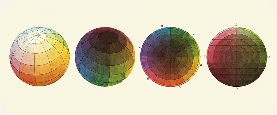
The color sphere of Philippe Otto Runge
Michel Eugene Chevrel tried to solve this problem in his hemispherical model in 1839. Instead of mixing shades, based on the quantitative ratio of colors used in the mixture, he chose those shades that are visually seemed true. Inspired by Goethe’s work, Chevrel used the residual images to verify his correctness choice. If a person looks at a green square for a long time and then looks at a white wall, he will see a purple color. This is due to fatigue of the green receptors in the retina, and Chevrel used this effect to identify complementary color in your model.
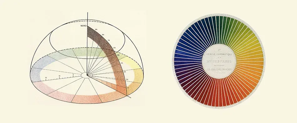
Michel Eugene Chevrell’s color hemisphere
One of the most historically significant color figures was created by American artist Elbert Henry Mansell on early twentieth century. Like his predecessors, Mansell wanted to create a model with a perceptually uniform step, and, despite the fact that he was an artist, his approach was extremely scientific. He used subjects and a whole set of tools of your own invention to create a surprisingly accurate model. An important feature of the Mansell model was that he re-marked the spatial coordinates: “shade” determined the type of color (red, blue, etc.), “Value” determined the brightness (dark color or light), and “color” determined the saturation (purity of color). These symbols are still used in some performances of the RGB color model.

Rendering of a colored Mansell tree
At first, Mansell wanted to arrange the colors in a sphere, but noted that “the desire to fit the model into a simple geometric shape, such as a pyramid, cone or cube, combined with a lack of proper testing, leads to numerous color distortions. Mansell realized that his color figure had to be the wrong shape to match his color pattern. Explain it can be quite simple. Low-brightness colors include much fewer visible shades between zero and full saturation (colors with zero brightness include only one - black). Also, some colors just have larger range than others. You can mix more different colors from red to white than from yellow to white, simply because yellow is lighter. Another important feature of the Mansell model is that he used mathematical symbols instead of color names to determine the position of color in space. It’s like the way we are today denote color in computer programs. Mansell’s model had its shortcomings and contradictions, but it was the first time it overturned a bridge between art and science, and to this day forms the basis of the curriculum in many art schools.
Many European movements in the art of the early 20th century showed a deep interest in the subjective perception of art. Although the Bauhaus school in Germany was more focused on a modern approach to art, design and architecture, two important publications on color and its perception, characteristic of this time, were written in the Bauhaus: “Art color “by Johannes Itten and” Interaction of Color “by Joseph Albers.
School building in Dessau
The view of Johannes Itten, a follower of the Mazdaznan religion, on art was largely dependent on his spiritual preferences. A staunch vegetarian, Itten was known for performing breathing exercises with his students to unleash their creative potential. He, following Goethe, believed that the most important is the subjective perception of color. His book is dedicated the ability of color to arouse feelings in the observer. The main idea of his work is to identify seven color contrasts, which the artist must learn to use to create the desired expressive effect. Some of these contrasts are simple, as the contrast of light and dark, which occurs when colors of different brightness are used together, or the contrast of shades, which can be seen when two different colors are used together. These observations can still be used novice designers to choose colors, as they systematize our knowledge of color. To explain their ideas Itten used a RYB (red-yellow-blue) color sphere, strikingly similar to the Runge model. Other contrasts of Itten may seem quite arbitrary, for example, his rule of “simultaneous” (simultaneous) contrasts, which states that some colors create expressive effects when used simultaneously. Itten often used his subjective experience for creating a generalized theory of color, as you can see from the quote below:
“To solve many problems, however, there are objective considerations that are more important than subjective advantages. Thus, the meat bench can be decorated in light green and turquoise tones in order to make the pieces of meat look fresher and redder. If the designer uses white and yellow stripes in the coffee package, or a pattern in blue peas for packing pasta, it will be wrong because these colors and shapes are at odds with the contents.”
Here, Itten’s personal preferences over the color palette lead to a strict generalization in terms of color and content. Who said that yellow stripes or blue peas can not be effectively used to create packaging for certain foods products?
Joseph Albers, a student of Itten at the Bauhaus, described a more vivid approach in his 1963 book, The Interaction of Color. Using opaque pieces of colored paper, Albers demonstrates the dynamic nature of color relationships, particularly as people perceive color depending on the environment. Instead of trying to come up with a single theory about why colors behave this way, Albers simply describes how students can conduct experiments to see the effects with their own eyes. This made “Color Interaction” one of the main and long-lasting works on color composition. Below one of his most famous experiments with two squares on a colored background. The viewer believes that the squares are painted in the colors of the opposite background, although in reality they are the same color.

Two inner squares of the same color
As mentioned earlier, our art history is full of controversies about the nature of basic colors, which are partly caused by confusion in understanding the difference between subtractive and additive color patterns. We know we can’t mix yellow color of darker colors, so Goethe and other artists considered yellow “pure”, endowed with qualities other than qualities of other colors of the spectrum. Today we know that the concept of basic colors is quite arbitrary, and that there is no such thing concepts like pigments of “pure” color. You can take any three colors and mix others and some colors allow you to get a wider range of shades than others, but in the subtractive model there is no way to mix the whole color spectrum in this way. On the other hand, humans have three types of receptors for color perception (conventionally “red”). cones, “green” and “blue”), but, nevertheless, this does not give the right to talk about “pure” or “real” colors in art.
“The bottom line is that base colors are just useful fictions. These are either imaginary variables taken in mathematical color models, or imperfect but convenient assumptions made in special mixing models light, color, paints or dyes.”
This understanding is deeply integrated into the devices we use on a daily basis. Industry standard for desktop printers and other printing mechanisms that use subtractive mixing of pigments, there are three colors from the CMY color model: blue, magenta and yellow. We know that this particular set allows you to mix acceptable range of colors in ink. Printers also use black ink, as the three base colors cannot be effective mix black. Black ink is added for reasons of economy. However, professional printers can use cartridges with lots of colors for greater reproduction accuracy. Epson, a leader in digital printing, uses ten ink colors in UltraChrome ® HDR technology.
Industry standard for computer screens and other light-reproducing devices based on on the RGB additive model and uses three base colors per pixel: red, green, and blue. These three colors are mixed in the allowable range of the spectrum, the exact value of which is determined by the characteristics of the monitor and video card. Any digital the design program makes it possible to determine the hue based on their combination of these three primary colors. Nice moment for RGB and CMY models - although they are based on different primary colors that complement the same colors.
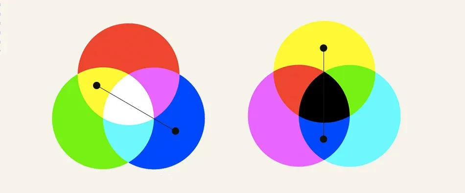
Complement colors in additive RGB and subtractive CMY models
Along with the current generally accepted scientific understanding of the nature of color, there is an understanding that human experience of perception color is a rather complex and subjective phenomenon. It is believed that it is impossible to create a simple, predictable theory color harmony, like the one in which Goethe and Itten believed. A number of factors such as gender, age, mood, personal background, as well as current trends that determine your perception of color combinations. In a sense, this makes it easier for beginners designers - you can not participate in insignificant discussions about what complement the colors to consider “correct”. In addition, without a simple algorithm for finding harmonious colors, students have no choice but to use their eyes.
Given how many artists and scientists have spent their professional efforts to create models that could help Other artists make informed decisions about color composition, obviously the way designers do today interact with color, leaves much to be desired. The pipette tool, which has remained unchanged for the last ten years, is a clear example. This tool is not able to convey a meaningful perception of the spectrum, although such methods already exist about three hundred years. Showing a square area with one color at a time, the “pipette” does not give the designer the opportunity understand some relationship between the colors he chooses. It turns out that modern design tools neglect the whole story color theory, and, consequently, it is neglected by novice designers.
Fortunately, we are not bound by digital tools in this book. In the following sections we will consider color models, color spaces, as well as many techniques that allow you to create color schemes on your computer. In order not to make the same mistakes, allowed by our predecessors, these sections will not aim to create a single theory about which colors are best suited for certain cases. Instead, we’ll just figure out what a color palette is and learn how to best use it effect from different color combinations. We hope this will help students create a solid theoretical foundation for their practice.