5 trends in graphic design, which should be abandoned in 2021
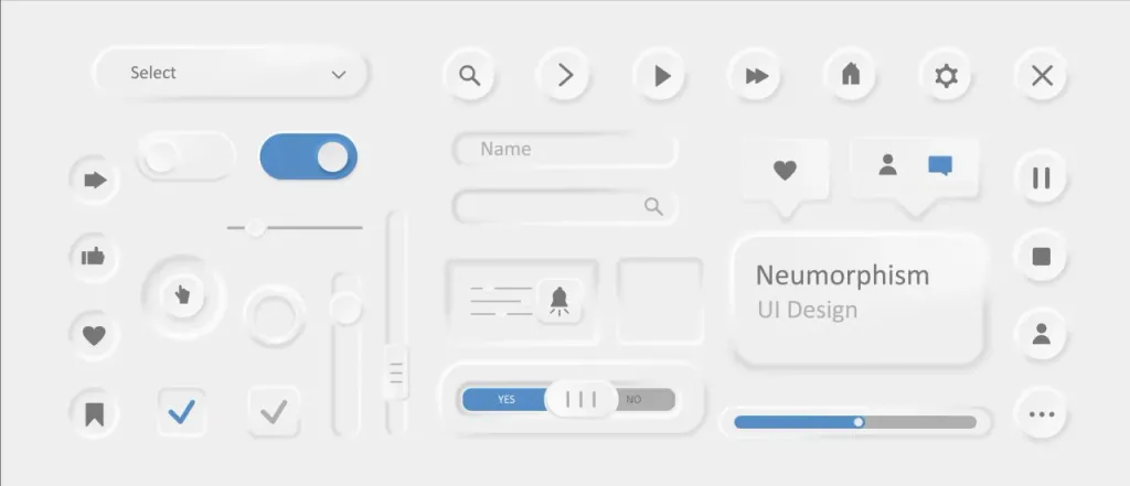
Neomorphism
Why it is desirable to avoid: low functionality, not suitable for inclusive products, can not be used in bright sunlight, it is difficult to implement at the programming level.
First came skevomorphism - a design in which the elements mimic real counterparts. Later, designers created a neomorphism. In 2019, platforms such as Dribbble were crowded with projects in this style. Modern, trendy and elegant, they quickly won the favor of an audience that wanted to see more allusions to the real world and fewer on the Internet visual noise.
But, despite optimistic forecasts, it became clear that the trend towards neomorphism is hopeless. Find at least one product in this style is difficult. All because neomorphism turned out to be quite impractical, and the cost of implementing design ideas at the software level - too high. It is not suitable for inclusive products. Even for ordinary people users such a design is inconvenient due to the limited color palette and low contrast.
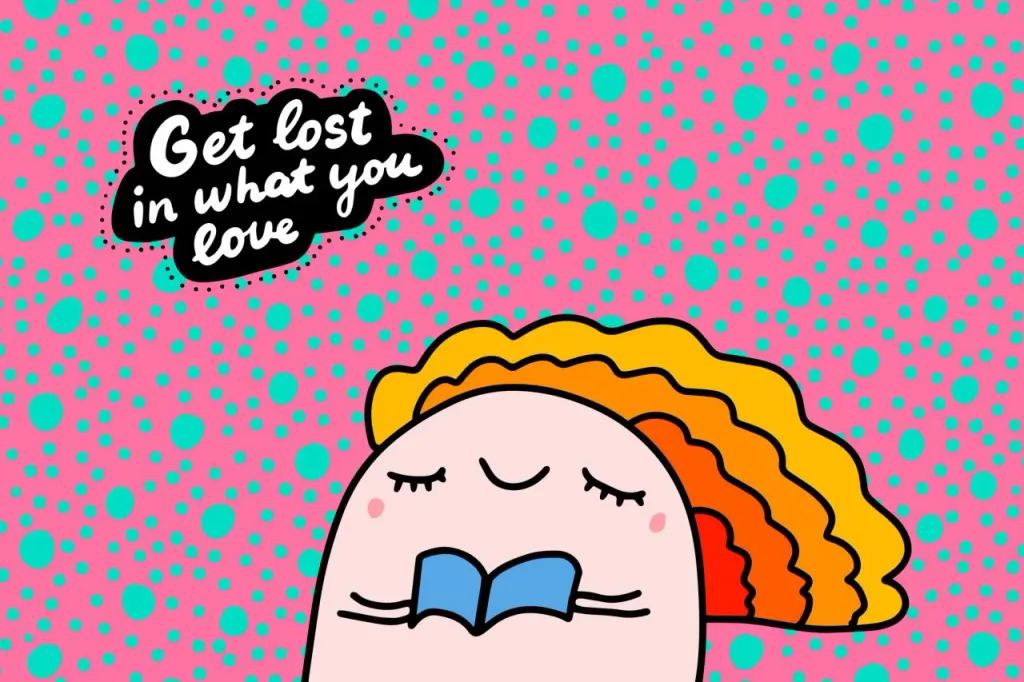
Illustrations that convey general ideas (flat or 3D)
Why you should avoid them: all applications and sites with typical metaphorical illustrations and have almost the same look.
Vector illustrations have many benefits, which is why digital product developers and marketers often choose them. Firstly, uploading such images to the user’s device requires very few resources. This, in turn, provides fast site load and low bounce rate.
Second, illustrations allow you to create beautiful, attractive sites for companies that can not show on their pages specific products (for example, service companies or IT).
Why are illustrations not the best choice in 2021? The thing is, he uses similar flat or 3D images right now almost every company in the market. Competitors’ sites often do not differ from each other. In order not to find yourself in a similar situation, it is desirable to choose original, authentic illustrations (for example, those resembling children’s drawings).

Organic forms
Why it is desirable to avoid them: complicate the understanding of the hierarchy on the page, confuse the audience, which leads to increase in failure rate.
The rounded corners of buttons and contact forms make elements of interfaces more attractive and provide more clicks. What’s the secret? People subconsciously associate sharp corners and edges with something threatening.
Organic forms can also help users navigate the site or application. Thanks to these elements you can attract the attention of visitors and direct them in the right direction.
But if you apply this approach too often, the whole product will seem unstructured, which can be confusing users and force them to leave the page. In Depositphotos it is advisable to use rounding only in cases where when it is necessary to attract a potential customer or push him to a certain action.
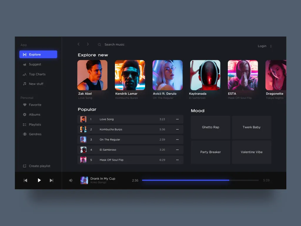
Excessive brightness and contrast
Why it is desirable to avoid them: unrealistic, too retouched images are often associated with insincerity in communication and attempts to hide something important; bright color contrasts create a visual mess and cause the eyes users get tired faster; excessively bright shades increase the feeling of anxiety and danger.
On the one hand, the greater the contrast between the interface elements and the background of the page, the more noticeable they are to the user. This, in turn, facilitates easy navigation on the site or in the application. On the other hand, according to the project on visuals 2021 trends from Depositphotos, currently the best choice is muted shades. An example is the colors of the year according to the version Pantone (Ultimate Gray and Illuminating), as well as the color of the year from Dulux (Brave Ground), which symbolize confidence and rest.
Why is it desirable to avoid bright colors and sharp contrast this year? The main reason is that potential customers probably feel constant anxiety due to an unstable situation. They seek peace and support. That’s right the design in muted colors has a calming effect.
Dark and adaptive themes
Why it is desirable to avoid them: unsuitable outside of mobile design, difficult to use in sunny weather, from bright letters on a dark background, the eyes get tired quickly.
In some cases, the presence of a dark background on the site, presentation, advertising or application is justified. Example, many messengers and news platforms offer a choice of “day” and “night” modes so that users do not worry other people by checking messages in the dark and saving the device.
When you need to project video or static advertising on the wall, white letters on a dark background will be the best solution. But this approach works well only if the text is small: when reading a large text with white eyes get tired much faster, and users tend to leave the page faster.
Another related anti-trend is the ability to customize the background. Although this feature is designed to bind the user to a certain tool, involving him in creating a design, most ignore the possibility of personalization. Our advice: think twice before adding a dark mode or adaptive theme.