Before Pantone? What the color catalog looked like in the 17th century
The modern world has spoiled us. You can not spend hours on simple tasks - or rather, now they have become simple. For example, choose a color - for this there are huge catalogs from Pantone. Centuries ago, artists did not have such luxury.
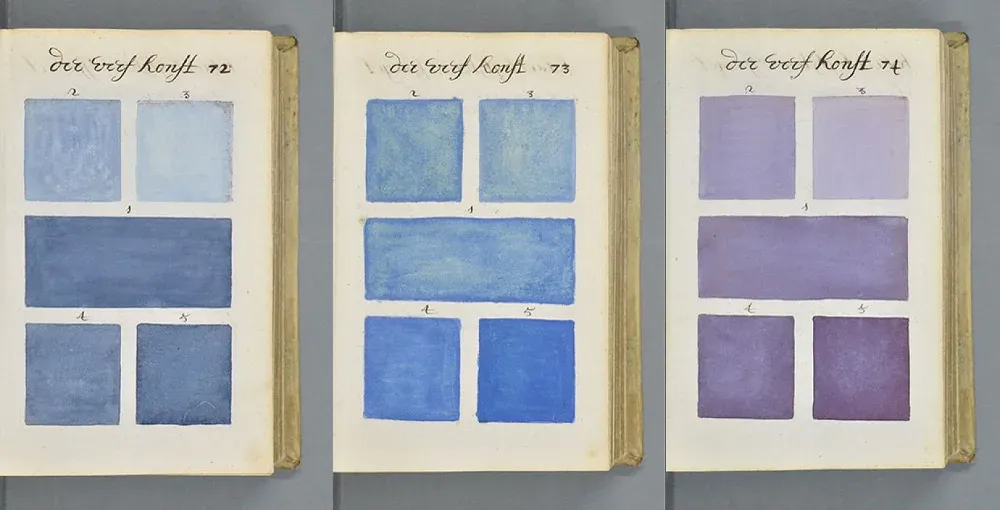
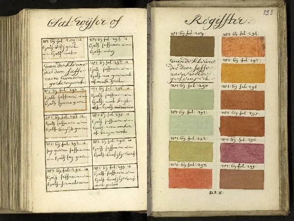
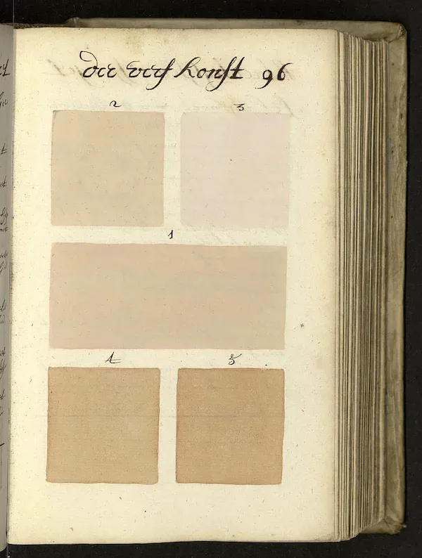
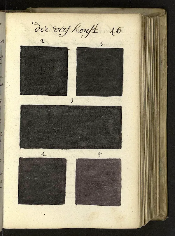
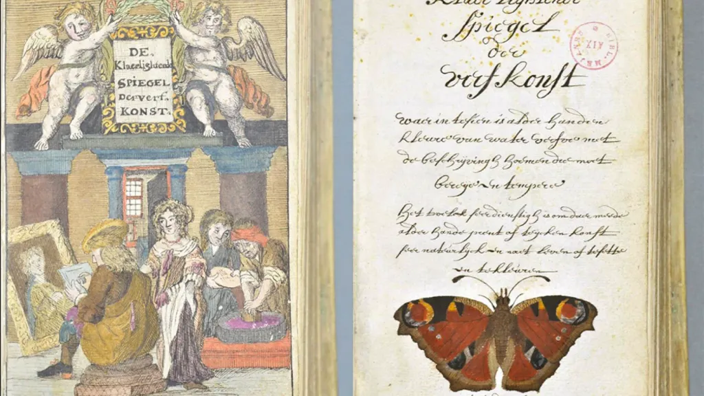
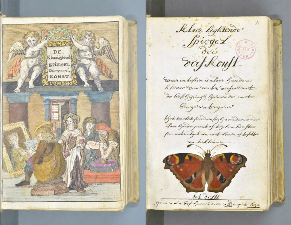
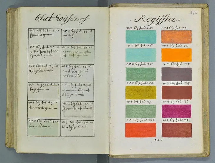
However, they had huge books like Klaer Lightende Spiegel der Verfkonst, a 900-page manuscript with samples of paints. Here readers were shown how to mix colors.
The author and artist A. Bugert created one and only one copy of his unusual guide to mixing colors in 1692. The book is based on Aristotle’s color system, not a new understanding of the color spectrum, fully developed by Newton in his “Optics” more than ten years ago.
It will be another hundred years before the flow of color books begins to make the theory more practical: from Goethe’s color theory 1810 and Werner’s color nomenclature of 1814 to the realization of the dream of color standardization - Pantone, founded in 1963.
Unfortunately, Bugert’s colossal work seems to have passed down a generation. The only copy is hardly seen by many people.
Instead, the book was intended for the training of watercolorists, hence its French name Traité des couleurs servant à la peinture à l’eau, which means “water-based paint”. (A literal translation from Dutch indicates something like “illuminating a mirror of fine arts “.)
Historian Eric Kwakkel found the book in a French database, “and it turned out to be absolutely special,” he writes, “because allows you to look into the studio of artists and illustrators of the 17th century.
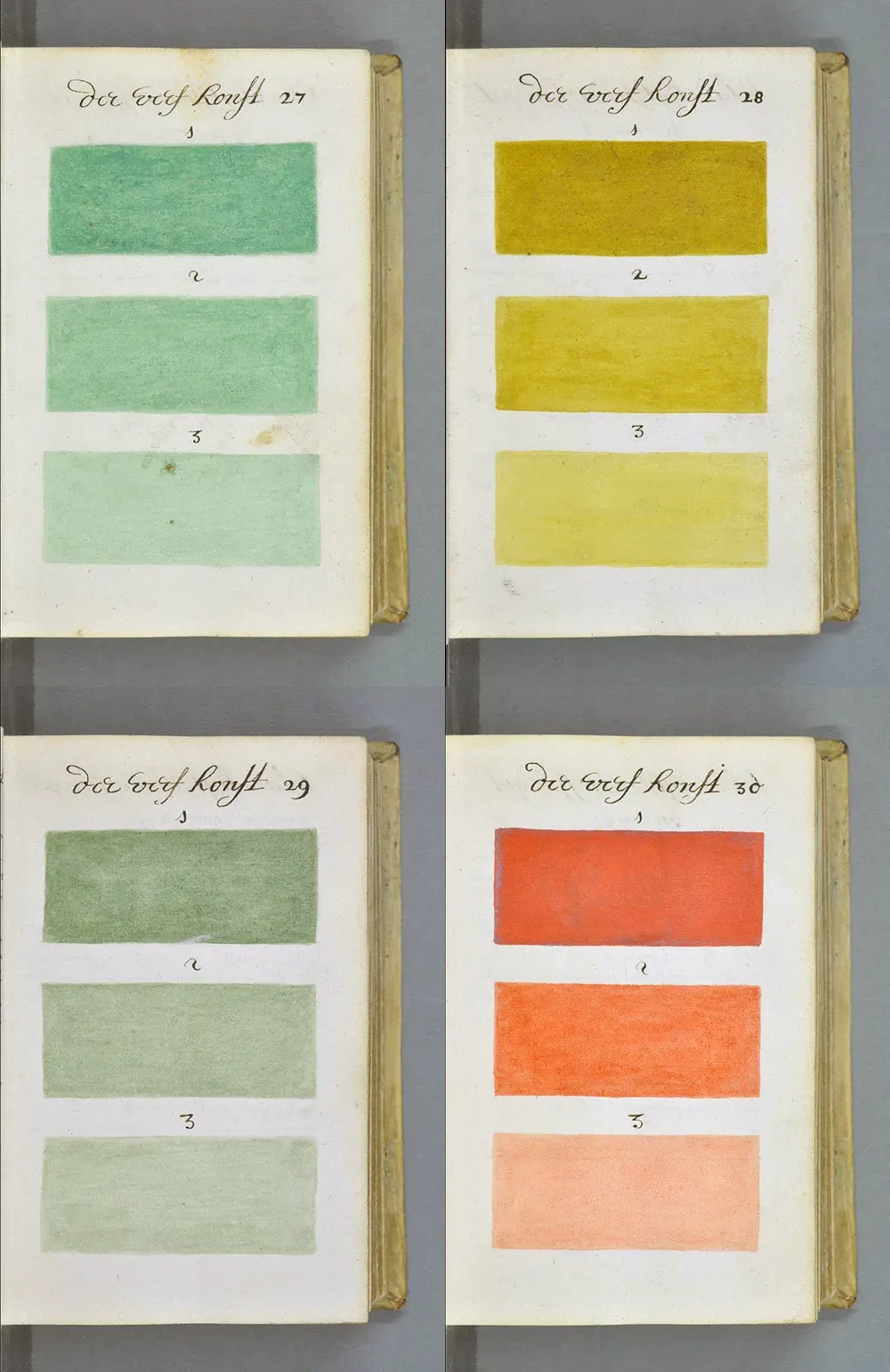
He explains how to mix colors and how to change their tone by adding “one, two or three servings of water” … In an era known as the golden age of Dutch painting, this guide would be correct. “
But apparently the author was late - after all, the book was published at the end of the century.
The book is currently in the Bibliothèque Méjanes in Aix-en-Provence - the site can be found full-length scanned scalable and high resolution images.