The complete guide to creating interface icons.

Icons are an important part of any system design or product history. Icons help us navigate quickly. They are independent of language. And the best part: they are very small, so they do not take up much space. Icons are fundamental part of a good design system and very useful for marketing materials. They are the main block of illustration content, also high-tech.
There aren’t many people who like to create icons, and even fewer than those who do. I wrote this guide, to help you become one of those people.
Whether you are a design systems expert, illustrator or product designer, this guide will help you will learn how to create icons, associate them with your brand and how to implement them into your design system. Let’s start from the basics.
The main elements of the icons
Size
Consistency and matching are key to icons, and all of your icons should be the same size when you create them. First, you need to make sure you know how your grid is built (multiples of 8 or 10?). Based on this, yours the base icon size should be directly related to these conditions. So if you have a grid based on 8, you are would like to build in 16, 24 or 32.
Select a common size to create all the icons, and then allow them to scale to other sizes. which other designers may need. You do not want to create the same icon over and over again, only in different sizes.
When you need the complexity of the glyph, then you want to add other sizes. You may have a base icon product at 24px, and marketing icons - 80px due to the huge difference in usage. You will want to add more parts for larger sizes.

When creating the same icon of different sizes, I prefer to start with the largest size and go to the reduction. It’s much easier for me to remove details and simplify than to add as I grow. It also gives you a sense of object, before you really minimize it.
Color
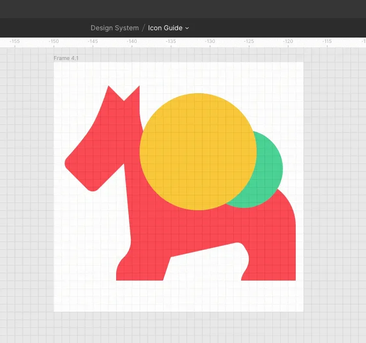
For product icons, use one color: black. If you add something other than that, your components will become too much complex and difficult for other designers. You can use two colors for marketing icons if it is important part of your brand, but I personally believe that badges should be monochromatic. Anything that has 3 or more colors is there illustration, not an icon.

Grids
The pixel grid is the main grid that uses the smallest element: the pixel. When creating icons you always want align pixel grid objects, especially in straight lines. But you can create other shapes on the pixel grid (If you use Figma, it is already installed automatically). You want to build objects on a pixel grid not only because it will look more beautiful, but also because it will make your life easier. Gradually distribute the objects a lot easier when you use a grid. It helps you stay in line with your location, and overall yours icons will look better. You can easily see in Figma the difference between something that is on a pixel and outside.

I like to build a grid before I start. Here are my settings in Figma.

Wonderful! Now that you have mastered the pixel grid, you will want to learn about the optical grid. Optical grid helps us determine where the center of the icon is and how it is perceived by the human eye. Circles and curved objects occupy less visual space than squares. It is best to place the icons in a fixed size container to allow during export they were the same size.
When constructing my optical grid, I prefer to indent along the edge, which is equal to the width of my stroke, or perhaps twice as wide if I use a 1px bar. In the examples below, you can see how the different shapes fit to different edges of the grid.

The visually dominant object should be centered both vertically and horizontally.

If you use a pixel grid and take advantage of the optical grid, you will be ahead.
Strokes and fillings
Remember when I said that consistency is the key point? I say this again. Nothing bothers me more than two icons, where one is painted, and in another only the contour is executed. It is very important to make sure that all your icons are decorated in the same way. For example, you may have fill options to show that something is highlighted, but you probably want to create set with one style and possibly create another option.
As a rule, filled badges have a higher level of recognition. Icons made only with the help of the contour give you a great the ability to create tiny details. When choosing which style is more favorable, you should also consider the overall look of your brand.
If you are going to create bar icons, all the bars must be the same width. I also recommend that distance between strokes was not less than the width of your stroke.

You may have a set of icons that matches one style but not another. When creating painted versions of the contour icons you want to see how to simplify linear operation. Ideally, painted icons resemble shadows, not inverted lines. Creating outline versions of painted icons involves determining how wide the outline can be use in this space and what details you can add while maintaining clarity.

I do not recommend making outline icons smaller than 10px (provided that the stroke width is 1px-2px). They are very difficult to decipher.
Choice of style
Your badges are a reflection of your brand. Starting with this work, it is important to understand the core values of your brand and what how they manifest visually. Some adjectives for reflection: hard / soft, ordinary / formal, luxurious / economical and literal / abstract. You may have a style visualization that you can refer to.
Some icons seem simple (X, hamburger menu, chevron), but these icons require you to understand the basic principles your icon system. I recommend starting with more sophisticated icons to help you determine what rules you want to install. So once you start creating simple icons, it will be easier than simple.

Geometric shapes
If I’m not creating a very natural, organic style of icons, then I like to start with basic shapes to create shapes of my icons. Rectangles, squares and circles are great starting points for creating more sophisticated icons.

If you draw geometric shapes, if you need to create complex polygons, you can start with a square or rectangle or use the Pen tool to go from point to pixel. It is very important to have a clear grid so you can see where these points are going.
When you need to draw angular geometric shapes, I do not recommend using a rectangle and rotating it. Instead, use a pixel grid to draw your rectangles at an angle

Natural forms
It is easy to draw more natural shapes in Figma. You can use the traditional method of drawing curves point by point, or you can use the great tool Figma angular radius. I like to draw all my points in the form straight lines, and then round the corners with the tool “Angle Radius”. This tool is useful for creating organic, balanced forms. Since Figma angles are automatically adjusted, you can move these points, and the corners adjust to you.

Angles
There are several options for angles: beveled (square), beveled and rounded. I recommend you stick to one style for your icon set.
Angular radius
When using this to round squares and rectangles, you want to make sure that all your corners have the same radius. When creating concentric shapes, you need to adjust the radii of the corners to create perfect concentric shapes. Internal forms will have a smaller radius than external forms.

Any intermediate point on the path can be smoothed using the Angular Radius property in the Inspector. If you choose the whole path, it rounds all the corners equally. If you switch to edit mode, you can choose separate points and round them separately.
Painted objects
If your icons require painted objects inside basic shapes (such as windows in a house), ideally you you want to save the outline shapes in the shaded icons. And painted objects in painted icons. If you do not have places for contour shapes, you want to use painted shapes that are proportional to your contours. For example, if you have a contour width of 2px, you do not need painted shapes larger than 4x4px.
Metaphor
Metaphors are important in icons, we use them constantly, without even thinking. The home icon indicates the home page. An insect means a mistake. When scaling icons to create thumbnails, I prefer to keep in mind the metaphor (meaning), which I use to pass the value of the icon.


Prospect
Using perspective in icons is not easy - their size complicates the task, because drawing in perspective takes extra space. If you want to use perspective, or use it to scale and make it key part of your system, or use it sparingly if it helps increase clarity and clarity.

Font (avoid!)
If possible, avoid using labels for icons. Icons must be global. If you need a font (for example, currency symbols), draw it yourself, instead of using a font.
Boolean operations
Logical operations combine any set of layers of figures by means of one of four formulas: association, subtraction, intersection and exception. This tool is relevant and amazing. This is a great way to make your icons more changeable. Instead of trimming the outlines, you can use the merge function. Don’t want to search for intersections by hand? Try to subtract.

Boolean groups are processed as a single form layer and have common fill and stroke properties and can be combined with other Boolean groups using the following logical operations.
Merge: merges the selected shapes into a logical group. If the objects overlap, the outer path of the new shape is folded of the set of paths of its sublayers minus any overlapping segments. Then this stroke will be applied to it external path, ignoring any segments that overlap.
Subtraction: the opposite of unification. Subtraction removes an area of a shape or set of shapes from the base shape. Only the bottom layer forms are continuous, others are subtracted from it.
Intersection: creates a logical group, the shape of which consists only of overlapping parts of its sublayers.
Exception: is the opposite of the intersection. The exception shows only those areas of its sublayers that do not overlap.
When I’m done with the icons, I’d like to create styles for them, so when future designers adjust the color, it is easy to simply change one property (fill) instead of fills and strokes instead.
Network vector
Vector networks are one of the most unique features in Figma. Most pen tools draw contours in a loop with a definite direction, always wanting to reconnect to their starting point. Vector networks do not have a direct and can disintegrate in different directions without requiring the creation of a separate object of the path. Complex objects can be created inside the same object and with the same properties much faster than they can be drawn using traditional vector outline tools.
How to use icons in a design system
Making a set of badges available to the rest of your team is a matter of organization, asset management, and awareness.
Organization
Let’s start with the file name. Your icons should be named based on what they show, not what they represent. For example, the stopwatch icon should be called a stopwatch, not a speed. A light bulb should be called a light bulb, not an idea. You want people to immediately understand what an icon is, not what it conveys on a more conceptual level. Desirable short names. When you need several words, use dashes to separate them.

Over time, you will turn all your icons into components. In Figma, the components work in the same way as the frames, with a small one a trick that duplicates a component, creating new instances instead of copies. This means you can have a giant library with all your icons, and when you need to use it, you create an instance from the library. If someone contributes changes to the original, your icons will be updated. You may need to search for these assets, so you can add information to search. But instead of putting it in the file name, there is an alternative. Figma has a component description window that allows you to add tags and keywords. This is a great place to add all those phrases that people can look for in yours library without making crazy long and complicated names. That’s where the value of the product comes from!
To help your engineers, you will want to use both frames and pages. The pages represent the farthest group (so I like to sort them by size). Then the frames will help you narrow down the content, as in the example below. The naming system for this icon is> category> filename.

When there is the same icon in different variations, here’s how I like to handle them.
Different sizes: Use different pages because you will rarely switch directly from one instance to another.
Fill vs outline: If you use both styles, use a slash after the icon name to indicate the shaded or shaded icons.
Adjusted images: If you have an icon with a visual option (for example, with multiple currency options), you also you can use names to help differentiate using the same method as painted and contour icons.
Transfer your badges to other hands
You may be the biggest badge designer in the world, but if you can’t incorporate your badges into your program / web page / direct mail program, it will not give anything. Talk to the team before you start designing engineers responsible for their implementation in the product.
They will be able to provide you with information about the website or the program infrastructure that will determine some of your options, such as the width or size of the stroke. Ask others designers that have been done before to make sure you are not duplicating work.
Find out from PMM what additional icons are they want to see. Be a friendly employee who is interested in feedback, advice and help. This will give you the best idea of what you need to do so that you do not have to redo the work and do not miss key tenants with whom other people have already agreed. And when you’re ready to implement with your developers, try using the Figma API for software export.
