Cyrillic and Latin in the Ukrainian language
The idea to study the Cyrillic alphabets arose after the proposal to translate the Ukrainian language into Latin. Then they became more active controversy over which Cyrillic is bad, as opposed to excellent Latin, and vice versa. But these disputes were not enough important arguments. Even the subject of the dispute - Cyrillic versus Latin - distracted from the essence of the problem. In fact there is no Cyrillic! And there is no Latin either. And there are languages.
For each font and each script, language is a separate discipline. One font can look harmonious in Russian language and awkwardly in Ukrainian or vice versa. Just as one person can be a good tennis player but a bad football player. Therefore, it is more practical to consider individual languages than the entire Cyrillic alphabet and the entire Latin alphabet.
The results of this study will be useful to those who create new fonts or Cyrillic on the basis of Latin, as well as simple designers who are afraid to work with Cyrillic.
Letters and words of the Ukrainian language
Grammar and spelling determine the nature of words, the distribution of letters. These features are unique to each language. Therefore, first than to think about the Cyrillic alphabet, it is necessary to consider what graphemes it gives to a particular language, how economical they are, noticeable, visually balanced.
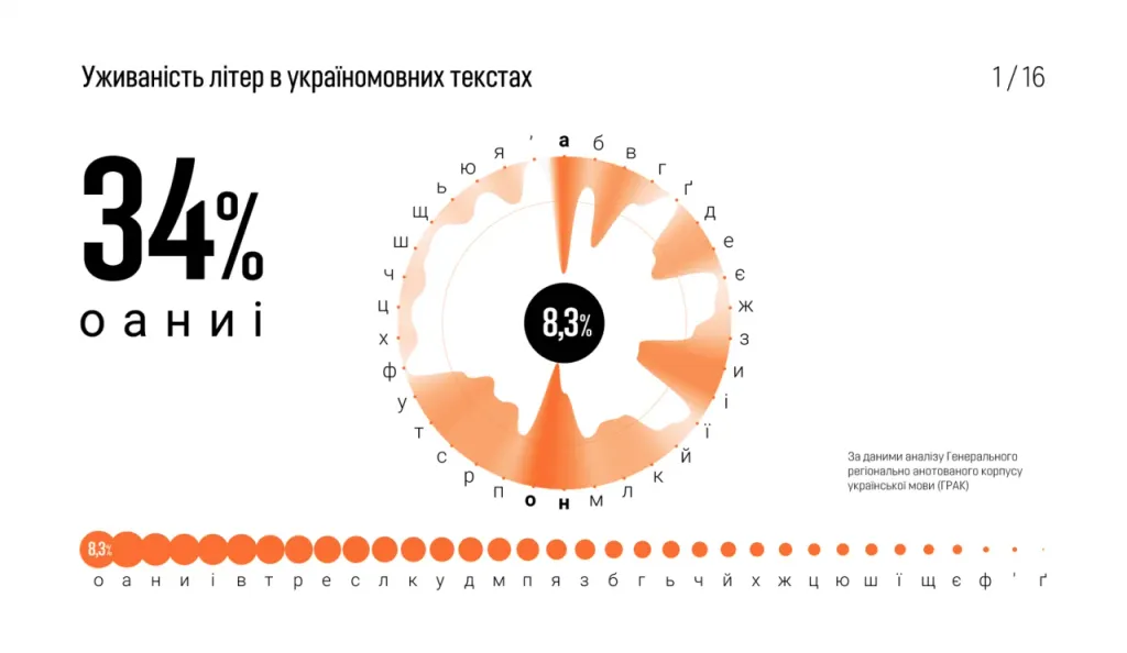
The frequency dictionary of the General Regional Annotated Corpus of the Ukrainian Language (GRAK) shows that all Ukrainian texts 8.3% consist of one letter Fr. And more than a third - of the five letters o, a, n, i, i.
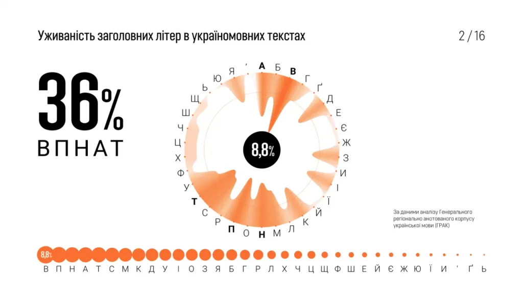
In Ukrainian texts, capital letters are used 35 times less often than lowercase, and are used in special cases: at the beginning of sentences, names, proper names, abbreviations and title inscriptions. Therefore, they are distributed in the texts differently. The most common capital letters are B, P, H, A, T.
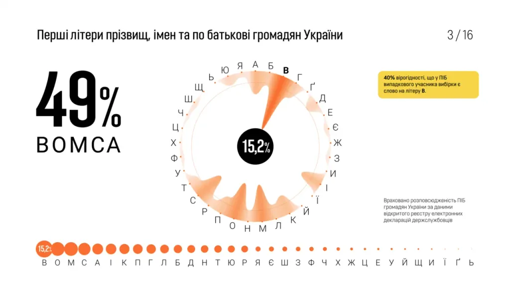
And these amazing adventures of the letter B in the passport data of Ukrainian civil servants show that sometimes it is important to analyze language in more detail, choosing texts of a certain genre, type or style, for example, scientific articles, fiction, news, names of city streets.
Usability determines the effect of each letter on the capacity of the entire font. For example, when reducing the width of the letters o, a, n by 20% most texts will take up 4.5% less space, although the length of the alphabet typed in one line will decrease by only 1.75%. Let’s compare this with the change of the wide letters ж, ш, щ, which are not to the liking of many. If we make them 20% narrower, the capacity texts will increase by only 1%. These values apply only to Ukrainian-language texts, in other languages the same letters affect the capacity of texts differently.
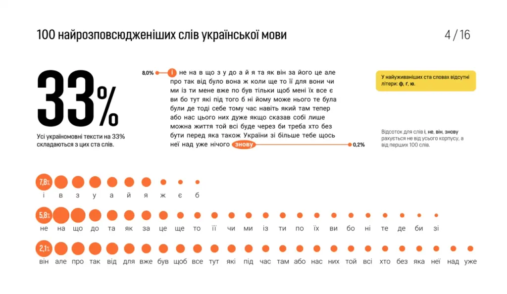
Of course, the text does not consist of individual letters, but of words, which are also unevenly distributed. Frequency analysis shows that 33% of all Ukrainian-language texts consist of 100 words. And eleven one-letter words: and, in, with, in, and, and, I, w, is, b cover 10% of the corpus of the Ukrainian language.
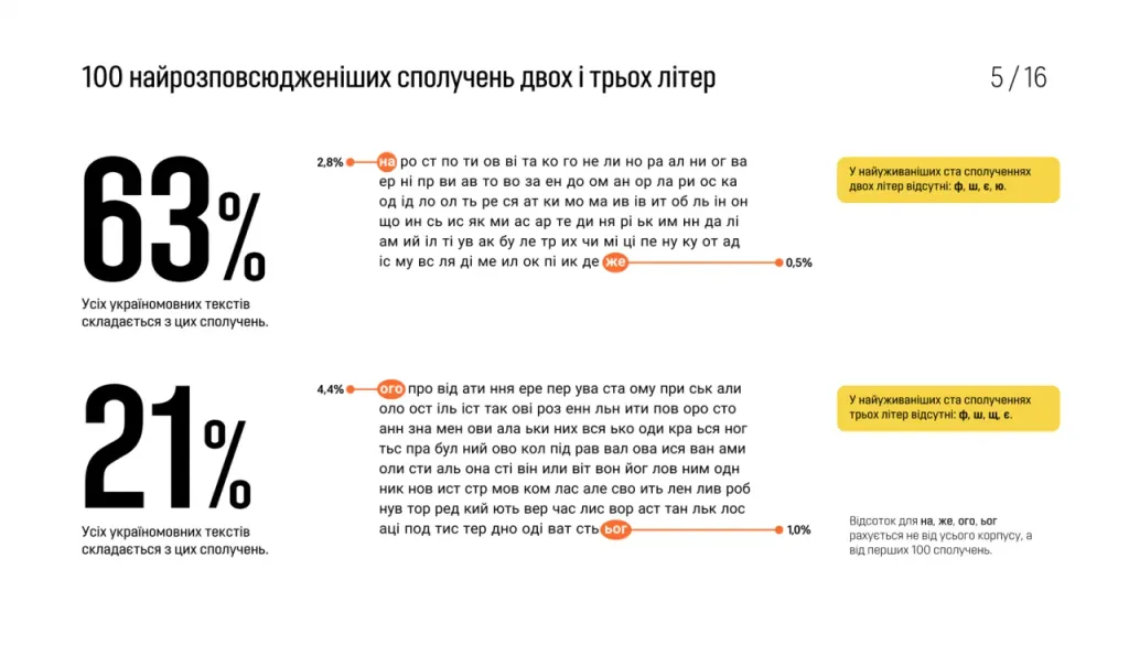
It will be no less useful to take into account the prevalence of two-letter combinations. The top 100 two-liter combinations cover 63% of all Ukrainian texts. Unbelievable, but a fact! Therefore, kerning is more convenient to start with the most popular combinations. But the best top combinations and words are suitable for testing irregular fonts: calligraphy, literature, imitation of handwriting.
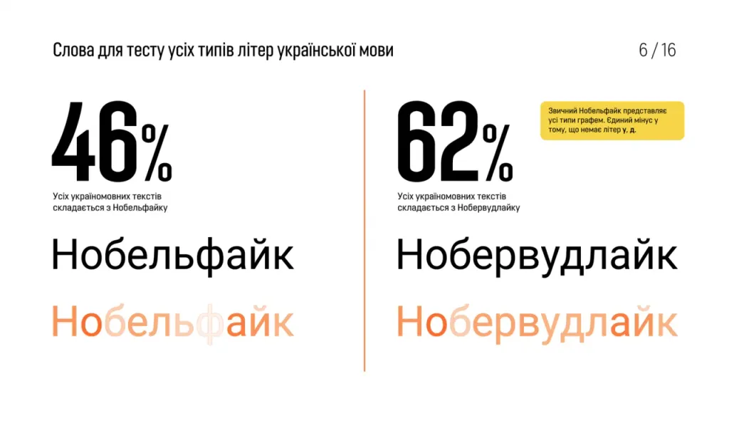
Test words for early font sketches can also be improved by taking into account the use of letters. For example, ten-liter Nobelfeik presents 46% of Ukrainian-language texts and almost all types of graphemes of the Ukrainian alphabet. Not bad for one word. But Noberwoodlike covers 62% of the body, all forms and external elements, being only two letters longer.
Form and plasticity of letters of the Ukrainian alphabet
Every designer at least once scolded the Cyrillic alphabet for the shape and plasticity of the letters. It is considered a fence, and rightly so. But before to announce the verdict, it is necessary to examine the evidence and understand what exactly the defendant is guilty of. Maybe there are mitigating circumstances?
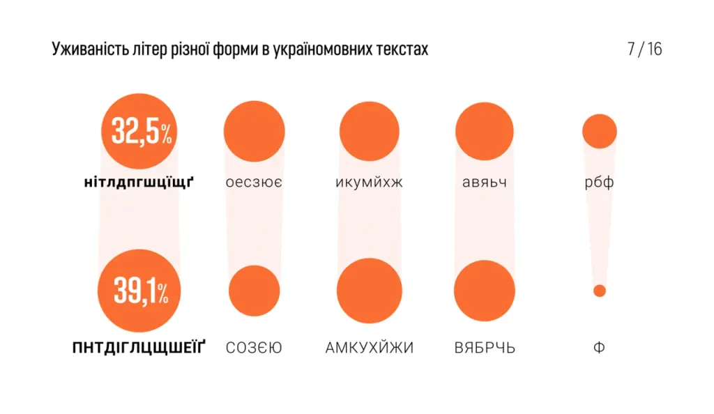
Almost 40% of capital letters in Ukrainian-language texts are a real fence. Terrible perpendiculars, four identical overhangs and the same hook from above. Very few oval shapes - only 15%. But capital letters cover only 3% of the language and are rare gather in groups of more than three. This is a mitigating circumstance.
Lowercase letters are much more harmonious. They turn only 32% of the text into a fence, and diversify the dots above and beyond monotony of his group. But 21% of the texts consist of pleasant ovals, and 19% of a good combination of semi-ovals and direct. Remote elements of lowercase letters are quite beautiful. It is a pity that y, p, b, f cover only 10% of the texts.
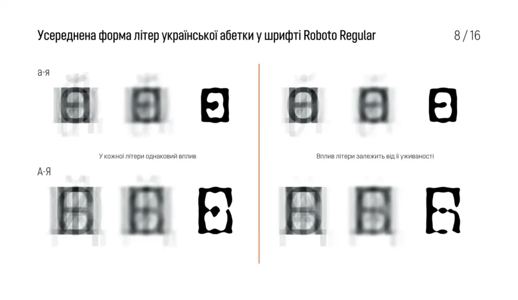
Let’s look at the “portrait of the Ukrainian alphabet”. It looks like a photo of two accomplices in the crime. They are similar to each other in in this case is an aggravating circumstance. Excessive resemblance of the uppercase and lowercase is not only ugly, but also impractical. There is a very serious problem in the Ukrainian alphabet - too frequent use of the crossbar, as in H, n. This zone is used in 13 lowercase letters and 15 uppercase letters. Excessive detail of lowercase letters increases the risk of optical distortion and spreading of printing ink.

In the Russian alphabet it is even worse, because of yo, y, b the “waist” is loaded in 16 lines and 18 headings. Instead in English language - the crossbar area is used only in 5 lowercase and 10 uppercase letters. Simplicity of form and many graceful remote elements makes the English text less vulnerable to physical and optical distortions. The following articles will more details about the English alphabet.
The above-described features of the Cyrillic alphabet in the Ukrainian language relate only to graphemes, not to history or politics. The Ukrainian language and its alphabet could look better. If we aim to improve the quality of the Ukrainian alphabet, it is necessary will change some letters or even the whole alphabet.
Two utopian ideas are known for improving the Ukrainian alphabet: the first is to move away from the “civic font” that came up with Peter I, the second - to switch to Latin.
The first idea is somewhat archaic, it involves a return to the sources, to the mythical Ukraine of Gogol. And the second idea is progressive and a little Tolkien. Her supporters say we need to switch to Latin to finally break with Russia and to fall under the influence of Western civilization, as if Latin is the magic language of the higher elves.
Ukrainian Latin
To switch to Latin, Ukraine needs to spend billions of dollars and a couple of decades. During this time you will have to do a few “Steps towards people”:
- Change the documents of 45 million people;
- Change laws, codes, all document flow;
- Reprint educational literature for all educational institutions;
- Increase the burden on students by complicating the Ukrainian language;
- Retrain millions of civil servants and state employees;
- Reprint Ukrainian fiction;
- Reprint all coins and banknotes;
- Replace millions of road signs, signs, plates;
- Overcome another additional division of society;
- Exacerbate the conflict between the older and younger generations;
- Slow down all the processes where a person reads texts;
- To suffer increased losses from accidents due to new road signs.
After that, we will abandon not only the “civil font”, but also the historical heritage of Ukraine, because the Kiev princes, chroniclers, hetmans, Cossacks wrote in Cyrillic. We will also spend time and money complicating our own language, even though it is now is not developing intensively enough. And all this to test the illusory hypothesis that radical change alphabets will make Ukraine fundamentally more progressive. Although this hypothesis may be wrong in general.
By the way, you can switch to Latin in several ways. Take for example the two most different ways of transliteration Ukrainian language: the international standard ISO 9 and “national transliteration” - and we will study them taking into account the frequency language analysis.
National transliteration of the Ukrainian language
Today in Ukraine there is a procedure for transliteration of the Ukrainian alphabet adopted by the Cabinet of Ministers in 2010.
This alphabet may please someone with the absence of the letters ц, щ, ж, but with these achievements came a number of problems:
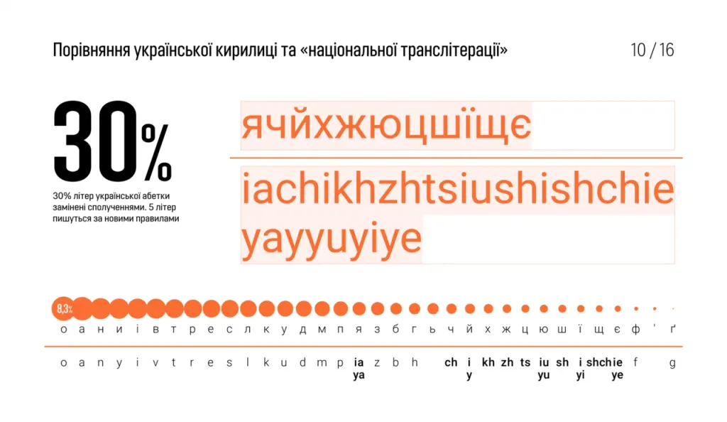
- The correspondence of graphics and phonetics of language is lost. Instead of 1 letter for 1 sound and one soft sign, entered letter combinations ia, ch, kh, zh, iu, sh, ts, yi, shch, ie;
- Complicated spelling rules of 5 letters: ia (ya), i (y), iu (yu), i (yi), ie (ye);
- Additional rule to replace the apostrophe and soft sign;
- Reduced by 1% the capacity of all Ukrainian-language texts;
- Some very popular words have changed beyond recognition, for example: that (shcho), still (shche), if (yakshcho);
- The number of remote elements has increased, but they have become more identical. In 99.85% of texts only verticals are used (as in h, k) and overhang (as in y). A large number of any identical elements reduces the speed of word recognition.
Transliteration according to ISO 9
The international standard ISO 9 defines the method of transliteration of Cyrillic alphabets.
This version of the alphabet will also please those who do not like the fence letters n, ts, shch or swimming. Also, these are Latin letters, like Cyrillic, convey one simple or complex sound. Symbols for soft sign and apostrophe too remain. The capacity of Ukrainian texts is also increasing. Texts typed in this alphabet will be 14% shorter.
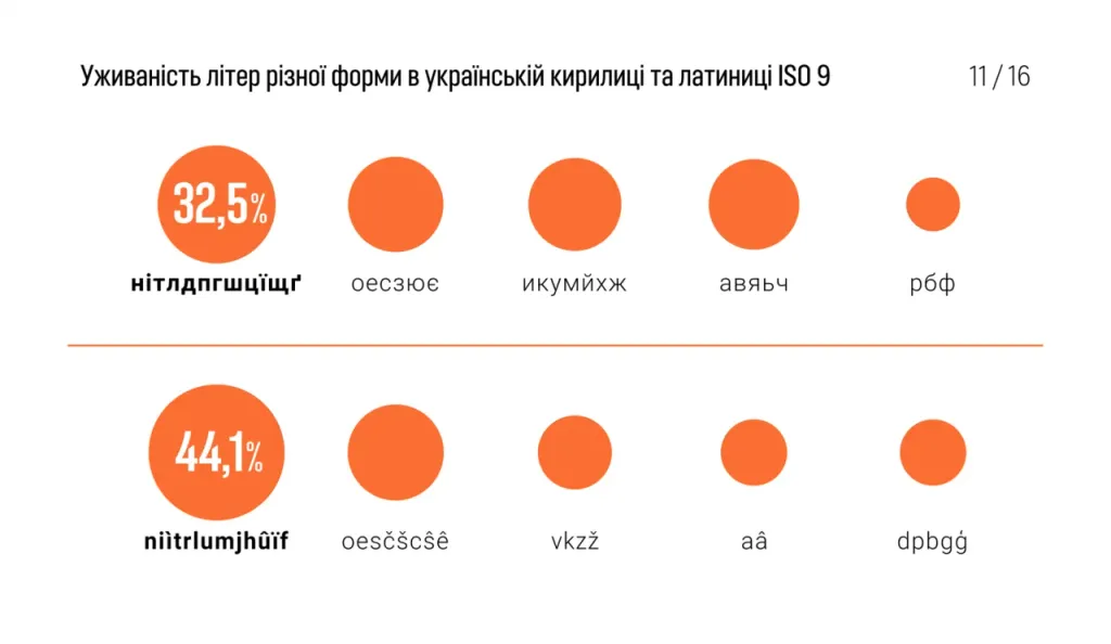
But this system has a serious drawback - very poor character discrimination. 20 out of 32 letters can be confused with each other. For example, in the case of road signs, the speed of recognition of inscriptions depends on the risk of an accident. In other cases, the person will stay healthy, but will lose time. An attempt was made to convey complex sounds in one letter There are many diacritical marks that create difficulties in typing and slow down the recognition of signs by both humans and computer. Instead of the Cyrillic letters: и, і, ї, у, ю, е, є, с, ш, щ, ч, ц, з, ж, а, я, г, г, ь, ’are used Latin: i, ì, ï, u, û, e, ê, s, š, ŝ, c, č, z, ž, a, â, g, ģ, ’,’.
Another catch in Latin ISO 9 - “Cyrillic fence”, from which Latin seems to save, not only does not disappear, but on the contrary, deteriorating. Instead of 32.5% of the use of “fence” letters from verticals and horizontals in Cyrillic, we have 44.1% of the text in in the form of a Latin “fence”. This fence looks nicer due to the lack of horizontals, but it is even readable worse than the usual horizontal fence.
And another story for supporters of Ukrainian Latin. Imagine Ukraine in 2038. We finally switched to Latin, became very civilized and unlike the Russians. But it turned out that to understand Western texts you need to know not writing, and European languages. Meanwhile, the whole world has not used writing for 10 years, the interfaces of all devices are voice or visual, and machine translation has virtually removed the language barrier.
Improving the graphemes of the Ukrainian Cyrillic alphabet
There is another way to solve the problems of the Ukrainian alphabet and keep in touch with tradition. We will make minimal changes in graphemes, based on their problems and frequency of use in the corpus of speech.
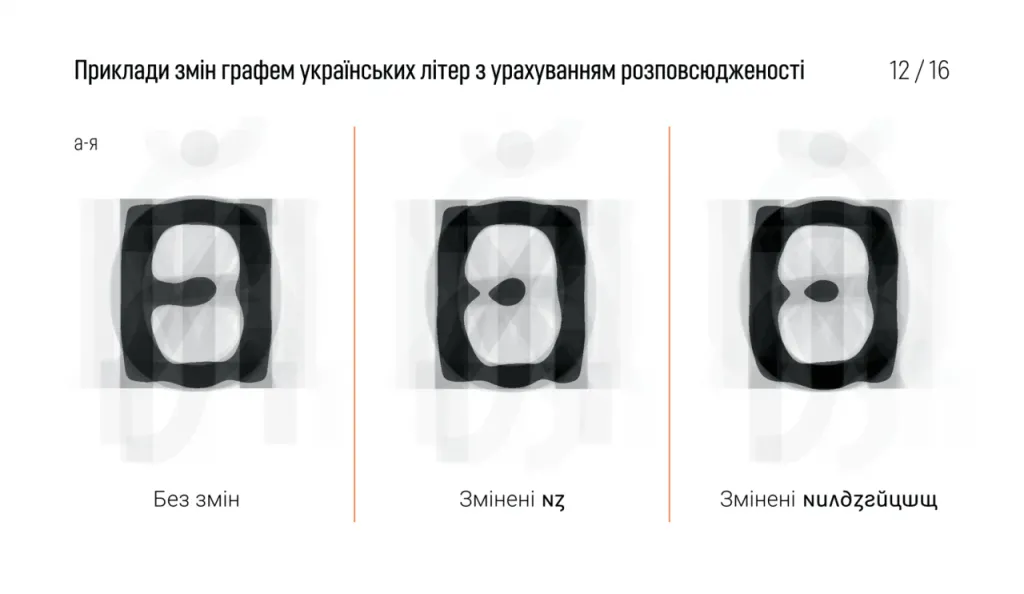
Minimal interference with the letter n (every 15th letter) and c (every 40th letter) frees the text column from the two crossbars, which are poorly distinguished and float in print, and adds a lower remote element. And remote elements allow to make the letter is more recognizable and readable.
As a result of minimal changes (only 2 letters - n and c) the average form of Ukrainian lowercase letters became more similar to average form of English letters. Quite recognizable graphemes, familiar from the classics of Ukrainian, were used printing house - Alphabet of Narbut, and from the works of modern fonts: Vasily Chebanik, Kirill Tkachev, Dmitry Rastvortsev, sisters Lopukhin and others. Modified letters are easy to remember and distinguish from other letters, they can even be used without special laws and standards. Bulgarian designers did the same with their version of the Cyrillic alphabet.
The Ukrainian version of the Cyrillic alphabet is not “anti-Russian”, it only improves the letter resolution, increases the capacity texts, eliminates the problem of a monotonous “fence” of verticals and horizontals. At the same time, the Ukrainian text begins even more different from the Russian, for the better.
Further changes may include smoothing some corners in the “fence” letters and choosing more compact graphs where possible.
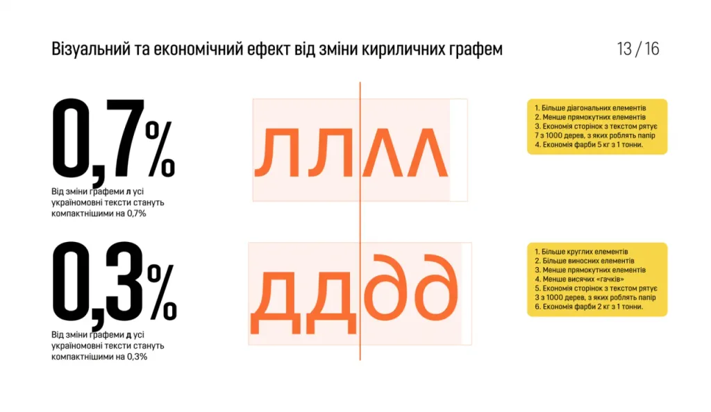
You can achieve a tangible visual and economic effect by changing only two graphemes - l (each 25th letter) and d (every 28th letter):
- Save 1% of book pages due to more compact text and 0.7% of printing ink by reducing the surface of the letters;
- Increasing the distinctiveness of the characters due to the upper remote element;
- Reducing the “fence” effect by converting two rectangular letters into one diagonal and one oval.
1% saving on book pages is a saving from cutting down 10 trees out of 1000.

0.7% saving on the surface of the letters is a saving of 7 kg of paint per 1 ton.
The advantage of such changes in the Ukrainian alphabet before the transition to Latin is not in the preservation of our historical writing - it’s just a bonus. The benefits are purely economic. Changing several graphemes to others, but still familiar as variants of the usual norm, does not require global government action. The positive effect will be from the fact that font designers will start making such letters, without asking the government’s permission, without spending billions from the budget and without inciting conflicts in society.
By the way, even with the current alphabet, any Ukrainian-language book is more economical than its Russian-language counterpart by more than 10%. There are many reasons for this, among them:
- Ukrainian “і” instead of Russian “и”;
- Ukrainian “и” instead of Russian “ы”;
- Missing letter “ъ” (solid sign);
- Compact apostrophe instead of separating soft and hard characters;
- The word “is” instead of the word “is” and “is”, “what” instead of “what”, “how” instead of “how”.
Rhythm of a line in Ukrainian-language texts
Frequency vocabulary allows you to more objectively assess not only the grapheme, but also some features of the language at the typographic level. A language can consist of hundreds of thousands of words, but not all words are equally useful when it comes to kerning, the texture of the column and the chaotic effects of literature or writing.

In text fonts, such as Roboto, the most common words and letter combinations of the desired language are very useful for kerning pairs and adjust the proportions of the characters.
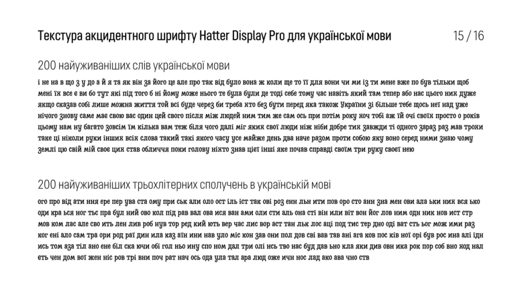
Irregular fonts like Hatter Display usually mimic the randomness and variety of handwriting. It can vary literally everything: fat, contrast, height, width, slope, various shape distortions. To create a rhythm of “coincidences” you need to follow the popular combinations of letters and words so that they have beautiful boring variations.
True coincidence looks awkward and not even accidental. Therefore, the “handmade effect” needs to be adjusted for each language.
But in this font, the Cyrillic alphabet was made after Latin and, perhaps, without taking into account the frequency, so the chaos of the baseline, height and distortion in the English text is much more noticeable than in the Ukrainian.

Cyrillicization of a chaotic font is a difficult and interesting task. To repeat the “dancing line” you need to write the distortion in each letter and the frequency dictionary to determine the prevalence of a distortion in the whole language. Next is needed transfer these distortions to another language, taking into account the frequency of the letters of the desired alphabet. For example, if in English In texts, 30% of letters bounce, and 25% fail, which means that Ukrainian letters, according to the frequency in Ukrainian texts should repeat this relationship.
All distortions should be distributed so that the most common words and letter combinations do not look boring. If your letters move away from the baseline by -10, 0, 10 and are compressed by -30%, 0%, 30%, you need to watch so that in the most frequent combinations: ogo, pro, od, ati, nnia,… there were no sequences like -10, -10, -10 or 30%, 30%, 30%.
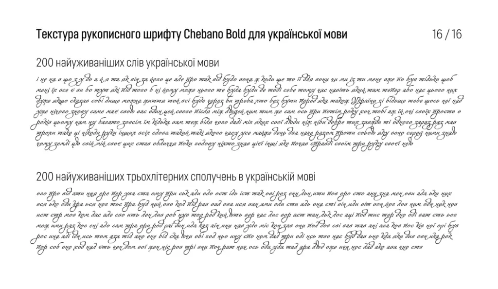
Fonts that mimic calligraphy or handwriting, like Chebano, also have to “tame the chaos.” And in this, as you already are understood, frequency dictionaries of the most common languages of the world will also help.