Yak zibrati moodboard. First and foremost, I wondered if I needed it.
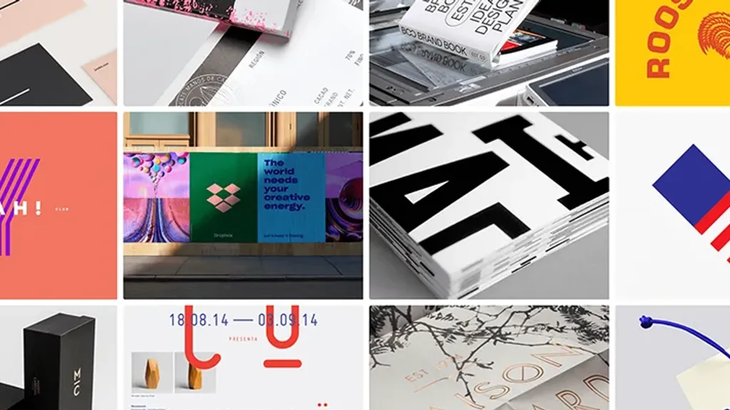
Sometimes it seems that mudboard is just a decoration, an afterthought, and sometimes it is perceived almost as a limiter of creativity. Neither the first nor the second is true. In fact, mudboard is a pre-concept, the basis on which the project will grow.
Mudboard rules
Moodboard is a concentration of inspiration to create a new digital or material product, illustration, site, interior, you name it. Often such boards are collected not only “for the task”, but also for the general mood, then inspiration for a separate the project may become part of this mudboard.
On dribble or bihans you can find hundreds of strong mudboards - for cases and more. For example, this is what a mudboard looks like on the identity of Behance co-founder Matthias Correa:
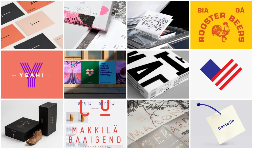
And if there are no rules for compiling general mudboards, it is important to be guided when compiling a board for a specific project such principles:
-
Association game. To assemble a set of correct visuals, choose specific words that describe them. To do this, use the method of associations: write down the first thing that comes to mind. The more specific the association, the more interesting references. For example, by the way “air” suitable cloud, pillow, marshmallow, poodle’s head. If it’s hard to come up with associations, look them up at sociation.org or relatedwords.org.
-
Search for images. Look for different textures and angles. The details always concretize the idea - it becomes clearer and more realistic. You do not need to use generalized or complex compositions with a lot of details. Instead of a cityscape, choose a traffic light, machines and architectural elements of buildings. Fonts also set the tone - for example, if the mudboard has a gothic font, then it will be about something serious (or even cryptic).
-
Colors. The more colors - the more chaos. It is better to limit the palette to three colors: the first color is the background, it will assemble the composition into one whole the second and third colors are accents, they will stand out against the background Well, when the background color is more muted, then others will look brighter. To choose the right shades, use the color palette generator - for example, colourpod.com. Or just extract colors from a visual you like using color.adobe.com. You can look for inspiration in working with flowers: at least in movies, at least in illustrations from books about nature.
-
Number of pictures. The concept of less is more is quite applicable here. The more images, the harder it is to understand what they are unites. 5-7 pictures are enough to convey the essence. If the image is overloaded and only one object is needed, it is better to cut it out and place it on a light background or on top another picture. It is important not to pour images for the masses, but to choose the most accurate ones.
-
Composition. Think about the order of the pictures - do not sculpt them in vain. An element of chaos can be introduced, but a flow must be created, to view the mudboard was more enjoyable. If you combine close-up and distant images, the volume will appear in the composition. And remember the peculiarities of perception visual objects. For example, the lower left corner is always visually “deaf” - our eye never focuses on it, except specifically.
Analog vs digital mudboard
Gathering a concept in your head is a good start. But for the idea to begin to turn into something real, you need to visualize thoughts and images on the mudboard - physical or digital.
Now almost all design work is in the digital dimension, but analog techniques should not be forgotten. They even fit when the final product will be created in numbers.
Analog mudboard. The old-school version works best in the collage technique - when the images are superimposed on each other in a chaotic manner.
In this format, it is better to use something tactile - pieces of fabric, wrappers, tickets, key chains. Glue it all together to the board is not necessary, you can just take a picture, as do the guys from Materia 2.0:
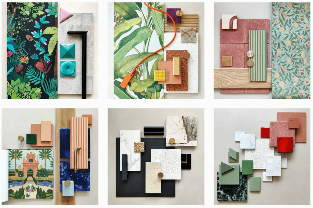
Digital mudboard. In addition to static images, the multimedia mudboard is convenient to add audio files, gifs and videos. To share an analog mudboard, you need to take a picture of it first. And with the online format everything is easier here send links to others and edit the set collectively. There are dozens of services for creating mudboards, but the most convenient are:
Milanote Mudboard service for creatives - designers, writers, photographers, marketers, agency teams. Here, literally everything is sharpened to create creative mudboards: there are dozens of templates for a photo, UI, logo, character creation or interior design, illustration:
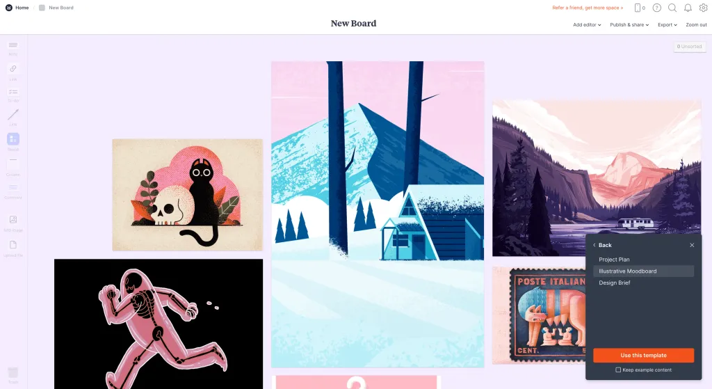
Restriction: up to 100 stickers, objects or links can be downloaded in the free version.
Miro Not the main service of all remote commands. It is more suitable for mind-mapping and prescribing logic processes, but for the assembly of mudboards will also be needed.
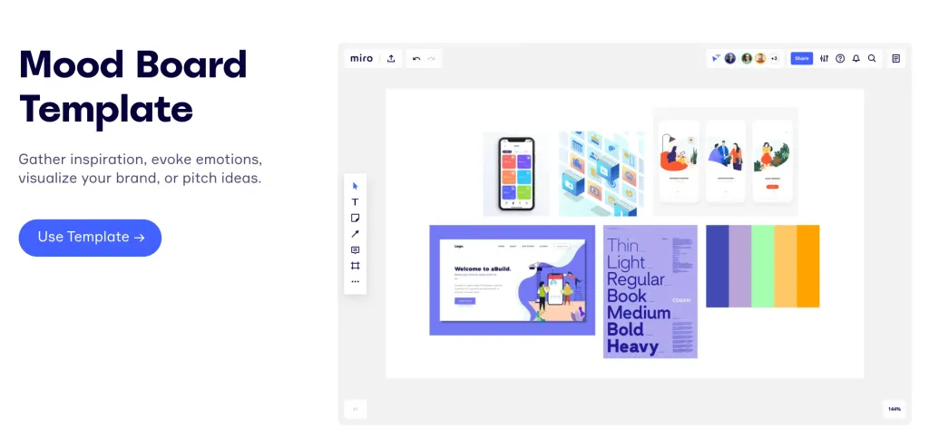
Restrictions: In the free version, only three boards are available, which can be edited collectively. If you create a fourth, one of the first goes into view-only mode.
GoMoodboard This service has a minimalist interface. It is suitable if you do not want to dive into the thin settings, and you need to quickly sketch the concept and show it to someone. There is no registration here, special functions too: drag and drop in its pure form.
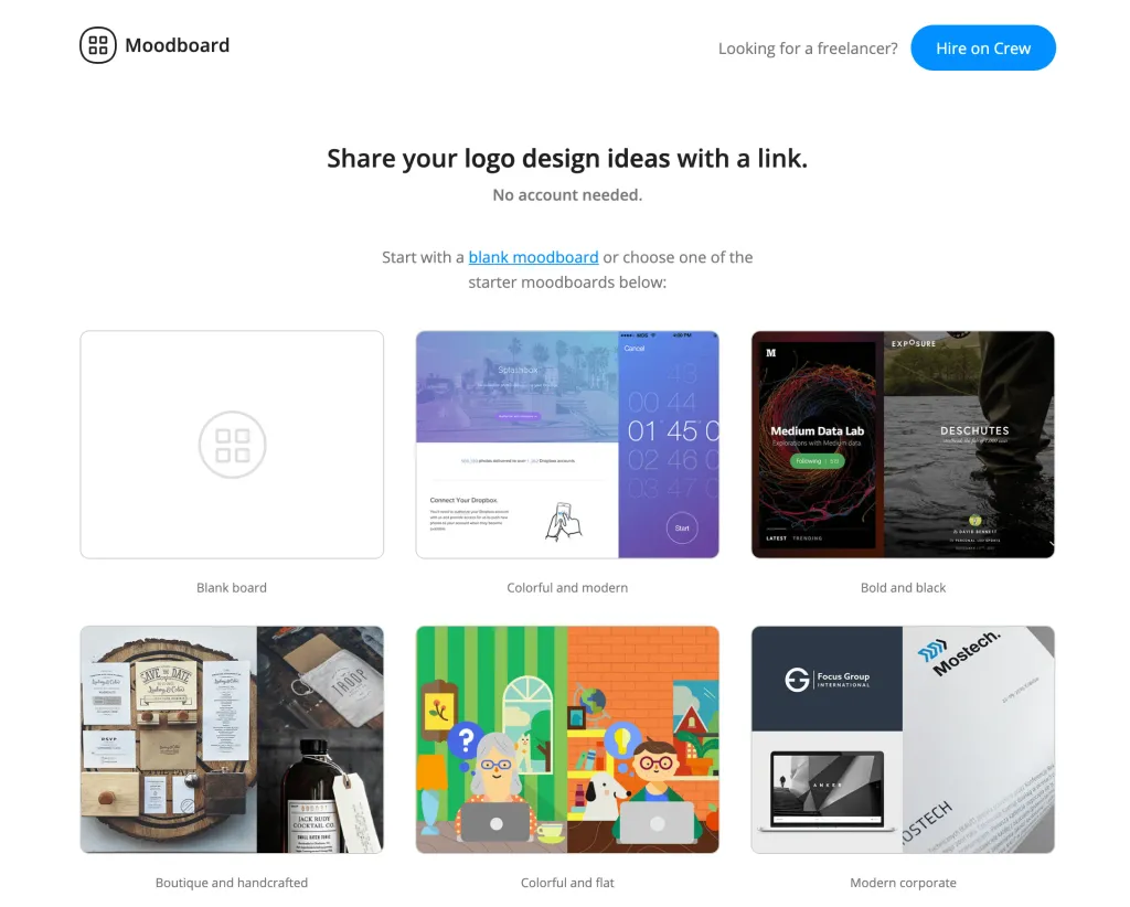
Restriction: You can only upload images - and only in tile format.
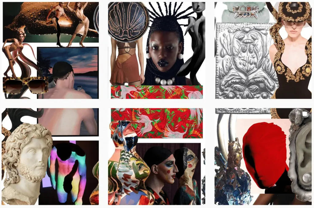
Instagram Social media accounts are a super obvious tool of mudboarding, which is not used very often at the same time.
You can create a separate secret page for your mudboards (each time for a separate project). Or directly in your account make thematic selections of savings. Or pour ready-made mudboards on your page - and get them after a while “Infinite Mudboard Mudboards” - as the JPPM studio team does:
Create a mudboard in 3 steps
For example, you need to create a mudbrod for Nike AM 90 Infrared sneakers. According to the classics, a set of references is first created pictures, and only then the product on them, but we will go in the opposite direction.
Step 1 Find the association. This model of sneakers “stands on three whales”: 1980s, Air Max model, intense red color. Therefore, all associations also lie in this plane: aggression, flame, rocket launch, the surface of the moon, craters, Tetris or games with 8-bit interface, lightsabers, “Star Wars”, movies with the aesthetics of neo-noir and cyberpunk.
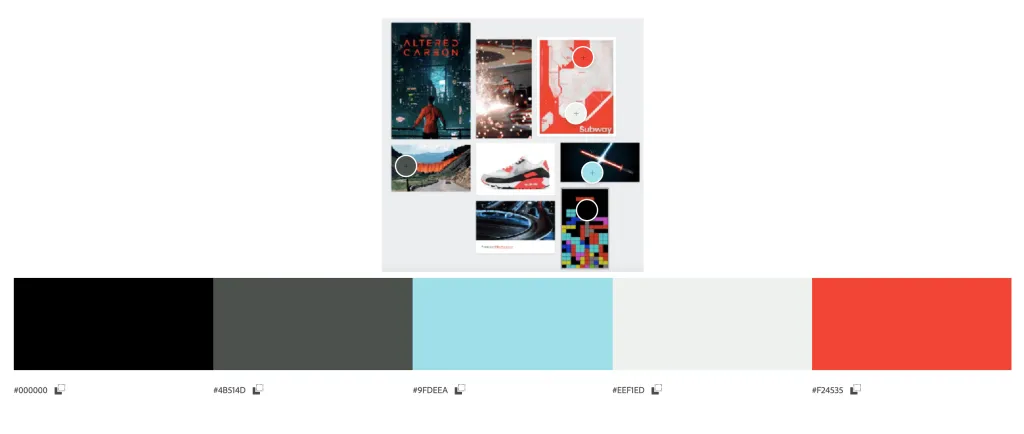
Step 2 Choose a palette. It also comes from associations: gray-gray, coal- (noir) -black, neon red. You can extract them from the reference visuals.
Step 3 Choose a mudboard format. In the case of Nike AM 90 Infrared board is more convenient to assemble immediately in digital (for example, in Milanote) - images are more important here than textures. But if you want to focus on the tactile part, then a physical board would be a good solution.
We transfer to the board the images that correspond to the associations - 7 pieces are enough. Here the poster of the series went on the board “Modified carbon”, a race track, a subway map, a screenshot of a Tetris game and a few more techies.
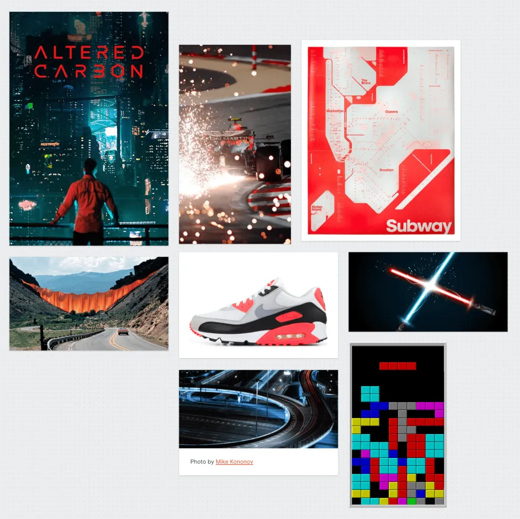
You still need to add a color palette. To do this, simply take a screenshot of the board and fill it in color.adobe.com - and already there to adjust a set of shades (or simply to copy color codes and to save them the list):
The main part is ready. If you want, you can add animated elements or videos with the desired vibe to the board - so be it it is easier to understand what energy to communicate to the concept.
