Minimalism in web design
Minimalism in web design
The minimalist style on the site is reflected in the conciseness and simplicity of the composition. The design is based on neutral colors, simple geometric shapes. Constructivism and functionalism are the origins of modern minimalism.
The concept of minimalism in web design
The main principle of minimalism is to keep in mind only important content. Additional effects, unnecessary animation overload the site, distract the user. Relevant images and content will immediately make it clear for what purposes site created.
Distinctive features of minimalism
Minimalism can be distinguished from other web design styles on several grounds:
- background;
- color;
- photos and textures;
- typography;
- grid;
- navigation.
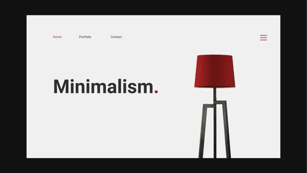
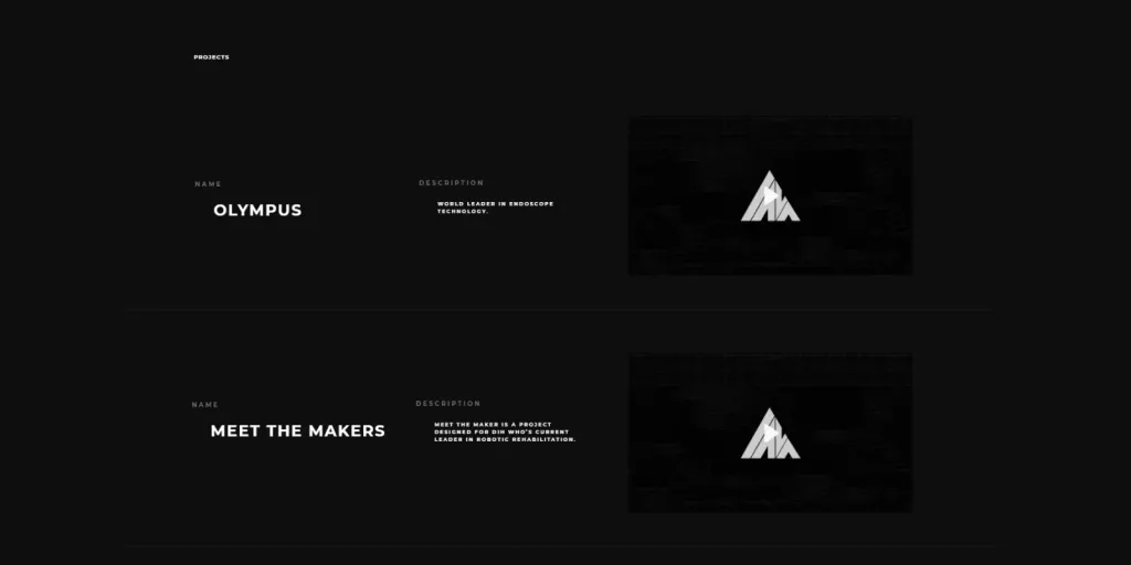
1. Use of negative space
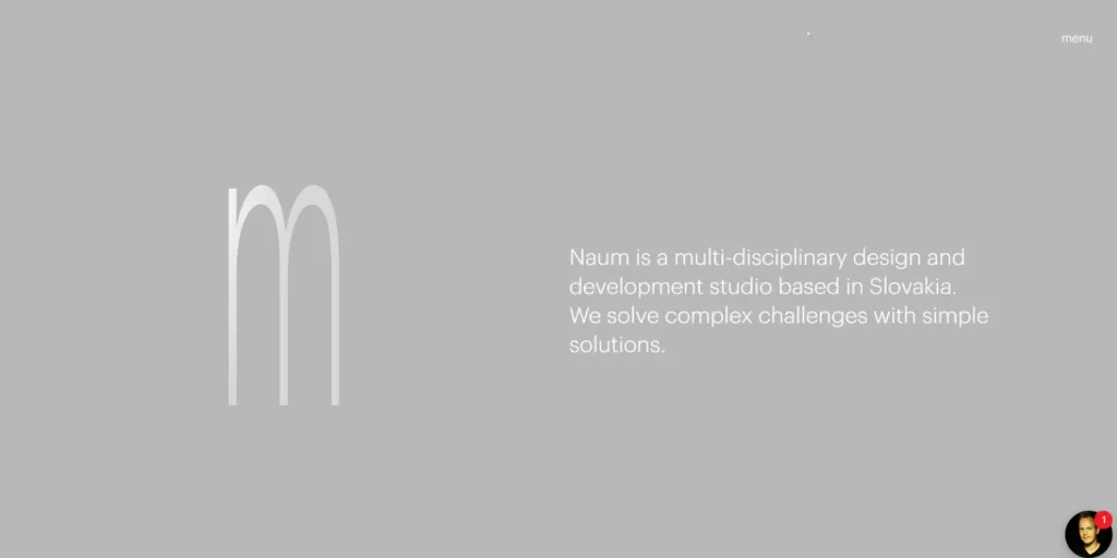
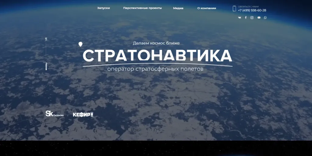
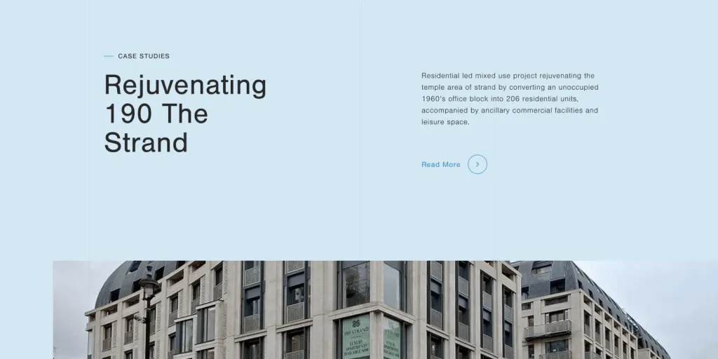
One of the main components in a minimalist design - a negative space - an empty, unoccupied space between elements on the page. It is used for to focus users’ attention on the content of the page, simplify the perception of content. It is often mistaken to believe that negative space is a white background. But this is not the case. It is not always white. It can be any blank full color background.
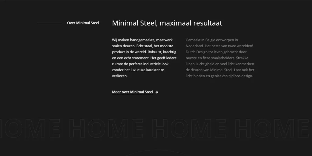
2. Flat design and texture
Minimalism design style uses flat textures. The goal is to get rid of unnecessary details. Three-dimensional effects, gradients, shadows are rarely used. In a flat design, everything is minimized - fonts, icons. It is aesthetically pleasing and functional.

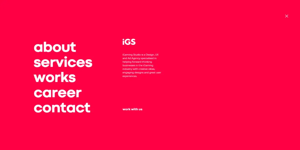
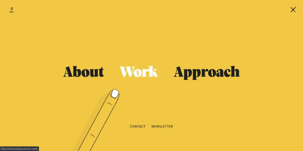
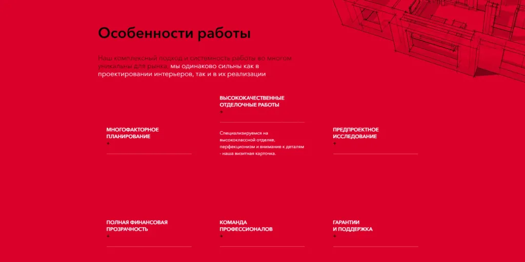
3. Monochrome palette, minimum color
Color has the ability to make a visual accent, but it can also distract the user. That’s why designers are creating minimalist site, often choose a limited palette:
- monochrome palette - one color;
- use of two colors;
- no more than three colors.
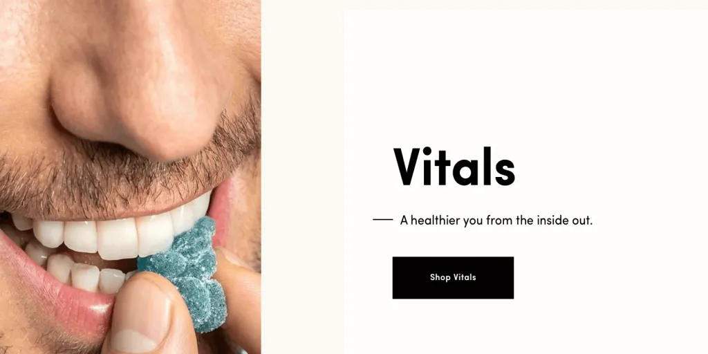
Saturated color is used to make the site more attractive or to draw the attention of the site visitor to important information, bring to the fore the content. The highlighted elements are often clickable. The images can be bright and bright.
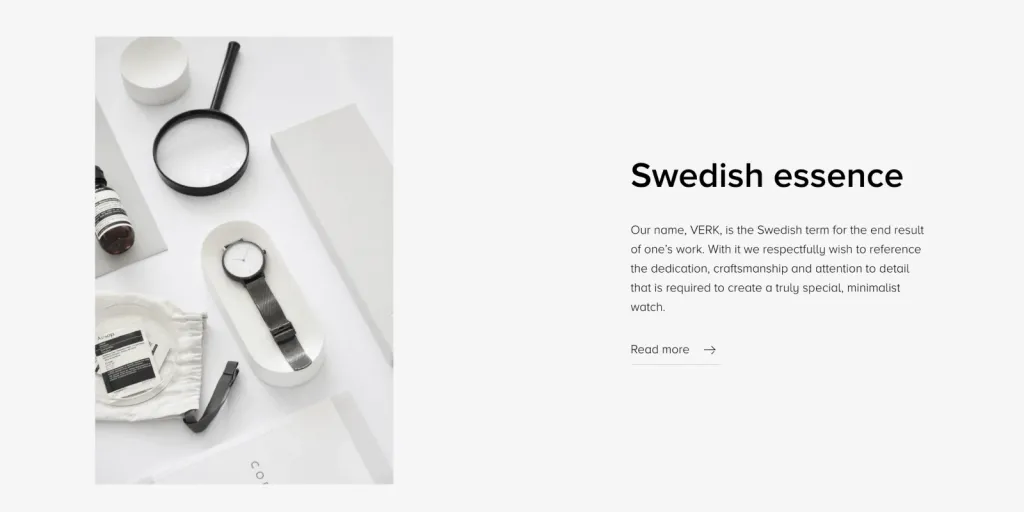
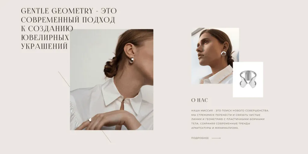
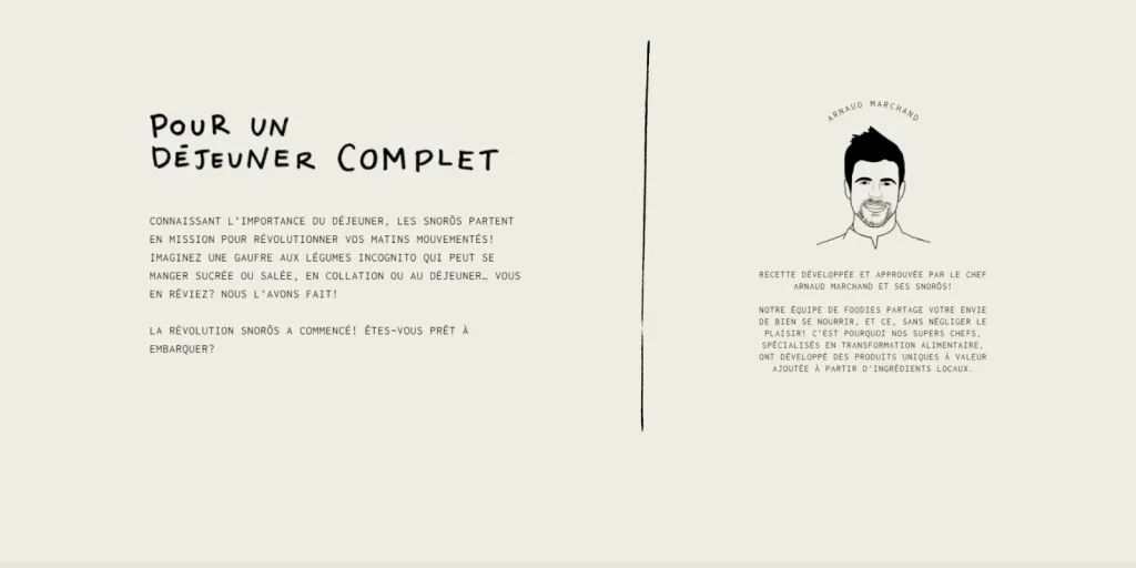
4. Photos and illustrations
Photos and illustrations are important design elements in the style of minimalism. They can convey more thoughts and emotions, than words. But the images used must comply with the principles of minimalism. If a photo or illustration too saturated with details, the effect is nullified.
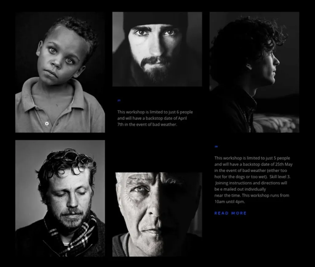
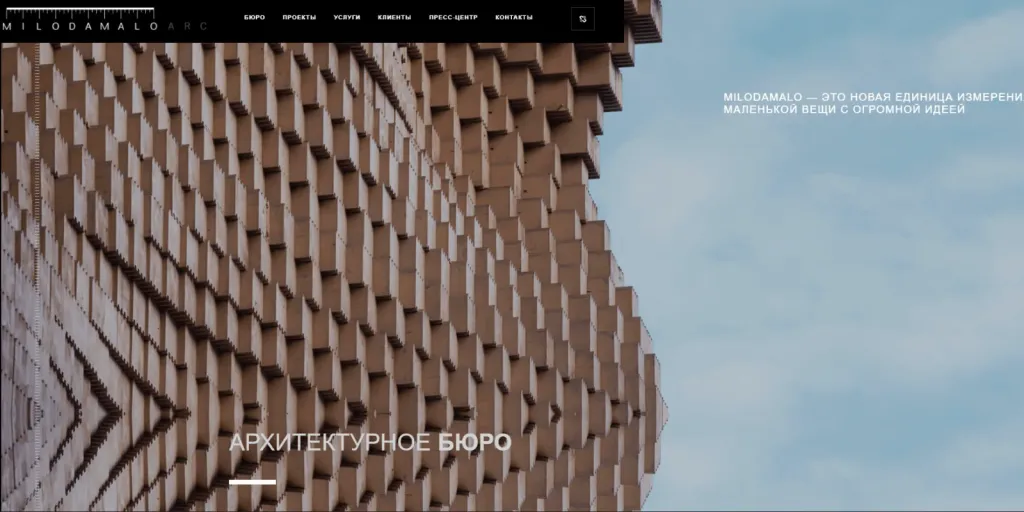
Minimalism also uses large images or a videophone, although this contradicts the idea of minimalism: to get rid of excess. However, large photos and videos often appear on sites in the style of minimalism and their use as a background is justified. The main advantage of this solution is a positive impact on the perception of content. But you need to use such techniques thought out and make sure that they do not argue with other elements on the site. With the right images, a minimalist site will not be boring.
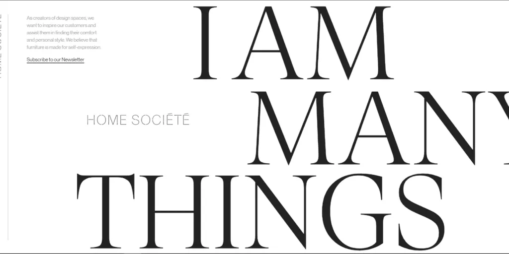
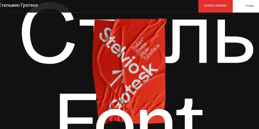
5. Spectacular typography
Minimalism is a style where content comes first. The main thing is to draw it up and submit it correctly.
For design in the style of minimalism often use simple grotesques - fonts that have no serifs. This text looks simple and neat.
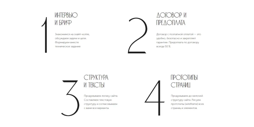
Large headings, separate decorative elements in the form of the text or one word look good in minimalism. They are wonderful convey meaning without cluttering the page.
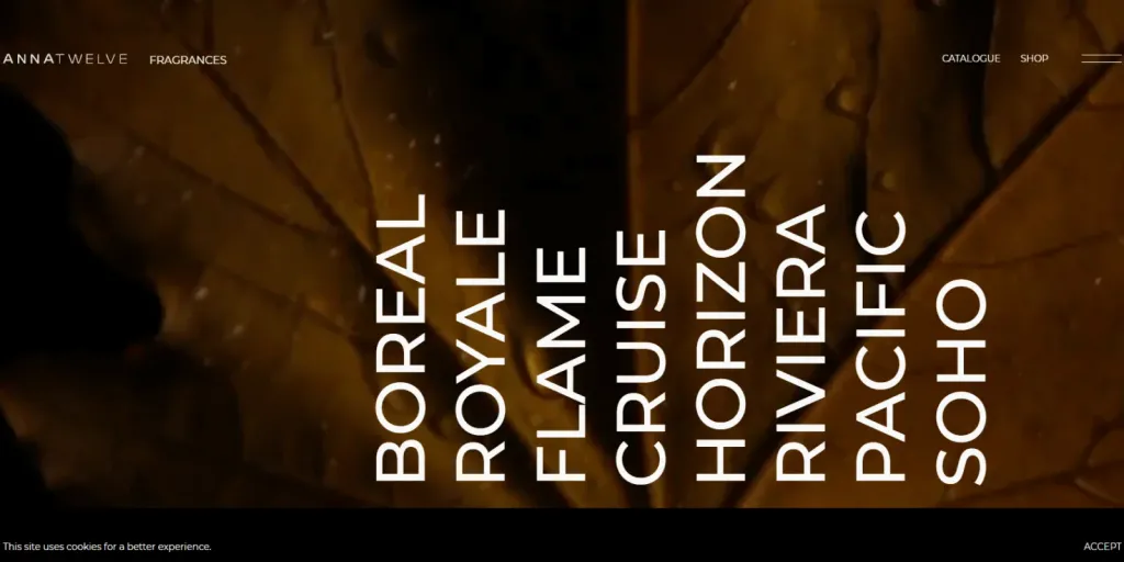
Blocks with text on the site usually contain a minimum of information - only useful content. The text supports the principle “Nothing extra.”
The site with a minimal design also has handwritten fonts and lettering. They also accentuate the visitor’s attention on important details, give the site a boring look.

Competently selected and composed typography can fill the lack of images, other elements, present the site in winning form. Different variations of size, saturation of the font, its image, help users with perception text structure, its hierarchy.
Importantly! Bold typing is appropriate when the text contains important information. The main rule is not to overdo it. There is a fine line between a creative, well-thought-out font solution and eye-cutting text. Not sure of the result - better not risk.
6. Contrast
Contrast between components is another way to emphasize important content, to quickly convey an opinion to the user.
Contrast is a great tool in a minimalist style. With the help of contrast, without much effort, you can profitably beat a simple item. Contrast is a great way to focus the viewer’s attention on the main content of the page.
For example, it could be a large black text on a colored background or another combination of elements highlighted by a change sizes, colors, textures.
7. Net
A modular grid is usually used in a minimalist design. There is also a design with a hierarchical structure or a simplified version - a columnar grid.
All options help to organize content in space, it is advantageous to submit it on the site.
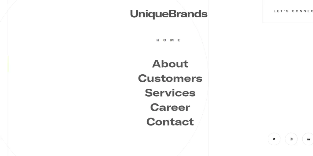
8. Clear navigation
In a minimalist site usability comes first. It is easier for the visitor to navigate when the site is not overloaded elements and details.
The minimalist design allows the user to adapt faster, feel comfortable and confident on the site.