8 Common Mistakes in UX Mobile Application Design
Even useful applications with great potential are not always successful in the market. The reason often lies in the bad designed and awkward UX. Some are created by small teams without UX specialists and designers. As a result, the results are far from ideal.
The good news is that most mistakes are fairly common. Knowing the essence of the most common, you can avoid most problems. So, a list of eight that are best not to repeat.
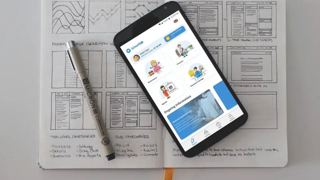
1. Inexperienced architecture and navigation
Just as you can’t build a house without project drawings, you can’t create a good UX design without sketches and prototypes. Otherwise it is necessary to redraw elements of the interface and to rewrite the code only for the reason that from the beginning was not considered program logic, user behavior scenarios and navigation.
The prototype should help visualize the user’s route within the program, as well as a diagram of their interaction.
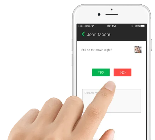
2. Sophisticated and confusing interface
Murphy’s Law for Mobile Applications can be paraphrased something like this: “Anything that users may misunderstand they will misunderstand. “
In practice, a person not deep in the “topic”, it is difficult to understand what seems obvious to the designer. To avoid this, it is advisable to use familiar and well-known characters in the interface. Characters that you don’t confuse with anything and that evoke unambiguous associations.
For example, green is usually associated with the meaning “yes”, “forward”, “allow”; red usually means “no”, “Stop”, “prohibition”; “+” icon - add something.
Try to avoid obscure characters that can be interpreted ambiguously.
3. Lack of consistency
Another common mistake is to use several different fonts and color schemes in the same style. User interface - this is not what makes the application stand out from other developments.
There is no need to make other elements of the interface that are responsible for the usual tasks. Easier to get used to one style, and then understand the purpose of the remaining elements elsewhere in the program.
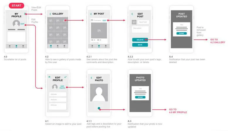
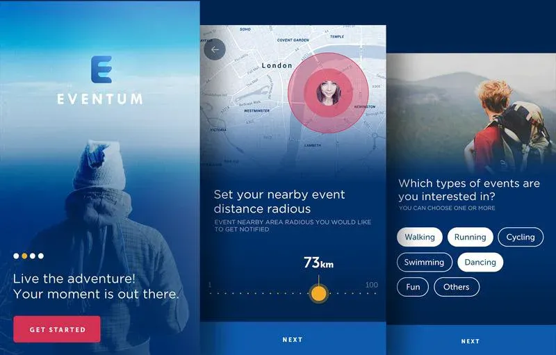
4. Bad or absent Onboarding
The first acquaintance with the application is the most important. During this time, a certain relationship is formed - whether it solves the problem, whether to use it in the future. “Where?”, “How?” and especially “Why?” - questions of this nature should not arise.
Onboarding is a system in which a sequence of screens is thought out. They need to be shown to the user at the first acquaintance with the application, with contextual hints on the interface. There are different types of onboarding process that are used depending on the task.
Developers often neglect this step and leave the user to their own devices as soon as they install the application. It is important at the beginning to put everything on the shelves - take your hand and spend in all places in the application, step by step.
5. Obsessive messages
Abuse of notifications is like a very annoying acquaintance who can’t understand hints about employment and inability to meet.
Even if the user’s perception of the messages is positive - it is possible failure. Possible absence synchronization with the user device. No one wants to read the same messages over and over again. As well as in software development, a good tone is considered not to be repeated.
An even worse option is pointless advertising messages and other unsolicited mailings. Only in rare cases to the user It’s really interesting to know that you can buy three new characters in your game.

6. When the design is too much
Adding a unique style or creativity will never hurt. But often designers are too enthusiastic. Schemes, shadows, the presence of different styles can turn an icon or button into a surreal or just scary image. As designer Joe Sparano once said, “Good design is immediately apparent, great design is invisible.”
When creating graphics, designers often forget about their mission: to help convey information without distraction or confusion. If you want to create a user-friendly interface - be simpler.
Ironically, the most common mistake is when a designer thinks that everything is simple and clear, and the user is surprised and disappointed. This happens quite often.
7. Lack of internal search
Lack of content is wrong. However, there are things that are more problematic. For example, when there is too much content and files, and the ability to search the database is absent. Without integrated internal search, the user in this case is simply defenseless and is easily lost.
However, not all search bars are the same. Sometimes a page filled with poor search results, without filters, is almost the same, as well as the lack of search.
A good built-in search option can simplify the lives of users and even smooth out the impression of some shortcomings in the overall UX.

8. Inability to set priorities
When working on any design, it is important to identify the most important elements for users and the secondary ones that require it less attention. Unfortunately, many designers do not understand this concept. As a result, you have to deal with information a mess where each component looks the same.
Visual hierarchy is a very effective concept that allows you to make the main details more visible, so that the secondary elements not much conspicuous. You need to decide which objects the user will interact with most often and highlight them them against the background of others. It will be much more comfortable to use such interface.
The overview of the financial data panel was designed to make it the first element, to which the user will pay attention.
Analyze and work on errors
Mistakes are made by all without exception. It doesn’t matter if you are a major publisher or an independent developer. Regardless of scale of the company, the basic rule remains the same: the more testing and analytical work, the better the result will be.
If you want to make a good interface, you just have to do a comparative analysis of UX-design, based on best practices and data on user behavior. So you can find and eliminate existing shortcomings.
And remember: if the developer does not want to spend enough time on UX - users are also unlikely to want to spend time for the developed application. As a rule, the creation of really good interfaces is preceded by painstaking and long work. But in the end she is rewarded.