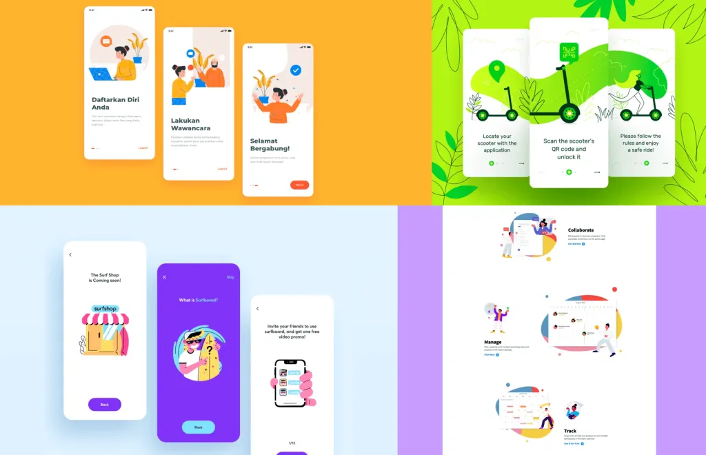
Overview of UX/UI design trends
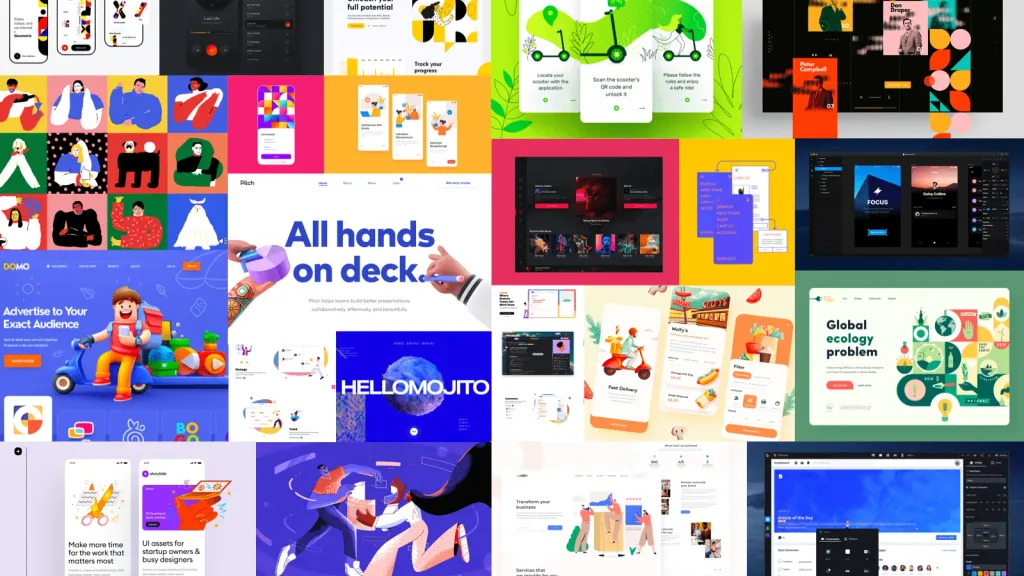
Technology and design are evolving rapidly. That’s why I like to periodically emerge from the flow of daily tasks and look around. In general, keep my selection of fresh trends.
Trends in UI design and interface design
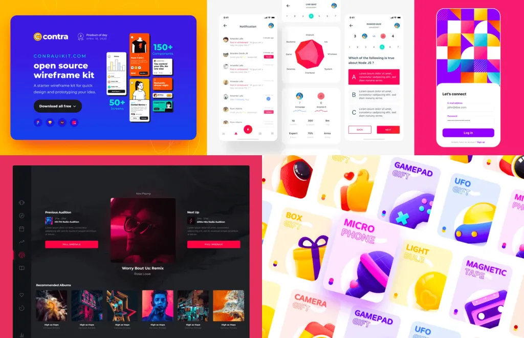
Illustrations
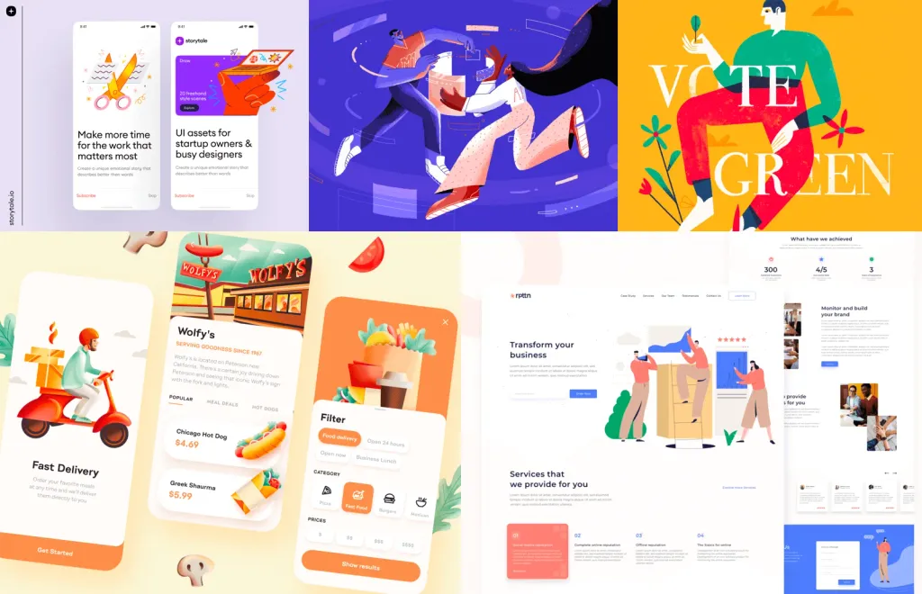
Illustrations continue to spread rapidly in the interfaces. Especially popular are hand-drawn illustrations in Procreate using Apple Pencils. This couple has already 10 times accelerated the process of creating unique graphics with character. Now you can create an effective work and emphasize the uniqueness of the brand without unnecessary fuss, in the most natural way. Such illustrations are especially good in articles and onboarding scripts.
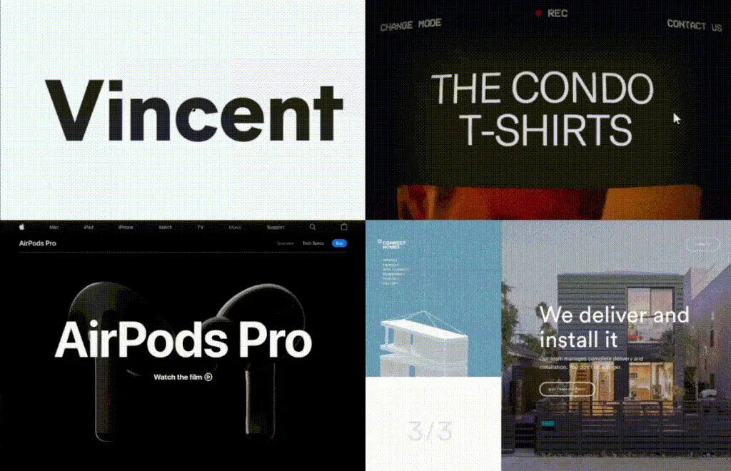
Motion animation and design
Motion design in the interfaces and stylish animation are especially good when emphasizing the manufacturability and friendliness of the application. With them, any software feels pleasing to the eye, agile in solving problems and made professionally. In addition to animation in the interfaces, there is another point of application of Motion in live video scenes on the site and in onboarding scenarios. Such scenes help show the product in the midst of work or tell a story about the user of the product in order to provoke feedback and lead to registration. That is, animation in all its manifestations leads to an increase in application metrics (registrations, purchases, increases engagement), so it will still be in trend.
Scroll effects
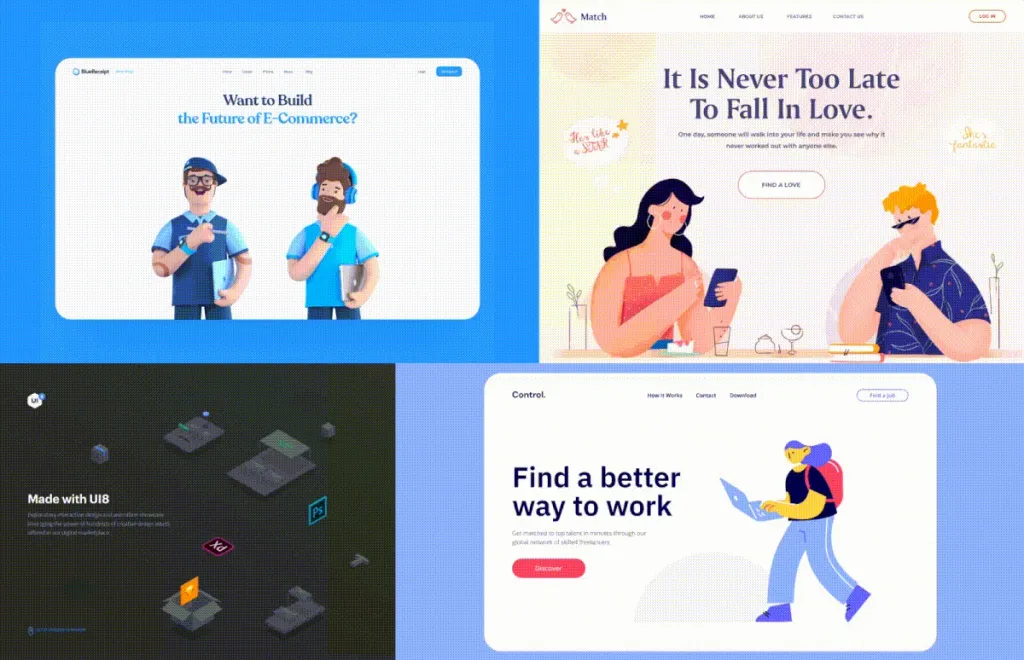
Yes, this is not a new feature, but it is still very popular. The thing looks very impressive, helps to attract the user to study material, attracts attention, so it is very popular in the design of web and mobile applications.
Retro
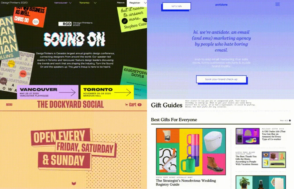
Retro style from the world of cinema and art has penetrated even into the world of user interfaces. What can you do, customers like it.
Visible colors
Visible colors still hold the bar, but muted calm tones usually crowd them. Notable combinations are especially popular on promo pages. I recommend to try how the corresponding project will turn up!
Creative fonts
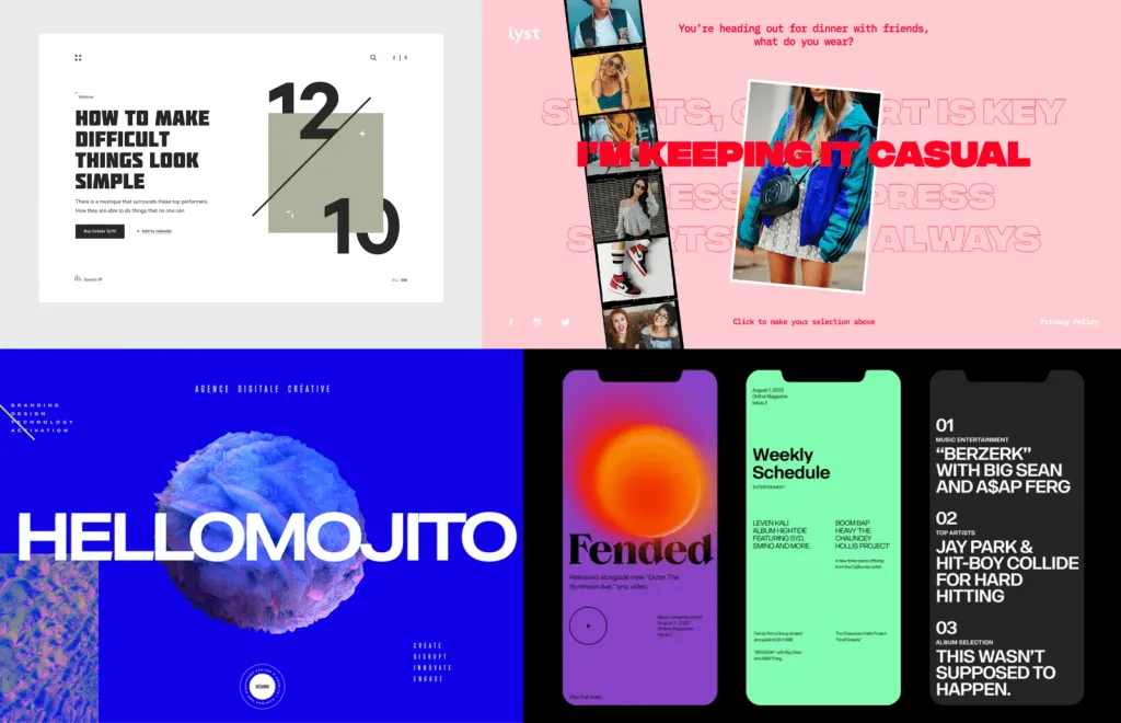
Very popular in web design. Designers on the sites just come off in this regard. Standard fonts, of course, no longer suitable for expressing the nature of the brand. And the fonts Open Sans, Lato, Roboto have long gone into applications and help there designers provide the principle of accessibility to the capabilities of the application from any screen and any device. But on sites, it is important to take bold and memorable fonts, work on branding. Also, the fonts are good as a phone with extra communication and as a reinforcement of the main message.
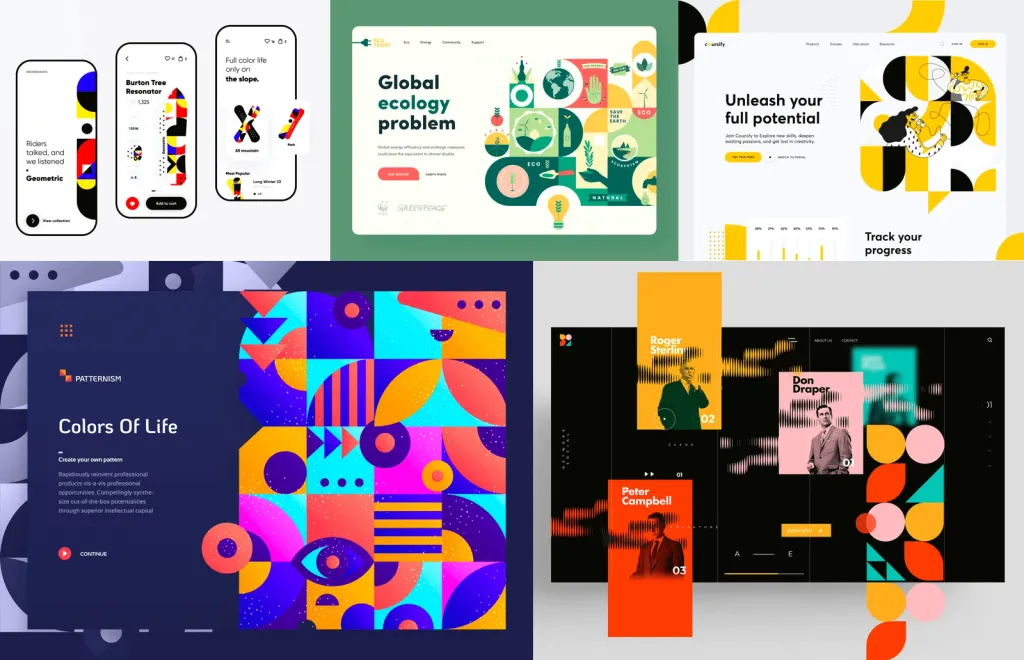
Graphic images in the style of Bauhaus
Often found in web design. Web designers apparently decided to be seriously inspired by the Bauhaus. Distinctive features of the Bauhaus straight and straight lines, strict geometric shapes, as well as the absence of distracting and non-functional details. Graphic Bauhaus patterns go well with photos, life graphics and illustrations and look quite effective as independent graphic solutions.
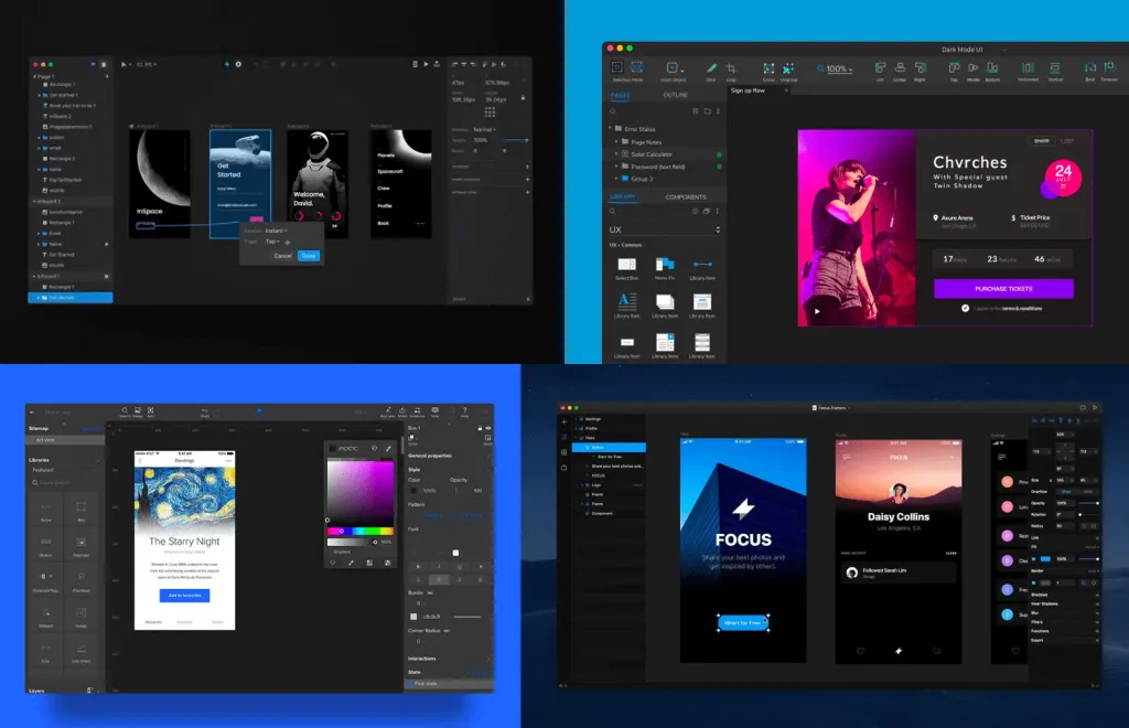
Dark theme vs Light theme
It seems that the dark theme has become a classic. And to test the design system to work in the dark has already become the standard mobile application design. What do users appreciate in a dark topic? Reduce eye strain and reduce battery consumption on smartphones and tablets.
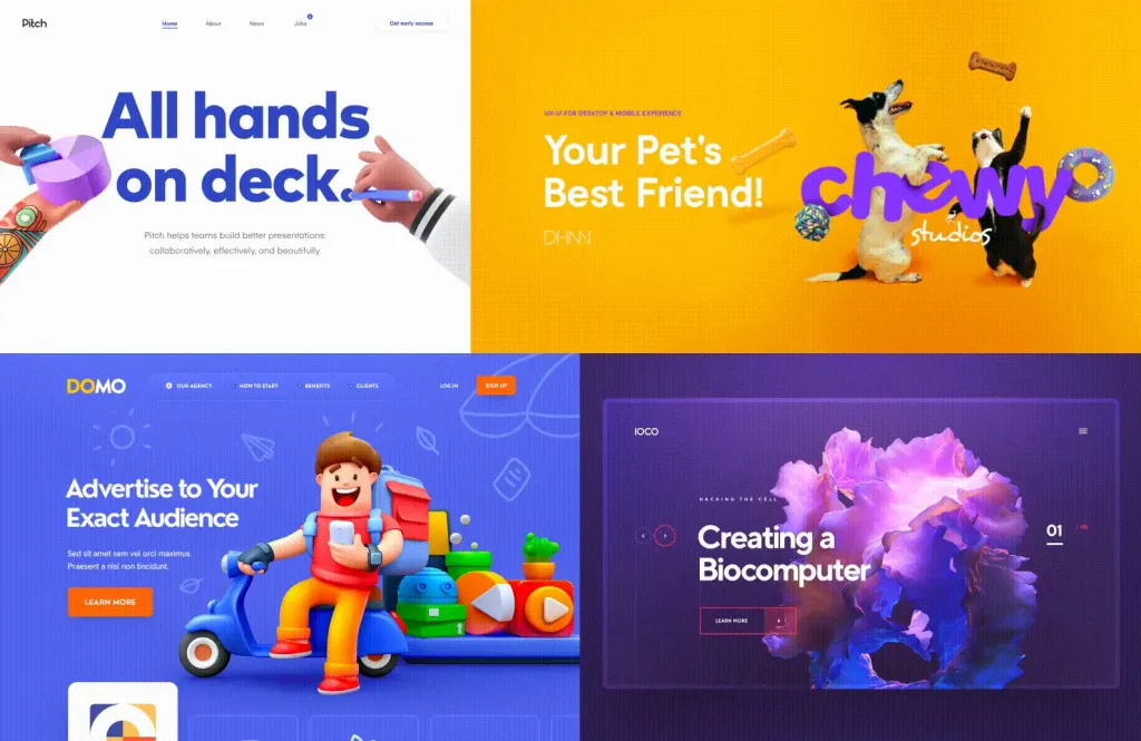
3D
In the struggle for the user’s attention, designers are looking for everything new, actively trying fresh solutions. While competitors are flat, designers roll 3D to evoke feedback and increase conversions. 3D can be found both in statics and in dynamics. At the dawn of 3D on the Internet on the sites were more common abstract and geometric compositions, and now it’s works of professional illustrators, only in 3D.
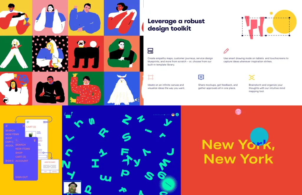
Brutalism
Take a look at Figma and Tubik Crew. They have simple and straightforward shapes, bold colors, combinations rough and simple shapes with micro-hatching in the illustrations - all these are also micro-trends that have developed into one big trend bold design. Now it is gaining momentum, especially in the field of product design and branding.
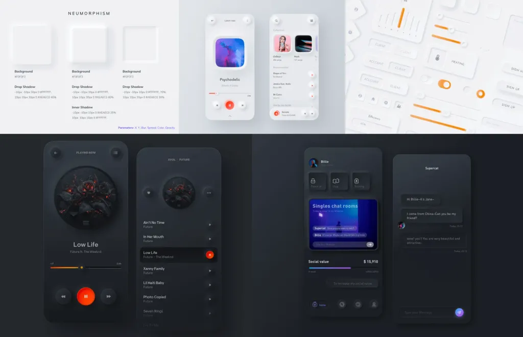
Neomorphism
Once upon a time, skevomorphism was very popular at the dawn of the first iPhones. Then he grew old and was replaced by a wave Flat Design, followed by Material Design. Then the cyclicity of tastes did its job and here we have Skeomorphism 2.0 - Neomorphism. Neomorphism is a combination of Flat Design with objects of the real world, the world with textures, shadows, depth. The trend is not new, but in the design concept it can be found often.
UX design trends
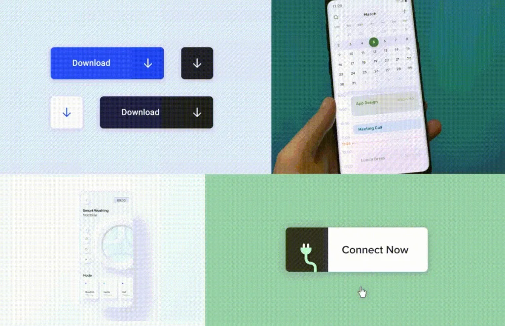
Microinteraction
Micro-interaction is one of the most effective ways to improve the user experience. Micro-interactions help to pump ux product is noticeably simpler and smoother. I believe that this trend is long-lasting, as the products that go to the bar soft and smooth user experience is becoming more and more.
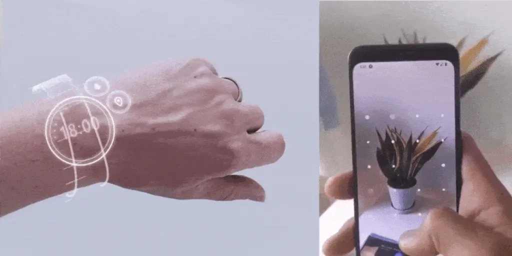
Augmented Reality (AR) and Virtual Reality (VR)
The digital world is pumping up our opportunities for work and entertainment more and more, engineers are inventing new sensors and sensors, new machine learning algorithms appear and now the most convenient interfaces are not far off.
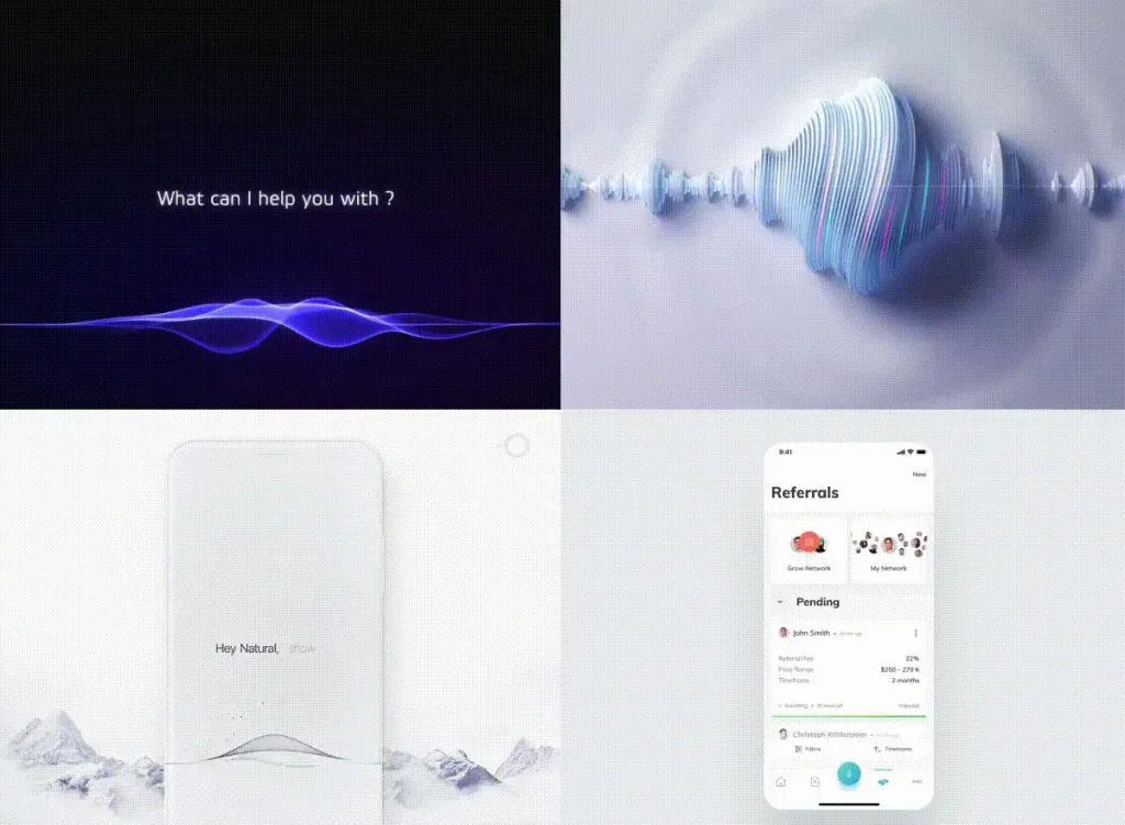
Voice technology
Edison Research and Triton Digital have published an annual Infinite Dial survey, according to a survey of 62% + respondents use voice virtual assistants in phones and laptops. According to Statista 50% + respondents use the voice interface (VUI). So, this technology has already penetrated our lives and continues to grow.
Onbroding and tutorials
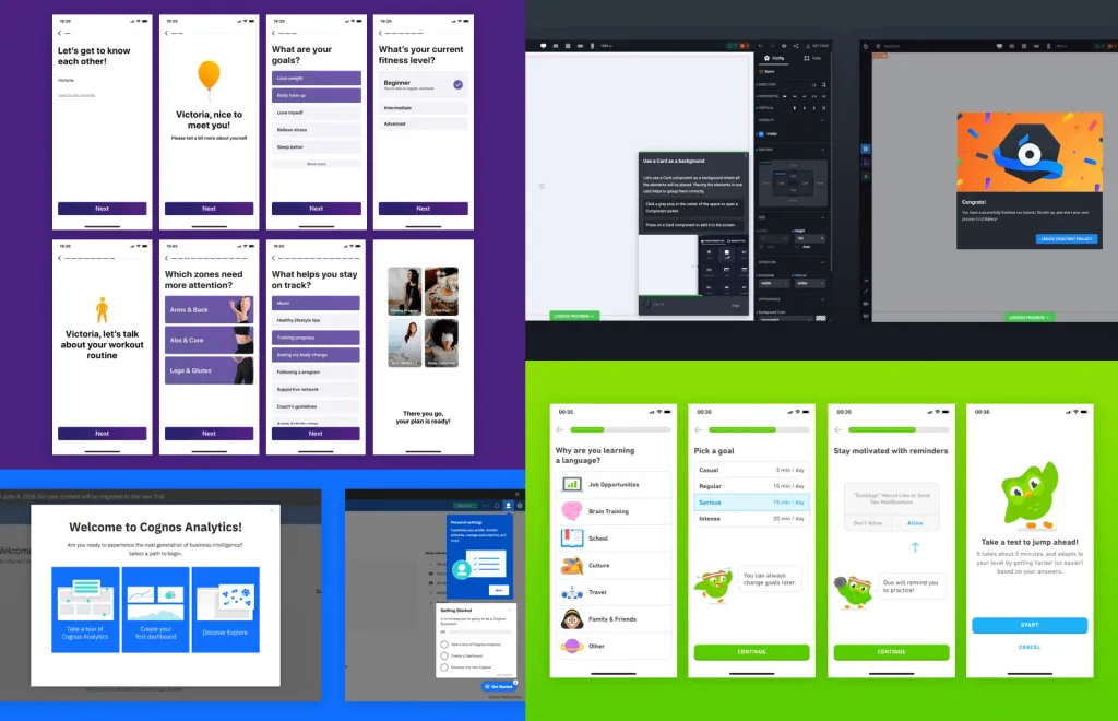
Every manufacturer of software and devices is now concerned about quality training at the start of the product. Creators of gadgets and software for a long time realized that they are creating something completely new and therefore it is important to competently teach users to find new applications in his life. The interfaces of professional applications are increasingly beginning to resemble games in which something new is always happening simply necessary and extremely convenient in solving problems thanks to onboarding.
Storytelling
Storytelling (verbal and visual) helps to create an emotional connection with users. It is the stories in the product form a special field in which the user dives when he starts working with the application. Storytelling is the first to display consumer contact, ignites interest in the brand and attracts him to the functions of the product.
