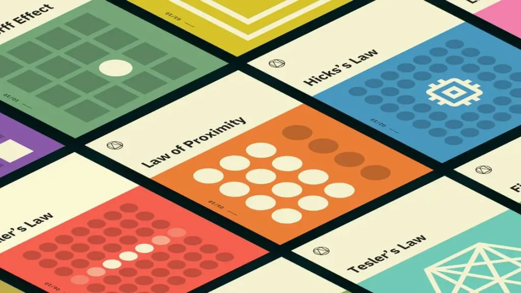
UX Laws

“Aesthetic effect of usability”
Users often perceive an aesthetically pleasing design as a design that is more convenient to use.
Specifics:
-
Aesthetically attractive design causes a positive reaction in people’s brains and makes them believe that design really works better.
-
People are more tolerant of minor usability issues when designing a product or service is aesthetic.
-
Visually pleasing design can mask usability issues and prevent problems during testing usability.
Origin:
The effect of aesthetic use was first studied in the field of human-computer interaction in 1995. Masaaki researchers Kurosu and Kaori Kashimura of Hitachi Design Center tested 26 ATM interface options, asking 252 participants research to evaluate each design for ease of use. use, as well as aesthetic appeal.
They found out a stronger correlation between participants’ assessments of aesthetic appeal and perceived ease of use than the correlation between their assessments of aesthetic appeal and actual ease of use.
Kurosu and Kashimura arrived the conclusion that users are strongly influenced by the aesthetics of any interface, even when they try to evaluate the main system functionality.

Doherty’s Threshold
Productivity increases when the computer and its users interact at speeds (<400 ms), ensuring that no one do not have to wait for another.
Specifics:
- Provide a feedback system for 400 ms to hold users’ attention and increase productivity.
- Use accepted performance to improve response time and reduce anticipation.
- Animation is one way to visually engage people while downloading or processing in the background.
- Indicators of progress help to make waiting times tolerable, regardless of their accuracy.
- Purposefully adding delay to the process can actually increase its acceptance of value and instill a sense of trust, even if the process itself actually takes much less time.
Origin:
In 1982, Walter J. Doherty and Arvind J. Tadani published a research paper in the IBM Systems Journal that established a computer scan time requirement of 400 milliseconds instead of the 2000 (2 seconds) that was the previous standard. When the man’s command was executed and returned the answer in less than 400 seconds, it was considered that it exceeded the Doherty threshold, and the use of such a program was considered “addictive” for users.

Fitts’ Law
The time to reach the goal depends on the distance and size of the goal.
Specifics:
- Click targets should be large enough for users to select them accurately.
- Sensory targets must have a sufficient distance between them.
- Touch targets should be placed in the areas of the interface to make them easy to obtain.
Origin:
In 1954, psychologist Paul Fitts, studying the human locomotor system, showed that the time required to move to the goal, depends on the distance to it, but proportionally depends on its size. According to his law, fast movements and small targets lead to a higher level of error due to the trade-off between speed and accuracy. Although there are several versions of Fitts’ law, they all embrace this idea. Fitts’ law is widely used in user experience (UX) and interface design user (UI). For example, this law influenced the convention to make interactive buttons large (especially on mobile ones) finger-operated devices) - smaller buttons are harder to press (and take many hours). Similarly, the distance between the user’s task / attention area and the task-related button should be as short as possible.

Hick’s Law
The time required to make a decision increases with the number and complexity of choices.
Specifics:
- Minimize the choice when the response time is crucial to increase decision time.
- Divide complex tasks into smaller steps to reduce cognitive load.
- Avoid overloading users by highlighting recommended options.
- Use progressive adaptation to minimize cognitive load for new users.
- Be careful not to simplify to abstraction.
Origin:
Hick’s Law (or Hick-Hyman’s Law) is named after the British and American team of psychologists William Edmund Hick and Ray Hyman. In 1952, the couple set out to investigate the relationship between the number of stimuli available and a person’s response time for any given incentive. As expected, the more incentives to choose, the more hours the user needs, to decide which one to interact with. Users who are overwhelmed with choice must spend an hour interpreting and make decisions by giving them jobs they don’t want.

Jacob’s Law
Most of the time users spend on other sites. This means that users prefer your site worked just like all the other sites they already know.
Specifics:
- Users transfer the expectations they have built around one familiar product to another, similar.
- Using existing mental models, we can create a great user experience in which users can focus on their tasks, not on learning new models.
- Minimize differences by allowing users to continue using a familiar version for a limited time.
Origin:
Jacob’s Law was invented by Jakob Nielsen, a user advocate and leader of the Nielsen Norman Group, which he co-founded with Dr. Donald A. Norman (former Vice President of Apple Computer Research). Dr. Nielsen founded the movement “Discount usability engineering” to quickly and cheaply improve user interfaces and invented several usability methods, including heuristic estimation.

“Law of the common region”
Elements are usually perceived in groups if they are common to an area with a clearly defined boundary.
Specifics:
- The common region creates a clear structure and helps users to quickly and effectively understand the relationship between the elements and sections.
- Adding a border around an element or group of elements is an easy way to create a common area.
- You can also create a common area by defining a background by element or group of elements.
Origin:
Principles of grouping (or Gestalt laws of grouping) - a set of principles in psychology, first proposed by Gestalt psychologists to explain the observation that people naturally perceive objects as organized patterns and objects, a principle known as Pregnancy. Gestalt psychologists have argued that these principles are because the mind has an innate tendency to perceive patterns in incentives based on certain rules. These principles are divided into five categories: proximity, similarity, continuity, isolation and connectivity.

“Law of the Exile”
People perceive and interpret ambiguous or complex images as the simplest possible form, because it is interpretation requires the least cognitive effort from us.
Specifics:
- The human eye likes to find simplicity and order in complex forms, because it does not allow us to be overloaded with information.
- Research confirms that people are better at visually processing and memorizing simple shapes than complex ones.
- The human eye simplifies complex forms, turning them into a single, unified form.
Origin:
In 1910, psychologist Max Wertheimer realized when he observed a series of lights on and off on the railway moving. It was like igniting and turning off the lights surrounding a movie theater tent. It seems to the observer that one light moves around the tent, traveling from light bulb to light bulb, when in fact it is a series of light bulbs that turn on and off, and the light does not move it all. This observation led to a set of descriptive principles regarding how we visually perceive objects. These principles underlie almost everything we do graphically as designers.

“Law of intimacy”
Objects that are close to or close to each other are usually grouped together.
Specifics:
- Proximity helps to establish a connection with the surrounding objects.
- It is believed that the elements in the immediate vicinity have similar functionality or features.
- Proximity helps users understand and organize information faster and more efficiently.
Origin:
Principles of grouping (or gestalt laws of grouping)

“Law of similarity”
The human eye tends to perceive such elements in the design as a whole picture, shape or group, even if these elements separated.
Specifics:
- Visually similar elements will be perceived as related.
- Color, shape, size, orientation and movement may indicate that the items belong to the same group and are likely to have a common meaning or functionality.
- Make sure that links and navigation systems are visually different from regular text elements.
Origin:
Principles of grouping (or gestalt laws of grouping)

“Law of Uniform Connectivity”
Descriptions of elements that are visually related are perceived as more related than unrelated elements.
Specifics:
- Group functions are similar, so they are visually related by colors, lines, frames, or other shapes.
- In addition, you can use a tangible link (line, arrow, etc.) from one element to another, to also create a visual connection.
- Use homogeneous connectivity to show context or emphasize the connection between similar elements.
Origin:
Principles of grouping (or gestalt laws of grouping)

Miller’s Law
The average person can store only 7 (plus or minus 2) items in their working memory.
Specifics:
- Do not use the magic number seven to justify unnecessary design limitations.
- Organize content into smaller chunks to help users easily process, understand and remember.
- Remember that the amount of short-term memory will be different for each person depending on his previous knowledge and situational context.
Origin:
In 1956, George Miller argued that the interval between direct memory and absolute judgment is limited to about 7 pieces of information. The basic unit of information is the bit, the amount of data required to choose between the two equally plausible alternatives.
Similarly, 4 bits of information is the solution between 16 binary alternatives (4 consecutive binary solutions). The point where confusion creates incorrect judgment is the bandwidth of the channel. In other words, the number of bits that can be reliably transmitted through the channel for a certain period of time.

Occam’s Razor
Among the competing hypotheses that predict equally well, you should choose the one with the fewest assumptions.
Specifics:
- The best way to reduce complexity is to avoid it in the first place.
- Analyze each item and remove as much as possible without violating the overall function.
- Consider completion only when you cannot delete additional items.
Origin:
Occam’s razor (also Occam’s razor; Latin lex parsimoniae “law of economy”) is a principle of problem solving, according to which, when competing hypothetical answers to the problem are presented, the one who makes the least number of assumptions should be chosen.
The idea is attributed to William Ockham (c. 1287–1347), who was an English Franciscan monk, scholastic philosopher, and theologian.

Pareto Principle
The Pareto principle states that for many events, about 80% of the consequences come from 20% of the causes.
Specifics:
- Inputs and outputs are often unevenly distributed.
- A large group can contain only a few important participants who contribute to the desired result.
- Focus most of your efforts on the areas that will benefit most users.
Origin:
Its origins go back to Wilfredo Pareto, an economist who noted that 80% of Italy’s land belongs to 20% of the population. Although it can seem uncertain, the 80/20 way of thinking can provide a deep and infinitely applicable analysis of one-sided systems, including user interaction strategy.

Parkinson’s Law
Any task will be inflated until all available time is spent.
Specifics:
- Limit the time required to complete the task to those expected by users.
- Reducing the actual duration of the task compared to the expected to improve the overall work of the user.
Origin:
Formulated by Cyril Northcott Parkinson as part of the first sentence of a humorous essay published in The Economist in 1955 and after its reprint on the Internet, it was reprinted along with other essays in the book Parkinson’s Law: the pursuit of progress (London, John Murray, 1958). He derived this statement from his extensive experience in the British civil service.

“Rule of the peak end”
People judge an experience mostly based on how they felt at its peak and at the end, rather than on the overall the amount or average of each moment of experience.
Specifics:
- Pay attention to the most intense moments and the last moments (“end”) of the user’s path.
- Identify the moments when your product is most useful, valuable or entertaining, and create to please the end user.
- Remember that people remember negative experiences more vividly than positive ones.
Origin:
A study by Kahneman, Fredrickson, Charles Schreiber and Donald Redelmeier entitled “If more pain is preferred less: add a better end “entitled” If more pain is less: adding a better end “provided innovative evidence of the peak-end rule. Participants were subjected to two different versions of one unpleasant experience. In the first In the study, patients immersed their hand in water at 14 ° C for 60 seconds. In another study, subjects were immersed the other hand in water at 14 ° C for 60 seconds, but then kept the hand immersed for another 30 seconds, during which the temperature increased to 15 ° C. Subjects were then asked to choose which study to repeat. According to the law of temporary monotony subjects were more willing to repeat the second test, despite prolonged exposure to uncomfortable temperatures. Kahneman et al.

Bed Law
Be liberal in what you receive and conservative in what you send.
Specifics:
- Be responsive, flexible and tolerant of any actions that the user may take or any contribution he makes can provide.
- Anticipate virtually anything in terms of input, access and capabilities, providing a reliable and accessible interface.
- The more we can anticipate and plan in design, the more sustainable the design will be.
- Receive variable data from users, translating it according to your requirements, defining input boundaries and providing clear feedback to the user.
Origin:
Postel’s law (also known as the principle of reliability) was formulated by John Postille, the first pioneer of the Internet. Law is a recommendation for software development, in particular for TCP and networks, and states that “TCP implementation should comply with the general principle of reliability: be conservative in what you do, be liberal in what you accept from others “. In other words, programs that send messages to other machines (or other programs on the same machine), must fully comply with the specifications, but the programs that receive the message must accept inappropriate input, while the meaning is clear.

“Sequential position effect”
Users tend to remember the first and last elements of the series best.
Specifics:
- Placing the least important items in the middle of lists can be useful, as these items are usually less stored in long-term and working memory.
- Placing key actions left and right in items such as navigation can improve memorization.
Origin:
The effect of sequential arrangement, a term coined by Hermann Ebbinghaus, describes how the position of an element in a sequence affects the accuracy of the response.
The two concepts involved, the effect of primacy and the effect of recentness, explain how the elements are presented at the beginning of the sequence and at the end of the sequence, are mentioned more accurately than the items in the middle of the list.
Manipulating the sequential placement effect to create a better user experience is reflected in many popular ones designs by successful companies such as Apple, Electronic Arts and Nike.

Tesler’s Law
Tesler’s law, also known as the law of conservation of complexity, states that for any system there is a certain number complexity that cannot be reduced.
Specifics:
- All processes have an essence of complexity that cannot be designed, and therefore it must be accepted by the system or the user.
- Make sure that as much load as possible is removed from users, solving the inherent complexity during design and development.
- Be careful not to simplify interfaces to abstraction.
Origin:
Working at Xerox PARC in the mid-1980s, Larry Tesler realized that the way users interacted with programs was so as important as the program itself. Dan Saffer’s book, Interaction Design, features an interview with Larry Tesler that describes law of conservation of complexity.
Interviews are popular with user experience and interaction designers. Larry Tesler claims that in most cases the engineer has to spend an extra week to reduce the complexity of the program rather than forcing Millions of users spend an extra minute using the program because of the added complexity.
However, Bruce Toniatsini urges people to resist reducing the complexity of their lives. So when the app is simplified, users begin to perform more complex tasks.
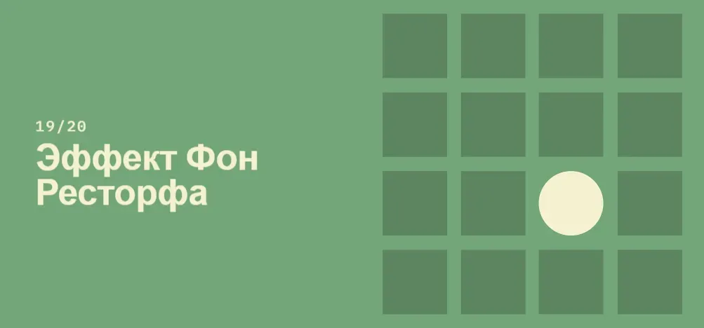
“Von Restorf effect”
The von Restorf effect, also known as the isolation effect, suggests that when several such objects are present, the one who differs from others will be remembered.
Specifics:
- Make important information or key actions visually distinctive.
- Use restraint when focusing on visual elements to avoid competing with each other and to ensure that visible elements are not mistakenly identified as advertising.
- Do not exclude people with color vision impairment or poor eyesight, relying solely on color to convey contrast.
- Think carefully about users with motion sensitivity when using motion to transmit contrast.
Origin:
This theory was developed by the German psychiatrist and pediatrician Hedwig von Restorf (1906-1962), who in his study of 1933 found that when participants were presented with a list of categorically similar items with one distinct, isolated item in the list, the memory for the subject was

Zeigarnik effect
People remember unfinished or interrupted tasks better than completed ones.
Specifics:
- Offer to detect content with clear signs of additional content.
- Providing artificial advancement to the goal will help ensure users are likely to be motivated to perform this task.
- Provide a clear indication of progress to motivate users to complete tasks.
Origin:
Bluma Wolfovna Zeigarnik (1900 - 1988) - Soviet psychologist and psychiatrist, member of the Berlin School of Experimental Psychology and Vygotsky’s circle.
She discovered the Zeigarnik effect and contributed to the formation of experimental psychopathology as a separate one discipline in the Soviet Union in the period after World War II. In the 1920s, she conducted a study of memory, c which compared memory in connection with unfinished and completed tasks.
She found that unfinished tasks were easier remember than successful. This is now known as the Zeigarnik effect. She later began working at the Institute of Higher Nervous activities where it will meet its next major influence on Vyhovsky, and become part of his circle of scientists. Ibid Zeigarnik founded the Department of Psychology.