8 failed design trends
Each year, we start with a list of design trends that experts believe will dominate next year’s projects. Undoubtedly, there are mistakes in such forecasts.
In one application, it is a chip that works perfectly, and in another it is flat. Here are some trends that are fast disappearing.
Off-screen elements
One of the design trends that gained momentum at the beginning of the year was the use of off-screen elements. This facilitated horizontal scrolling. Everything, from the text to the images, seemed to be out of bounds.
Why the trend didn’t catch on: it’s an exceptionally complex technique. Off-screen elements look different on different screen sizes, and this can significantly affect readability and comprehension.
Overlapping design elements
Using overlapping design elements is another trend that can be visually overwhelming, but which difficult to make work in real situations.
Why the trend didn’t catch on: it took a lot of time and effort to make everything work as it should. And you should have only the right one content that stacks well.

Super minimal aesthetics
While true minimalism never goes out of style for long, the super-minimalistic style was relatively short-lived. These designs were almost absent from the main page. You probably already guessed why this trend didn’t last long.
Why the trend didn’t catch on: There’s nothing wrong with this school, but there’s a problem - there’s not enough attention-grabbing.

Interesting patterns while scrolling
Like many of the trends on this list, cool scrolling patterns are difficult to manage and control on different ones devices and sizes. The basis of use is to help site visitors navigate the design.
Why the trend didn’t catch on: Users want to know what to expect and don’t want to think about how to interact with the design. This creates a cognitive load and people can leave the site without having understood it.
Exaggerated white space
This trend is not so bad, but it looks very unusual. Just look at the screenshot above: the content is close here a third of the space is too wasteful.
Why the trend didn’t catch on: If you have a lot of content, this feature will turn into endless scrolling. No one needs it.
Video everywhere
Before the start of 2021, many blogs and articles expressed the idea that this year would be the year of video. And although the trend took a back seat, but will probably be back soon.
Why the trend didn’t catch on: It seems that the trend didn’t really take off because of the cutbacks: it’s hard to find money for video on a limited budget.
Shapes of bubbles and drops
It’s almost surprising that this trend has died out - for many of the same reasons that video has. Although the shapes of bubbles and drops seemed a good alternative to real images.
Why the trend didn’t catch on: With so many designs, the trend may have died out due to general design fatigue.
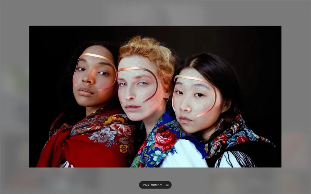
Artificial intelligence hints
We believed that this year would be the year of augmented reality and artificial intelligence. But hurry up: it happens that technology not keeping up with the forecast.
Why the trend did not catch on: AI is an interesting technology that is difficult to grasp. There’s a lot going on in the background. Perhaps, the designers simply couldn’t think of more ways to show it visually.