Classification of fonts

Classification of fonts has always been and still is a field for discussion. And it is not surprising, because it is almost impossible to do classification according to some single criterion — structural features, historical period or context of their use.
In addition, when forming an actual font classification system, it is useful to look back at the purely practical component. For example, consider the classification systems used in online catalogs, from which modern graphic and digital designers have to choose fonts.
In this article (and in the Basics of Design course in general), we will rely on the following division:
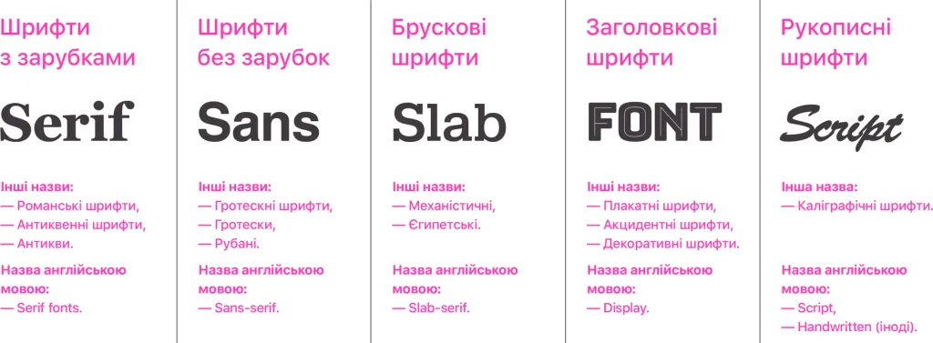
- notched fonts
- fonts without serifs
- block fonts
- header fonts
- handwritten fonts
A separate material could be devoted to each of these groups, because each of them has subgroups, interesting constructive and historical features.
But in this material we will give them only a general description.
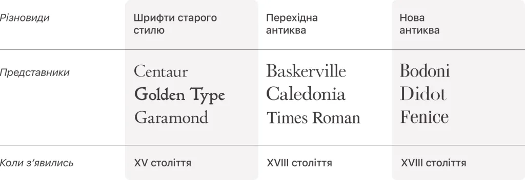
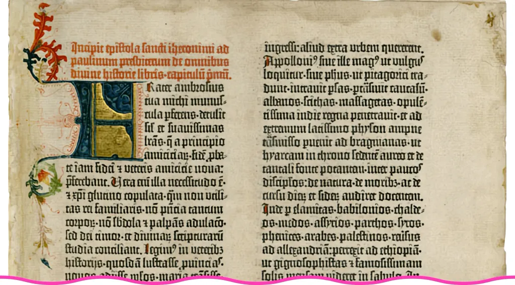
Serif fonts
They are also called antique fonts or simply antiques. This variation of the name comes from the Latin word antīqua, i.e. “ancient”.
Some of the first fonts of this type appeared as early as the 15th century. But they are called ancient for another reason. The period of appearance of these fonts came during the Early Renaissance. During this period, interest in antiquity was awakened, and in particular — among scribes and typographers.
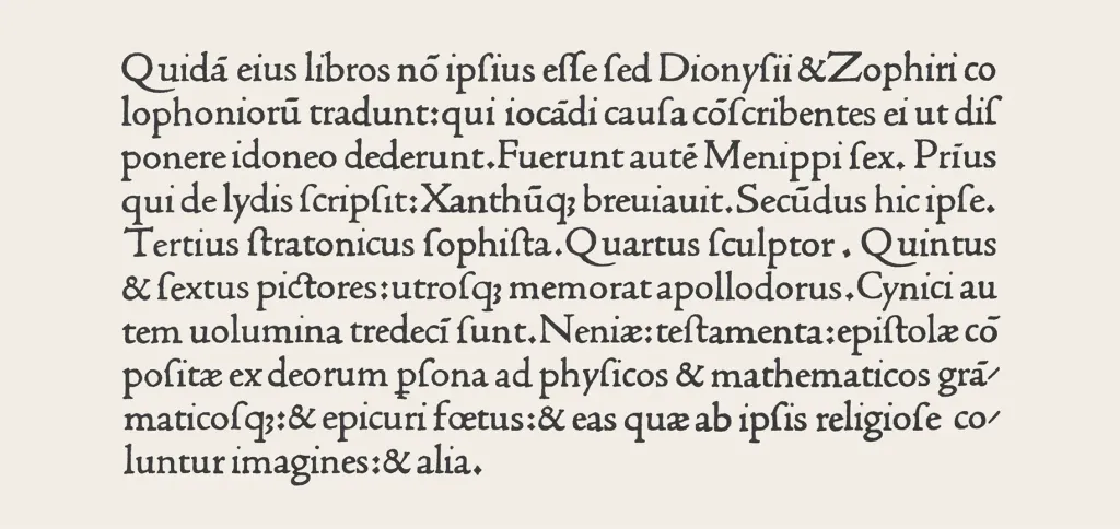
The structure and appearance of these fonts borrowed a lot of features from the Roman high school font. The one who in In the Roman Empire, inscriptions were carved on temples and monuments. Because of this origin, this group of fonts is sometimes called Romanesque, i.e. Roman.
But in contrast to the real Roman fonts, in the ancient fonts, line letters appeared.
In the period from the 15th to the beginning of the 19th century, the majority of printed publications and posters were created using antique fonts. Their structure has undergone certain changes over the centuries - in the course of the development of printing technologies and because of a change in current fashion — but the general constructive principles were preserved.
Sans-serif fonts
For a long time, notches in fonts were a technical necessity. When carving inscriptions on stone, it was almost impossible without them to avoid cracks, and when writing with a pen, ink spills.
But with the development of the printing business, the improvement of printing presses and the technology of paper production, notches ceased to be a real necessity. Over time, they turned into a kind of rudimentary element of the font structure and performed rather a decorative function.
At the same time, since most of the inscriptions consisted precisely of fonts with notches, the font devoid of them was almost doomed to stand out against their background.
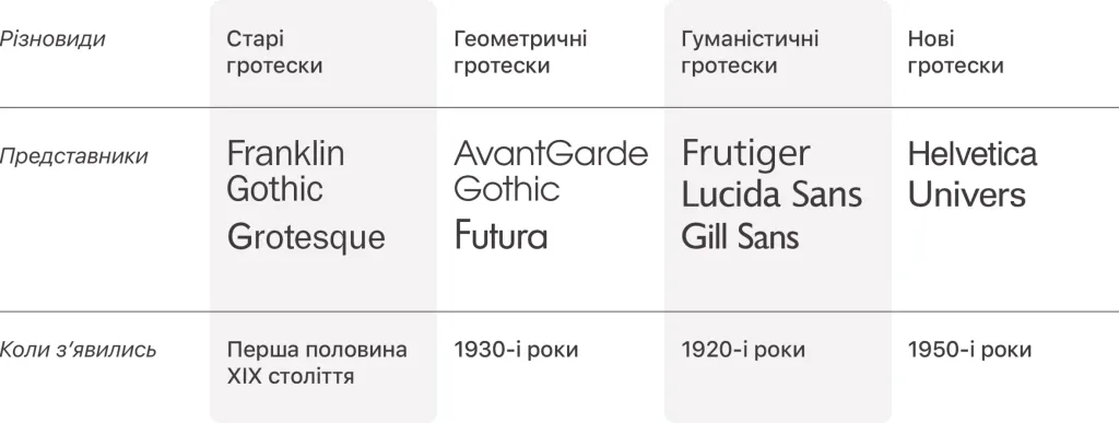
It is believed that one of the first fonts of this group was Caslon’s Egyptian font (English Caslon’s Egyptian), created William Kezlon IV at the beginning of the 19th century.
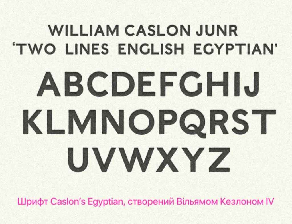
Then the new font was poorly received. It was called “grotesque” and “gothic”.
The very word “grotesque” comes from the French word grotesque, which can be translated as “grotesque”, so in it several meanings are reflected at the same time: the unusual structure of the font compared to the traditional one and the ability of the font to attract attention with its appearance.
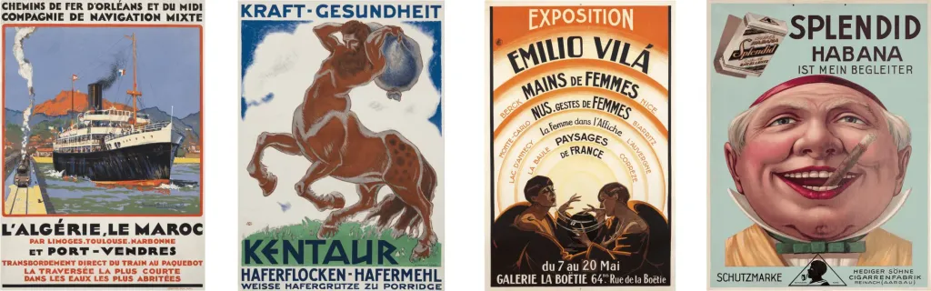
In fact, for a certain time, inscriptions typed in this font were used precisely for the purpose of attracting attention in headlines, posters, advertising But over time, grotesque fonts began to be used as the main book layout.
In the 20th century, the fonts of this group became more widespread and gradually began to be perceived as more modern, corresponding to the era. In his work “New Typography”, which was first published in 1928, Jan Tsichhold even wrote:
Of all the fonts of the past, the so-called grotesque or chopped font corresponds best to the spirit of our time.
Probably, this statement is true even today.
The development of grotesque typefaces continued after the publication of “New Typography” (and to some extent, under the influence of this book).
If the first grotesques imitated some structural features of antiques, then over time their structure became more and more authentic, independent, relevant. Now these fonts are often used in logos, navigation, mobile interfaces applications.
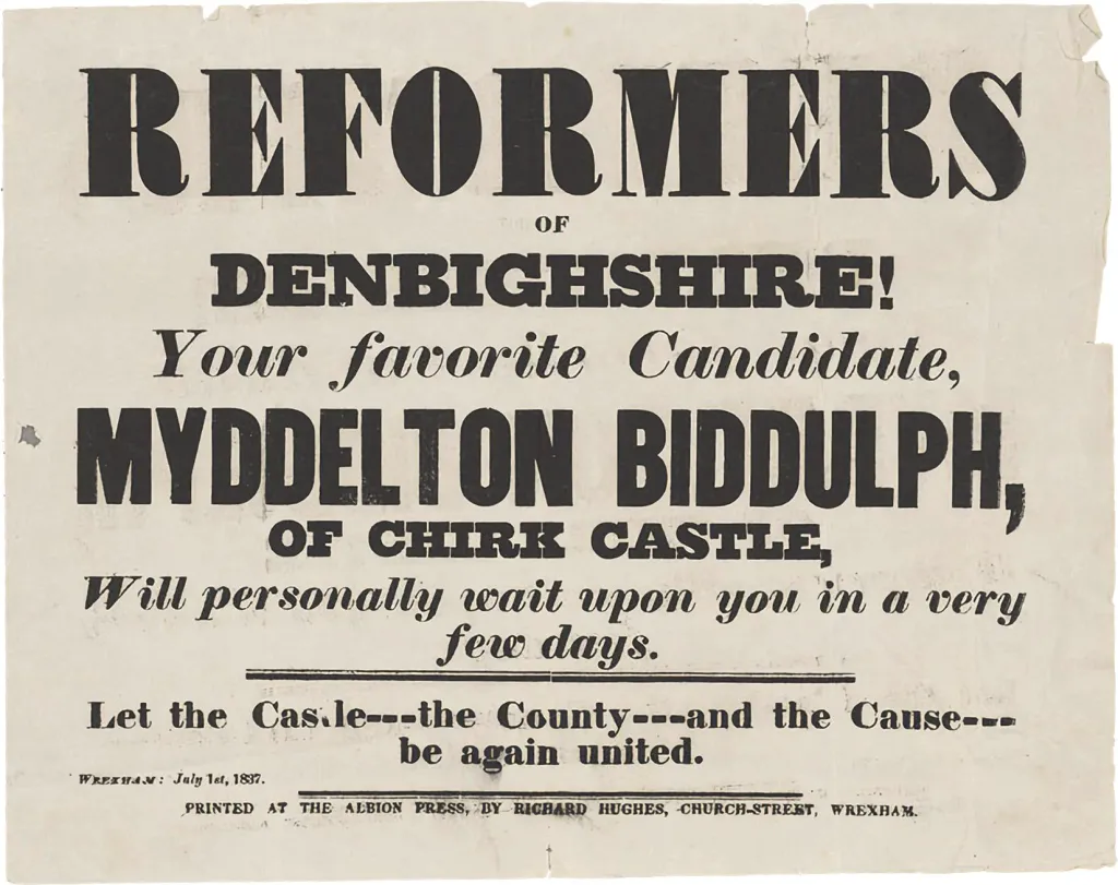
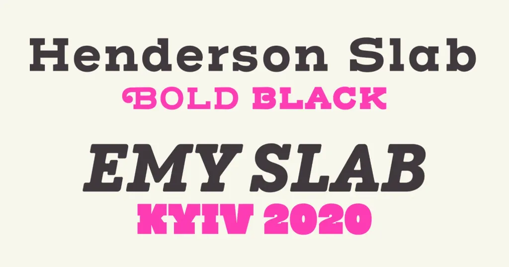
Slab-serif fonts
Another name for block fonts is Egyptian.
As with antique fonts, the name here is somewhat misleading. There is nothing Egyptian in the structure of Egyptian fonts. It’s just that the period of their appearance coincides with the period of fascination with ancient Egyptian culture, which flared up with new force after Napoleon’s Egyptian campaign in the period from 1798 to 1801.
In the book of the designer Yuri Gordon, a hypothesis is given, according to which the shape of the first block fonts was similar to the font of the name inscriptions of the French ships that participated in this campaign. Whether it’s true or just a guess, it’s hard now to determine, but the influence of fascination with Egypt affected, in particular, the names of some block fonts - “Cairo” (Cairo), Karnak and Memphis.
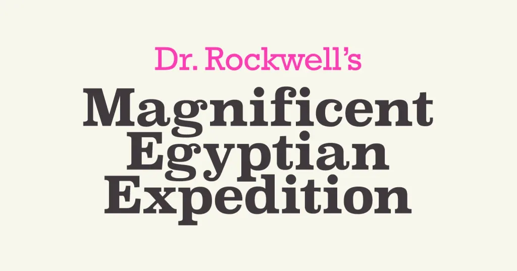
Bar fonts could be classified as serrated fonts, but their shape was significantly different from serrated antique fonts.
In antiquity, notches had a secondary role in relation to the main strokes, which was emphasized by their thin outline. But in brick ones in fonts, notches and main strokes were balanced. And in some subgroups of block fonts, they are also called Italian block fonts, they were even thicker than stem (this feature of the structure in fonts is also called reverse contrast, we will tell you more about what font contrast is in the next material).
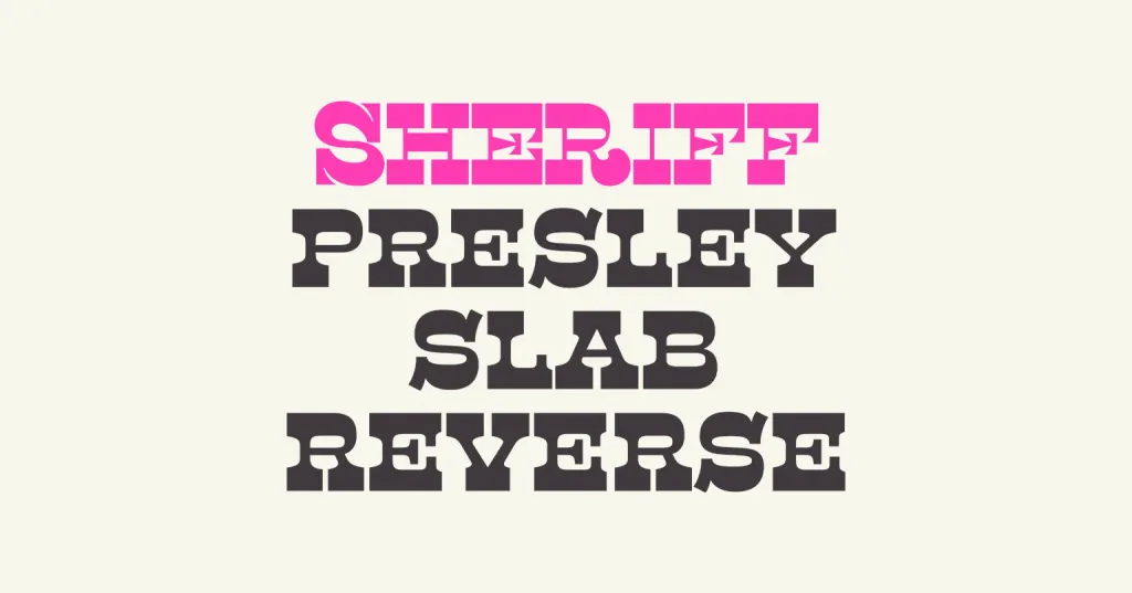
The first block fonts appeared as a way to highlight individual inscriptions, because due to their own form they looked more noticeable in headlines, signs, posters, shop windows and advertising. However, later, modifications of block fonts began to appear, with which it was possible to comfortably type significant arrays of texts.
Their undoubted advantage was that they were well read at almost any scale, and due to the expressive notches, they also made the texts typed by them are more expressive. Due to this quality, in particular, they were used for typewriters, and later also for program code editors.
And although block fonts had a less long history than ancient ones, they also underwent their own evolution, and the form of this types of fonts changed over time.

Heading fonts
Another group of fonts is the so-called header fonts (they are also called poster or decorative fonts). This group is something different from the previous ones, mainly because it unites fonts not by design principle, but by purpose.
Fonts that were to be used in a large size - in fact, as newspaper or magazine fonts - were called headline fonts headers, for signs, on posters or advertising billboards.
Another name for them is accidental fonts. It comes from the word accident, which was the name of small typeset forms - business cards, book covers and advertising layouts.
Of course, such a context of use also influenced the structure in a certain way. Headline fonts often had thicker main ones strokes and a generally more expressive drawing.
The first such fonts, which appeared in the 18th century, were made with larger pins or, in general, with separate printing presses forms English printers such as Thomas Cottrell and William Keslon II are considered pioneers in the creation of title fonts.
But the size and expressive style do not fully describe the principles of font belonging to the heading group. Adding to the confusion is the fact that fonts from other groups can often be found in quality catalogs at the same time headline and, say, bar.
This is easy to explain. The fact is that block fonts at the time of their appearance were used precisely as headers. A similar situation is possible with both grotesque and handwritten fonts: a significant part of them can be used in this capacity.
At the same time, heading fonts include not only fonts of other groups that are organically perceived in advertising, headings or on signs. In many situations, inscriptions in header fonts are required to have a more expressive aesthetic than the rest of the inscriptions. Therefore, they can be endowed with additional decorative features:
Because of this, header fonts are sometimes called decorative. The degree of decorativeness can be insignificant — for example, these can be small modifications of the basic outline.
And it can be very pronounced, so much so that the poster font almost turns into an illustration.
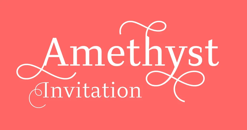
Handwritten/Script fonts
The last group of fonts that we will consider are handwritten, or rather, those that reproduce handwritten sketches. Sometimes there are more called calligraphic fonts.
Today, these fonts are mostly used in a decorative context or as headers, because in the majority sometimes it is uncomfortable to perceive a significant volume of texts in such an essay.
But although we are considering a group of handwritten fonts, Gutenberg’s first printed “Bible” was created last precisely in a handwritten font called “Texture”.
Handwritten fonts are often divided into formal and casual.
Handwritten fonts based on the form of letters characteristic of calligraphers of the 17th and 18th centuries are called formal, such like George Bickham, George Shelley and George Snell.
The outline of these fonts resembles writing with a pen. One of the first fonts of this type is Union Pearl, it also belongs to it Kuenstler Script, Palace Script, Propisi.
Such fonts were often used for invitations (for example, for weddings) and letters. And now they are also used.
Casual type fonts have a freer outline. To a certain extent, we can say that they have the same arbitrary and capricious shape, like our own handwriting.
For a long time, there were not so many fonts of this subtype, because until the 20th century, the process of their creation was technologically difficult But with the advent of photocomposition in the 1950s, and later with the advent of digital font editors, their creation significantly simplified, and the number of casual handwritten fonts, accordingly, significantly increased.
Representatives of this family of fonts include Brush Script, Decor, Kaufmann, Art Script, Corrida, Freestyle, Kaliakra, Parsek, Mistral.
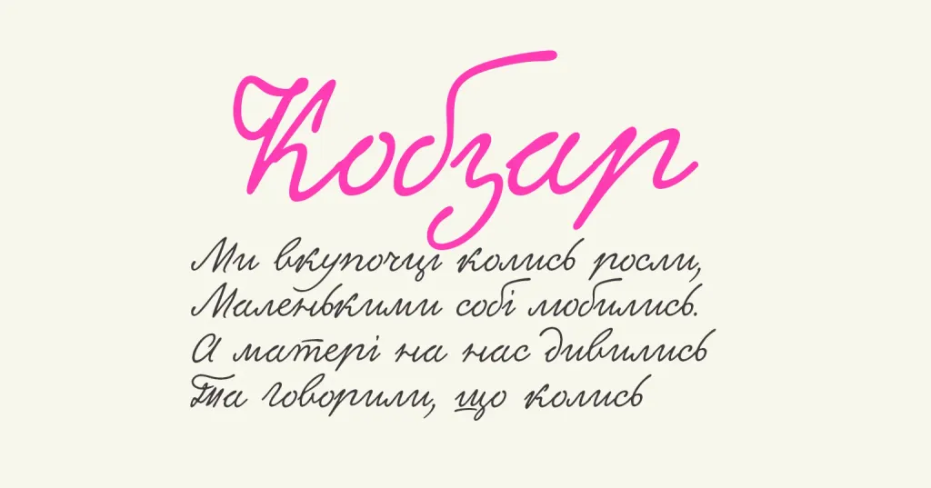
Among the Ukrainian fonts of this type, we can highlight, for example, the font “Kobzar”, created by designers Dmytro Rastvortsev, Lukyan Turetskyi and Genadiy Zarechnyk and based on the handwriting of Taras Hryhorovych Shevchenko.
It is important to note
In the chapter on the classification of fonts in the “Book about letters from Aa to Ya” Yuriy Gordon notes:
Over the thousands of years of the existence of alphabets, and especially over the last century and a half, a significant number of different ones have accumulated fonts Periodically, and recently even constantly, there are attempts to organize them. Fonts stubbornly resist such attempts.
Indeed, often the same font can formally belong to at least two of the groups described in our material.
There are numerous alternative font classifications:
- classification of fonts in accordance with GOST 3489.1-71,
- Maximilian Vox’s classification,
- classification of the company Paratype,
- classification according to the German industrial standard (DIN),
- Yury Gordon’s classification (which in turn is based on the classification of Volodymyr Krychevskyi).
- Therefore, the classification described in our material should not be perceived as claiming to be unambiguous and the only possible division into groups. But this classification will help you better navigate some font catalogs when you are faced with it the task of selecting one or more fonts for your project.