Contrast, dynamics, weight, openness and font width

In this material, we will consider some additional parameters of fonts, with the help of which we will be able to characterize their structure. We are talking about the following parameters:
- font contrast,
- font dynamics,
- font weight (this parameter is also called “saturation”),
- openness of the font,
- font width.
Font contrast
In the lecture on expressive means of composition, we said that contrast is a significant difference between two elements.
In the case of fonts, contrast refers to the difference between the thicknesses of the main and secondary strokes. We will remind that vertical strokes (stems) and diagonal strokes are the main ones in the fonts, and the reverse diagonal strokes and crossbars
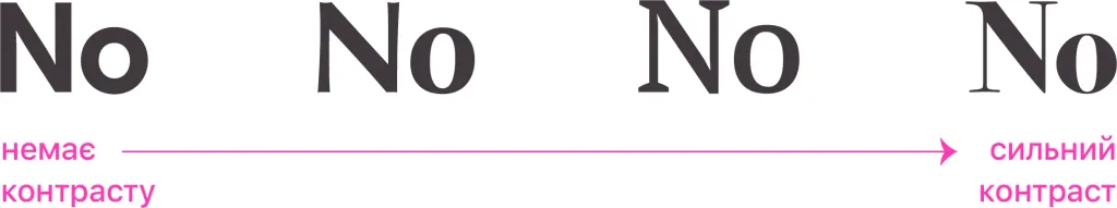
If the thickness of these strokes is equal, it means that such a font lacks contrast. And if the difference in thickness is significant, the font has a strong contrast.
Here are some more examples of high-contrast fonts:
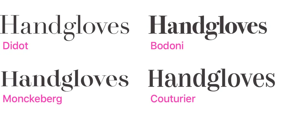
Historically, the contrast is more pronounced in antique fonts. It is much weaker in block fonts and early grotesques. Geometric grotesques are characterized by a lack of contrast.
Font dynamics
Like compositions, fonts can be divided into static and dynamic.
To evaluate the dynamism of the font, it is necessary to pay attention to the axes of symmetry in the ovals and semi-ovals of the letters. The stronger will be the inclination of these axes relative to the stems, the stronger will be the dynamics of the font.
If such an axis is parallel to the stem, we say that this font is static. In italics, stems are slanted for default In them, you should also pay attention to the angle of the ovals relative to the stems. The stronger the difference, the more dynamic italics.
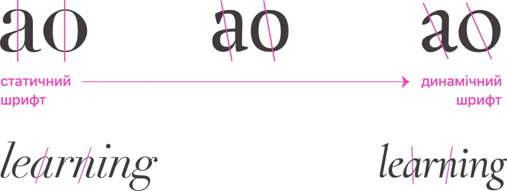
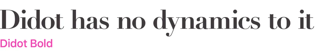
The absolute majority of block fonts and grotesques are static. Among antique fonts, the font can be considered static “Didot” (Didot), because all axes in it are purely vertical.
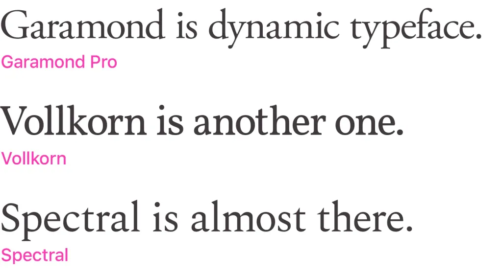
Here are some examples of dynamic antique fonts:
The dynamic and static nature of the font is a purely constructive feature. But if you want to convey emotional dynamism, an italic version of the font can be used.
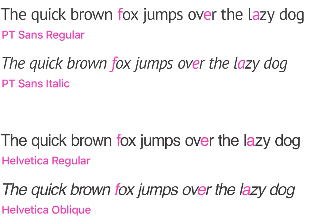
At the same time, a distinction should be made between italics — they are often called italics — and italic fonts (they are also called oblique). Formally, both of these variations of the font add dynamics to it, but they do so in different ways.
Italic is a slanted variation of a typeface that gravitates toward a handwritten outline. It is, in particular, present in the Times New Roman family.
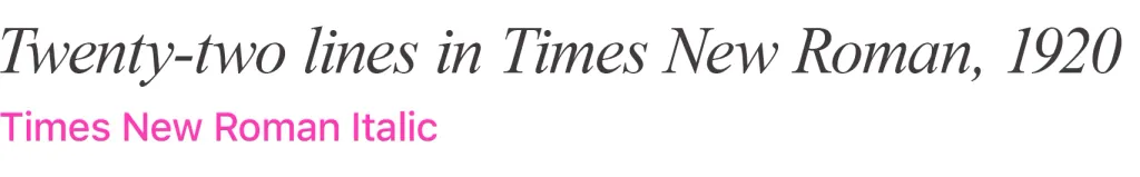
It can be easily distinguished from the slanted script by the shape of the linear letter “a” - in italics it is more like a handwritten one. Usually, the geometry of the italic variation of the font is perceived more organically and is more complete in structure, because during its development in essence, a new geometry of the font is being built.
Italic is generally a less organic typeface variation. It changes the inclination of the font axis, and at the same time — the slope of the main strokes. Most graphic editors allow us to modify almost any font in a similar way. But often an oblique essay is perceived less organically and somewhat forced. This is especially noticeable when using it in context grotesque and block fonts.
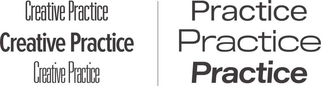
Font weight (saturation)
Another important font parameter is its weight (this parameter is also called font saturation).
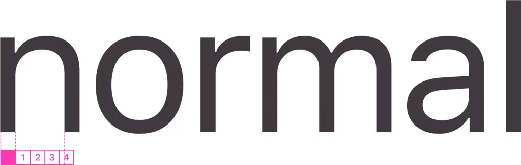
Weight is the ratio of stem thickness to character width. Simply put, the thicker the strokes of the font, the greater is its weight. It is best defined by the graphemes of the Latin letter “N” or the Cyrillic “P”.s
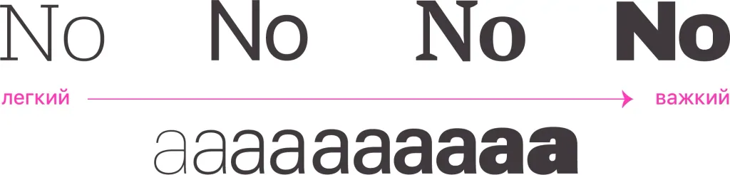
A normal sketch is considered to be one in which 3-4 main strokes can be placed in the white space of the letters. It is so they call it regular, that is, translated from English, “ordinary”.
As a rule, fonts with increased weight are used for inscriptions that should be better read from a distance: for newspapers or magazine headlines, for signs, for outdoor advertising, etc. That is, it can be said that the thick strokes of the fonts are tangential to header fonts.
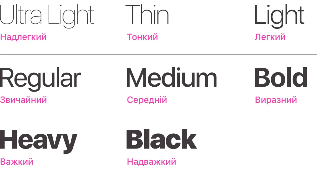
The following modifications of the font are usually distinguished in the context of increasing its weight:
- ultra light — Ultra Light,
- thin — Thin,
- light — Light,
- regular — Regular,
- medium — Medium,
- expressive — Bold,
- heavy — Heavy,
- super heavy — Black.
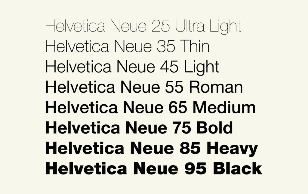
It should be noted that not every font family contains such a wide range of fonts. This is due to the fact that for to achieve the harmony and balance of a new typeface, the font designer often has to significantly rethink it, essentially, create a full-fledged additional font. Therefore, most font families have only a few types.
To feel how significantly the perception of the font changes along with the typeface, you can look at the Helvetica Neue family.
Openness of the font (aperture)
Another font parameter related to its structure is openness. Another name for this parameter is aperture (the word comes from the Latin apertura, which can be translated as “opening”).
In the context of typefaces, an aperture is the area of a character that is completely or partially limited by its shape. Apertures are divided into closed (these are, in fact, the same openings and eyes that we wrote about in the first article about the structure of letters) and open.
Closed include:
A, B, D, O, P, Q, R, a, b, d, e, g, o, p та q
0, 4, 6, 8 та 9
And the open apertures are:
c, f, h, i, s
The essence of this parameter is easiest to explain using the example of the letter “C”.
In this case, the aperture is the distance between the two tips of this letter.
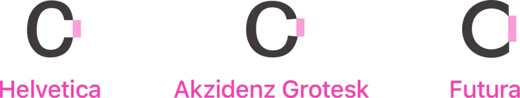
Fonts with a large aperture, respectively, are called strongly open, with an average aperture - moderately open, and such, in which the aperture is small - almost closed.
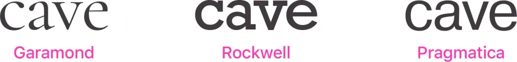
Most antique fonts are open. Bar and grotesque fonts tend to be more closed.
More open fonts have a more compact shape. But at the same time, it is believed that semi-closed fonts are better recognized when reading quickly, and therefore they are often used on license plates and in navigation design.
It is also believed that more open typefaces convey a sense of emotional openness, simplicity and openness. And closed fonts, respectively, a sense of closure, stability, security.
Font width
Finally, the last font parameter we will consider in this article is the so-called font width.
Sometimes this parameter can be confusing, because in fact it does not mean the width of the character in the font, as such, but the ratio of the width to the height of the symbol.
The shape of the symbol can therefore be close to one of three states:
- Tall rectangle — in this case, we say that this font is narrow.
- Square - this font has a normal width.
- Wide rectangle - we consider fonts with a similar ratio to be wide.
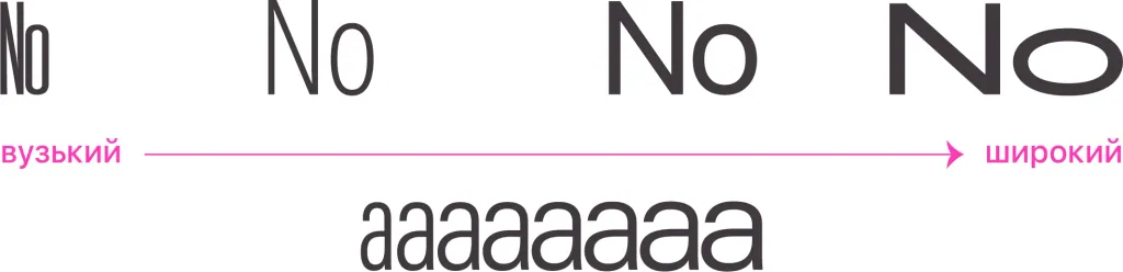
It is fonts with a normal width that we most comfortably perceive when reading large text arrays.
Narrow (as well as ultra-narrow) and wide (and accordingly, ultra-wide) fonts are well suited for poster inscriptions, newspaper headlines, advertisements, etc., where word arrays are insignificant.
In such contexts, they can have a positive visual effect, because due to their unusual shape, they attract attention well.
But for reading significant arrays of text (even a sentence or two), they are not very well suited.
Precisely because of their quality, narrow fonts are often used for various mandatory inscriptions in outdoor advertising.
At the same time, individual characters inside the font can have a different width. For example, the letter “Ж” is often wider than “I”.
Fonts in which all characters have the same width are separated into a separate group in font catalogs. They are called monospaced and, as a rule, used in contexts where the equality of text lines is important. For example, for recruitment software code.