5 design systems that a UX designer should know in 2022
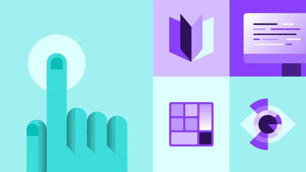
What is a design system?
In summary, a design system is a set of standards to manage design at scale by reducing redundancy and maintaining consistency. A design system is a collection of documents, articles, examples, code snippets, screenshots, design guidelines, components, philosophies and other digital assets for a product design company. It’s usually hosted online as a website (public or internal).
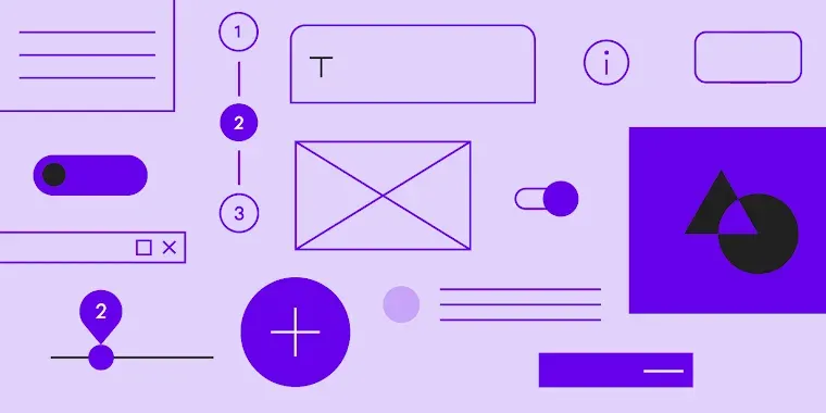
What can you learn from them?
So how can you learn from this? Say you’re designing a e-commerce website and the menu needs a dropdown for categories. Not sure what size your arrow should be on the dropdown or how far away from the text to place it? Well, you can look to a shopping system pioneer like Shopify to see how they do it!
1. Google Material Design System
In terms of design, Google’s publicly shared ‘Material Design’ system paved the way for many to follow.
2. Apple Human Interface Guidelines
Needing no introduction, elegant and intentional design is in the very DNA of Apple. Apple’s Human Interface Guidelines is not only a design system but an incredible resource full of downloadable templates and other guidelines that you can use in your own projects.
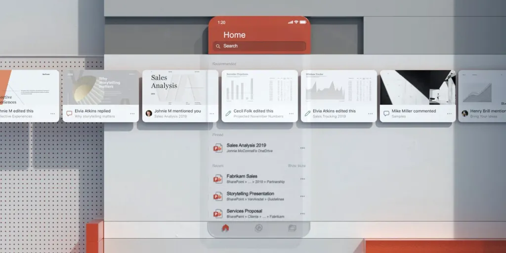
3. Microsoft Fluent Design System
Microsoft’s ecosystem of design tools and open-source components can help you get the same look as their products quickly and easily so you can create a consistent vision across Web, Windows, iOS and Android platforms and understand the logic and look of Microsoft products
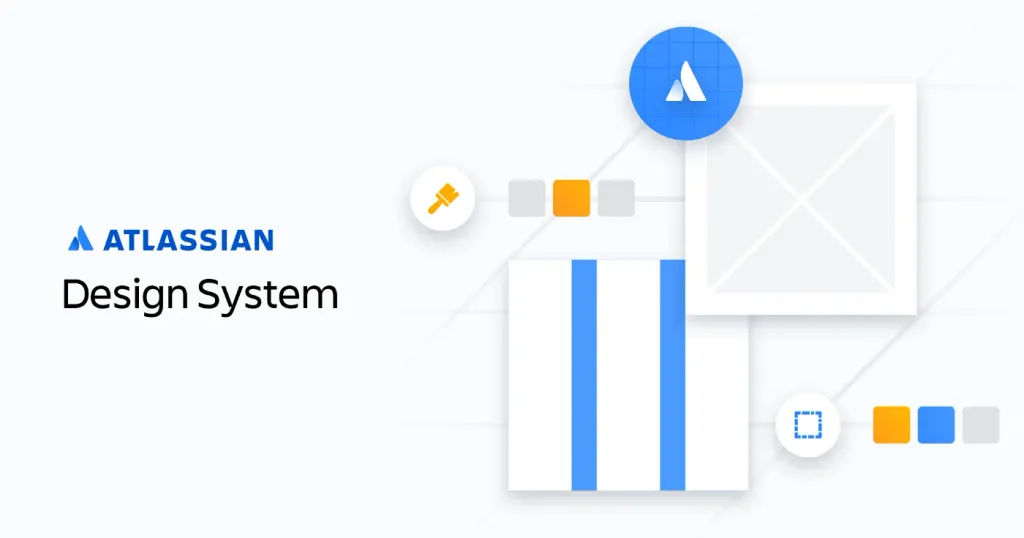
4. Atlassian Design System
Atlassian design system has plenty of design resources to create better and scalable designs. These resources include tools, plugins, and kits. It has patterns that are a reusable combination of components used to solve user problems. It has an intuitive interface that makes it easy to create designs
5. IBM Carbon Design System
Carbon allows teams to build excellent experiences that differentiate IBM from the competition. Products and experiences built with Carbon provide an interoperability of experience and visuals across products. More complex multiproduct stories are easier to tell when product experiences are in lock step.