Expert evaluation of the usability of your site and Jacob Nielsen's 10 heuristics

Jakob Nielsen’s 10 heuristics were created without emphasis on application to websites, applications, or other specific interfaces: the original article uses a broader concept of “system”. However, almost all the rules given in it are successfully applied in modern web resources, helping to make them more convenient and intuitive for users.
Heuristics do not have a strict rationale, they are useful practical algorithms that make it possible to obtain adequate ones problem solving in most practical cases.
How can Nielsen heuristics be used?
They are used by usability experts when evaluating and analyzing interfaces, websites or mobile applications. In the process of creating or testing interfaces, their correlation with certain principles and best known practices is carried out. The method of expert evaluation is very popular, as well as relatively inexpensive and fast compared to comprehensive usability testing.
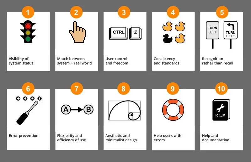
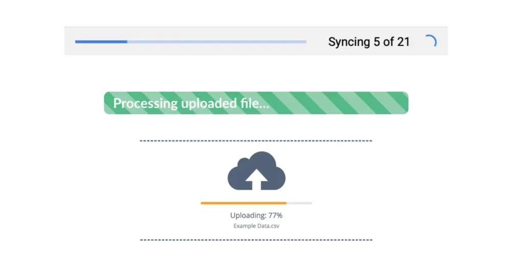
Visibility of system status
The user must always orient himself and understand well what is happening in the system. Interaction between the user and the system should be as logical and fast as possible.
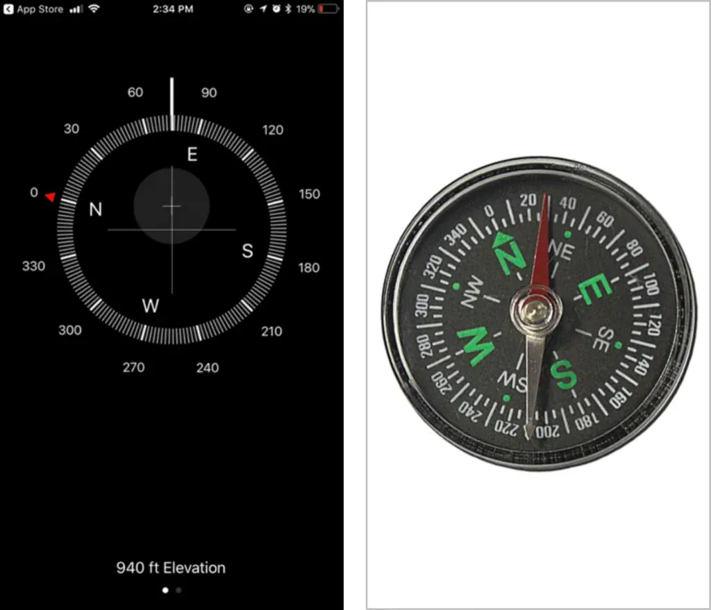
Combining the system and the real world
The system must communicate with the user in a language he understands. Use of words, phrases and concepts familiar to the user in the real world, much better than using specialized terms.
User control and freedom
Give users the ability to undo actions, as well as go back to previously undone actions. Users often select system functions by mistake and need a clearly marked “emergency exit” to exit unwanted state without having to go through an extended dialogue with the system.
Consistency and standards
Users should not have to wonder if different words, situations or actions mean the same thing. Don’t confuse the user by describing the same things with different words and terms. Stick to uniformity and use standard communication elements.

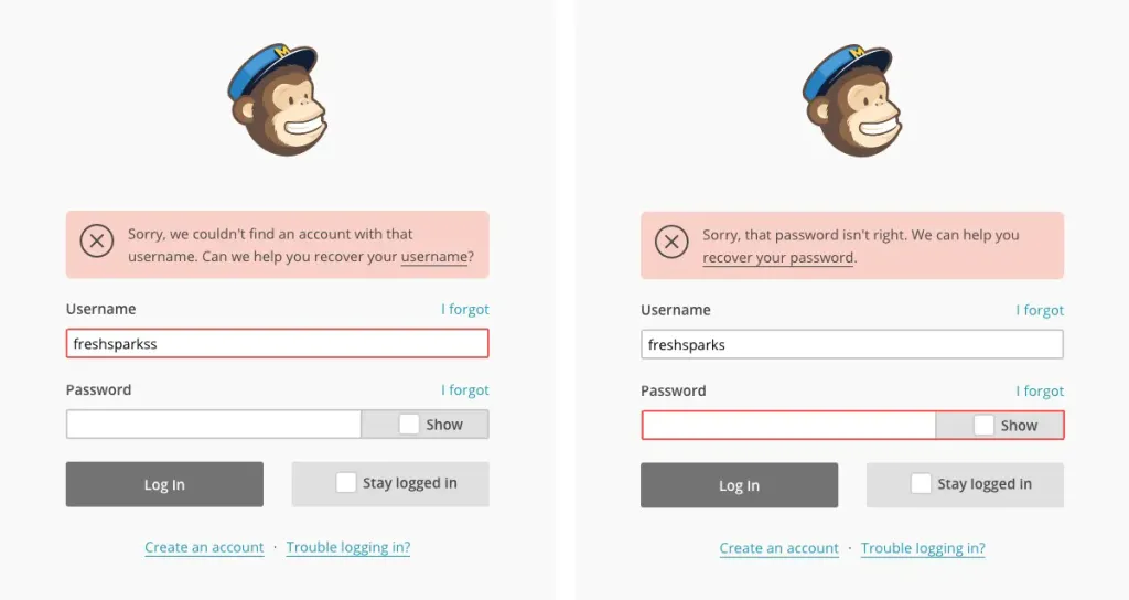
Error warning
Careful design that prevents problems is far better than good error messages. Minimize the number of error-prone conditions or eliminate error-prone conditions in working with the system, or give users the opportunity to confirm before they take an action.
Recognition instead of recall
Don’t force the user to remember a lot of information by making items, actions, and options obvious. The visitor should not keep information in his head, moving from one part of the system to another. Instructions for use systems should be visible or easily accessible as far as possible.
Гнучкість та ефективність використання
Accelerators that are invisible to the novice user can often speed up the interaction for an experienced user. The system should effectively serve both inexperienced and experienced users. Simplify the features that visitors use your site is used most often. Do not overload experienced users with unnecessary information, give them the opportunity to perform frequently repeated actions as quickly and easily as possible.
Aesthetic and minimalist design
Communication with the user should not contain information that is irrelevant or rarely needed. Each additional unit information in the dialogue competes with useful information and reduces its relative visibility. Texts should not contain unnecessary or outdated information. Every extra word worsens the perception and reduces it the probability of finding what the user came to the site for.

Help users recognize, diagnose, and recover from errors
Error messages should be expressed in a language understandable to the user, how to describe the problem as accurately as possible and to offer constructive options for its solution.
Help and documentation
It is great if the system is easy to use without documentation, but there may be a need to provide assistance to users. Any such information should be placed in quick and convenient access, it should be oriented to the user’s task. If necessary, it is worth describing the specific steps to be performed, they should not be time-consuming.
Such documents should be compiled in such a way that it is easy to find the necessary information in them.