How to use emotions in UI/UX

If you think of yourself as a logical and rational person, you are only half right. This idea is confirmed by Peter, who bought a piano because it looks like the one his grandfather had; and Janice, who bought the chocolate because of its attractive wrapper. Maybe there are people around you who make decisions based on emotions? We are sure that you are now in the affirmative nod your head
People are often driven by emotions and logic only occasionally dominates. And if you believe Herbert Simon, an American scientist and Nobel laureate, most people’s everyday decisions are not only influenced by emotions, but completely are determined by them. Is it bad? Not at all.
Despite the significant role that emotions play in decision-making, no one has canceled the cognitive functions of the brain. They are always ready to learn and understand the world, as well as to weigh all the pros and cons.
But in this article, we will focus on emotional reactions, because they can help designers create a better user experience experience and establish lasting connections with the audience. Next, you will learn how to master emotional design and how to use it emotional responses to drive customers to action. So fasten your seat belts and let’s go!
Let’s start with the basics: what is emotional design
Before delving into this topic, let’s understand what emotional design is. Basically, this is the concept of creating such a design, which causes emotions: positive and negative. It’s not that hard, is it? We move on.
Positive emotions best form customer loyalty and motivate them to take action. But do not underestimate negative emotions. Just think of the goosebumps from horror movies. They can also come in handy, especially when you need to attract to attract attention or interest.
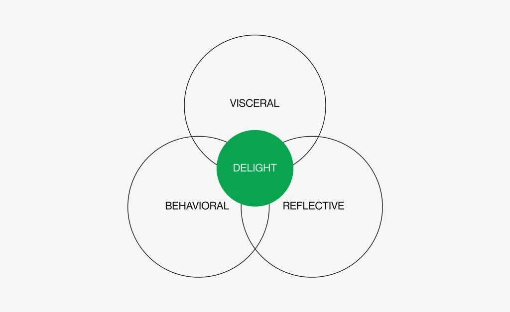
The main thing to remember: people always think, perceive and react. So when you’re designing a website, app, or whatever, appeal to the person’s cognitive responses. Emotional design researcher Don Norman distinguishes the following levels:
-
Visceral. Love at first sight happens right here. If the user’s first encounter with the product was successful, visceral reactions create a positive context for subsequent interactions.
-
Behavioral. This level is responsible for evaluating the usability of the product. How easy is it to find the solution you need? Does the interface look cluttered? Positive behavioral responses are inextricably linked to trust in the product.
-
Рефлексивний. А тут в нас проживають свідомі реакції, коли користувачі аналізують і оцінюють продукт. Це найвищий когнітивний рівень, хоча емоції все ще впливають на нього. Загальне враження формується саме на цьому етапі.
Every cognitive level is important. When they are all satisfied, a lasting emotional connection is created between the audience and the product.
Emotional design in UX/UI: how to use
In this section, we will talk about the most popular ways of applying emotional design in UX/UI. You are ready? Let’s get down to business!
A little humor doesn’t hurt
Humor is a useful tool, especially when you need to engage the user and give him a pleasant experience. Of course, funny jokes and witty remarks will not be appropriate in absolutely all design solutions. But everything must be done with mind, to joke too.
Sometimes even serious sites need a little wit to strike the perfect balance. If used correctly, humor can cause a feeling of joy, encourage users to perform the desired action or simply increase the duration of their stay on the site.
A bad experience is not a judgment
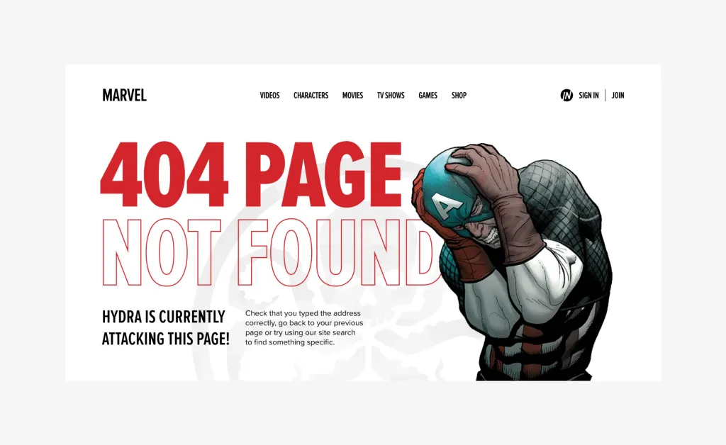
Sites can be frustrating. It’s good that designers can, if not correct, at least mitigate the negative experience. Come up with something that will take the hit. Like Google Chrome’s dinosaur game. Without this creative solution, people would were more indignant about the lack of Internet. And so you can have fun.
404 pages require special design attention. It is so painful to receive a rejection, even if from the site. “No page” or “the service is down” — such messages can spoil anyone’s mood. To prevent this, twist creativity to the full You can also use humor without fear that it will be inappropriate.
Offer users a small reward to reduce tension. It can be a short but useful guide or eBook. You can also post a video or voice message with wishes for a good day. Or add a mascot, which only by its appearance will minimize irritation from a non-working page. By the way, we will talk about them in next section.
Mascot: Add some mimism
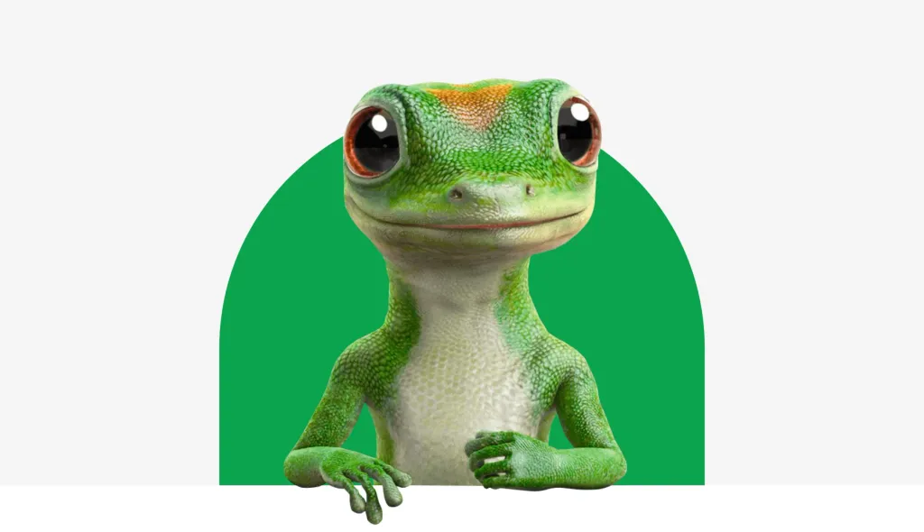
Why do you need that design if it doesn’t have a little kitten, a funny monkey, or a clumsy creature with funny eyes? The question is, of course, rhetorical.
Well, not every design needs a mascot. But it will not be superfluous to think whether a mascot will suit your brand. It engages users in the best possible way and makes their experience more fun and personal. Mascots create a strong connection between the client and the product, evoking sympathy for him. Remember the guys from M&D, Michelin Man, Mr. Clean by Procter & Gamble, Julio Pringles or Geico Gecko. Not only are they cute, but they also give their brands personality and create a positive vibe user response.
Just as you create a mascot, do not ignore modern trends and rules. Avoid any prejudice, esp racial and gender. They are capable of spitting even the cutest talisman.
Microinteractions for a better user experience
When working on a project, don’t forget about microinteractions. They make the design more interactive and personalized.
Microinteractions are such events that provide feedback to the user and improve his experience on the site or in the application interactive Like swipes that eliminate taps, animated buttons, quirky tutorials, emojis and sounds—all that helps the user understand the result of his interaction with the product.
The most obvious example would be Apple, which starts vibrating the screen when the password is entered incorrectly. This microinteraction mimics gestures of a person when he gives up something, creating a strong connection with the user.
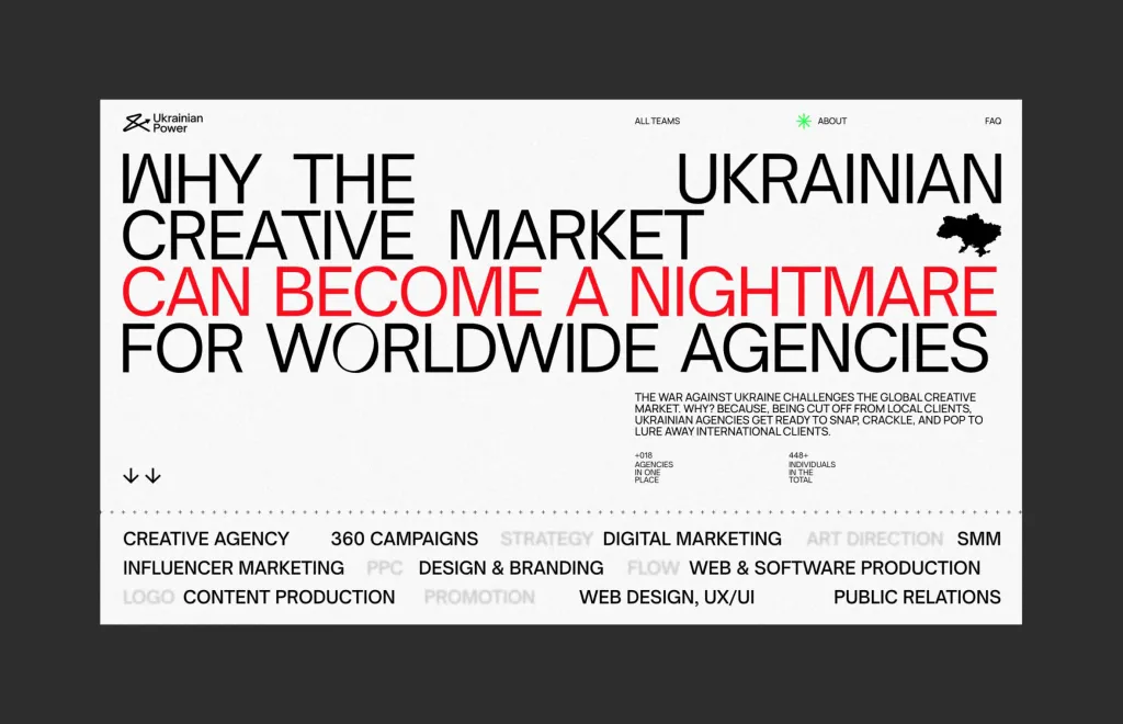
Techniques of emotional design on the example of UkrainianPower
We continue to explore design and emotions, but in this section we will rely on the real case of Lazarev.agency. For your attention, the website of UkrainianPower, an 8-time laureate of the most prestigious design awards, which popularizes the partnership between Ukrainian creative agencies and global companies.
After the full-scale Russian invasion of Ukraine, the creators lost many local clients, because businesses began to close and cut costs. Ukrainian agencies had no other choice but to enter the world market in search new sources of income.
To encourage international companies to partner with Ukrainians, the Lazarev.agency team developed a site that successfully emotions and ratio. In the following sections, we will delve deeper into the strategy of emotional design, analyzing the case of UkrainianPower.
Storytelling: how to tell a compelling story
Once a vile, terrorist country called Russia invaded small but brave Ukraine. Russia planned to occupy Ukraine in three days, but it didn’t happen as expected. The Ukrainian people rose up against the invaders, defending their lands and dignity and will
Creative people were among those who are ready to do everything possible to help Ukraine, contribute to the needs of the army and bring closer victory But due to the Russian invasion, the situation on the market from a financial point of view was not the best. That is why it was created UkrainianPower website, with one clear goal — to help Ukrainian creative agencies to enter new markets and demonstrate its expertise from the most advantageous sides.
As you can see, the idea of this site is based on a terrible but motivational story about brave people who chose to fight instead of to give up The site is a narrative that takes the user by the hand from the horror of war to the business stability that is only possible with his active participation. With the help of storytelling, we appeal to the international community on an emotional level and appeal to partnership.
To create an unforgettable brand story, follow a few simple rules:
-
Enter the conflict. If your story doesn’t have one, you probably aren’t telling a story. Do not over-dramatize. Just think about the problems of your target audience and propose a solution.
-
Structure the story. To achieve this, let your narrative answer three questions: What? So what? Now what? The first part presents the problem while the latter offers solutions and conclusions.
-
Use motivation. The strongest driving desires of a person are: to achieve success; feel safe; to be confident tomorrow; freely choose a lifestyle; avoid stress and health problems.
Storytelling is an effective tool, and our case is proof of that. UkrainianPower was launched at the end of June 2022, and has since gained worldwide acclaim, rocked Cannes and been nominated for FWA, Awwwards and RedDot. More than 10 Ukrainian and international media, including Adweek, wrote about it, and the statistics of visits count 10+ thousand users month.
Colors and emotions: how they are related
Colors can make people feel happy or sad, anxious or relaxed. These reactions have deep roots in human psyche, as well as formed at the cultural level.
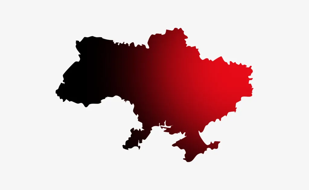
In the UkrainianPower design, we added red accents to the text blocks to convey the emotional motives behind the request Ukrainians to fight. The green palette at the end of the page relieves emotional tension and emphasizes the advantages of partnership between Ukrainian and international agencies.
Use the color palette wisely to effectively convey the brand’s message and lead the user to one or the other reaction and prompt action. For example, pastel shades such as lilac, mint or light blue are good, to soothe and relax. And muted and cold colors can be used to broadcast sadness and grief.
Impress with details
As Leonardo da Vinci once said: “Details make perfection, and perfection is not a detail.” Who are we to argue with Leo?
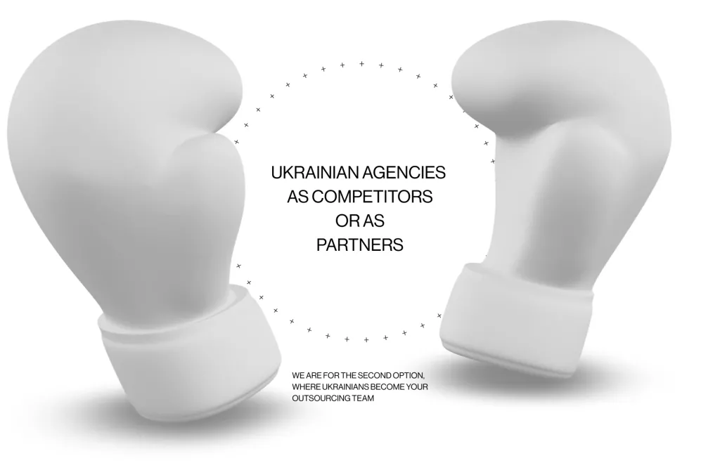
Returning to the case of UkrainianPower, we put a significant emphasis on details to provide a more personal and interactive user experience. For example, added hover effects on reward blocks for a playful vibe. So interactive feature attracts people and increases the length of stay on the site.
Lazarev.agency designers added animated circles with 3D elements. This solution forces users to stop and choose whether they want to see Ukrainian agencies as their competitors or equal partners. We introduced a blur effect to emphasize that the desire for partnership is the main goal of this site.
Another thing that emphasizes emotional stress is the font. In our design, it is quite sharp and straight. Besides his the density on the layout is high, which indicates stress from the situation. We also do the right accents by using the big one font size and stretching it to the entire site. So it is similar to a cry that emphasizes the despair due to war.
The designers also decided to draw attention to the problem using a broken grid method. It allows you to present content in a new and unusual way, thereby causing interest and focusing attention even on minor details.
Speaking of details, we cannot help but pay attention to the background of the site, which is not pure white, but contains noise. Grainy veil on in the background affects the user’s mood by emphasizing the chaos and destruction caused by the war.
Videos and animations in emotional design
They say a picture is worth a thousand words, and it’s true. However, we would like to add a small but significant remark. The effect of the image can be doubled by making it move. Simply put, motion in design is a fail-safe tool for user engagement and effective information delivery.
In the case of UkrainianPower, we needed something that would instantly grab the attention of site visitors and inform them of the situation in Ukraine. We understood that things like the occupation of a foreign country, the killing of civilians and the destruction of cities are difficult to understand to civilized people who live in a time when diplomacy decides everything. That’s why we added a powerful video. Not to tell what a terrible war and how much grief it brings, we have shown it.
We also used a video to tell about each of the agencies presented on the site. This is how creative teams were able to broadcast their stories more dynamically and excitingly.
Don’t underestimate the power of motion design. This tool is best for telling stories, describing complex concepts and effectively broadcast brand narratives.
In summary
What a long and informative journey into the world of emotional design! It’s time to sum up.
You can satisfy three cognitive levels with emotional design: visceral, behavioral, and reflective. By paying enough attention to each of them, you can increase the value of the product and create a truly unparalleled interaction with the user.
And remember that emotions are certainly important, but the functionality of the product also plays a significant role.
So before work on emotional reactions, make sure that the design solves the problems of the users and passes the usability test.