UX trends to look out for in 2022
When we move on to the next year of new versions of COVID, new rules of social distancing and permanent updating the rules of work from home, we caught ourselves thinking about what 2022 will look like for UX trends (user). Having more time to think at home, designers from around the world have a unique opportunity come up with innovative products and rebuild existing ones. This year, let’s rebuild with ourselves and understand who we are as designers and what makes us.
https://www.youtube.com/watch?v=YRIHdCJqQOg
Login without password
The average user uses at least 30 applications a month, and it is enough to remember each password difficult task. Often the password must be a combination of numbers, special characters and letters, which complicates it memorization. And when we still forget, it becomes very unpleasant, because we have to go through everything “forgot password” procedure.
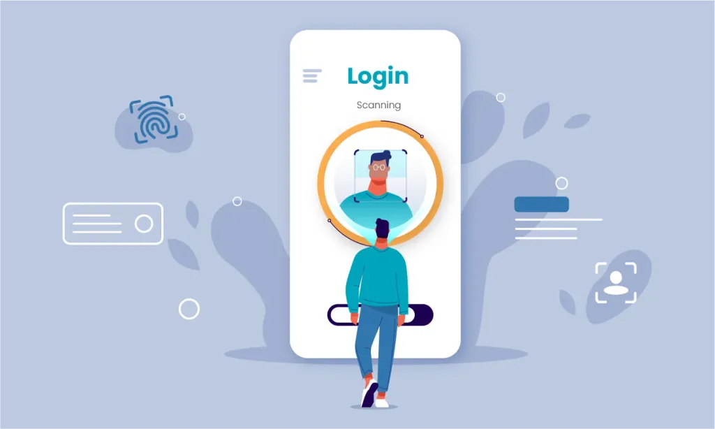
A simple solution is to switch to a “passwordless” login. Passwordless logins work like magic - entrance through your own Google Account, social media accounts, fingerprints, iris scans, or phone unlock templates that are just a few touches away!
Microsoft is an example of a brand that has worked hard to remove passwords. Microsoft Windows 10 Version 2004 introduced a solution called “Windows 10 Hello”, a biometric login system. Users can now log in using fingerprints, iris scans, face scans or patterns.
Biometric authentication is one of the technologies that can cover a security-based approach for both business and for users, which significantly improves user performance. Promising market for biometric authentication provides people identification without the risk of being issued.
Scroll
Scrolling is the interaction of the past; apps and websites are moving fast toward scrolling. In this experience the user sees how each element on the page comes to life thanks to micro-interaction and creative storytelling through action scroll down. No clicks, no selection issues and pop-ups.
Users are no longer interested in seeing a long page filled with information; they want to be part of the narrative - yes just like in the video game. Scrollelling does just that, providing a more exciting way to engage users.
This interaction requires designers not only to create cool visual elements, but also to think about the story we want. share her story and the people we tell her to.
Control of air gestures
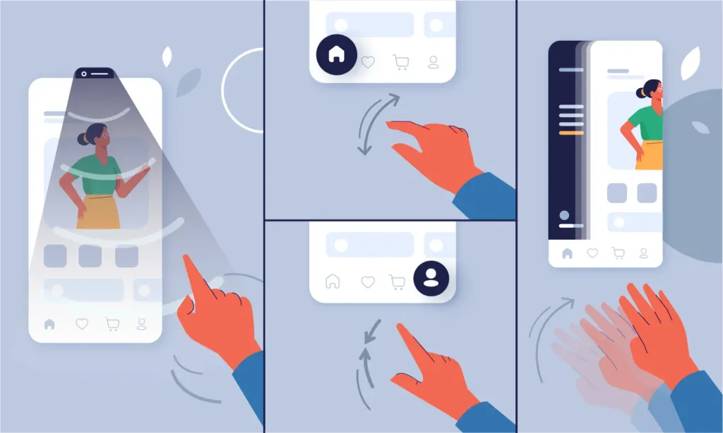
Air Gesture Control is a non-contact mechanism that allows users to control their devices with gestures and air movements. Movements such as waving, pinching, opening your palms, sliding or waving can be used to start various actions. An example of this is the users who show their palms to their mobile phones to open the front camera and take a selfie.
Google Pixel 4 is equipped with motion-responsive radar to facilitate many of these contactless interactions, making its one of a kind device. In 2022, we will see that air gesture control will be integrated into all areas, as contactless interactions continue to gain momentum after the onset of new pandemic options Covid-19.
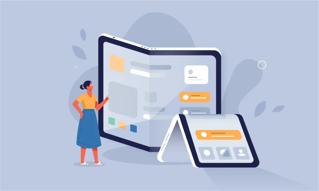
Materials design and engineering for large screens
As people spend more time on their devices than ever before, screen sizes increase dramatically. Companies like Google have begun to adapt and optimize their design systems to meet these new requirements.
This will affect the entire industry as other competitors want to move on the train to compete with Material-based applications. Design. The growing popularity of sophisticated and tablet will mean more designs for all form factors as well layout and sensitivity based on components on different devices. We all know that for mobile and for websites design principles are different. 2022 may be the year of a new era of synchronous design for different screen sizes.
Advanced personalization
Advanced personalization uses emotional and sensory design to fine-tune the technology to suit any need and the desire of the individual user.
Custom UX is a very powerful tool for both designers and companies - we’ve all experienced it because that appears on our Netflix feed, the types of ads we see on Instagram, or related products that appear when browsing Amazon web pages.
Not only in terms of user experience, but when users see personalized options, they are more likely to convert. In a world where every time we open a device or website, we are overwhelmed with options personalization can change what products we choose in our lives.

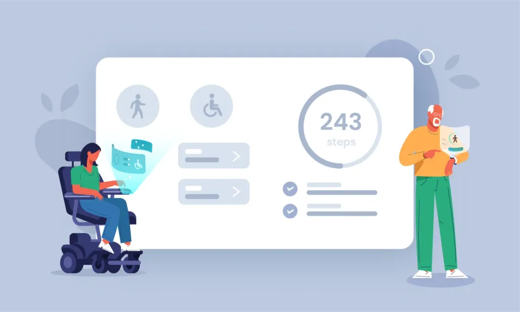
Inclusive design
Inclusive design is widely talked about, especially after the pandemic, and most companies have begun to go online. However, most websites in India do not implement it, as it is assumed that it does not make any commercial sense. The truth is that yes. Attentive and design development for people with disabilities or people who are not so technologically advanced savvy as we are, or people who don’t get into the binary world we’re all used to, it will only expand the business market and in the long run it guarantees a better experience with all users.
Companies like Microsoft now see the potential for inclusiveness. Announcing that they will pay special attention availability in 2022, they are now paving the way. Even Google is aggressively addressing the need for inclusive design. It’s time for us to do the same.
Inclusive design revolves around two basic principles:
- Recognition of bias and exclusion: it is about understanding whose point of view is included in the decision on UX, and whose - excluded.
- Decide for one, expand for many: it is always useful to consider the full range of potential users of the product and design for extreme cases. This ultimately provides accessibility and usability for a wider audience.
Web Content Accessibility Guidelines (WCAG) are a great resource that offers numerous methodologies for creating affordable and inclusive web design. Intercom Messenger is an interesting example because it complies with all the rules WCAG, providing support for screen reading, keyboard navigation and a restrained color palette.
Well-composed text is also an important part of inclusive UX design. For example, it is always better to use neutral forms. Instead of calling their audience “guys”, “gentlemen”, “Miss”. use gender-neutral forms such as “friends”, “users”, etc.
“The right microcopy can create a cult brand and an unforgettable user experience for your customers, as well as improve conversions from 14.79% to 166.66%. “ “Joshua Porter, the father of the microcopy.”
Artificial Intelligence (AI)
Artificial Intelligence (AI) is a term used to describe any intelligence expressed by machines or computerized technology. The potential of artificial intelligence in UX design is quite impressive, especially in such areas as user research and information architecture. AI can be easily programmed to create large numbers frameworks based on our requirements and best practices found on the Internet. This optimizes the design process and helps provide us with solutions much more effectively.
Although AI has a very promising effect, it is useful to remember that behind each AI is the person who programmed it, which means that it is not always neutral or without flaws. Designers need to find a way to get rid of these possible prejudices.
Remote and virtual cooperation
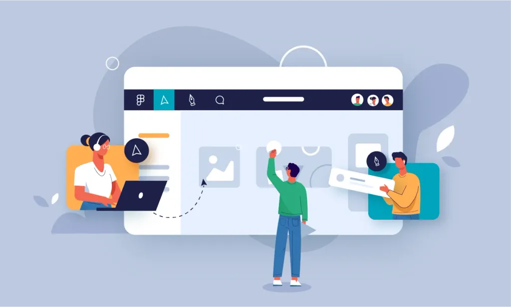
In 2021, we massively introduced remote user surveys, usability testing, and a virtual board. This one is remote the revolution led to the growing popularity of collaborative design tools such as Figma and Miro, which have a short learning curve and allow greater joint iteration.
More table space means a better idea and shorter lead times, which is a huge advantage for the industry; and although some of these remote methodologies still need to be optimized to get rid of inherent biases that would affect results, we see this as a model that will remain here in the long run.
More and more applications are being redesigned to keep up with Figmas and Miros in the world, so virtual collaboration live will only improve over the next few years. Soon the burden of proof will be on “why it is necessary do it in person, if it can be just as effective in a remote environment? ”
The answer to the Metaverse
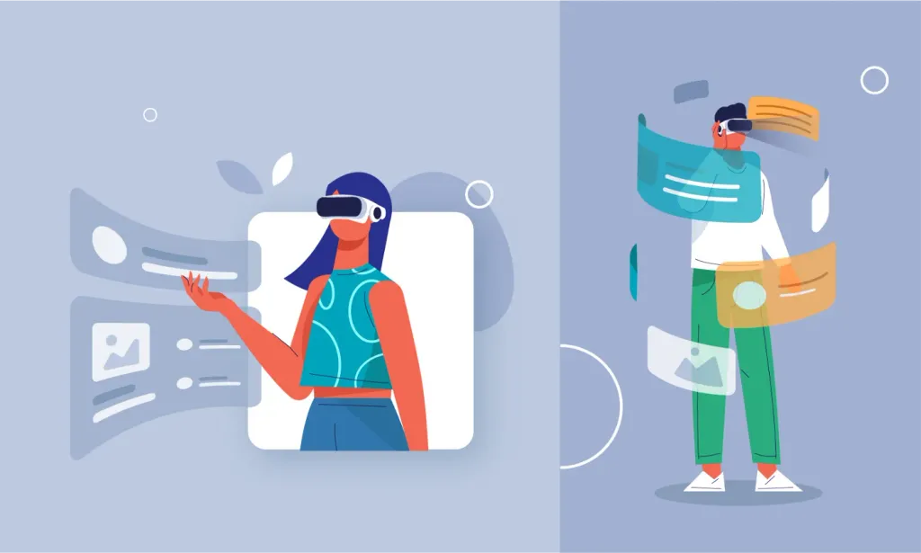
Metaverse is a digital universe created using technological elements such as AR, VR and video, in which live users. A big push for the Metaverse, such as Facebook (now Meta), Microsoft and Roblox, will have a whole a new set of design and research implications for UX; because here the design is more concerned with creating exciting experience, rather than focusing on how quickly the task can be completed. Think of the metaverse as grand the culmination of all these aspects of interaction and interaction.
Although it may be several years before the Meta Universe becomes part of the mainstream, we can be sure that the boundaries between our the digital and physical selves will still be blurred. Avatars will soon be made in the field of AR, VR and AI users, 3D visualizations and other augmented reality features are more accessible, so design innovations products that support this change will have the potential for real impact. As a practicing UX user, the time has come to begin this new era of virtual interaction.
Conclusion
Now that we’ve seen some of the UX (user experience) trends that this new year will bring us, it’s also time It’s time to talk about how UX design will become more and more specialized in the coming years. This will directly affect on UX maturity, which is observed in different organizations - a structured level of UX maturity will become the norm, and integrated UX’s maturity stage is what we will strive for. There will be a sharp shift in the culture of work, not only in where we work, but also in how we work with each other and how we design for our future generations.
