Peculiarities of styles in web design on the example of a water delivery site

Web Design is like fashion: to stay relevant, you need to constantly follow current trends. The very styles in there is a lot of web design. Some are popular for a year, and some have long since become classics. As in fashion, styles are quite cyclical and return after a certain time with new chips.
We decided to consider and compare several styles that have already managed to become trends this year. Let’s analyze their features and appropriateness to demonstrate the product using the example of the main page of the site about ordering water.
We really wanted to reveal this topic in as much detail as possible and lay out everything on the shelves. But we have some difficulties here:web design is not a science and it is very difficult to systematize creativity. Illustrations, for example, existed before our era, and web design has existed only since the 20th century, so perhaps the time for some specific systematization has not yet come, but there is an opinion that it is not will never Therefore, it is necessary to understand that the styles that we will consider are not some generally accepted rule!
To compare different styles, we took the case of designing a water delivery website, namely the main page.
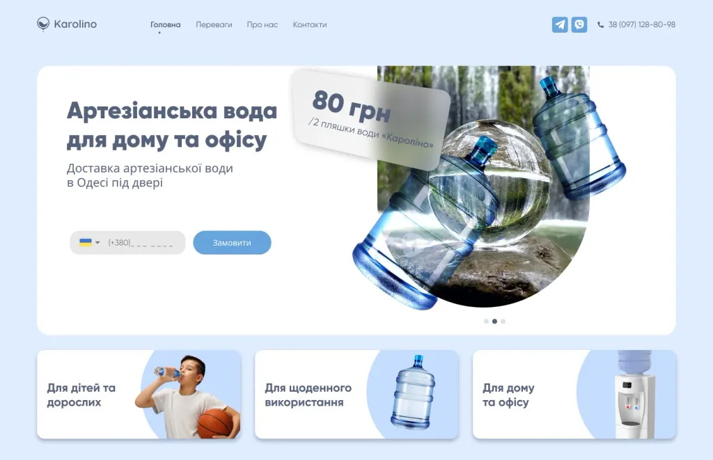
Minimalism
A style that is the easiest to detect, but it is very rarely in its pure form. Most often, this style is mixed with by others As the name implies, minimalism is the use of a small amount of everything: elements, text, colors, etc support simplicity and transparency. Usually, you need to work a lot with the space. In addition, the main feature of minimalism — focusing on the most important content, so there will be a minimum of texts and CTA buttons. The design is based on neutral colors(color has the ability to make a visual accent, but it can also distract the user), simple geometric shapes. One of the main components in minimalist design is negative space – an empty, unoccupied space between elements on the page. It is used to focus the attention of users on the content of the page.
As for fonts: simple grotesque fonts are often used for minimalist design - fonts that lack serifs. Such text looks simple and neat. Big headlines look good in minimalism, they convey meaning well.
Minimalism is very popular in Europe, so finding its representatives on Behance and Dribbble is quite easy. At first sight it may seem that this is a very simple style, but try to make at least one site in the style of minimalism, and stop yourself, when you want to add decorations, for example, a shadow in the buttons.
It is quite difficult to work in the style of minimalism and create a design so that it is not empty, but beautiful. Therefore, in fact, minimalism — not such a simple style.
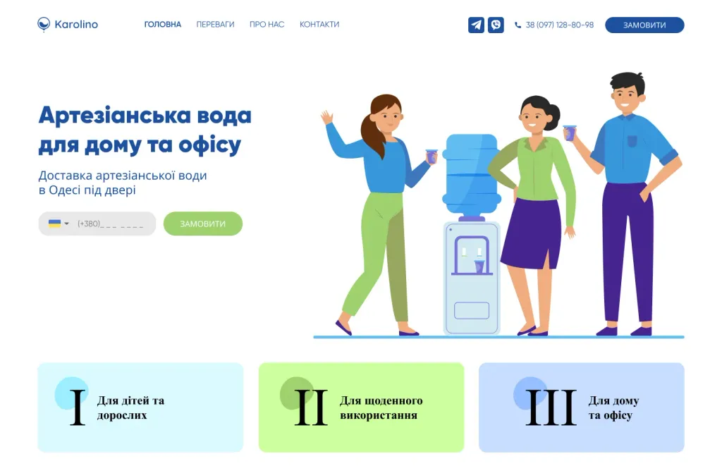
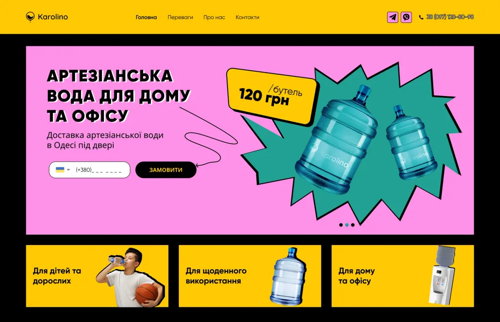
Flat
A style that has been greatly deformed over time. Initially, a flat design was considered as flat as possible, without shadows, gradients, volume Its main feature was a complete disregard for reality: no images and photographs.
Now the flat also has certain rules:
- Two-dimensionality. No volume: shadows, textures, reflections, reflections and 3D images. Flat design = flat design.
- The presence of signs of minimalism. No extra decorations.
- Clear contours. Images in flat design should be simplified, without unnecessary details. Often quite schematic images.
- Contrast. This style does not tolerate gradients. Color transitions add a depth to the design that flats don’t need. It is worth choosing bright or muted colors with maximum contrast.
As for typography, it is often responsible for navigation. So fonts must follow all the rules of flat design As a rule, it is better to choose laconic options without serifs. The main thing is that it should be clear which text is clickable.
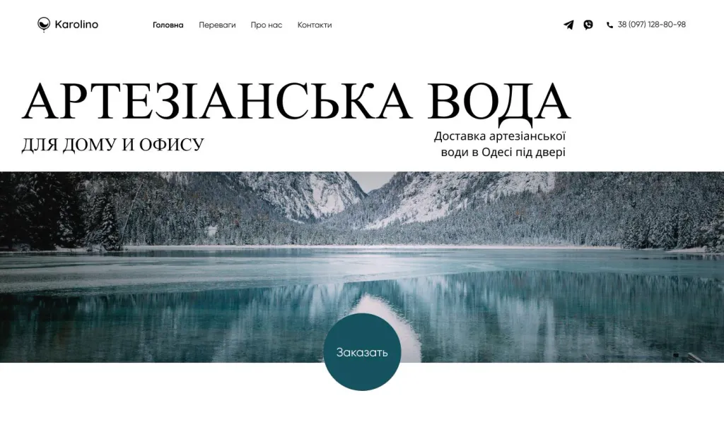
Neo-brutalism
Neo-brutalism comes from the classical roots of brutalism, the architectural movement of the 50s and 70s of the 20th century, when in construction raw materials such as concrete predominated. Brutalism has been gaining momentum in web design since the digital renaissance of in 2014. Primitive HTML with no styles applied, simple backgrounds, asymmetric layouts, standard computer fonts and raw photos - this characterizes digital brutalism. This style is created to be strict, tough.
Let’s consider several main characteristics of brutalism:
- Super high contrast
Neo-brutalism is not afraid of merging pure black (#000000) with other colors. Most people try to avoid this practice other design styles, because by using a more affordable contrast, we don’t want to strain the eyes of our users. In most modern UI styles, it’s popular to “water down” the black with a small amount of accent color — for example, a small amount of red. This helps the color blend better with other shades while avoiding it too much diversity and eye strain.
- Shadows
Instead of soft shadows, hard black rectangles are used under the elements. Instead of typical faint contours – thick, dark and clear outline.
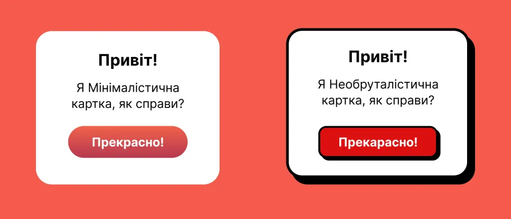
- Colors
A combination of colors as in neo-brutalism would be considered ugly or contradictory in most other styles, e.g. mixing shades of red with blue or green. The main difference is that now these colors also have low saturation. They “fall into the eye”, but do not exaggerate with the contrast.
There is always a primary color and dozens of secondary or accent colors. They are often used in certain sections of the website or programs, for example, to sort categories by color.
- Typography
Typography plays a very important role in this style, but behaves quite conservatively. Although the fonts are a bit fancy, they are presented in such a way as to achieve maximum readability.
- Illustrations
Illustrations usually contain colors that don’t go well together, such as red and blue or red and green Colors are also quite bright, with high contrast and clear contours.
There don’t seem to be any rules here - some lines are thick, some are thinner, and it all looks a bit chaotic.
Swiss style
At the heart of the Swiss style is a design that should be quickly perceived, universal, economical and maximally informative. The style gained its popularity in posters and gradually moved into web design. Currently, the principles of the Swiss style are possible to see in designer online stores, personal sites, longreads and interfaces.
The Swiss style is pragmatic, so there will be no decorative details on the site. All objects have a certain function and highlight content. The elements on the page are systematized, the visual hierarchy is clearly visible — the person’s attention is focused on the content, nothing distracts her.
Consider the main characteristics of this style:
- Modular grid
In Swiss style, all elements on the page are organized and strictly adhere to a modular grid. A large number of “air” in the layout adds visual weight to accents and helps guide the reader’s attention.
- Fonts and typography
In Swiss style, the typeface should help convey the message clearly and distinctly. Therefore, they are usually used grotesque sans serif fonts.
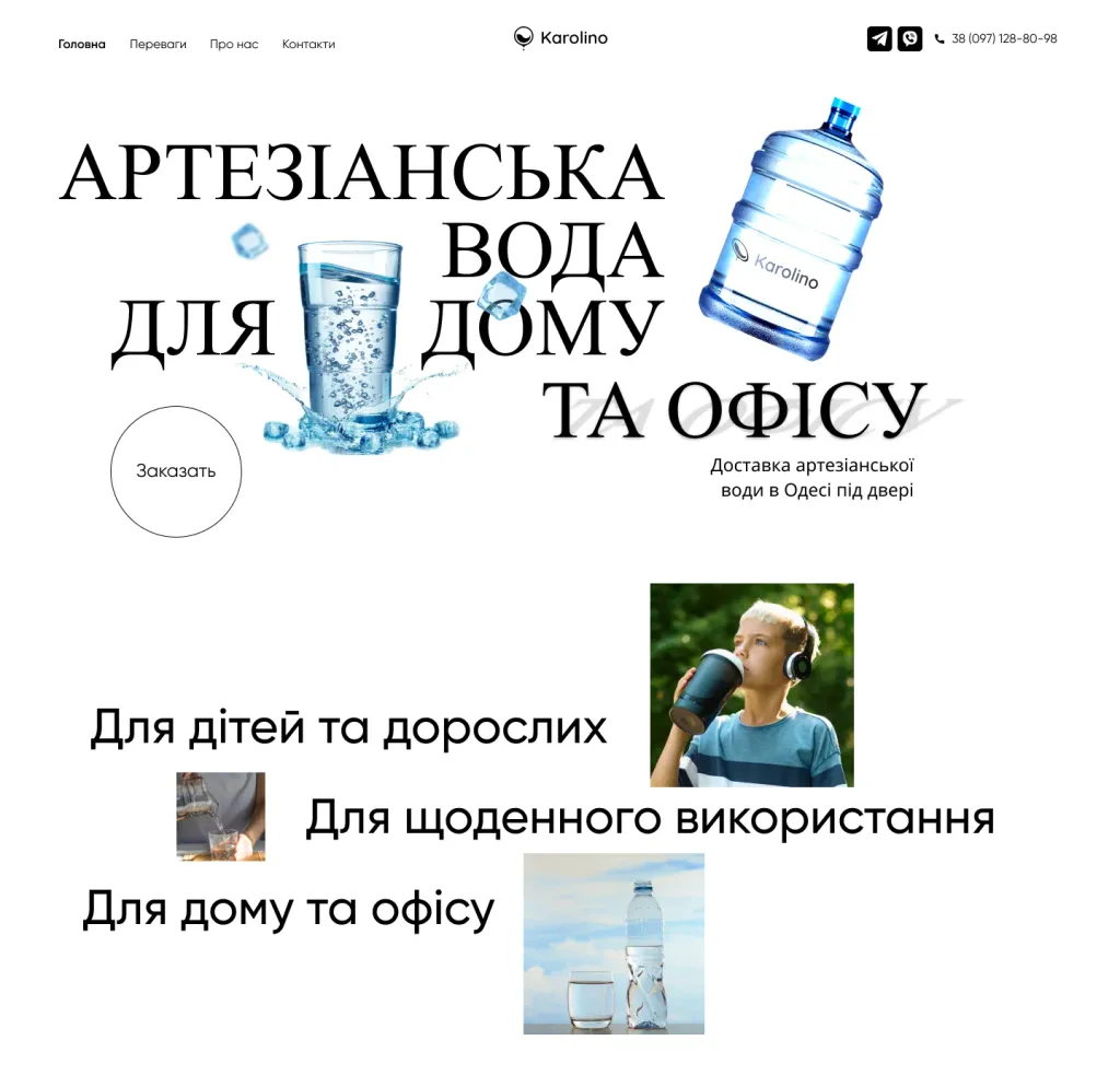
The text on the page has a clear visual gradation: bold heading, subheading, body text. The title has hook the reader to continue reading the main text.
- Photographs and illustrations
As for photos, pictures and illustrations, they should be minimalistic. Complex whimsical drawings do not work, when information needs to be transferred quickly. It is best to use simple abstract forms altogether.
CONCLUSION
Do not forget that it is very rare to find only one style on one site, most likely they are combined there at once several styles. At the same time, there are styles that are very difficult to combine. For example, you are unlikely to be able to match flat and Swiss style. But that doesn’t mean you can’t try and experiment.