Seven principles of icon design.

Creating a high-quality icon family takes a thoughtful approach, a trained eye, a little iteration, and a lot of practice. Below, I’ll illustrate the signs of icon quality using 7 principles and lots of real-world examples. The goal is to show you the key attributes of great icon design.
Clarity
The main purpose of the icon is to quickly convey an idea to the user.
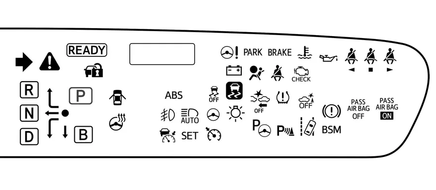
These are the icons on the dashboard of the Toyota Prius Prime. Which of these symbols do you understand? Drivers can learn them over time, but some of these icons are not intuitive. You need guidance to decipher their meaning. This is how they line up for me by level of comprehensibility:
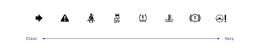
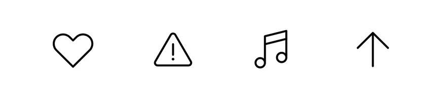
When an icon uses an unfamiliar metaphor, it is difficult to understand. “Seat belt reminder” (3rd from the left) is enough literal and we can understand it quickly. “Power steering signal” (far right) a lot more difficult Often an incomprehensible icon is simply annoying. Misunderstanding of safety indicators when driving vehicles can be dangerous. Here are some of the icons that seem most familiar – love, warning, music and up/forward:
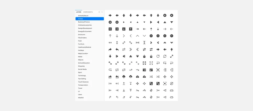
Familiar metaphors from the Phosphor Carbon family of icons The arrow is a powerful symbol for navigation:
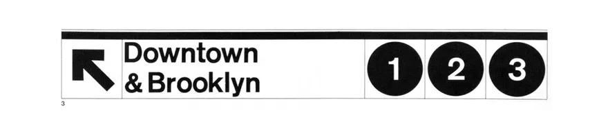
These are New York subway signs The most successful icons are easy to understand not only for a group of people, they are universal for different cultures, ages and knowledge. Study your audience and use metaphors and colors that resonate with them. Remember that a single icon may not be the clearest solution if the idea is too abstract. In this case, add text label to the icon or find an alternative.
Readability
If you have a clear symbol, make sure it’s legible.
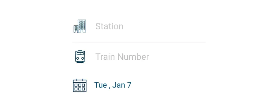
Amtrak mobile app icons The Station icon in the Amtrak app (first line) is hard to see because the details are too small. Transit has a similar problem. Their paperclip folder icon looks like a blob because the space between the folder and clamp is not enough:
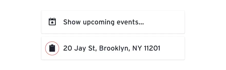
Icons in the Transit mobile application A small adjustment will greatly improve the icons:
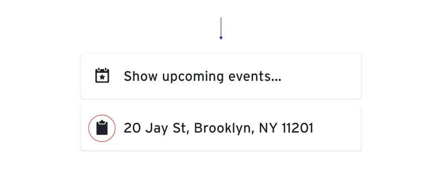
When working with multiple shapes, leave enough space between them. A large number of fine strokes make an icon congested and difficult to read. Google Maps coped with the task perfectly - the icons are easy to read at a very small size:

Alignment
To make sure each icon looks balanced, optically align it.
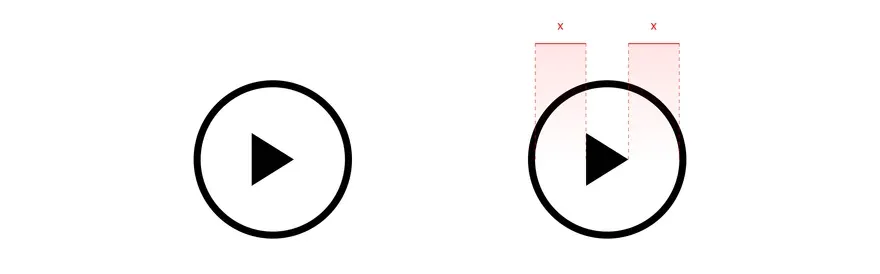
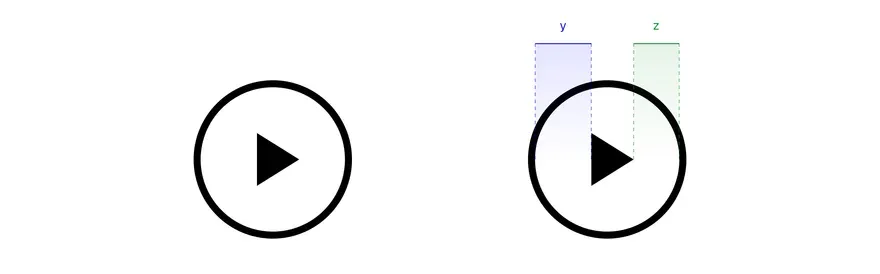
Although in this “Play” icon, the triangle is located in the center of the circle, to our eyes it appears to be offset. Wide part of the triangle appears “heavier” than the dot and shifted to the left. Just as typeface artists fine-tune fonts to create the optical illusion of balance (note the offset points on “i” and “j” and on the protrusion of the letter “O”)
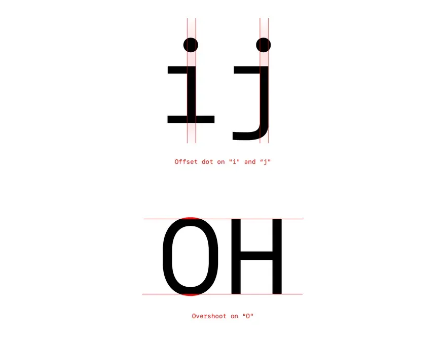
Icon designers make similar adjustments to balance the icon. Let’s move the elements around a bit to fix it above example:
Conclusion: don’t trust the numbers, use your eyes to check your work.
Conciseness
An idea expressed in a few words seems effective and elegant. Material Design illustrates brevity quite well in its system icon guide. Instead of saying:

Say it more simply:

Conciseness is good for icon design because we often work with small canvases. Do not use more details in icons than needed. Striving for reduction and simplification in interfaces emphasizes content and frees up space for content. Telegram icons are concise and pleasant:
Sometimes the interface icons acquire a more illustrative style. Yelp icons are great images of the most popular products food. The shrimp in the icon of Thai cuisine is exquisite:

In the case of adding apps that represent apps, you can add more depth and color. Because the audience understands their context on mobile home screens, docks, and app stores, icons can be more expressive.
Sequence
To achieve harmony in the family of icons, follow the same stylistic rules. Before iOS 13, Apple icons had all kinds of strokes, fills and sizes:
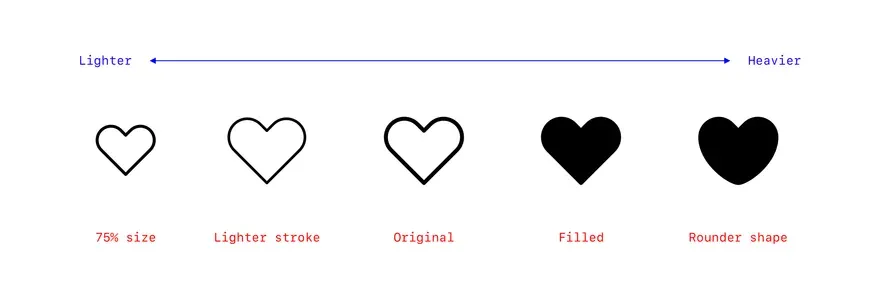
Any icon has a visual weight, which is determined by parameters such as fill, stroke thickness, size and shape. For consistency and consistency, these settings should be the same across the entire icon set.
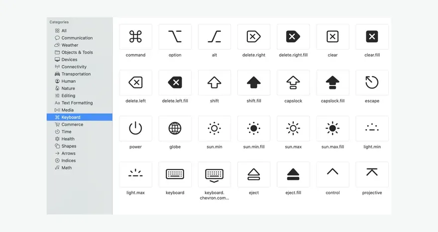
Apple recently released an introduction to SF Symbols, an impressive addition to the San Francisco font. SF Symbols covers graphic icon style in 9 weights and 3 scales (maybe a bit complex, but meticulous guidance). Because of this, the icons seem more harmonious.
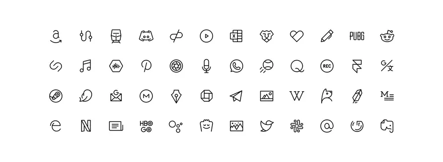
Maintaining consistency is a difficult task for a large family of icons, especially those created by multiple designers. It is very important to have clear principles and rules to follow. The Phosphor icon set, designed by the author of this article and created by her husband, contains over 700 consecutive icons. Although each has a different shape, they have the same weight and look good together:
Individuality
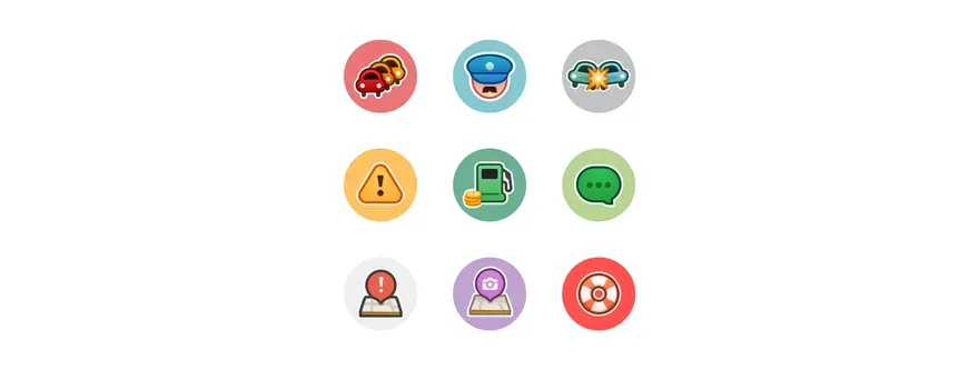
Each icon set has a flavor. What makes it unique? What does it say about the brand? What mood does it create? The Waze interface largely depends on icons. These colorful, concise icons say: We are fancy!
Twitter icons are light and clear:

Sketch icons are sleek and airy:
Freemojis are very cute:
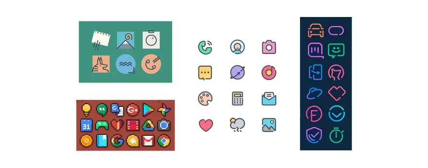
Android icon packs are designed for a wide range of home screen theme moods. Below are abstract, pixel, bubble and neon styles
Ease of use
Creating an icon set doesn’t end when you draw the icons. Their further testing is required. It needs to be it is easy to create new icons so that designers can use them in their projects (for screen, print, etc.), and developers to code them.
A quality icon set that is organized, well documented, and tested in context. Good if it is supported special tools such as icon manager.
Organization
Keep your master file clean, name your assets correctly, and place them in a way that makes them easy to find. Let’s consider the best way to categorize. In alphabetical order? By size? By type?
Technical rules:
- Use a 48x48px canvas
- Use a centered stroke of 1.5px
- Use rounded ends
- Use solid lines, except when broken segments are helpful for understanding
- Use straight segments, perfect curves and 15° angle increments where possible
- If necessary, adjust the curves to follow the design principles
- Use, if possible, the increase of whole, even numbers; reduce to 1px and 0.5px if necessary
- Use the following shape outlines: 28x28px circle, 25x25px square, 28x22px landscape orientation, 22x28px portrait orientation
- Keep a 6px thick trim area