Selection of fonts and font pairs

Selection of fonts
Despite the fact that the task of selecting fonts for a project is somewhat mundane and accompanies the profession of a graphic designer many centuries, there is no simple and universal algorithm for this.
Therefore, in our material we will rather talk about certain rational recommendations that designers can take into account in their work.
The first parameter should be compared directly to the structure — that is, the font type as such. You can also compare the following design parameters:
- contrast,
- dynamics,
- weight,
- width.
At the same time, the openness of the font (that is, the aperture) is a secondary parameter in comparison.
Selection of fonts according to the type of project
Analyzing the classification of fonts, we already paid attention to the fact that all fonts from the very beginning were designed to solve one or another task.
A large part of the fonts were created for the set of large text arrays, and if such fonts are used as intended, they perform their function perfectly.

To some extent, the choice of the main fonts for the project is influenced by where exactly the text will be placed - in a book, in a brochure or Online. On the one hand, here a certain aesthetic aspect is added to the choice (often grotesques are perceived more organically in the modern context), and purely constructive features of fonts.
At the same time, many fonts were designed as headers. Therefore, they work better in an organic context for themselves. When the inscriptions in such fonts consist of 2-3 words, the decorative component helps the font look attractive and interesting.
Conversely, header fonts are poorly perceived as the main font for text. They are simply uncomfortable to read.
Constructive and compositional correspondence of the font to the project
In addition to function, you should often take into account how well the font as a whole fits into the overall composition of your project. After all, to a certain extent, the inscription and each letter in it are compositions in themselves. Accordingly, the form of these compositions is harmonious fit into the overall composition of the project.
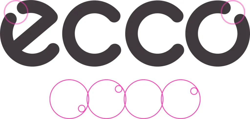
In his “Book about letters from Aa to Yay” Yuriy Gordon suggests the term graphic rhyme.
The essence of graphic rhyme is a simple idea: for a harmonious combination of compositional elements, their individual constructive ones features must match.
As one example of such a rhyme, Gordon cites the ecco trademark font: in it, on the one hand, all the letters have a rounded shape, and therefore are balanced, and on the other hand, a mirror decorative technique is used - the break of the stroke in the letters “e” and “o”.
This is an example of a rhyme within an inscription. But the designer should also, when choosing a font for the project, take into account how its thickness, the size or slope of the diagonal strokes is matched with the surrounding elements of the composition.
For example, you can match the thickness of the main strokes of the letters in the menu inscriptions with the icons next to these inscriptions.
Context in fonts
The functional purpose of fonts and compositional compatibility are important components of a successful font selection. But both these components are rather formal. It is also useful to consider the context in which the fonts are used.
In fact, fonts have several such contexts. In particular:
- historical context,
- industry context,
- emotional context.
Let’s get to know each of them.
Historical context
The historical context is the correspondence of the project’s fonts to one or another historical epoch. Indeed, in certain historical periods some fonts gained considerable popularity and were therefore used for printed products, advertising posters and signs.
Because of this, they became as much a component of the visual attributes of the era as architecture, art or clothing.
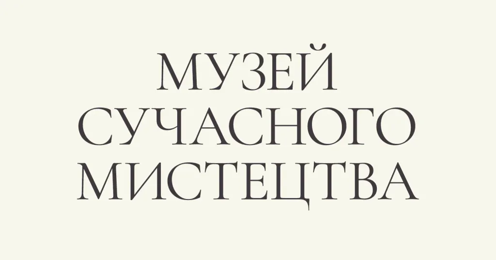
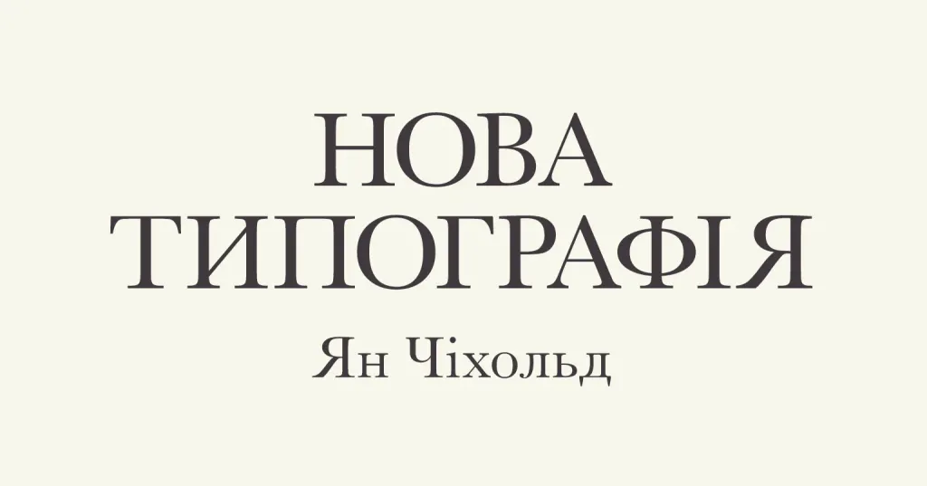
It seems quite logical that if the historical context is important in your project (for example, the project is a book, a poster or a presentation related to New York in the 1930s or the Middle Ages), the use of appropriate fonts in the project will help give it additional aesthetic relevance to the era.
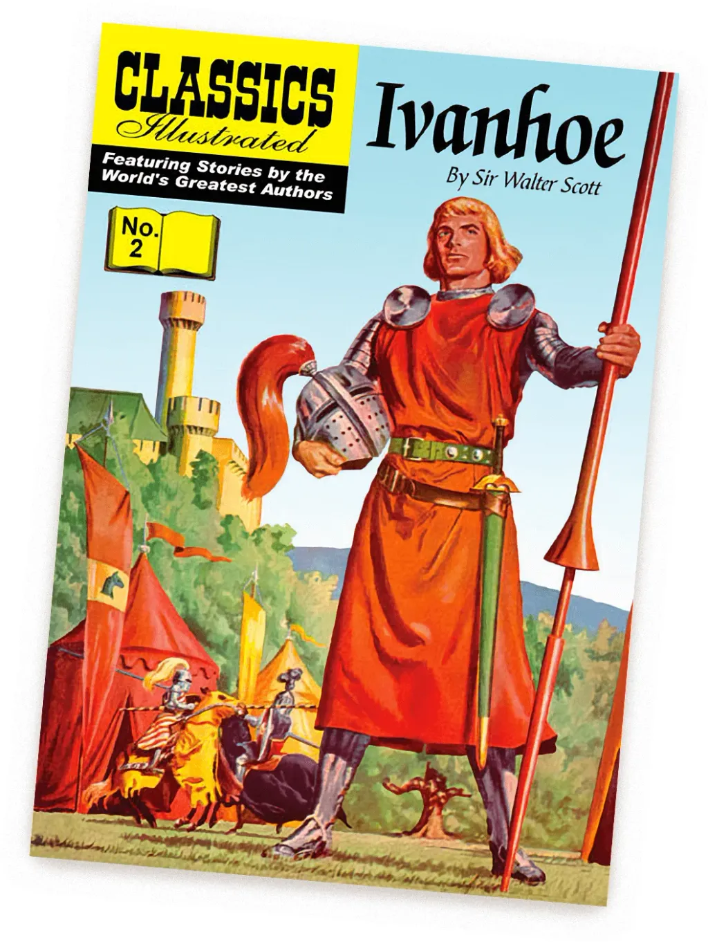
For example, on this cover of Sir Walter Scott’s book, the name “Ivanhoe” is written in the style of Gothic calligraphy characteristic of for the Middle Ages, and therefore it looks organic in the appropriate visual context.
Conversely, if we write a text about Ancient Greece in a modern font without serrations, we will get a feeling of a certain dissonance.
Industry context
We especially note this context in the logos. We have already noted earlier that fonts themselves are carriers of certain emotions and associations.
Therefore, when certain representatives of the industry begin to select for themselves an essay for a logo, they seek not only to solve the formal task is to write the name of the company, but also to convey an emotional component in this inscription. It often happens that ideas and the emotions of an entire industry eventually combine into a kind of industry aesthetic.
And that is why the logos of many brands of clothing and accessories have many similar features.
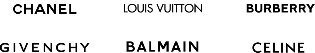
For the most part, fonts in the fashion industry are grotesque. After all, fashion should always be modern, up-to-date, and fonts with notches are more associated with something classic and old. Therefore, they are a rare exception for fashion brands.
But in logos, for which reliance on tradition and history is important, antique fonts are quite characteristic and organic.

Of course, this also works in the reverse order: the inconsistency of fonts with industry aesthetics is often noticeable, even though observers and they cannot always explain it on their own.
Emotional context
Another context is the purely emotional perception of the font.
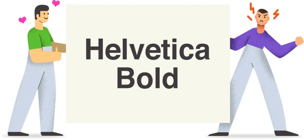
It is rather difficult for us to place it within strict and constructive limits, because the emotions of some fonts may be different in different observers. For example, the font “Helvetica” (Helvetica) will be characterized by some people as modern, simple and elegant, and others as banal, emotionless or omnipresent.
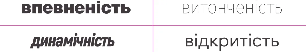
However, emotional context is an integral part of font selection. And it is useful to remember him. To talk about emotional characterization is more reasoned, you can rely on some principles described in the previous material. In particular, the majority of people agree with the proposition that thicker typefaces are generally perceived as more confident, slanted typefaces conveys dynamism, open fonts - openness, etc.
Often, the nature of the font, if the designer ignores the emotional context, is able to make even a serious text the viewer will not take seriously.
Combination of fonts
Often in the projects there is not one, but several fonts, and therefore the question arises, how to choose them harmoniously in relation to each other.
To do this, you can use one of two strategies:
- Try to choose fonts according to the parameters
- Or choose fonts according to the difference in parameters
We considered the font parameters in detail in the previous article of the cycle, so in this material we will simply list them:
- Building
- Contrast
- Weight
- Dynamics
- Width
It is also necessary to pay attention to the structure of the font (that is, look at which group the font belongs to - antique, grotesque, bar, etc.).
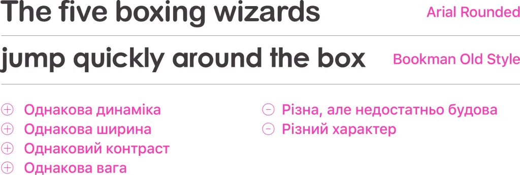
Selection by similarity
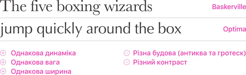
When we select fonts by similarity, it is necessary that at least 3 of the 5 specified parameters match in them.
Selected fonts can be used as follows: antique Baskerville, which looks more decorative against a grotesque background, we we will use it as the font for headings, and Optima for the main text.
Selection by difference
Interestingly, sometimes differences also allow fonts to be combined in harmonious combinations.
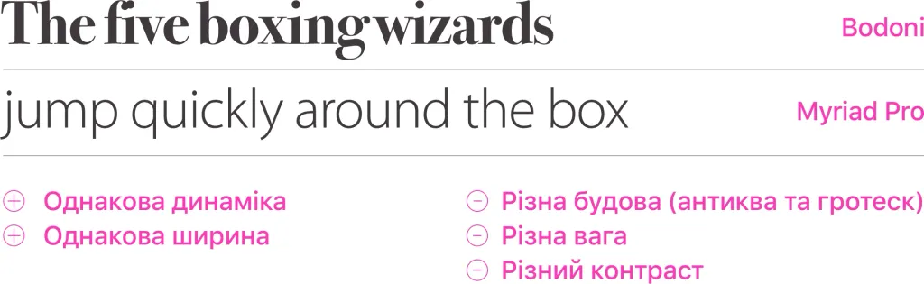
It is worth noting that contexts should also be taken into account here. At least emotional.
After all, if you even choose a font with the same width, weight, dynamics, contrast, but at the same time one of the fonts will have a more pragmatic and constructive outline, and the second - rounding at the ends, which will give it a somewhat frivolous character, such a couple will not be perceived as harmonious.
Of course, none of the described strategies is a strict algorithm, the observance of which guarantees an excellent and always optimal result.
Often, combinations of fonts can seem strange, but still be harmonious. A lot depends on the designer’s personal perception of aesthetics.
Where to download fonts
Many young designers are concerned about where to look for fonts for their own projects.
You can start with the most popular free font catalog platforms:
- Google Fonts
- FontSquirrel
You can find more fonts in paid online catalogs:
- Rentafont
- Adobe Fonts (підписка на Creative Cloud)
- MyFonts
- Fonts.com
It is also useful to look at individual manufacturers of fonts and typefaces:
- Typotheque
- Brownfox
- CommercialType
- Klim Type Foundry
But you should not limit yourself to these lists. As you dive into the topic, you will definitely find even more interesting fonts for your projects
Respect copyright and property rights
Digital fonts are the product of the work of type designers, and that work should be respected. The best way to express such respect — purchase a license to use the font in the project. The cost of such a license can vary from very little amounts (about $20) to several hundred dollars for one typeface.
Often the cost of expenses in the project is significantly limited, and then you can turn to catalogs of free fonts, but also in in this case, you should carefully familiarize yourself with the terms of their use, because often free fonts are not provided for use in commercial projects.
Finally
Finally, it should be noted that all four articles in this series are only an introduction to typography. We do not consider many issues in them. In particular, each group of fonts from the article on classifications could be described in a separate in-depth material. Within this cycle, we almost do not touch on the issues of calligraphy. So, hopefully you won’t limit yourself to these articles and keep exploring typography theme.