Structure of characters in the font

Що таке типографія
The word “typography” comes from the ancient Greek words τύπος - i.e. “print” - and γράφω - “write, draw”. For centuries the essence of this concept was constantly changing, because the methods of creating inscriptions and copying texts were constantly undergoing changes transformations
Moreover, both writing itself and, of course, technologies were changing. People used to write on clay tablets and bark trees, later they began to use papyrus, and even later - paper. And now most of the inscriptions appear on the screens various electronic devices.
At the beginning of the 20th century, the concept of “typography” could mean the art of creating compositions within the given limits sheet area. Today we have to understand it more broadly. We offer the following definition:
Typography is a set of principles and methods of working with text, the application of which makes it possible to create harmonious compositions within the given format.
The task of a designer working with texts is to make their design, on the one hand, aesthetically attractive, and on the other comfortable for perception.
And although at first glance the task seems quite clear, actually learning to achieve this balance is not easy. After all, it is necessary to understand the purely constructive features of the texts, and to learn how to convey through the selected fonts and composition of texts, their emotional, semantic and even historical context.
Of course, it would be naïve to expect you to master the subject of typography by reading just a few articles about it. But we will try explore some general principles, important concepts of typography and find answers to a number of important (and interesting) questions.
For example: in the image below, we wrote three words in three very different fonts. The left word is written in Helvetica font, the word in the center is the work of a calligrapher, and the word on the right is almost a puzzle. But you’ll still read all three!

Have you ever wondered how it turns out that, no matter how diverse in form the inscriptions are, we still read them?
About graphemes
Actually, the secret is to focus not on the differences, but on the similarities.
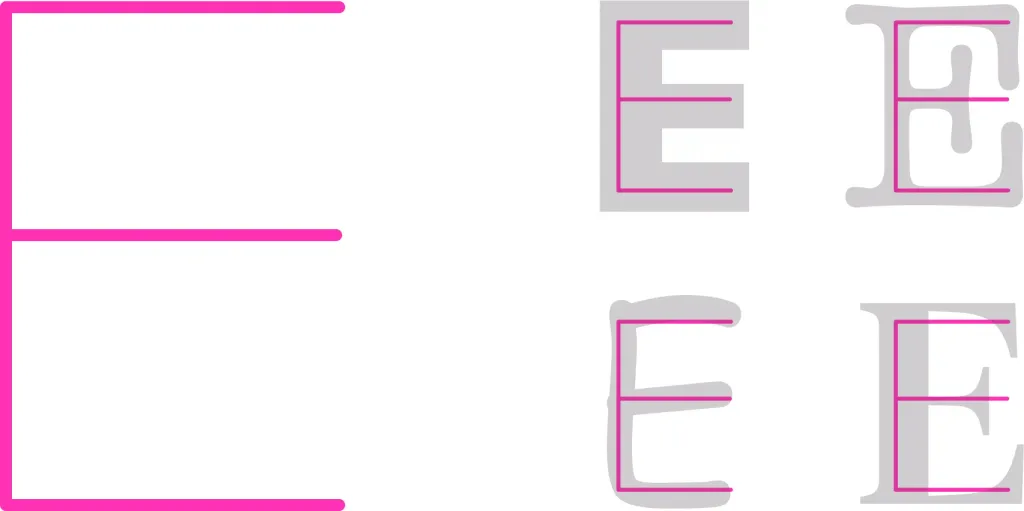
After all, really, no matter how diverse the fonts are, no matter how different our and your individual handwritings are, the structure letters always rests on the same foundation, a kind of skeleton, essay.
For example, no matter what the final embodiment of the capital letter “E” is, at its base there is one vertical line and three horizontal ones.
Individual writing symbols endowed with these individual features are also called graphemes. This word comes from the Greek word γράφω (pronounced “grapho”), which translates as “write”, “draw” or “describe”.
A grapheme is a unit of writing (letter, character, or syllable) separated from the final form or style.
Specific stylistic features of a letter arise when it is written by a calligrapher or even just an ordinary person. After all, one thing different people write the same word differently.
But in printed or digital words, the individual features of letter patterns are usually associated with belonging to one or another font.
About fonts
The word font comes from the German word schrift, which, in turn, comes from another German word - schreiben, i.e. “record, write”.
Today, under this word we understand a set of letters, punctuation marks, numbers, mathematical and special symbols that have common features and design features.

When we say the word “font”, we often mean a digital file that we can download to a computer.
But earlier (and not so long ago), fonts existed in the form of physical sets, from which, as if from a constructor, assembled impression for creating printed products.

Each font had a unique character structure, often corresponding to the era in which it appeared, as well as the author’s handwriting. Many of the classic typefaces found in digital collections today bear the name of their creator. For example, a group of fonts Garamon was created in the sixteenth century by the Parisian printer Claude Garamon. Baskerville font in the eighteenth century created by the English printer John Baskerville. The Dido font was created by François-Ambroise Dido, also in the eighteenth century.
Each letter was first designed and created in the form of drawings, and later cast from metal. Workshops, where fonts were made, and because of the process of creating letters, they were also called word-casting.
A set of ready-made fonts could be a bulky cabinet with a large number of tables, in each of which sets were stored characters of a certain size.
Today, such sets are almost no longer used. But modern typographic terminology has inherited many concepts from era when fonts still existed in the form of such sets.
So, for example, even today we can often hear the word pin in the context of the font.
Kegel (you can also write “kegel”)
The word “kegel” comes from the German word Kegel, which literally means a cone or a cone-shaped object.
In typography, a kegel is essentially a font size. Any symbol is within the conventional rectangle — on the cone site Now it is conditional, but once it was quite real.

Each letter “stands” on the so-called base line. It is invisible, but it is on it that words are written. In some letters (for example, the string letter “y”) has elements located below this line. And some letters have a height slightly greater than in other letters - for example, in the capital letter “Y” after two dots. So there was extra space on the pin under and above the letter letter So when we talk about font size, we don’t mean “size” of the letters, but rather “size of the pin”.
This size was measured in points.
A point is the font size in millimeters multiplied by a factor of 0.3759. Such a standard was proposed by a representative of Paris of a publishing dynasty named François-Ambroise Didot, it was based on the French foot, equal to 0.37593 m.
Fonts with a size of 3 to 12 points are called text fonts. Fonts from 14 to 64 points are heading fonts. And all sizes more than 72 points — posters.
By the way, different sizes of fonts corresponded not only to numerical values, but also to names. For example, a font size of 7 points also called a minion, a font size of 12 points is Cicero, and 16 points is a third.

Structure of characters in the font
In order for us to perceive symbols in fonts as part of a general system, they must contain a number of common and constructive features features. In particular, they can be associated with individual elements of the font design. Let’s try now deal with them.
Strokes form the basis of the structure of part of the letters.
They can be:
- vertical (they are also often called stems),
- diagonal (as well as reverse diagonal),
- horizontal (they are also called crossbars, and often they are less thick than the main strokes).

Other important concepts of font structure
But not all letters can be built using purely straight lines.
Some letters can contain ovals, semi-ovals, loops and unique combinations, such as the back is the stroke from which it is built Latin s.
And the letters have their own arms, legs and tail. Just like in the old cartoon.
In general, many components of fonts have their own names. For convenience, we depicted them on a general diagram.
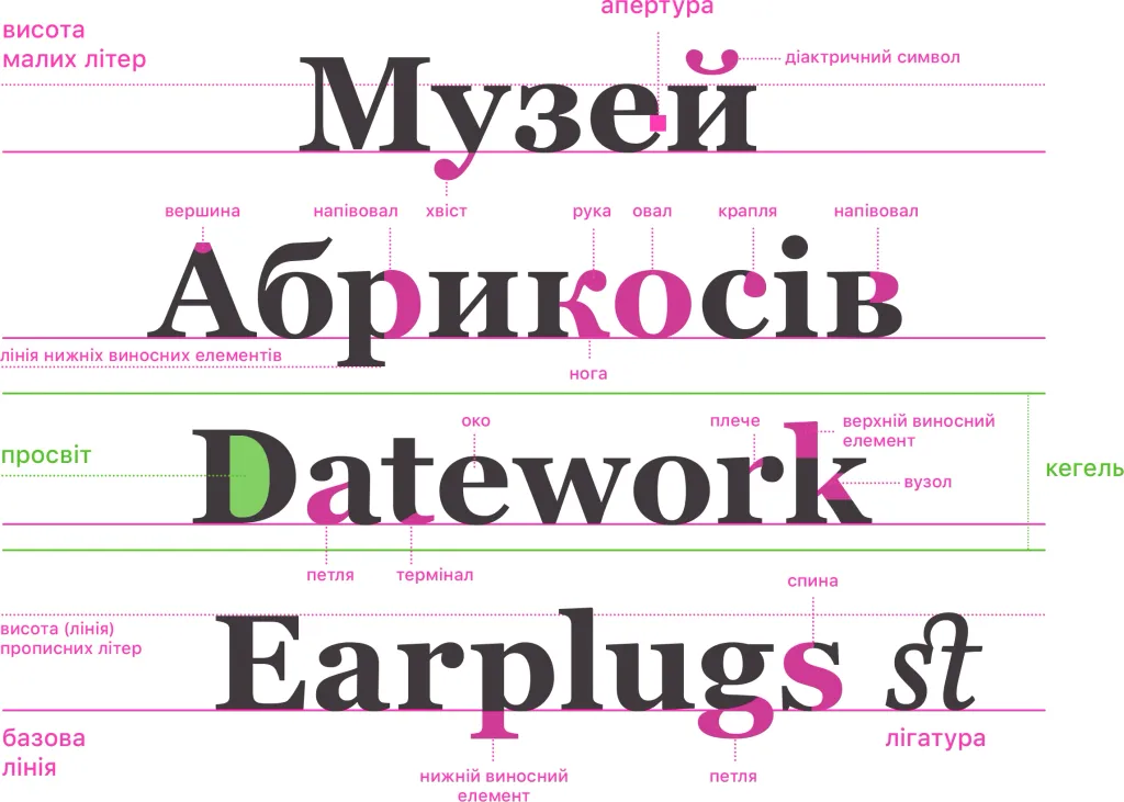
In addition to the baseline on which the words “stand”, there are also:
- the line of lower outriggers,
- the height of small (line) letters is an imaginary line that defines the upper limit of line letters,
- the height of uppercase letters is an imaginary line that defines the upper limit of uppercase letters and some upper floating elements
- lowercase letters.
The parts of the letters that are lowered below the base line are called the lower floating element, and the upper floating element - those that are protrude above the height line of small signs.
Some letters have internal holes, they are called gaps. And small holes, as in the letters “e”, “v” or “a” are also called eyes
There are a few more specific terms that are also useful to know:
- aperture — means the degree of openness of the entry gap into the open internal lumen of the letter,
- the terminal is the end of any stroke that does not have a notch,
- a ligature is two or more letters combined into one symbol; ligatures mostly had a decorative value.
Notches
A special structural element in the structure of fonts is the so-called notches. They are extremely important for learning fonts.
Notches are elements at the ends of vertical and horizontal strokes. They have been an integral part of fonts historically. They can be seen even on the first Romanesque Mayuscule fonts, which were used to carve inscriptions on monuments of Roman architecture empire

They appeared there due to a technological process: when carving the inscriptions on the stone, first narrow strips under the main strokes, and only then, the completion of the letters. Without these notches, it was impossible to avoid cracking on the stone at the ends these letters.
It is interesting that notches were also a component of letters and when writing with a pen.

Here they were also the result of a technical process. With the help of notches at the ends of letters, scribes avoided additional movements, because of which the ink accumulated at the end of the pen could leave a blot.
In typography, notches appeared in particular because the creators of the first typefaces deliberately tried to imitate the style and aesthetics of handwritten books. For example, the first book — Gutenberg’s Bible — was typed with the so-called texture, variety Gothic writing.

Authors of later fonts borrowed many design features from Roman fonts, which also contained notches.
One of the first widely used typefaces without serifs appeared only around 1816, its author was an English printer named William Kezlon IV. This font was called the “Egyptian font” and was often called grotesque due to its unusual shape. Fonts without serifs are still often called grotesque today.