The magic of black and white in art and design

Everything starts with black and white
The black and white palette is sometimes considered devoid of emotions, limited in expressiveness and even banal. And for nothing. Skillful use of this range can work wonders!
How exactly - we will tell and show further.
Black and white in visual arts
For art, the combination of black and white is of fundamental importance.
Black and white is essentially the basis of any creative work. The artist will begin to paint a picture by drawing dark contours on white canvas, the writer - by printing black letters on it, and the designer will first stage create a light map, which is also black and white.
Two important works of art of the 20th century are also devoid of color. These are “Fountain” by Duchamp and “Black Square” by Malevich.
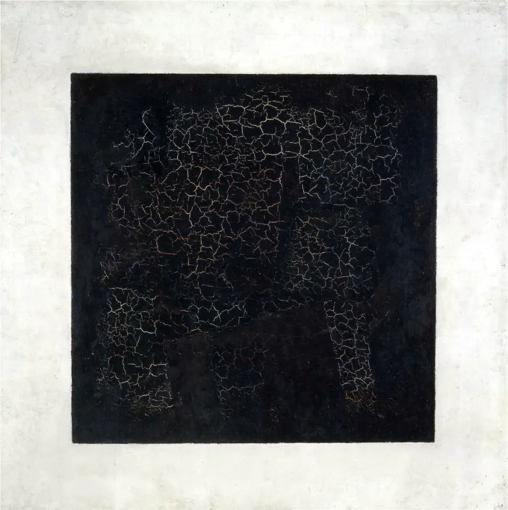
The work of the latter creates many illusions around colors. We see it as a black square on a white background, however, it is not quite so. Malevich’s black color is actually a mix of different colors, and shades of green and pink are skillfully hidden on the white background.
“Black Square” is an example of the direction of “Suprematism”, which means the superiority of color over all other characteristics of painting. It is interesting that the artist focuses on black and white colors. In this work, black absorbs all other colors and suppresses them itself white, as if standing on the obstacle of truth and truth.
Yes, with the help of only these two basic colors, the artist created perhaps the most resonant work in fine art, which gave rise to many theories and interpretations.
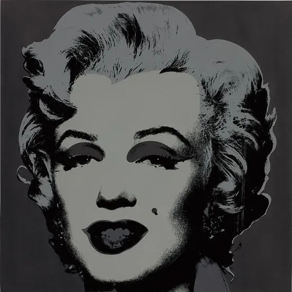
Black and white was also part of pop art artist Andy Warhol’s signature style. And although the recognition of the artist brought his colorful works, black and white paintings by Warhol are also worth attention. For example, in a series of works dedicated to the actress Marilyn Monroe, the artist deliberately uses black and white to emphasize the mysteriousness and distance of the heroine from the audience.
For commercial projects and magazines, Vorgol often had to illustrate women’s shoes. One of his most famous works became “Diamond Shoes” - a black and white illustration covered in diamond dust. In this case, black and white helped to make the emphasis on the shape of the shoes made the image more dynamic and even gave it a certain magical effect.

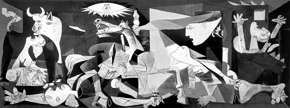
Another iconic black and white work is Guernica by Pablo Picasso. In it, the artist depicts the bombing of Guernica in 1937. In this work, achromatic colors are a tool for depicting drama, cruelty and the dark side of the human soul. In addition, such a choice of colors is dictated by the desire to create the effect of “reportage” and convey the reality of the events in the picture.
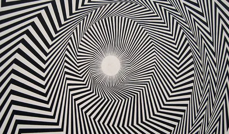
But representatives of the optical art movement (op art) in the 1950s often used black and white images with geometric repeated elements to cause the viewer a feeling of illusion, confusion - a real optical shock from the contrast.
Black and white photos can not only evoke nostalgia
The appearance of color photography in the second half of the 19th century was a breakthrough, and yet, despite many years of technological development and maximum realism, color images were never able to replace black and white.
One of the main reasons we love black and white photos is the nostalgic effect and flashbacks they evoke. A picture taken yesterday can look like it is 70 years old, and this mystery gives it extra beauty.
In addition, the black and white frame leaves a lot of room for imagination and makes the image more dynamic.

Another important advantage of black and white photos is the ability to focus the viewer’s attention on the accents needed by the photographer. On an achromatic image, it is easier to emphasize the main object, details and convey the photographer’s idea. Rejecting color, the artist focuses on light, contrast and form. At the same time, such photos do not seem boring to us, because accordingly to the gestalt law of previous experience, a person is able to reproduce the desired color in his imagination, even if he does not see it physically.
Some modern photographers fundamentally choose achromatic colors for themselves and shoot exclusively in black and white.
Black and white helps to place the right accents in the design
In design, the combination of black and white plays the same role as in photography. This is a good way to emphasize the shape, emphasize font, important details, etc. Also, black and white is ideal for animated typography.

On the other hand, achromaticity is to some extent a guideline for the designer. For example, when creating a logo, it is necessary make sure that it looks no worse in achromatic colors than in colorful ones.
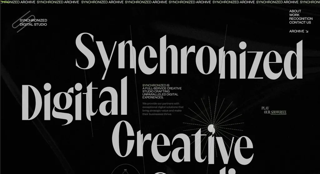
Black and white combinations have captured web design
Recently, black and white design is actively gaining popularity. Sites in this color scheme make up a third of the rating “Website of the Day” according to the version of the Awwwards resource.
The combination of black and white creates the maximum possible contrast, and therefore sites in such colors are stylish and elegant. While the rejection of color forces the web designer to perfectly work out the typography, layouts and grids of the site, so often such websites look particularly harmonious and high-quality.
Brands choose b/w for their products
As for product design, achromatic shades are also winning for him. One of the most famous works in Bauhaus style wall clock by Marianne Brandt is also available in black and white.
Apple is one of the brands that actively uses black, gray and white colors in the design of its products. It helps to stand out details of the devices and highlight their perfect shapes and textures.

A black and white logo will suit brands from different categories
Many big brands choose this combination for their identity and logos. At the same time, black and white is not characteristic only for of any one category. In the logos of Chanel and Louis Vuitton, the choice of color is determined by the desire to emphasize premiumness, refinement and aesthetics. In the logos of sports brands, such as Nike and Adidas, remove unnecessary graphic noise and demonstrate simplicity and minimalism. And in the case of Wikipedia — to focus the observer’s attention on the small elements of the logo.

Black logos are usually characterized as authoritative, sophisticated, classic, luxurious and, depending on the design, minimalistic. This is often influenced by the chosen shade. White is the opposite of black. It symbolizes purity, integrity, innocence and simplicity, so it can convey a feeling of peace and comfort. It is not surprising that white is often chosen as a logo design by charities. It also comes in handy when a company tries to simplify complex ideas.
While the combination of white and black results in a very strong combination.
Moreover, black and white logos look good in any format: from social network iconography to temporary tattoos and printed branded materials.
However, when creating a black-and-white logo, it is worth considering that such colors can make your logo unnoticeable against the background of others, so special attention should be paid to working out the general concept.
Black and white is an eternal classic
Despite the fact that the pair of black and white has always been relevant for visual communications, recently the popularity of this combinations is gaining even more momentum. In the cinematography, in order to convey the necessary meanings and immerse the viewer in history, modern directors are increasingly resorting to achromaticity in their films. Even Wes Anderson, a supporter of bright, colorful scenes also returns to the original sources and experiments with black and white in his latest film, The French Herald. The same it is also observed in pop culture.

So, if you are engaged in visual art, we definitely recommend paying attention to the black and white combination. Does not matter, whether it is an illustration, a logo, a website or a photograph. Sometimes achromaticity can reveal your work from a completely different side and show what was hidden behind colorful colors.