Correct typography = ease of perception of your content
There are many conflicting opinions about best typography practices, and there is no hard and fast set of rules that apply each case. However, there are a few things you can do to make sure the typography supports the content. improves readability, which affects the overall impression of your product.
Here are 10 practical recommendations and tips from Goldweb Solutions that we use in our practice:
1. Use the minimum number of fonts in your design.
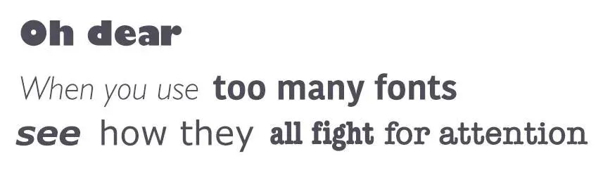
Using more than three fonts at once can make your app/site look overloaded and unacceptable. It is better to limit the number of used font families to a minimum (two is enough, although often enough and one), and stick to the same fonts throughout the project.
Where to start? Start by choosing a font for the main text (body text)
This is a very important decision that will affect the choice of any other font, such as the font for headings. The main text is the most common element of content, so the appearance of the text will have a significant impact on the quality of your design.
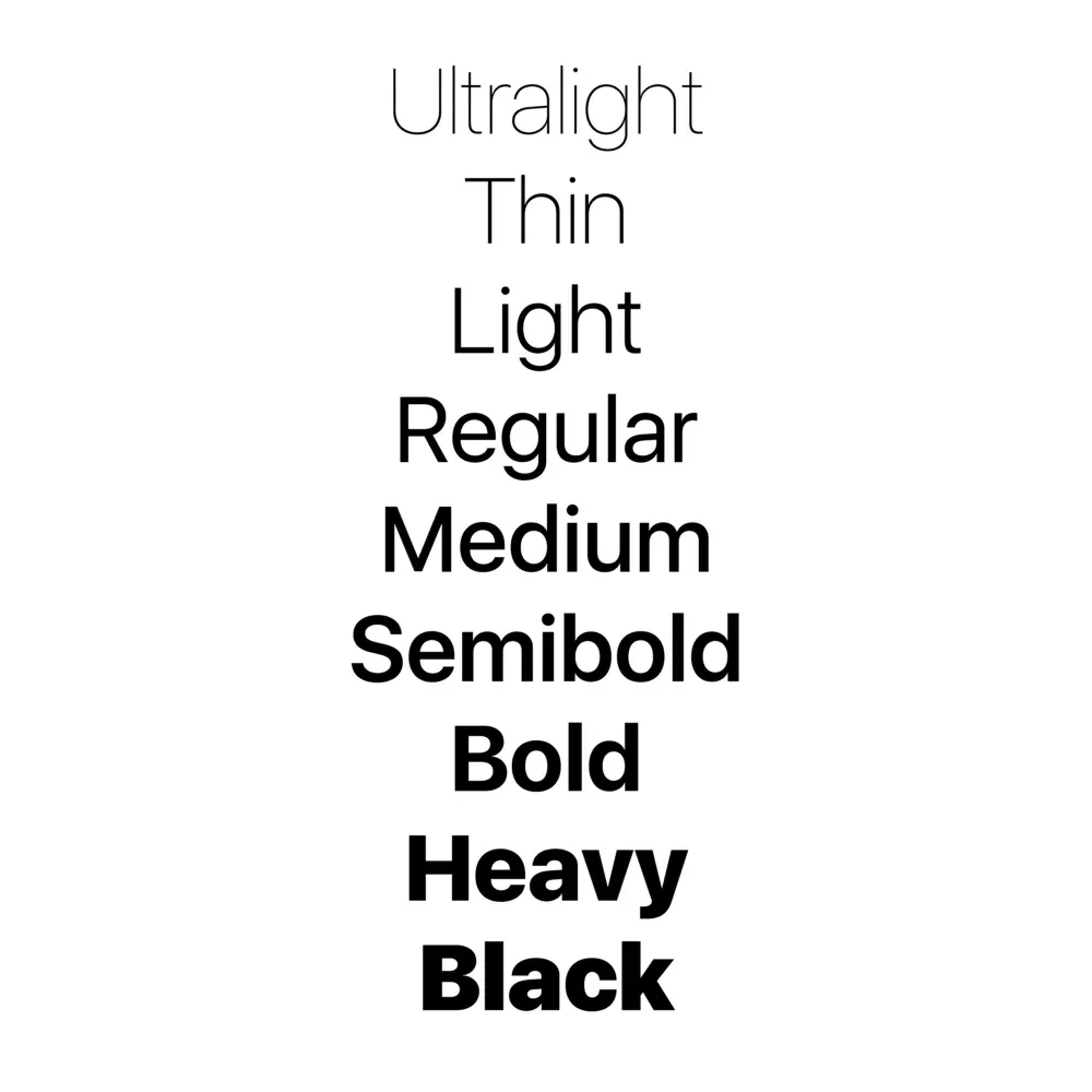
Stick with one font until you get the hang of it
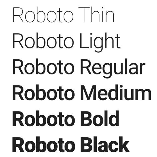
If you’re a beginner, we recommend using one font until you’ve mastered it. Experiment with styles. Modern fonts can be used with many different styles, which means they have commonalities and distinctive features. Fonts with a wider range of styles to help you differentiate text in different contexts, such as buttons or labels. A good example is Apple’s San Francisco font.
Make sure the font families complement each other
If you still want (or need) to use more than one font, make sure the font families complement each other. Take the example of font combinations below. The combination of fonts on the left have similar features that create a harmonious look a couple Now compare the fonts on the right, where the “heavy” weight of the word Impact greatly overshadows its counterpart.

2. Choose the correct font size

The size of your text has a huge impact on the readability and perception of the text on the screen:
-
Text that is too small can make the reader tense up. As a result, users will miss most of what is presented content This is especially true for mobile devices, where a tiny font on a small, bright screen can be the main thing a pain for your users.
-
Too long text can also cause problems. There is a possibility that the large text will distract and take away too much attention to yourself Therefore, you need to build accents correctly.
You should always start with a comfortable font size for your text. Despite the fact that it is impossible to provide a single decision for font size, there are general rules to follow:
-
Text that is too small can make the reader tense up. As a result, users will skip most of the blocks. For desktop version: use 16px font for body text. or higher It is not too big and it is easy to read.
-
For iOS devices: Use a text size of at least 11px. It will be sufficiently readable and legible on a typeface viewing distances on mobile without scaling.
-
For Android: the minimum font size recommended for reading is 12 pixels. for the main text.
Advice.
Choosing a font size can be tricky. But there is a technique that can help you - this is a modular scale. A modular scale is a sequence of values that can be applied to scale text styles harmoniously. You first choose a ratio – for example, the golden mean of 1:1.618 (scale factor). Then you will choose the main one text size, for example, 16 pixels. After that you multiply to get consecutive numbers: 16px, 26px, 42px, 68px, 110px. You can use a tool like Gridlover to determine the correct font size for different scale factors.
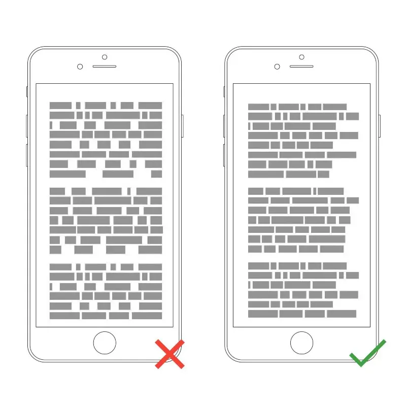
3. Align the text to the left and think about gaps between blocks of text
In the Western world, text is read from top to bottom and from left to right. By aligning the text to the left edge, you make the text simpler for reading The eye can find an edge, and this facilitates perception: a consistent left (vertical) edge helps readers, giving a place for the eye to return to after each horizontal line ends.
It is also important to remember the gap and avoid one word in the last line of the paragraph, the so-called widow 🙂
4. Choose a typeface that works well in different sizes
With the growing popularity of typographic design, the number of fonts to choose from increases every year. Users will use your resource on devices with different screen sizes and resolutions. Because most user interfaces require text elements of different sizes, it’s important to choose a font that looks good works in multiple sizes to provide comfortable reading for a variety of conditions.
It’s important to make sure the font you choose is legible on smaller screens! Try to avoid fonts that use italics, for example, Vivaldi (in the example below): although they are beautiful, they are difficult to read.

5. Use fonts with separate letters
Lightness is a measure of how easy it is to distinguish one letter from another in a given font. However, not all fonts are created with legible letters, specifically “i” and “L” (as seen in the image above). Another common problem reading is poor letter spacing – “r” and “n” can easily become “m”. You need to avoid such fonts because people will have trouble reading them and perceiving the information, especially on small displays.
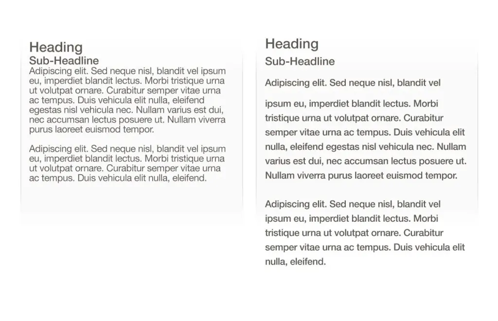
6. Length of lines
Line length is the horizontal size of a block of text. Unfortunately, long lines are one of the most common design problems in Internet. Having the right number of characters in each line is the key to comfortable reading of the text.
The generally accepted ideal readable line length for desktop interfaces is around 60 characters per string including spaces. This line length has a positive effect on reading rhythm. Our brain is stressed every time moving to the next line, so if the line is too long, the user will quickly tire and change his mind about reading what you have to offer.
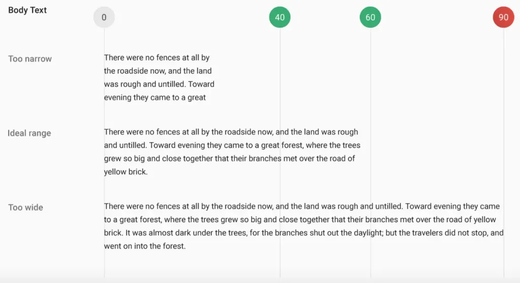
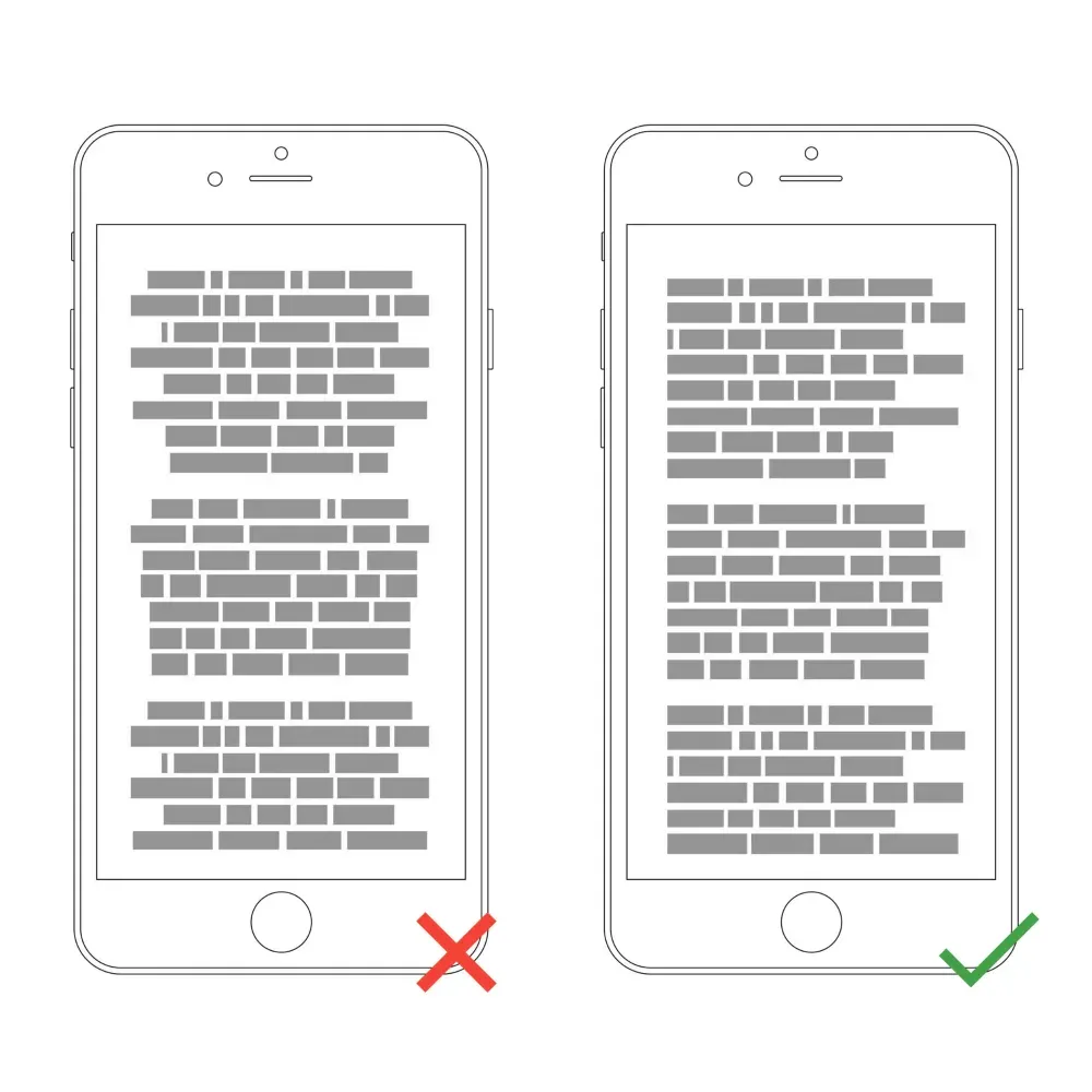
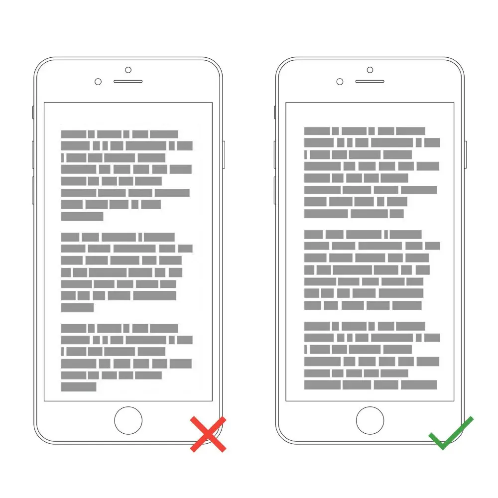
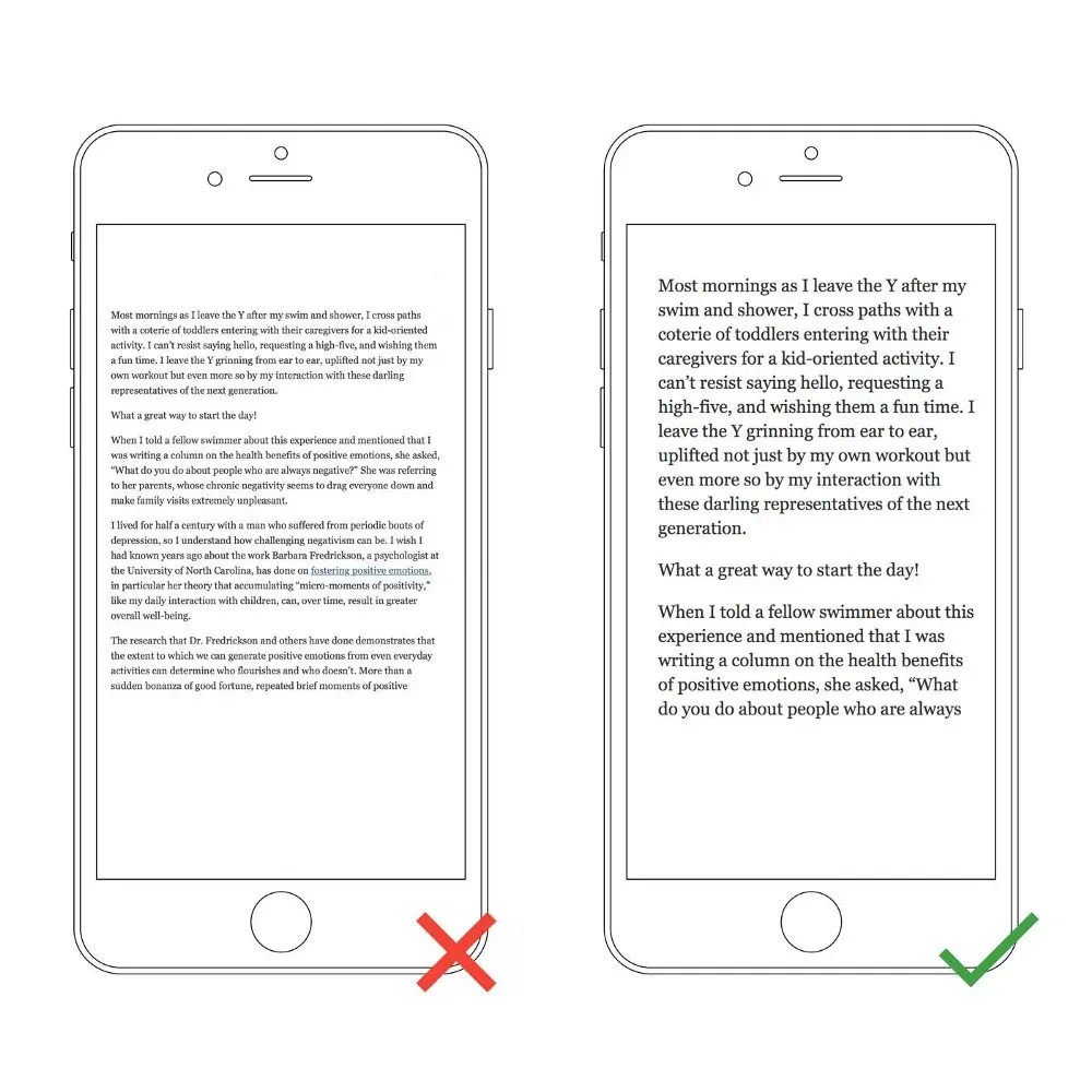
For mobile devices, the line length should be 30-40 characters per line.
Below is an example of two sites viewed on a mobile device. The first uses 50-75 characters per line (the optimal number of characters per line for a desktop computer), and the second uses the optimal figure of 30 to 40 characters.
In web design, you can achieve the optimal number of characters per line by limiting the width of text blocks.
7. Avoid Caps

All Caps Text – Works great in non-readable contexts (like logos), but better avoid any caps when your message involves reading. As Miles Tinker mentioned in his landmark work, “Lightness of typing”, this significantly slows down the speed of scanning and reading compared to typical words. Do not use all CAPS in text blocks longer than one line of text.
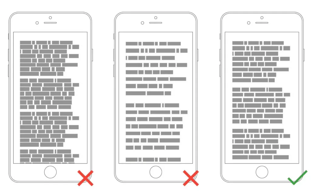
8. Alignment on two sides
Avoid aligning the text to two sides because the spaces between the words will be different and this makes it difficult to read, you lose the ease of reading that users are used to.
For example, you are reading a text from a mobile phone, at that moment someone called you. After the conversation, how would you like to return before reading, with the text aligned to the left, it will be more convenient for you to find the place where you stopped, because your eye will fix the edge text where you left off. If the alignment of the text goes on two sides, it will be much more difficult to do.
9. Do not reduce the space between lines
Too tight / Too much / Just right. After adding the right amount of space for the text (both between the lines and in the margins), you help users interact better with text.
Typography is all about distances. In typography, we have a special term for the space between two lines of text (or line height). In word processing software, this concept is usually called “line spacing”.
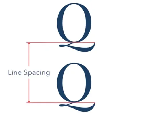
Optimum spacing helps readability. It has been proven that the correct use of white space contributes to the growth of understanding: this gives readers the impression that the text is not too dense and is noticeably easier to read.
10. Make sure your text has enough contrast
You should use color and contrast to help users perceive your text. Contrast is especially important when designing interfaces for mobile devices due to the distraction of the user by screen glare.
Contrast is a tricky thing, and designers often face the following problems:
- They choose a text color that is too similar to the background color. This makes the text difficult to read.

- They create too much contrast between the text and the background. This also causes reading problems. One of the most common problem is light text on dark backgrounds. Forcing users to read white text on a black background for extended periods of time time may tire the user’s eyes.

The WC3 Web Accessibility Guidelines are a good starting point if you want to master color contrast. They set minimum contrast standards so that users with different visual abilities (including humans with moderately low vision) could read your text.

Advice. You can use the contrast tool to quickly see if you’re in the optimal range.
Conclusion
Do not force your users to overwork, and create comfortable texts that you want to read.