How to effectively combine typography and images
Working with type and image, as well as the integration of these two elements, is the foundation and basis of good graphic design. These skills will be needed by specialists in any field: from book graphics to branding.
Methods of effective text and image interaction
At the first stage, you can distinguish 4 key methods of integrating typography with an image: separation, fusion, fragmentation and inversion. Each of them is subordinated to three more methods. All of them have certain properties and help to solve different ones design tasks: from attracting attention to creating a harmonious composition between elements.
The first method is separation
The main thing: typography and images exist separately from each other.
In the case of using this method, the separation principle gives the text and images a clear autonomy (such a separation effect can be achieved, for example, with the help of additional graphic elements).
What are the types of separation?
-
Layers (text and image interact, but are located on different independent layers).
-
Frames (as in web design - a frame is a separate area that contains a certain type of information; there is a clear division into typography area and image area).
-
Masks (the image is limited by a mask that separates it from the font and from the other image).
We use the separation method in order to:
-
Strengthen images with typography or vice versa, contrast them with each other;
-
Organize a hierarchy to simplify perception;
-
Add more content and combine different meanings of text and images;
-
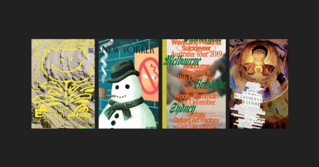
Create a series of works (used in the design of magazine covers, example — The New Yorker).

Другий метод інтеграції тексту та зображення — злиття
The main thing: typography and images are combined into a common structure
The fusion principle uses the power of synthesis and image. It will come in handy when you need to create a complete and harmonious picture.
Merger types:
-
Optical interaction (use of mutual perspective, single optical space by graphics and typography).
-
Merge — common plane (when it is difficult to separate the fonts from the image, penetration and overlap are possible).
-
Merger — general movement (types and images are affected by common forces or laws of physics, or one is a continuation of the movement of the other).
Merge functions in design:
-
Strengthening the conceptual direction;
-
Creating a complex unreal space;
-
Involvement of the viewer to look at a certain subject from an unexpected point of view;
-
Mixing opposite things to create a strong association.


Another effective type of interaction is fragmentation
The main thing: typography and images shift, overlap, destroy each other’s integrity.
The fragmentation principle occurs when text and images violate each other’s state. Elements are often separated, separated or unevenly distributed. During fragmentation, the main role goes to the visual part, and the text part goes to background.
What are the types of fragmentation?
-
Irregularity (elements are scattered, placed chaotically, unevenly).
-
Penetration (the text penetrates the image or one displaces the other).
-
Exaggeration (due to the size and color - the image stands out against the background of the inscription or vice versa. The effect of exaggeration can be achieved by any feature: size, plastic or color).
Using fragmentation will help:
-
Attract attention, make the right accent;
-
Create a feeling of anxiety or chaos;
-
Convey the effect of surrealism;
-
Build a complex message with multiple meanings.


The final type of integration is inversion
The main thing: typography and images change roles
The principle of inversion is a rather specific category of interaction with the exchange of roles. It strengthens the connection between word and image and creates a strong visual union capable of conveying new meanings of the image.
Inversion is divided into the following types of interaction:
-
Realism (possible use of craft, photography or 3D rendering, for example, the image becomes typography, there is a change of roles, graphic visual part = text)
-
Structures (typography is a structural part of an image, so in the case when typography acts as an image, it should remain readable)
-
Typography masks become an opening through which we observe the image
We can work with inversion to:
-
Create an effect of surprise;
-
Show the connection between elements;
-
Give compositions harmony.

