How and why should a designer create illustrations for a brand
Sooner or later, all designers are faced with the creation of illustrations, because through it they seek to establish commercial projects emotional connection with the consumer. In addition, illustration is increasingly becoming a visual design for thematic media. Having received a task, designers sometimes do not know where to start and how to evaluate the result. I want to share mine approach to creating illustrations, to help realize the importance of illustration for brands, and also to talk about cases, which the gang worked on.
Image tool
In the maelstrom of online content, a company’s survival or demise depends on its brand image. The image expresses the main message of the company, creates a connection with users. It should be recognizable in various media, especially on the company’s website and in marketing content.
A strong brand image is an anchor that helps ensure user loyalty and establish value associations.
The impression of the brand consists of various visual elements: logos, color palette, font. Illustration is important a means of visual communication that is increasingly in demand for online interfaces.
Trend techniques
Recently, illustrations are moving away from realism and allow to depict things as the brand imagines them. let’s say the simple technique of including human figures in the illustration helps to tell complex things in a simple way.
Digital design, which contains vectors, is characterized by clear, expressive images that can harmoniously transform into elements of brand identity. These online illustrations are used as part of complex visual systems, not as a one-off design campaign.
Of course, the designer-illustrator must adhere to the general principles used in the identity. Illustrations have be matched by mood or style and scale easily to any medium. They must be legible, understandable, identify with the broader brand image and message.
Illustration comes to life
The boundaries between animation and illustration are disappearing. It is necessary to attract the attention of viewers, therefore the interactivity of images is becoming a trend. Creative technologies open a new perception of art, a new experience of interacting with images. The animation plays more and more a more important role in AR, as an example - magazine covers that come to life through the lens of a smartphone.
There will be pictures again!
In the last century, brand identity consisted mainly of painted inscriptions and logos created by poster artists. At that time, graphic design and illustrations were practically identical.
Over time, global trends changed: graphic design became more functional, abandoned ornamentation, began to weigh to a more candid and minimalist style, which resulted in fewer illustrations overall.
I love that illustration is making a comeback in corporate communications.
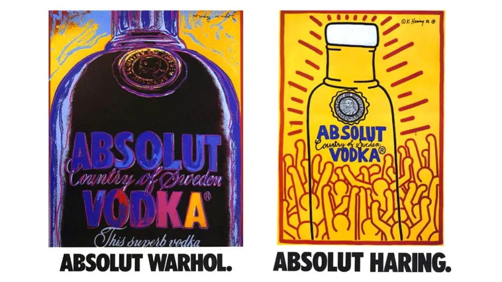
In 1985, the Absolut Vodka company commissioned Andy Warhol to create a poster to advertise its signature bottle.
A textbook case for advertisers is the Absolut vodka campaign by Andy Warhol. The success of the campaign contributed to that Absolut also invited other artists to reimagine the bottle design, including legendary street artist Keith Haring. Absolut commissioned artists to design a limited series of bottles, which later became an annual art competition.

First of all, research
Research the brand you are going to design for. Such a call seems obvious, but don’t underestimate this one stage of work Even if you think you already have practical knowledge, it’s worth taking the time to refresh or deepen your knowledge brand understanding. Learn about the company’s culture, products or services.
Never use stock illustrations.
Negotiate with the people who make decisions about the final look of the brand. Prepare a design session for them, in which you synchronize your views. The design session is a place of communication with the client, the key to further coordination of all people, who are working on the concept.
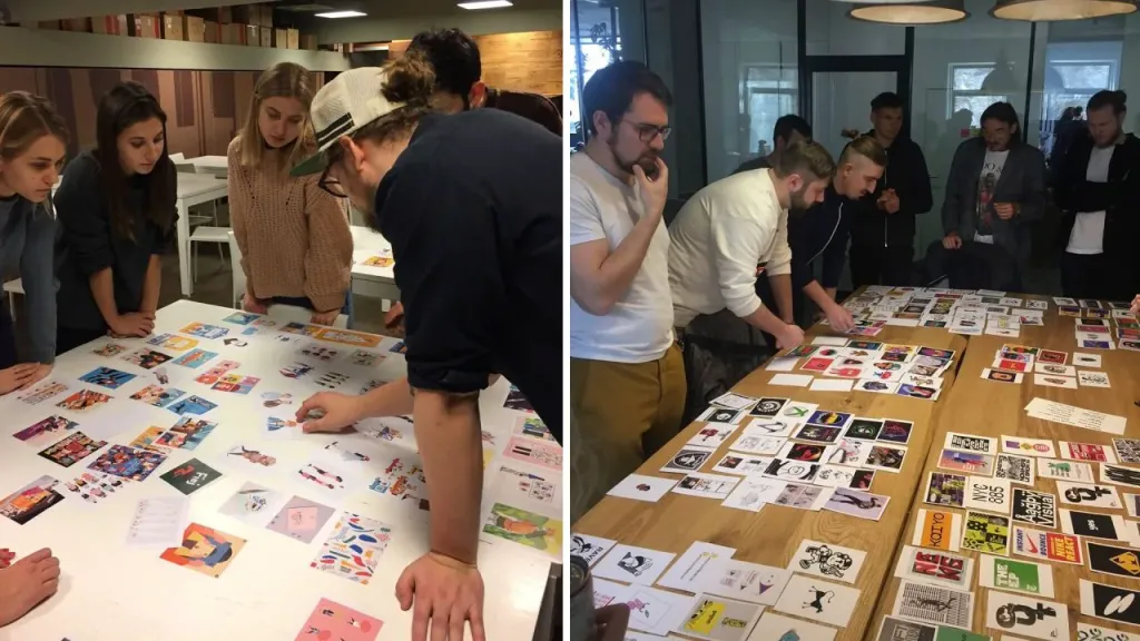
During the session, you can collect not only references, but also old brand materials. This will help you understand what is not working and why need to change the design. It will also be valuable to look at what competitors are doing in your market segment. The main board in the design session should answer the questions, how not to do. We pay maximum attention to it.
Find answers to the key questions about the design challenge: Where will the artwork appear and what should it express? What situations and emotions can they play on? What technical parameters do you need to work with?
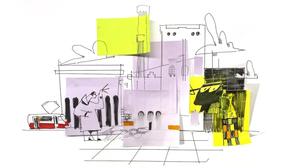
After that, start sketching. Cut, glue, scratch, collect shapes from different objects - it can push you to unexpected graphic findings.
A single graphical language
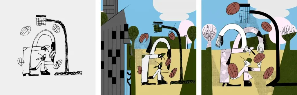
The images you develop should be integrated into a single system. Try to provide illustrations from the beginning of the work a signature tone that you can reproduce in the future. Try to find an internal logic for branding illustrations and adhere to it in all decisions.
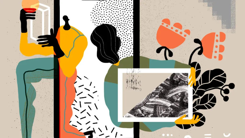
For example, in the illustrations for the Rihert&Park residential area, I focused on the human characters and the color scheme, thanks to which images correspond to other visual elements of branding. Despite the fact that many different illustrators worked in the project, this style provides general recognition.

These illustrations were created to convey the spirit of life in Podil. I started drawing characters along with buildings to they looked like inseparable structures from each other. The contours are mostly simple, but with unexpected proportions. I wanted the objects and environments to have a distinct style—abstract, futuristic, and design-oriented.
When preparing for work, it is useful to prepare a library of illustration elements that you have already used before. Thanks to this way you can refer back to them in the future and make sure you’re keeping the style and consistency of your artwork.
Illustration consistency is key to the overall effectiveness of your visual system in the long run.
The power of color
Working with color is an extremely important part of work, because it is color that people remember best. Colors are markers, to which we react subconsciously, the reaction to them is as if programmed in advance.
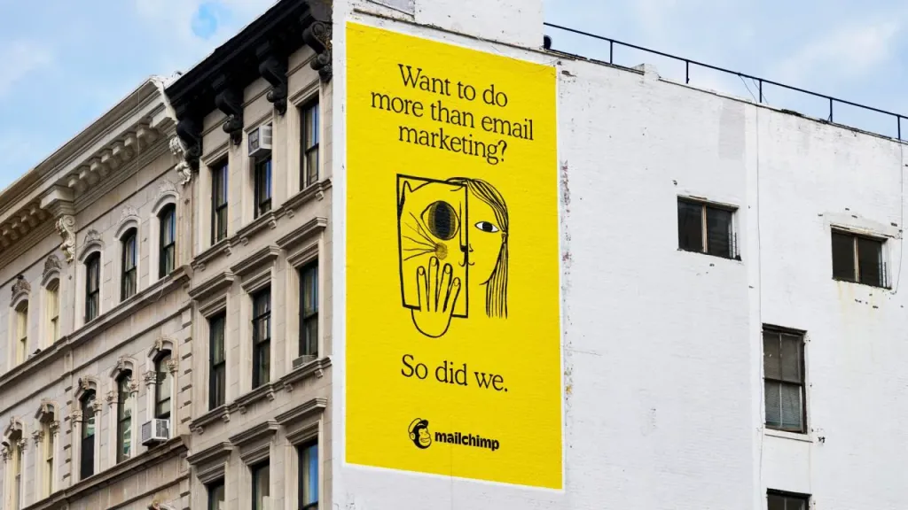 Mailchimp is one of the leading email marketing companies
In Mailchimp’s identity, yellow works very powerfully in combination with black graphics. Yellow is so bright itself on its own, which can stand out even against the background of other bright colors. Mailchimp followed a rather original path, because it signaled about a complete break with flat design, which until recently dominated much of the technology sector.
Identity improvements
There must be highlights, rethinking, and surprises in the design. It is necessary to depart from the usual forms and media, learn to convey the mood with something unusual. However, before that, you should formulate the right task and match it a series of decisions. Only then will it look like proper branding.
In identity, you cannot take one technique and multiply it - for example, draw a logo or illustration and reproduce it a million times carriers A certain variability is a sign of lively and inventive design.
There are many different techniques in good branding, but there is only one style.
Diligently create new versions of artwork, get feedback, and create new iterations. Treat everything as a working prototype, and you should always remain open to adjustments. Keep stakeholders informed, engaged, and present ready for unexpected decisions. Design is a journey where each step brings you closer to an exceptional result. As long as you dive in in research, you are moving in the right direction.
Cases in the gang
I am constantly inventing work with illustrations, because I really like to draw. Here are some of my works.
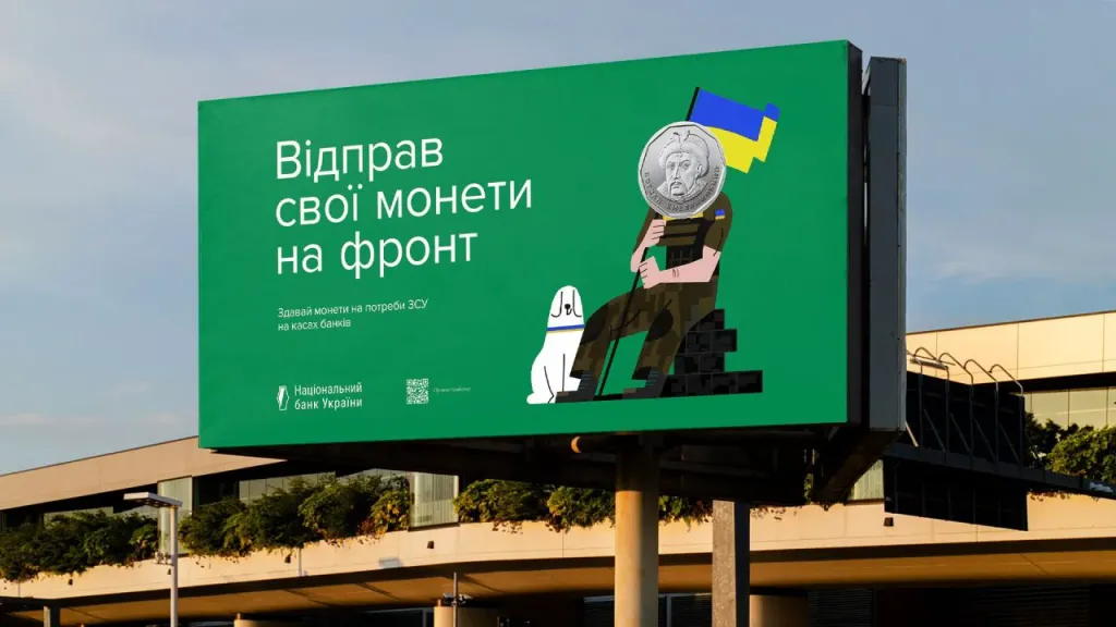
National Bank
My latest project is a campaign to collect coins for the military from the National Bank of Ukraine. This design spread across the Internet, therefore it seems to me successful.
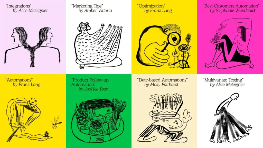
LUN
The first case with banda illustrations was branding for LUN. It was this project that taught me to think about the levels of complexity of illustrations.
Goodwine
The illustrations for the Goodwine loyalty cards express that Goodwine is a store that talks to you. First we created a huge pattern of illustrations, and then programmed a generator that broke the pattern into many unique fragments. Therefore, no two cards are the same - each client has his own unique design.
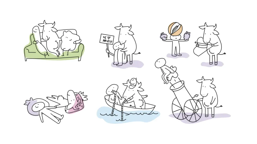
Molokiya
“Molokia” is a brand that fills me with vital energy every time I come to supermarkets. I forget what it is I drew the main characters for this brand and I’m just glad it exists.
The main purpose of the illustration
There is a famous quote: “A brand is not what it says about itself. It’s what people are talking about when the brand leaves the room.”
Illustration helps people say good things about the brand. It domesticates the brand, makes it closer, more pleasant.
Moreover, the illustration translates the text into the language of pictures. Thanks to this, the brand becomes more understandable and even emotional for the user.