Color guide

Everything you need to choose a winning color scheme.
One of the fascinating aspects of color theory is color psychology, which explains how people perceive colors and what their meanings are they are given Color affects how you feel about a product, how you make a decision, and how you perceive it message.
Color is a powerful tool for artists and designers, so understanding how to use it is the right way to go succeed. Do you want to create a new logo design or design a homepage layout? Understanding the meaning colors and the associations they evoke, you can choose the best colors to tell your story.
Create robots with all the colors of the rainbow.
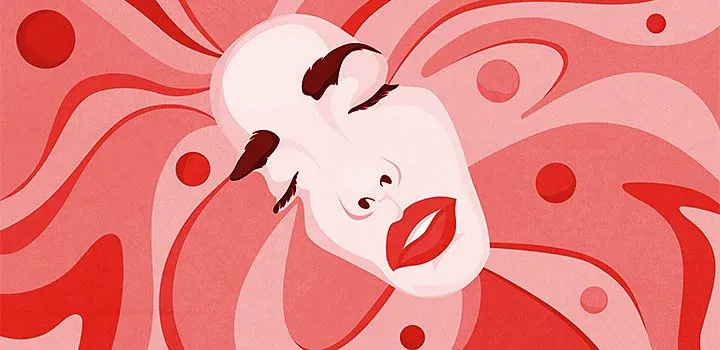
Red
Red is a very strong color that evokes both positive and negative associations. On the positive side, red is the color symbolizes strength, passion, confidence. But it can also trigger aggressive emotions, such as anger, anxiety, or feelings danger This does not mean that you should avoid red completely - each of its values can have a strong effect and used for your benefit.
Red is a very strong color that evokes both positive and negative associations. On the positive side, red is the color symbolizes strength, passion, confidence. But it can also trigger aggressive emotions, such as anger, anxiety, or feelings danger This does not mean that you should avoid red completely - each of its values can have a strong effect and used for your benefit.
Red can push people to make faster decisions. Almost every fast food brand has red color in its color palette because it causes a physical reaction that makes people hungrier and stimulates the appetite. Also, companies often choose red to announce a sale because this color adds impact to the message urgency
Orange
Orange is a bright and energetic color. Happiness, play, pleasure, power and excitement - all these emotions can be added to your brand or message using the color orange. Many tech brands use orange the color because it conveys optimism and youthful energy, which is what a new technology project needs.
Yellow
Yellow color is associated with cheerfulness and adds freshness to your palette. “It’s a very strong color that really draws attention, so I use it mostly for accent,” says Ackerman. Like red, it can also act as a signal in warnings and rich informational messages.

Green
Green is one of the most versatile colors in the color wheel, thanks to its wide use in everyday life. Money, trees, food, and traffic lights all share this color, and the shade of green you choose can convey very different messages. Its connection to nature can give your natural food brand or yoga studio a connection to organicity and health, while a brighter shade is often used in financial applications. “A soft shade of green can to be calming and relaxing, while a bright shade is more refreshing and energizing,” adds Akerman.
Blue
Blue is a calming, relaxing and friendly color. In many cases, this is a win-win, universal choice that can indicate professionalism or benevolence depending on how it is used. Blue is a reliable color, and many brands in all industries use it to create a positive image.
On the other hand, the blue color can cause sadness, and in the English language there are phrases where the word “blue” (blue) means sad emotions, for example “feeling blue” (to be sad) or “having the blues” (to be in despair). Partly it is happens because in the color spectrum blue is on the side of cool colors, unlike warm colors, in particular, red and orange. But then again, different shades of blue evoke different emotions; keep that in mind when selecting a palette.
Purple
“Purple is a very elegant color. It is associated with loyalty, so when you want to gain trust, purple is the color is a great option,” says Akerman. In addition to trust, the color purple often evokes a sense of mystery. This one is saturated the color is traditionally feminine and has long been associated with royal wealth and luxury.
The historical meaning of a color should not influence the way it is used, but it is necessary to realize that the associations, that are deeply embedded in the mind and subconscious can inadvertently change the impact of your message.

Pink
“A lot of brands that target a female audience use pink,” says Akerman. At the same time, gentle and playful, pink is a powerful color that often evokes thoughts of passion, love and youth. Intensive bright pink gives an effect of urgency, while minimalist grayish pink is more calming and neutral.
Pink is a great example of how the meaning of color in society can change over time. Once upon a time, pink was considered a “boyish” color, and now it is largely associated with femininity.
White
White color often symbolizes simplicity, integrity and purity. White is a color that is often used to render contrast, has a clean, neutral shade that does not overwhelm your design. “It is he who gives the feeling of freedom space around elements and helps highlight elements that need more attention,” says Ackerman.
Brown
Neutral and natural, brown “evokes some warm feelings and a sense of security,” says Ackerman. It is earthy a color that is undeniably associated with the elements of nature. If it is necessary to create a feeling that the product is organic and useful, the best option would be to add brown color to your palette.
Gray
As a truly neutral shade, gray is almost always used as an additional color or accent. It can be used to add changing colors, to complement any color, or as a background of a subdued shade. Try not to use a lot of shades of gray in the design, as this can disrupt the balance, and a neutral picture will become gloomy and uninteresting.

Black
Black is a powerful color that adds seriousness and power to your message. With moderate use, the color is black can give your design a sleek and minimalist look. Black backgrounds are becoming increasingly popular in web design, but be careful not to make the interface too dark and hard to understand.
There are definitely times when using deep black is the best way to tell your story. If you need to add expression or sophistication and seriousness to the design, black is a classic, no-win option.
Tips for improving your color selection skills.
Colors have different meanings in different cultures.
We like to think of color as a universal language, but that’s not always the case. Colors are not always perceived in the same way by different people cultures and countries. “In American culture, white symbolizes purity, innocence and simplicity. But in China it is white the color is associated with death, and people wear white to funerals,” notes Akerman. If you are developing design for a global audience, learn how colors are perceived in other cultures to avoid sending by accident wrong message.
The shade is as important as the color itself.
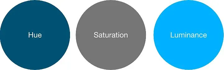
There are three characteristics of color: hue, saturation and brightness. When choosing a color palette, the shade and tone of the color are as important as the chosen color. Dark blue is the color of courage, strength and courage, and light or soft blue is airy, bright and young. When choosing a color, think about the many different shades it has, and about the different moods these shades can create.
For UX design, Akerman often chooses softer shades, especially when it comes to black or white. “I reduce the brightness of pure black or white colors by a couple of points. I always try to use a soft gray or white-gray colors because they are better perceived by the human eye, especially on screens.”
Experiment with color combinations.
Colors can take on a new meaning when combined. Color combinations can enhance your message, distract attention from him or give him a completely new meaning; the best way to learn how to choose the right palette for work is experiment. Try Adobe’s color palette generator to create your own color scheme and learn about the relationship between different color combinations.
Quality design starts with sound color theory. Now that you know the psychology of colors, you’re ready to customize color wheel for working on your own design.