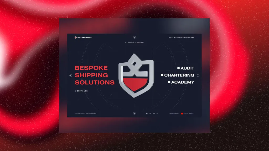
Design trends of 2023 .
Container design
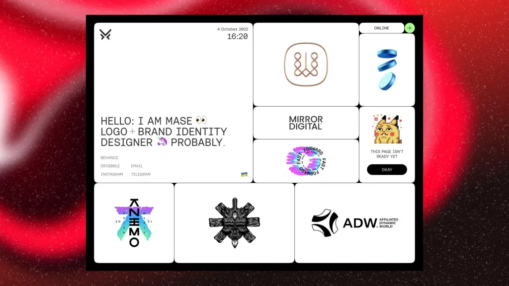
Increasingly, you can see sites whose elements are placed in blocks (containers). It is used to reduce visual weight and distracting noise. It is easier for users to perceive information gradually and separately. That’s why it’s like this the style will work where there are a lot of elements or text. Container optimization is trending.
Hand drawn style
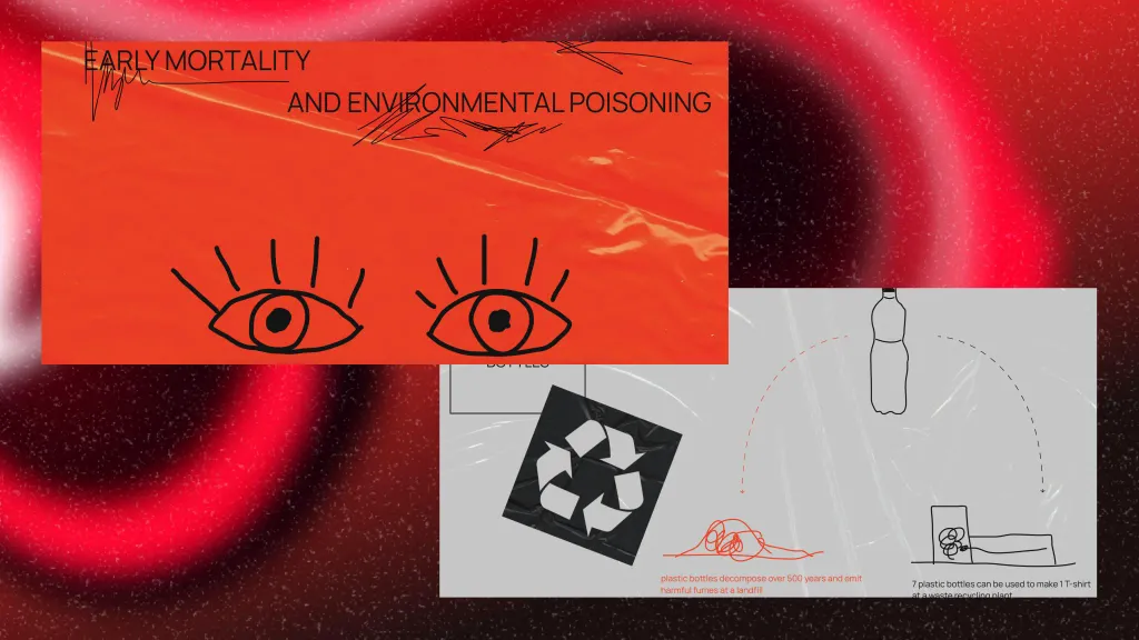
How to personalize the site and add your own story? Try the drawn style. He will definitely not leave indifferent the real ones connoisseurs of handwritten fonts, drawings and sketches. If the audience of your site is creative people, artists or teenagers, then you definitely can’t go wrong if you try this design. Drawing style is about friendly positioning in front of the audience. Well, one more indisputable advantage is uniqueness. It is very difficult to repeat or copy such a style. Therefore, it will be beautiful business card of the website.
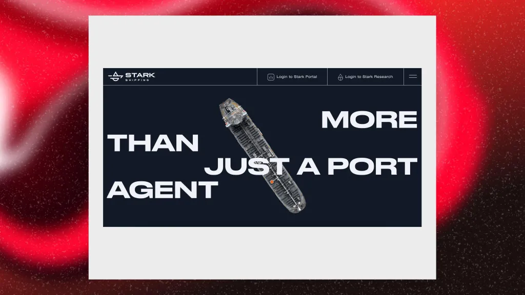
Giant text
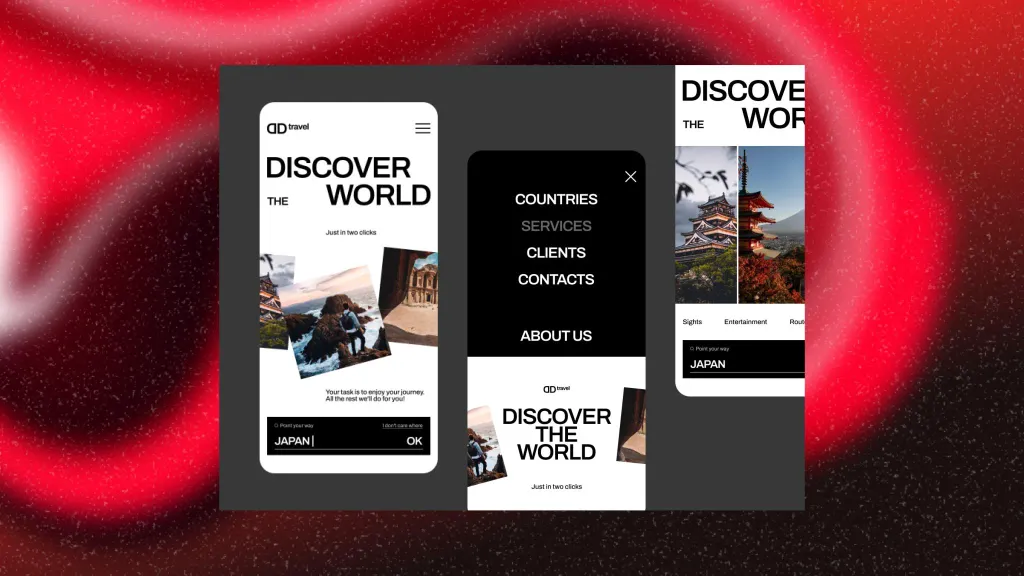
Big headlines and slogans are now more and more common. Typography is a creative tool for designing web pages. It happens that business styling does not involve a lot of graphic content, so designers use textual giantism. This trend looks very good in many variations and attracts attention at first glance. Visual memory of users handles large characters well. It may seem like there isn’t much you can do with the letters, but take your time. Number of fonts and there are a lot of ideas for text placement.
Strokes: outline and cross out
If you want to emphasize a button or word, then try dashes. They have an organic and unobtrusive look, go well with a drawn style or minimalism. They also work effectively when it is necessary to create the effect of comparison. For example, cross out the old price next to the new one. Strokes are suitable for these purposes.

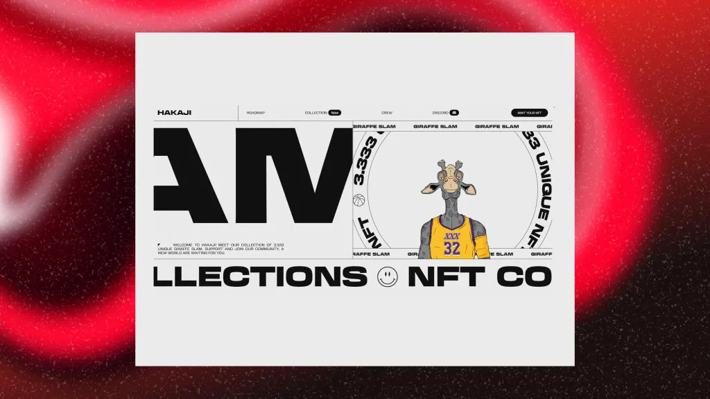
Visible borders
Designers work in graphic editors with grids and lines to arrange text, objects, and other elements according to with the rules of composition. What if we made this grid and lines visible and thereby change the user’s perception? An interesting trend that looks organic in a minimalist design.
Glass textures
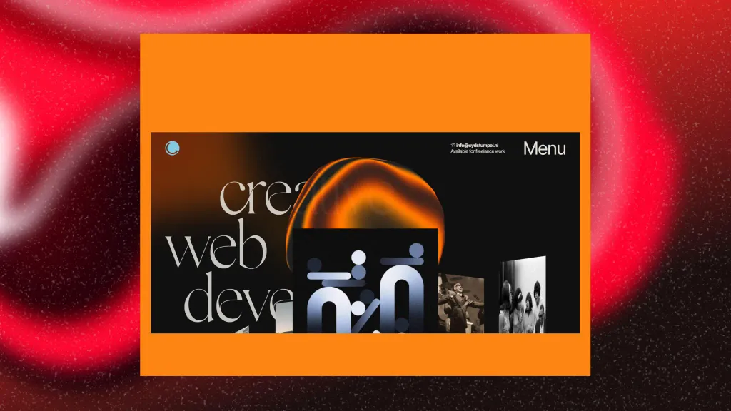
Transparent panels, blocks and forms change the architecture of the interface. The user seems to see more and further than he can. It forms a different understanding of design. The site becomes hierarchical and depth appears. The glass effect evokes more emotions. Translucent blocks can hide other elements and interact with the user in a more playful way. If you wish otherwise to build communication with the user and add space and elegance to the site - try glass textures.
Retro style
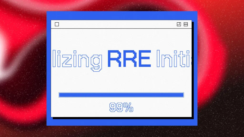
This style takes the user back to the era of neon signs, game consoles, CDs and denim suits. Yes, the culture of the 1990s and 2000s with their old computers, pixels and video games is back in fashion. Such sites form unique atmosphere and pleasing to the eye.
Kitsch design (neo-brutalism)
Neo-brutalism is a style that arose in the 1950s and 1960s of the last century. The main characteristic of this design direction — textures, brutality and naturalness. Kitsch is translated from German as “bad taste”. But take your time conclusions This style combines bright colors, thick font, strange shapes, textured materials, strange characters and chaos on the screen. He impresses with his audacity and atypicality. A cool trend that will be relevant not only in 2023.
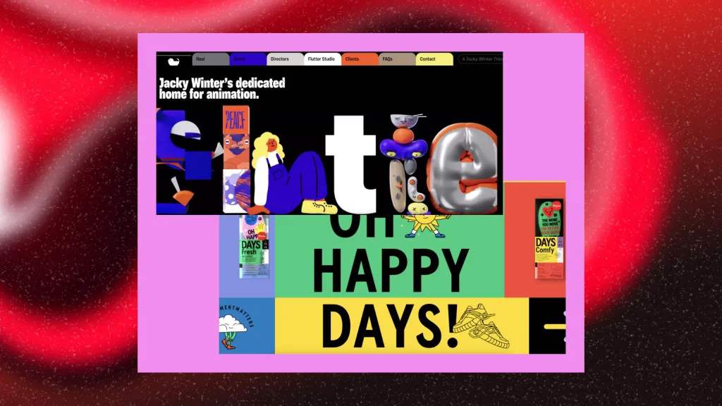
Product creation history
Are users interested in seeing the entire process of working on a product or site? This trend is inconspicuous, but very interesting. Now more and more often you can see the design of the design. It’s cool when you can look behind the scenes of a designer and see some others prototypes, colors and elements that were not used in the finished project. This trend is gaining momentum.
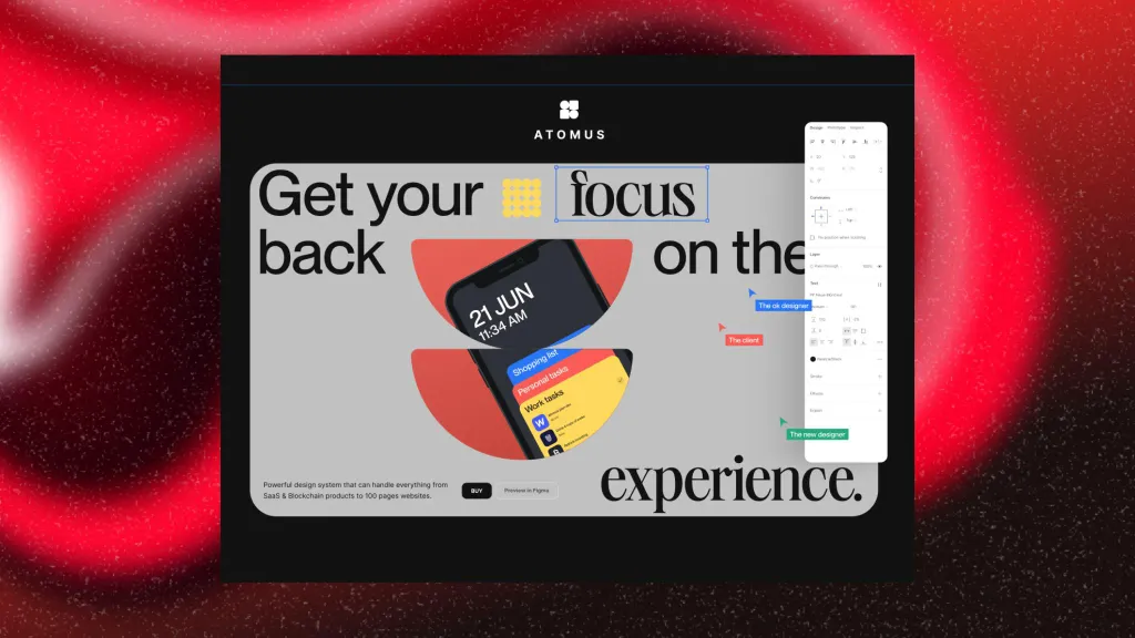
Video on the home page
Video has been trending for a long time. Presentations, promo videos, previews, etc.: all this helps to quickly convey the necessary information to the user information Video clips gradually replace text and images. Therefore, designers should pay attention to placement in 2023 video on the main screen. This has a positive impact on users and increases the chances of engagement and conversion.
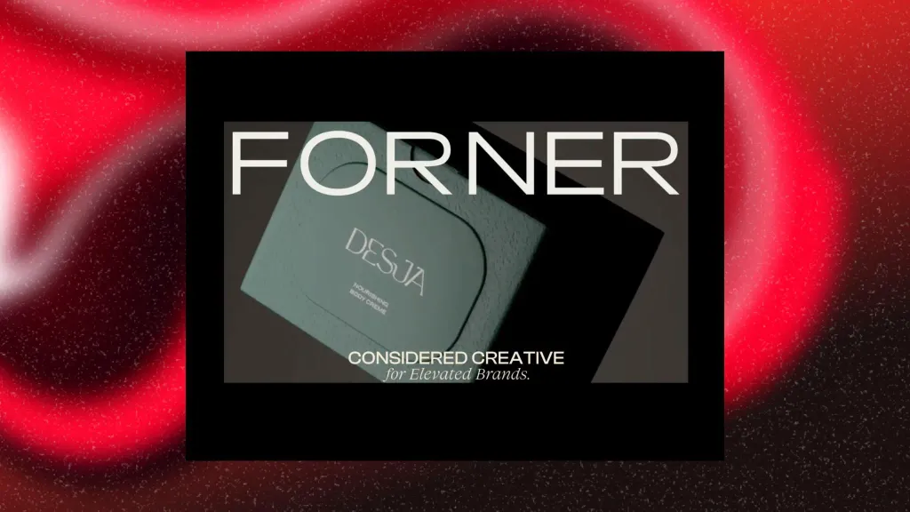
Virtual Reality (VR)
Technologies progress and this affects user behavior. Websites have long ceased to be a passive tool for observation. In 2023, thanks to VR technologies, sites become something like active platforms. You can interact with them, immerse yourself in the interface and look at things from a different perspective. It is virtual reality that gives cool emotions and sensations. This style will be in trend for many years to come.
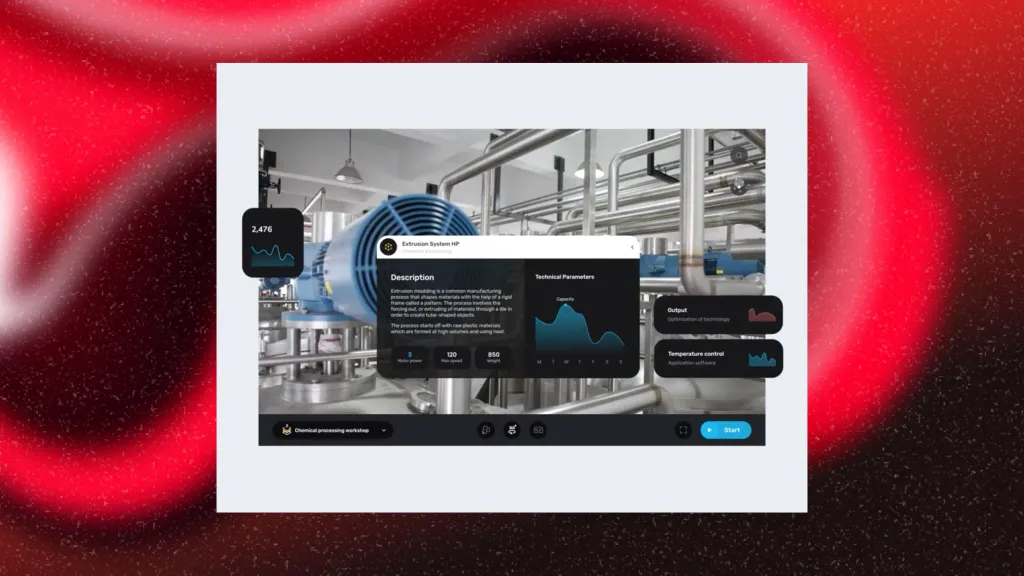
Mobile and responsive design
Mobile versions have long been no less important than desktop versions. Now interfaces must be adapted to mobile versions very carefully and carefully. The user experience is enriched, so the requirements for mobile design will increase. It should be taken into account developers The world has become more mobile than ever.
3D animations and elements
Even 15 years ago, people could not always make the form tangible. In 2023, with the development of 3D, it became possible to visualize anything and any way. The ability to look at the subject from different angles helps the user better understand its essence. 3D animations are also a good user interaction tool. They do not distract attention from the main block of information and add dynamics. Try animated logos or stick figures, it attracts customers.
