Monotype's annual typographic trends report
As we roamed the high streets and alleys of the internet in search of precious typefaces for this year’s Type Trends report, we realized that we are compiling the history of modern design trends on one shelf, observing the transience of this sphere. Today, the Internet and social media allow everyone to be noticed, to express themselves and their creativity.
Let’s see how current events were reflected in modern design and what trends they transformed into. In this article, we let’s talk about fonts. This year, the trend for playfulness is returning. Diversity and intelligence continue express themselves graphically thanks to the development of last year’s Mix-up trend. But now she shows the transition from wild to soft.
And Motion and 3D continue to expand and erase the boundaries of graphic design. Since the introduction of augmented and virtual reality becomes a part of our everyday life. Letterforms that are inherently static and incapable of movement. But with the arrival of the new Twisted and Liquify trends, they begin to move and take on new forms.
As designers, we know that the best way to hone your craft is to examine, question, challenge, evaluate and practice. That is why we have prepared this report. Welcome to the world of amazing typography.
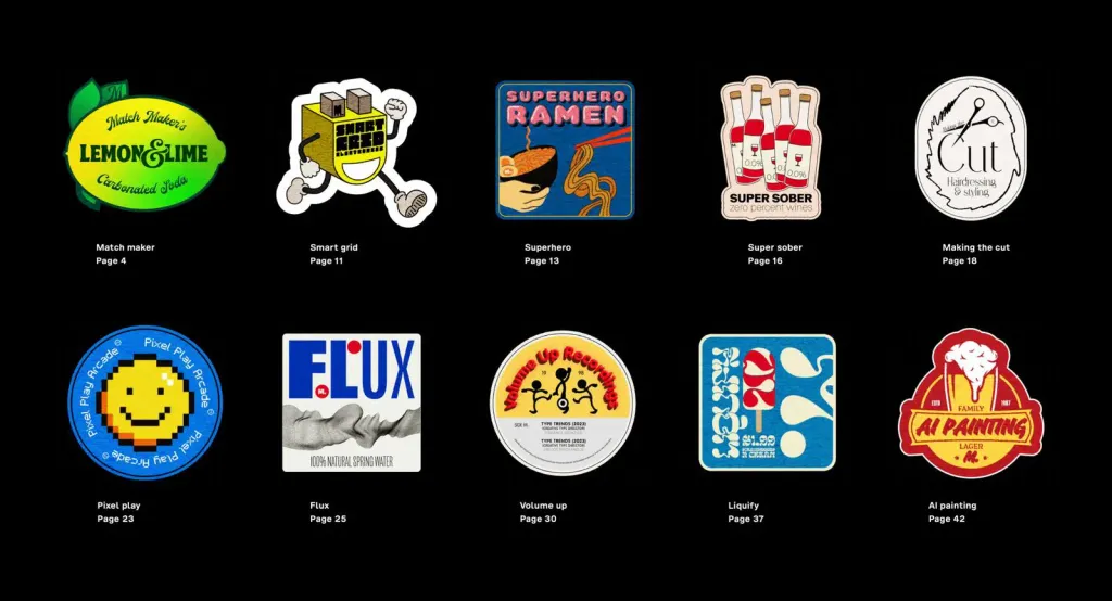
Match maker: Mix-up
Why use three colors when you can use thirty? This variety and variety of fonts continues reflect the attitudes, values, goals of this generation, missions. Diversity, equality and inclusion in visual form, Mix-up describes the human experience and life on Earth: extremely complex, diverse and rich. He often adds a visual depth and interest while being active and inclusive. It’s human. This is biodiversity. It lives.
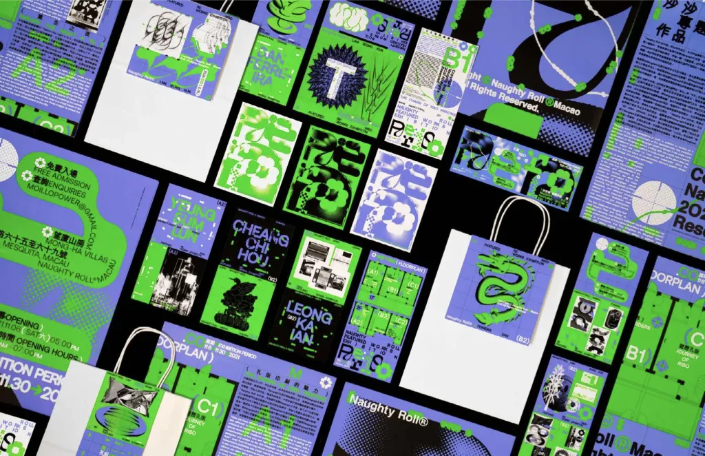
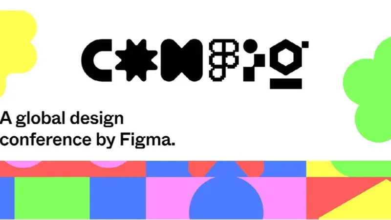
TDC Communication Design Award 2022 winner RE:RISO Naughty Roll Featured Works Exhibition by indigo design / macau is a Halftone Mix-up masterpiece printed with a risograph. 80 posters are presented at the exhibition four designers dedicated to the theme of “yesterday/today” to promote a new generation of designers. similar weights, alignment and color choices have a calming effect. Figma 2022 Config identification and BASE media logo Stepan Solodkov are exemplary examples of Mix-up.
Match maker: Loopy
A continuation of last year’s trend, so it’s clear that this is not a separate trend, but part of a larger change in approach. Looping shapes add organic movement and are often combined with plain, static type to create tension and dramatization
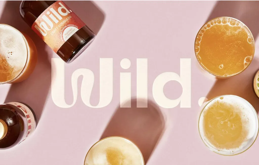
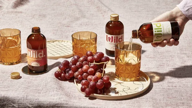
The fantastic work of Prague-based studio Marlon on wild kombucha skillfully fills the logo with effervescent waves. Curly the shapes can mean like a human touch, a signature, or the natural world combined with the rigidity of grids and geometry.
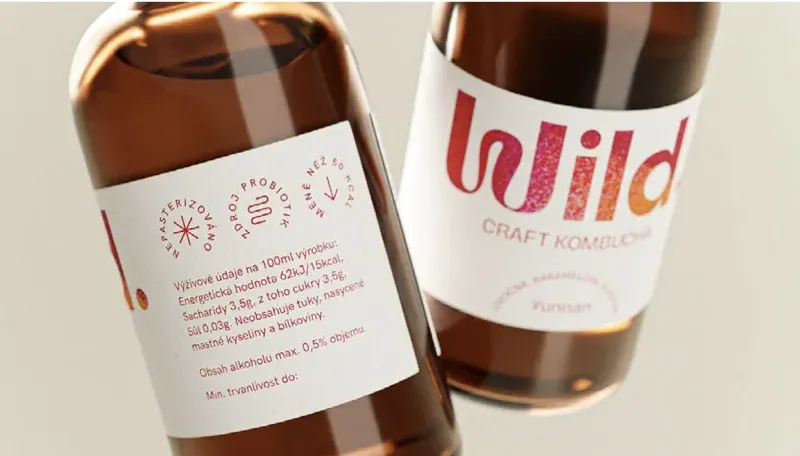
Along with the Flux trend (which we’ll talk about later), these swirling shapes are often in motion or represent static forms that look as if they could, hypothetically, be mobile. The graphic elements are particularly impressive combined with muted colors and detailed images from the historical art collection.
Match maker: Subtle
If Mix-up is the wildest version of the Match maker trend, then Subtle is the softest branch of this tree. But “soft” is not necessary means boring. Subtle Match Maker is limited to two styles. This distinguishes it from the traditional combination of fonts in layouts, as this combination is more visible and is used intentionally in titles or logos. It is more private and conversational, like two friends talking in the kitchen. This trend can change the brand’s tone of voice. If you are starting from a simple sans serif font, combining it with a script will make it more casual and fluid. Or you can add serif to add sophistication or stability.
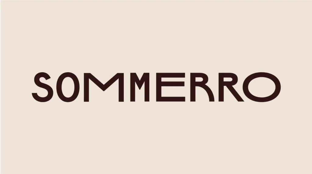
Bielke & Yang designed this beautiful and subtle mix for a hotel in Norway called Sommerro. It has a slight wave of motion through the inscription, and the variety it adds to the other appendages breathes life and humanity into a static and rigid structure hotel, proving that it is not just a room, but a place where you can feel alive. Coupled fonts are a spectrum of subjective possibilities, from harmony to contrast. Some pairs may share proportions and structure, while others reinforce contrast, combining square shapes with superfluid and curved lines.
Smart grid
Last year, in our report, we highlighted Organic Modular, the evolution of the “Blockheads” trend in 2021. Now in its third incarnation, we see how it has turned into a smart network, a combination of art and science, built on network structures broken reasonable - for a quarter or a half circle. This trend follows the tradition of NASA’s “worm” logo, as scientific and tech brands are united by our hopes and fears about the future and the unknown. The main attraction there are meshes here, but they’ve been selectively softened and cut with precision and sophistication.
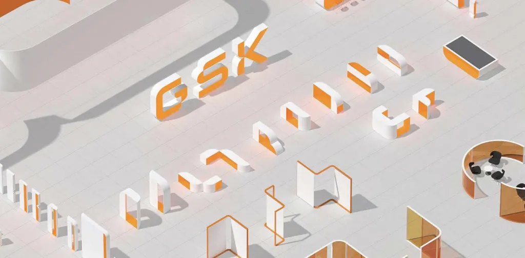
Biotech giant GSK’s new logo by Wolf Olins captures this scientific view with the organized precision of a grid, naturalized and humanized by curves, advocating the common mission of harmonizing man and machine.
Superhero
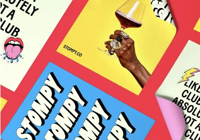
A new trend, explosive in form and color. This trend has a fun, playful comic book vibe. Superhero full of electrification and dramatic effects. He is big, loud, cheerful, does not avoid using the exclamation mark. So the superhero trend is only growing!
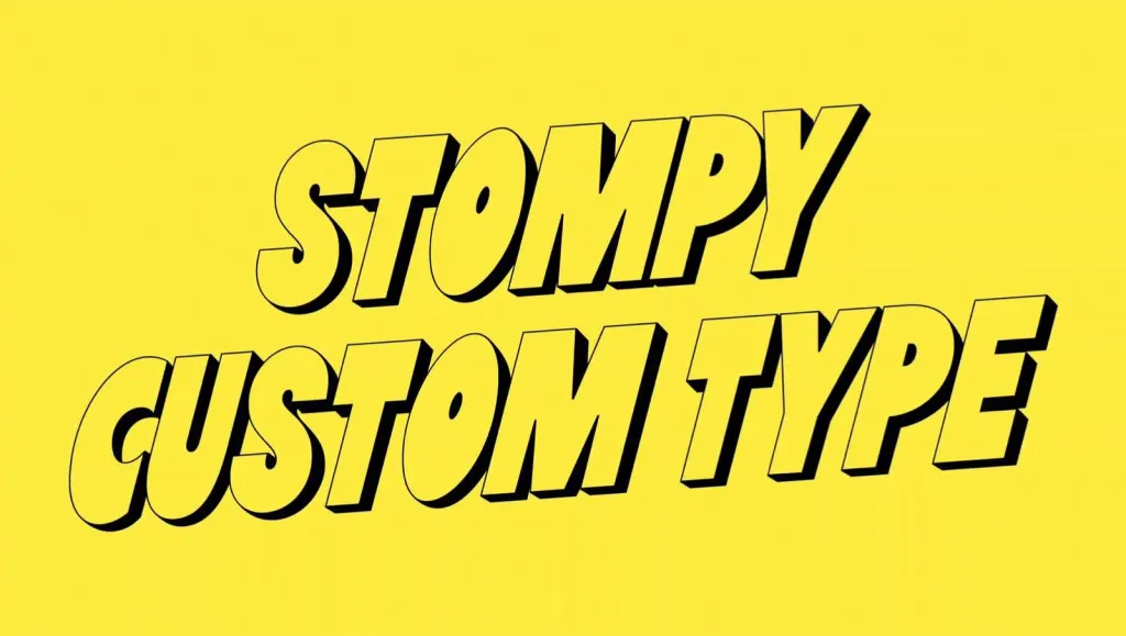
Agency &Walsh developed a fun, bold brand identity for Stompy. Stompy is a wine subscription aimed at a modern audience, which removes the formality in the consumption of wine in society. Bold shadows, bright colors instead of the typical smooth wine serif packaging with dark and natural palettes
The new interior of Brooklyn studio Order. The typeface, a revival of Original Sans from Commercial Type, carries an identity with distorted perspectives spilling over any page and just screaming for attention. Some are also overcrowded nostalgia, such as the airbrushed gradients in the title text of Marvel’s Thor, Love and Thunder. Interestingly, PANTONE’s color of the year, Viva Magenta, nods directly to this superhero trend, but the proposed combinations highlight more muted tones. This brings us to our next trend, which is the exact opposite of Superhero, standing out for different reasons.
Super sober
The graphic rigor that was the embodiment of almost every startup and brand in the 2010s is back in the spotlight in 2023. Super Sobriety is a major trend that never goes away, or maybe it just becomes more noticeable due to the contrast of the Mix-up and Superhero.
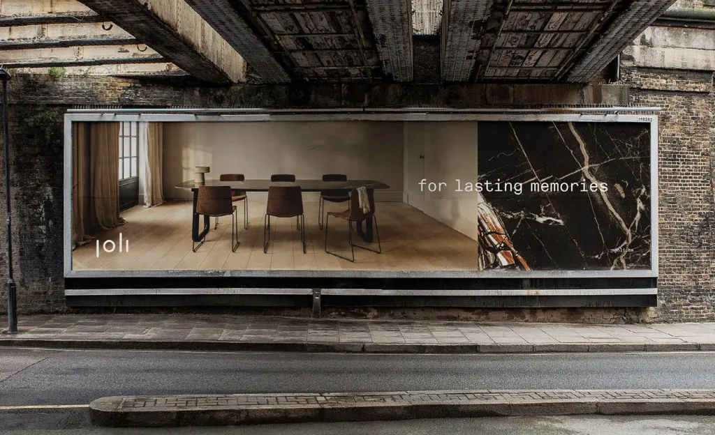
This style is often black and white, simple and centered. White space creates a quiet, calm and precise look, giving an additional focus on small fonts, logos, icons. Its simplicity stands out among the noisy landscape of competing brands, programs and notifications.
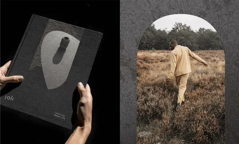
Branding agency Skinn was commissioned to update the Joli furniture brand. It skillfully displays a plate of dishes with precision and modern geometry that perfectly matches their individual tables. The calm sophistication of the product design is not overloads the brand, while a calm and natural color palette emphasizes the value of the materials.
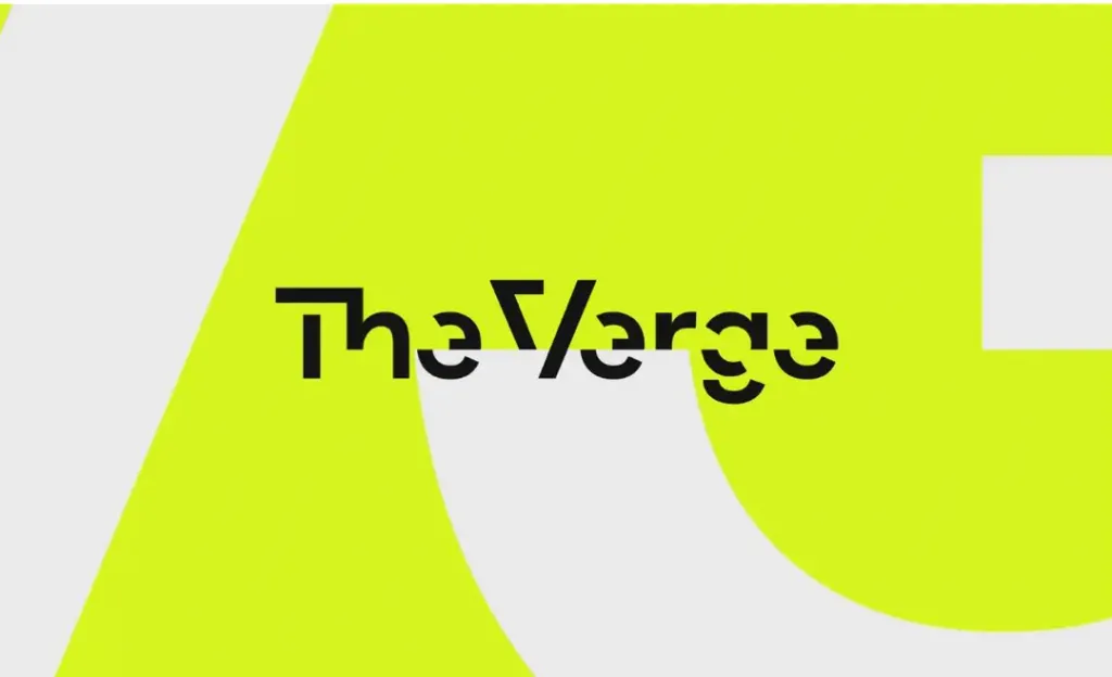
Making the cut
This tendency is to cut out and remove parts, often creating an exaggerated sense of sharpness. Some variations of this trends seem high-tech and pixelated, like the new Verge logo. Maybe they play with speed; triangles are fast, squares are slow. These finishes often add sparkle, movement and visual interest to plain sans serifs font They make the ordinary extraordinary. The Verge, a leading tech publication, supports the clipping trend, masterfully removing the correct parts of the font. The effect gives a stunning sense of movement, energy and tension.
Making the cut: Ink Tramps
Last year we were surprised at the prevalence of decorativeness. And this year, Ink Tramps (“ink traps”) as an object add interest and strange details to a regular sans-serif font. This year, we see such ink traps transform together with other trends; some examples have psychedelic tendencies and affect the psyche
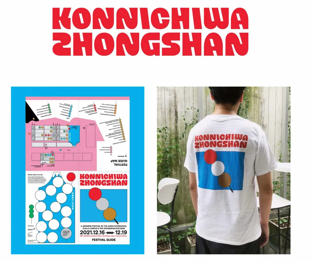
Negative space is just as important as positive space. Just look at the event identity for Konnichiwa Zhongshan, of the Japanese festival Valenlim Studio. The custom logo designed by Hammam Hidayat was inspired by a Japanese shape Dango dumpling, with a playful and lush heavy cut without corners and traps.
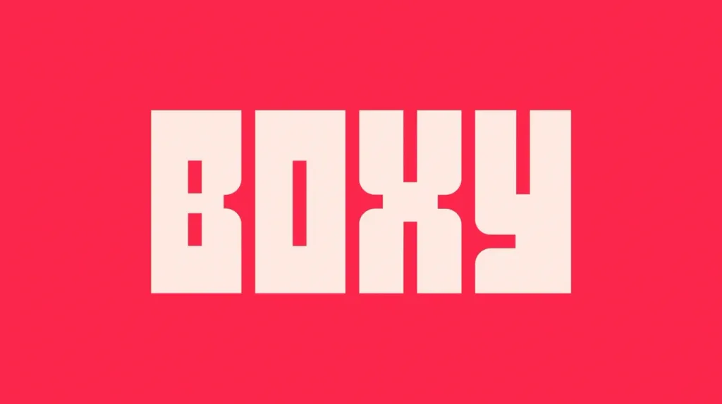
On the other hand, Japanese studio Koto took a similar approach to rebranding Boxy, a Paris-based startup that transforms shipping containers to automated grocery stores in underserved French suburbs supermarket chains. The letters pay homage to shipping containers while maintaining a curve to evoke friendliness, rather than industrialism.
Making the cut. Hypertension
Hypertension is a new trend that often looks flat, with sloping shapes that create visual tension and focus in work. This trend straddles the grid and ink traps, taken to the extreme with diagonals that add dynamic energy to these compositions. Hypertension looks technical and organized, but retains elements of spontaneity and surprises.
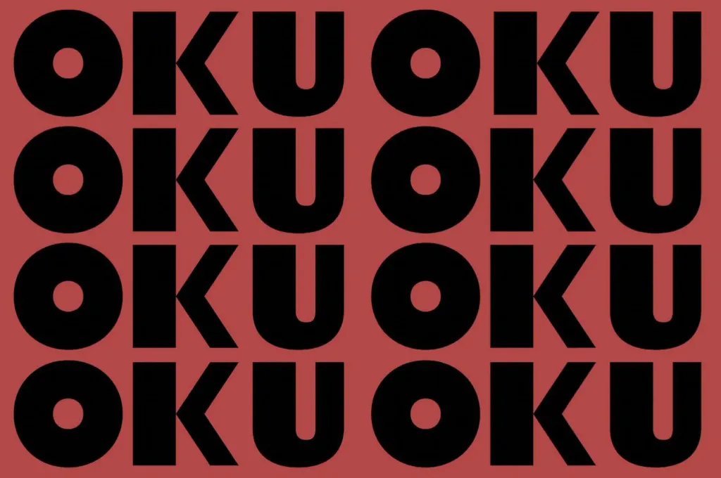
Our friends at DutchScot helped visualize Oku’s mission to create partnerships between African entrepreneurs and by Swiss companies through expert strategic work.
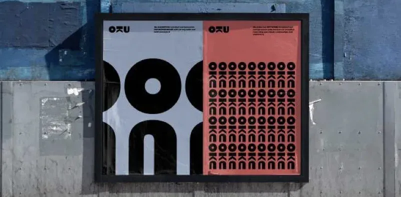
According to them, “at the core of the identity is the logo with the letter ‘K’ inverted, symbolizing the bridge that OKU is building between talent and industry, and between Africa and the West. The letters in the logo are then rearranged to create decorative ones patterns, and convey different aspects of the business, such as one-on-one mentoring and community.”
Pixel Play
A love of digital tools combined with a heavy dose of nostalgia. Some brands use pixel shapes, similar to those found in our Making the cut trend, adding interesting moments or inserting your flag with digital focusing. Others add beautiful texture glitches.
A pixelated game can display playfulness like vintage video game motifs. Examples of this tendency are authentic or a tribute to the early digital experience. The fact that the design is reduced to simple squares does not diminish the complexity or sophistication, similar to the fantastic Lego sets.
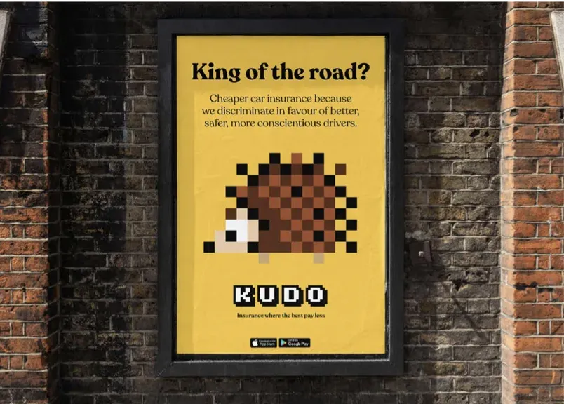
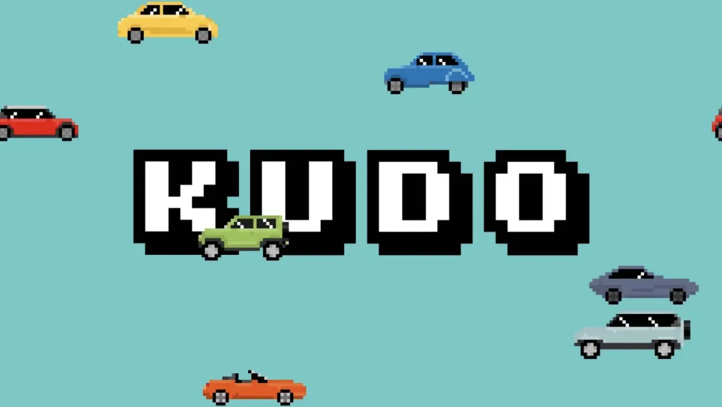
NB Studio’s new UK brand Kudo focuses on gamification and simplified positioning in insurance industry, and the playful and accessible 8-bit graphics are an undeniable differentiator.
Flux
As we noted in last year’s report, today everything that moves attracts attention. Even fonts and letters designed by in the form of static images, can appear as if they are in motion.
One favorite example is Aerial, a typeface designed for drones that create letters in flight, designed by by the Detroit studio of the Hobbes movement. Along with augmented and virtual reality, such projects offer a window into ours near future as design moves further into uncharted 3D spaces.
Another case dear to our hearts is the identity for the Brand New 2022 conference. Everyone’s favorite branding professionals at UnderConsideration collaborated with movement maestro Sultan Jum aka Geo to develop a “weird” design concept for by Ozik from Nuform Type.
Flux: Extended.
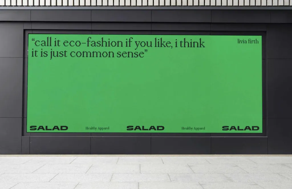
The trend shows a confident, commanding, stable and often luxurious use of typeface. And their clear proportions can convey a sense of movement and speed. Beirut-based sustainable fashion brand Salad has been given an enhanced treatment by studio fagerström with an elegant and statutory inscription. The design features a “dynamic letter S used horizontally to represent a wave that evokes the idea of roundness, as well as uneven cuts that make each garment completely unique.” Hootsuite logos, Lumafield and Buick look modern and low enough to display and stand out on different platforms and programs.
Volume up
3D models continue to appear on all the 2023 trend lists. Is it because today’s designers already have much better tools and more sophisticated technical skills than decades ago? Has 3D modeling and animation become one step closer with graphic design? The boundaries are still quite blurred. Along with the growing power of the latest electronics, the typical laptop is already able to reproduce glossy, chrome creations, which was previously simply impossible on the devices of that time.
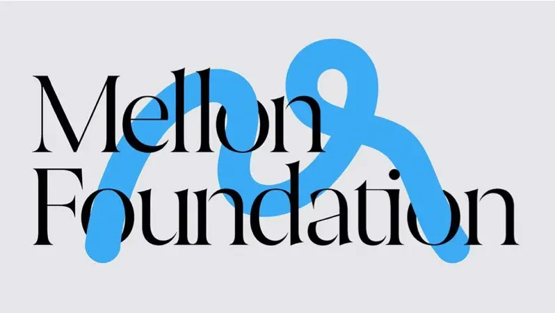
Pentagram’s work for the Mellon Foundation, the largest funder of the arts and humanities in the US, features a logo with a dynamic with the letter “M” demonstrating the gesturing of a human hand. “The logo can accept colors or materials outside of neutral basics of identity to complement the content presented. Translated into different media and materials - reproduced with help textured, shaped in three dimensions or animated in motion – a symbol can playfully evoke art forms such as sculpture, dance, painting and writing.” Modern textures are richer than before. This is no longer the plastic world of Toy Story. Luxurious textures and lighting are the norm: chrome, glass, wood.
Volume up: Illusion.
As we said above, this trend is related to movement. Shapes rotate to take the form of a 3D object or an animated 2D shape. Similar to the work we’ve already seen in the Making the cut trend, this trend transforms “simple” fonts into expressive expressions dynamic design.
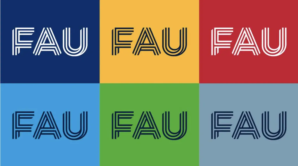
Germany’s Friedrich-Alexander-Universität Erlangen-Nuremberg has recently rebranded in line with its of the new “Knowledge Transfer” strategy. The result is a dynamic logo consisting of open lines that curl and intersect to demonstrate the interconnectedness of the university.
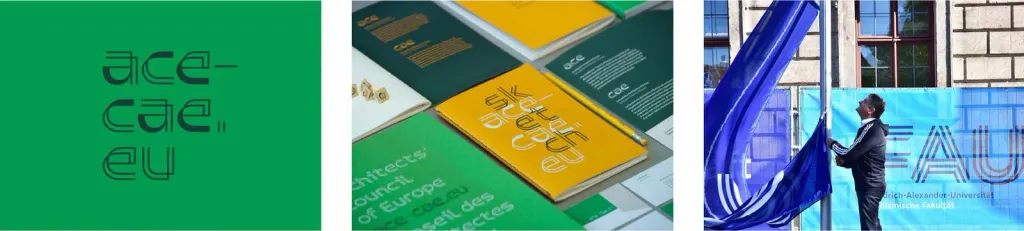
Red&Grey worked on an identity for the European Council of Architects, which supports a group of diverse architects. Duality of forms demonstrates the importance of continuous dialogue and immediately reads as spatial drawings.
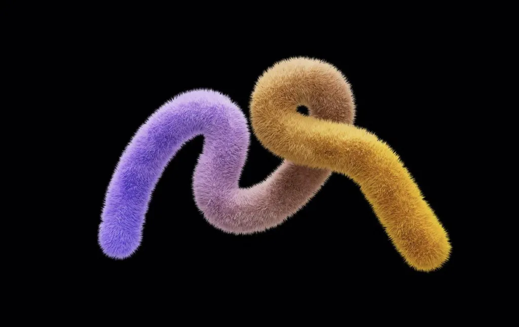
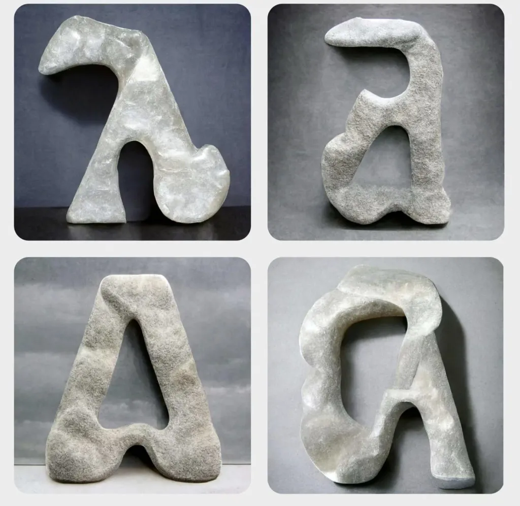
Volume up: Twisted
The Twisted trend adds striking flexibility, freedom and unbridled expression. It’s dancing like nobody’s watching. American television the Freeform network unveiled its “transformative” new logo, featuring fluted shapes that create a sense of movement, even when they’re not moving, inspired by an ever-evolving audience.
Volume up: Inflated
Last year we spotlighted the Throw-up trend, which elevated or commercialized the style of street lettering; this year we see that it continues to actively develop.
Speaking of development, brand benchmarking tools provider Brandpad has launched Brand Activation Management, a suite of post-brand design to help large companies use their identity more effectively. Along with a new offer a bloated, motion-driven new logo appears that floats, changes, and is covered in multiple textures.
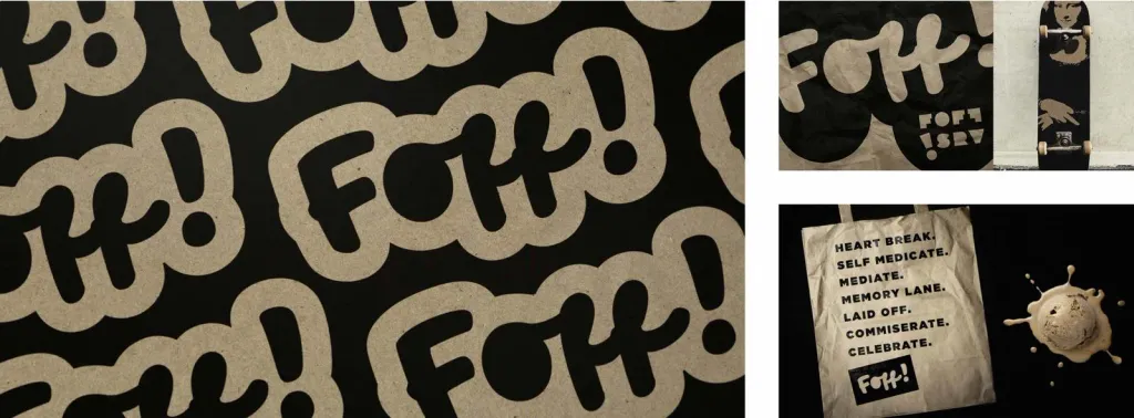
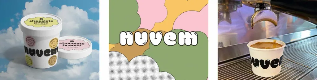
Custom murals are also a popular product for artists, opening up large canvases for typographic exploration. This rounded, fun and friendly style brings edge and attitude, especially to food packaging. Take a look on the lush inscriptions of both Foff! and Nuvem ice cream brands.
Liquify: Psychodelic
This trend is the latest continuation of one of the trends of last year, when the Acid Flow trend transformed into what we call Psychedelic within the broader genre of Liquify. More attention is paid to organic rounded and soft forms, and the more detailed look in the “Svelte Serif” and “Neue Nouveau” styles is reduced. While the trend is Soft-serve serif focused on headsets with rounded serifs. The more organic and wild this trend is, the better.
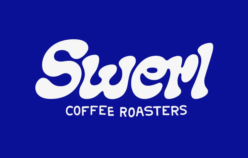
We’ve spotted this style on everything from ice cream to soda to coffee. Psychedelic lava lamp shapes that match in unique combinations, is a sign of an individual inscription. Swerl Coffee Roasters has developed its online subscription for coffee from the back of a 1972 Mercedes van straight out of the flower power era. The van inspired designer Andreas Pedersen draw a cool serif lettering, the swirling shapes of which resemble a milk latte.
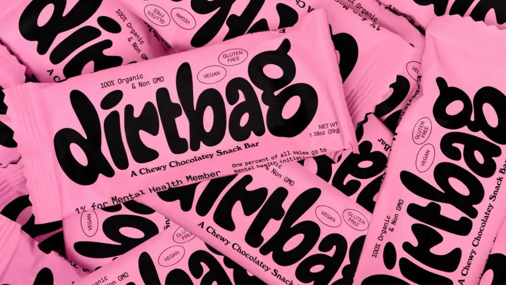
The more melted and more rarefied it is, the better. But legibility and readability in this trend hold on a thread Dirtbag, a chewy, gooey chocolate bar in a cute pink packaging with melted lettering Dakota Light-Smith from Day Job.
Liquify: Manual processing
In search of authenticity and novelty, digital designs are refined by hand with paints and markers. They help to retain the formality and power of a printed product, with the texture and imperfection of something hand-crafted.
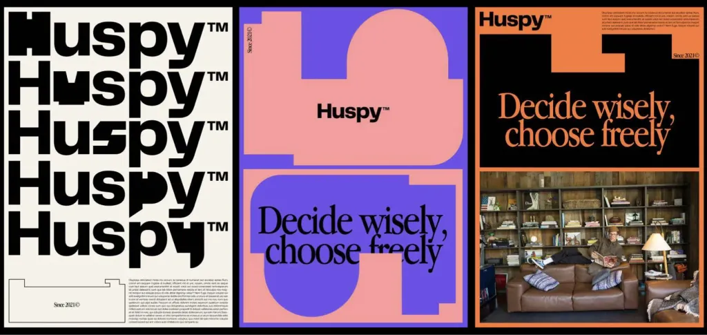
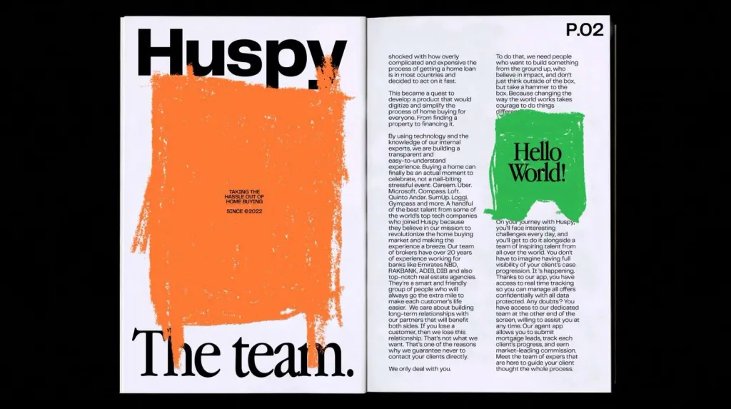
Codea studio in Barcelona took this innovative approach for Huspy, the online platform that is changing the world of real estate, improving the human side of home buying. The video created for the brand features sketches and doodles on top of a simple system fonts, which makes it not at all simple. A designed part or mock-up often serves as a framework for analog illustration.
AI painting
We are still in the early days of artificial intelligence tools, but the speed of evolution of these programs is amazing. AI will definitely change the world of art and design; we just don’t know for sure yet how it will turn out. While artists try and analyze the possibilities of new tools, all this is under the close attention of users. Artificial Intelligence promises to speed up the prototyping and ideation stages, leaving more time for strategy.
AI-drawn letterforms often look like a collage, with soft focus or spots where the machine stitched the image. Sometimes the font drawn by artificial intelligence has a strange appearance, conveys the amazing atmosphere of the valley, which we do not immediately trust.
The book Artificial Typography by Andrea A. Trabucco-Campos and Martin Azambugia explores these questions. Thanks to experimental access to Midjourney, they prompted artificial intelligence to imagine the alphabets of famous artists, architects and designers who have never designed typefaces. The results are printed in 26 letters “through the lens of 52 iconic artists in various media’ with amazing results.
Conclusions
Today’s world is extremely complex and diverse, so maybe we could have missed something. Or maybe there is one the latest development, which is actively developing and is about to break out into the market and make itself known.
As creative people, we can never take our hands off the pulse. Through observation and vigilance, we can truly create unique and valuable works that convey certain messages and tell a story about a specific brand or project. It is thanks to this that trends appear and develop - a long thread of creative thinkers who feel and interpret the world around.