Information architecture

Users are looking for quality content because it has value for them, and we simply have to make sure that this one content could be easily found in the least amount of time.
Important: When searching for information becomes too difficult or too slow, there is a risk that people will simply give up searching, and when this happens, it will be very difficult to turn them back.
Goal
Organize the content in such a way that the user can easily and quickly navigate the product with minimal difficulties. In other words, it helps to understand which sections and subsections are present, what they are called, and how they intersect among ourselves.
Value for the team
This artifact provides a clear representation of what major and minor sections the future product will consist of, and how these sections and functionality will interact with each other to make the user experience as efficient as possible.
Value for business
This artifact will help minimize problems that users may experience when interacting with the product. Others in words, if you do not allocate time to create IA, but skip this stage or create IA incorrectly (due to laziness, lack of time and money, etc.), then there is a very high chance that such a product will not fulfill the tasks assigned to it, and the users may not find critical information or functionality for them, or the interface itself may make them ineffective.
Method information:
Information architecture (information architecture, IA) —
it is a discipline that makes information accessible and understandable to users. In other words, informative architecture can be called a practice for effective organization of content.
It is the practice of organizing content in a way that allows the user to navigate your product easily and intuitively perform their tasks.
Important: Information architecture is much more than just a sitemap that shows which page goes where the practice of designing structures based on user expectations.
If you want to build a house, I am 99% sure (if you are not) that you will contact an architect, who will design a house for you according to your needs. In this context, you are the architect. Information architecture is used both in the physical world (for example, when designing a supermarket) and in the digital world (websites or mobile applications).
A well-designed information architecture is invisible to the user. The user will notice it only if it is designed - incorrectly.
Great information architecture is based on: content, context and users.
Important: the information architecture DOES NOT show any scenario because it does not exist in the plane of a specific user tasks (does not describe user actions).
8 principles of information architecture (author: Dan Brown)
1. The principle of objects.
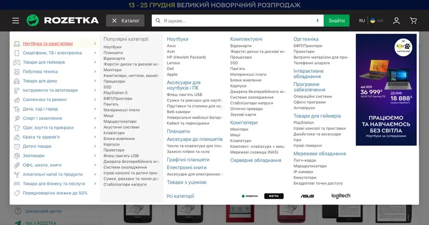
Treat content like a living, breathing thing with its own lifecycle, behaviors, and attributes. You have to start your project to determine the types of content that will be present (both broad and detailed). Example, ROZETKA online store does a good job of grouping related content and also defines behavior and attributes of each group;
2. The principle of choices.
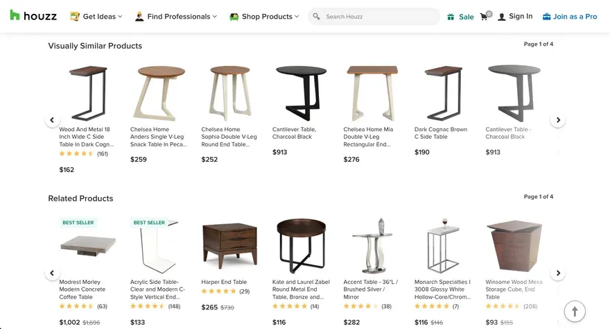
This principle says that you need to offer your users meaningful choices. Too many choices can be overwhelming the user and negatively affect his experience of using the product. For example, online store Houzz shows to users everything possible: Visually similar products, related products, people who liked this product also like, best seller products, frequently bought together, 4 stars and higher;
3. The principle of disclosure.
Show the user as much information as necessary to help them understand what information they will find, if they “dig” deeper. If the user is not interested or ready to process the information you provide them, in fact, we can call it “noise”. The main idea is not to overwhelm the user by trying to cram all on one page;
4. The principle of exemplars.
With an example, you make it much easier for your users to understand what they’re getting. It makes a big improvement user experience (UX). This concept is based on the psychology of how the human brain classifies elements to learn information faster and better;
5. Principle of front doors (principle of front doors).
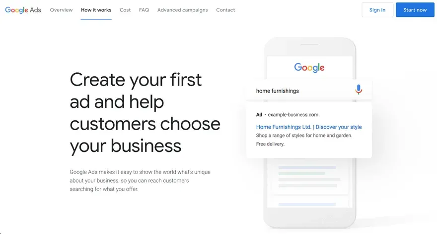
You should understand that users can get to your site not only from the main page, but also from others. In other words, the user must understand where he is and what he can move on to. For example, Google Ads, which always shows to the user CTA button in the header of the site for further actions, and it does not depend on the page the user landed on;
6. The principle of multiple classification.
Your users should have different (alternative) ways to view content because different people can use it different methods of finding information in your product. For example, let’s go back to the ROZETKA online store. The first type users will want to view all power banks in the “Universal mobile batteries” section, the second type is only with volume more than 20 thousand mA/h, and the third type will want to sort products from cheap to expensive;
7. Principle of focused / purposeful navigation (principle of focused navigation).
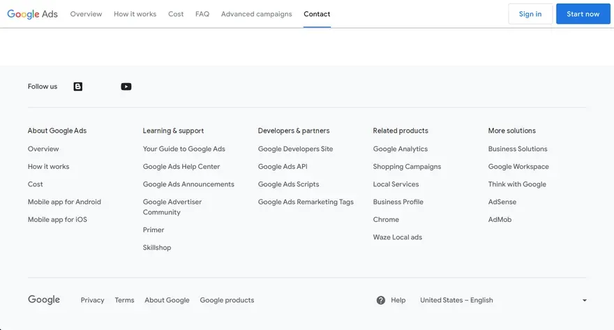
The menu you designed is the main (for most) method of finding content for users. In many cases on the site there may be multiple navigation menus providing different ways to access content. That is why Google Ads has different strategies (2 different types of information) regarding HEADER and FOOTER;
8. Principle of growth (principle of growth).
Design for future information architecture growth. This means that we must take into account the content, what the business might add in the future and whether that addition would create a lot of problems.
Types of information architectures
Flat (flat).
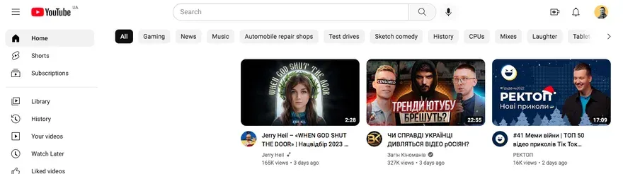
More sections in the menu, but the user will need fewer clicks to get to the very bottom (to the last nesting level). For example, YouTube; In other words, these are websites that try to make every web page accessible in a few clicks.
Deep.
More simple menu, but requires more clicks on the way to the goal. For example, Walmart. In other words, these are websites that use long paths to access certain pages of the site.
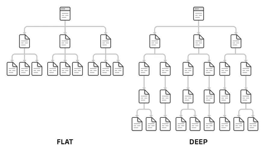
Important: simultaneous use of 2 types is incorrect! Also, if the content in these 2 types is the same, then anyway, the user experience when interacting with these 2 hierarchies will be very different.
A flat hierarchy makes it relatively easy for users to understand how a given page relates to other pages (if the user sees the navigation menu). But the deeper the hierarchy, the more likely visitors are get disoriented
Testing of information architectures
Card sorting
is a technique that helps to understand how users understand (perceive) and classify information;
Tree testing
is a way of evaluating the existing site structure (users are prompted to find a page or section based on the existing structure).
Types of information architectures:
Categories.
This is the most common type of information architecture. Mainly used in online stores;
Tasks.
It is mainly used in banks, as it is based on tasks that the user needs to solve;

Search (search).
If your product consists of user-generated content, then the best option would be to use just this type;
Time (time).
It means an information architecture that will change over time. For example, Gmail, Reddit or feed news on Facebook. It is a design that is built on time;
People (people).
This is an information architecture built on people. For example, Facebook. The design of this social network revolves around of a particular person and his relationship with other people.
Important: IA types can be combined! For example, Facebook uses a category system within each profile (for organizing information): photos, friends, places, etc.
An example of an information architecture that is not entirely clear to me (subjective opinion)
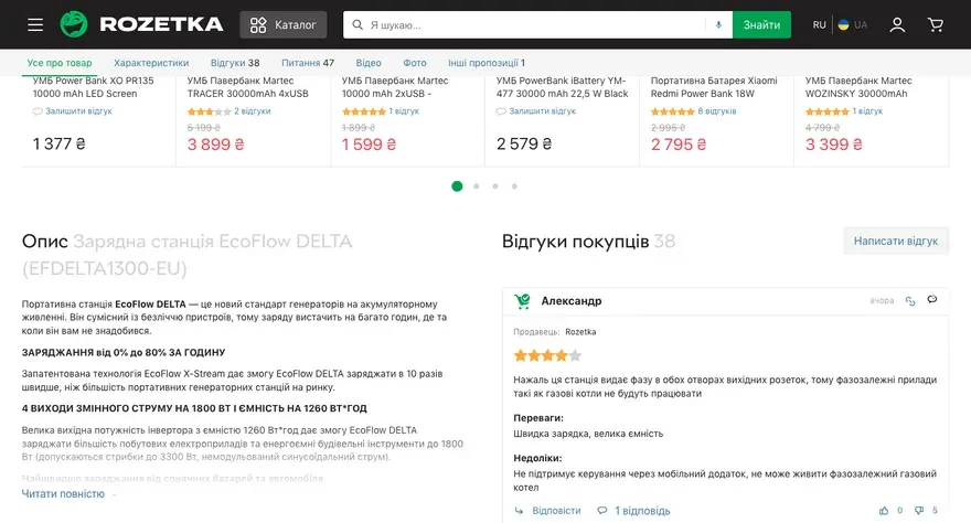
I decided to order a powerful power bank in the ROZETKA online store.
Interesting: the information architecture of this store combines 2 types: categories and search (maybe I’m not right, then you tell me).
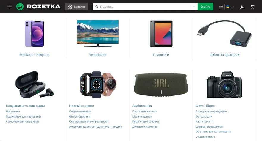
So, I opened the “Catalog” and started searching for the power bank category, but I couldn’t find it. Then I used the search. The results page let me know that there are power banks out there, but that’s not where I’m looking. Understand this problem the functional with bread crumbs helped me. Finally, I realized that ROZETKA classified power banks under the “Accessories” section for mobile phones and smartphones” > “Universal mobile batteries”. Personally, for me, a power bank is not an accessory for mobile phones and smartphones, as I charge my laptop, watch, headphones, etc. with the help of a power bank when turning off the lights.

For example, the
MOYO online store assigned power banks to the sections “External batteries” > “External batteries (Powerbanks)”. I was easily able to find what I wanted, as the navigation includes a “Power” section, which has a “Powerbank” section within it. (external batteries)”.

What did I want to say? In the case of ROZETKA, I spent much more time and had to use the search (what is not very critical, since the designers managed to correct the situation by following the principle of multiple classification (principle of multiple classification). In the case of MOYO, I found the section I needed very quickly.
Forming information architectures into an artifact
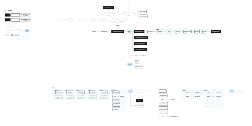 An example of the information architecture of the tickets.ua site
Important: Be sure to customize the legend for your maps! Without it, it is very difficult to read them.
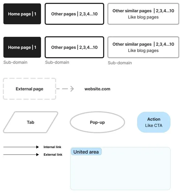
An example of a legend for information architecture
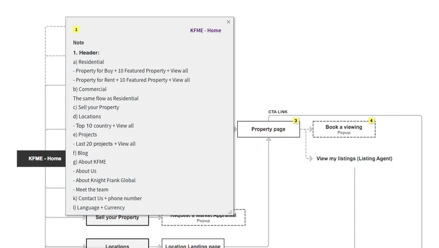 An example of a content description
Important: be sure to describe the blocks and interface elements that will be on each page. First, it will be easy for you present the structure to the team and stakeholders, secondly, the stakeholders will be able to independently evaluate it and give you extended feedback.
Advice
If possible, start working out this stage from paper sketches, as it is much more efficient and quick to display necessary on a large sheet of paper, and focus exclusively on the process of creating a structure rather than being distracted by the interface programs, indents, size and color (you can use felt-tip pens or colored pencils in sketches).