Web design trends of the second half of 2023

Scrolling
The name of the trend scrollytelling (English scrollytelling) is formed from the combination of two English words scrolling + telling, which in translated means scroll and tell. The main idea of scrolling storytelling is to create an engaging story, which develops as the user scrolls the web page.
It is worth noting that this is not a new trend that emerged in 2023, but the popularity of scrolling is growing at a rapid pace. Scrolling storytelling attracts and captures the attention of users who immerse themselves in a story that gradually develops as they scroll screen.
Scrolling can be not only vertical. Users can scroll websites in different ways: up and down, sideways and even combining scrolling with rotate and zoom gestures.
Pictures, animations, videos, audio, and other design elements can be combined to create scrolling. Modern websites can use the parallax effect, a method that creates a sense of depth by using different speeds scrolling for different elements on the same page. In particular, the background moves at a different speed than the main content. This allows you to add additional layers of entertainment and give users more insight into your brand’s personality.

3D content
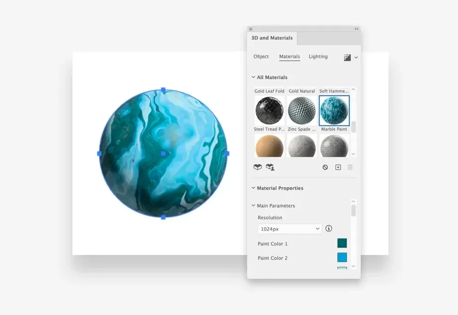
In the past, I have seen extensive use of 3D design elements, and the trends for 2023 show that 3D elements will be more more common in UI design. This is facilitated by a new generation of 3D tools, so everyone can easily create 3D projects.
The most common use of 3D elements has become for:
- Visualization of products;
- Interactive design;
- Creation of unique design elements.
In 2023, I recommend that designers improve their skills in using UI design software for creating exciting concepts and animations in 3D.

Aurora and holographic gradients
Aurora in the design describes a type of gradient reminiscent of the northern lights. This is a combination of bright colors that smoothly merge each other. A holographic gradient resembles an optical illusion or different colors blurring and blending together.
Color blocks with palettes that trigger the release of dopamine are becoming more and more popular. These palettes can be smoothly combine to create fascinating gradients. Vibrant color schemes called “aurora gradients” are combined light complementary colors allow you to create an unusual and modern atmosphere that pays tribute to the 80s and 90s.
This trend is actively making its way in web design, identity, and ready-made design elements.

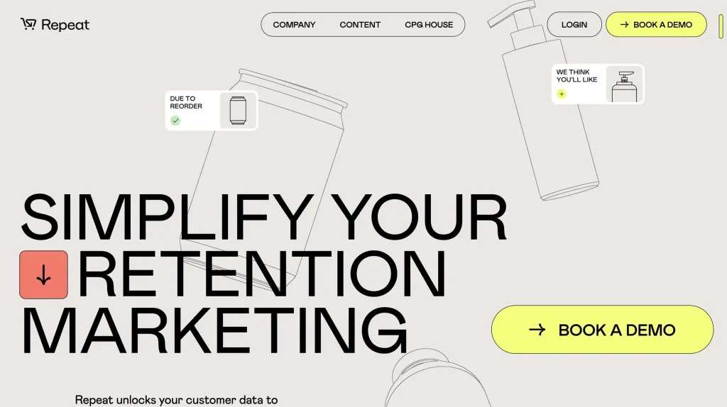
New, expressive minimalism
When you first look at the direction in which minimalism is moving, it may not seem very innovative.
In the new, more expressive minimalism, the fundamental aspects remain intact:
- focus on functional objects without unnecessary decorations;
- pure negative space;
- flat elements and patterns;
- convenient navigation and limited color palettes.
The future trend of more expressive minimalism is distinguished by a detailed and improved approach to the current concept. The new trend changes the focus from “less is better” to “maximum focus on the main components”. The new direction is distinguished by:
- in larger font;
- asymmetrical arrangement of elements;
- an unusual combination of colors.

Design focused on typography
Typography is a key element of graphic design that allows designers to communicate messages effectively. Expressive typography is popular because words become more visually impressive. Currently, the most popular styles are:
- Надмірна типографіка: дотримуйтеся тенденцій UI/UX, використовуючи великі, жирні заголовки або створюй дизайн, що сфокусований на тексті, щоб виразити суть вашого бренду.
- Різка та бульбашкова типографіка: експериментуйте з різкими, незграбними шрифтами або округлими, плавними формами.
- 3D і текстура: додавайте текстури до композицій шрифтів; у 2023 році актуальними будуть ртутні та металеві шрифти.
- Ретро-друкарня: використовуйте сміливі, яскраві, округлі шрифти, що нагадують ретро-естетику.

Microinteractions and animations
Improving user experience means providing feedback to actions. This applies to mobile devices, programs and website. Adding small visual, tactile and auditory details is crucial.
Micro-interactions create uniqueness and keep users’ attention. They provide feedback to the user, showing progress or hints. Enhanced microinteractions provide important feedback, especially in interfaces without buttons.
The most common types of microinteractions are:
- animation;
- swipes;
- progress indicator;
- hints to improve your password.
Generative artificial intelligence
Штучний інтелект вже доступний для використання в більшості графічних редакторів. Ось лише декілька прикладів.
Photoshop — Content Aware Fill and Face Aware Dilution Illustrator — deformation and global edit tool.
In addition, there are numerous AI-powered websites that help designers create color palettes for their own designs
- Midjourney creates images and artwork better than you can find on the drains.
- Framer recently added artificial intelligence to build the user interface, and Figma is about to do so as well.
- ChatGPT helps to explore user issues and better understand customers’ business goals.
In the coming year, more technologies will be introduced to help designers in their daily work. If you still this haven’t, it’s time to familiarize yourself with these features to improve your design workflow.

Personalized UX
Offering a personalized experience is a modern approach to capturing interest and engaging users. In the field of electronics commerce personalized purchase recommendations are effective in increasing sales.
As AI and machine learning continue to advance, we can expect more personalized experiences in various software products.
A few more examples of personalization in UX design:
-
Personalized navigation. The navigation bar changes the location of items, depending on the history of visits or purchases, to provide the most convenient access to the most popular categories.
-
Personalized content. Adaptive content in order to offer the most relevant content or make additional ones sales For example, Google has long been congratulating users of certain countries with local holidays with Google Doodles.
-
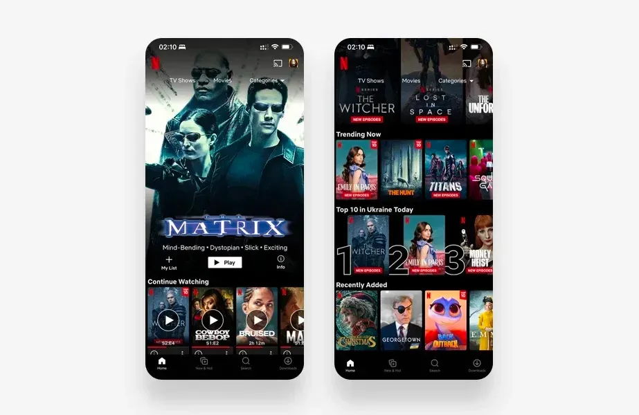
Personalized design. The color palette or design may be changed based on demographics, age, or other data user data. For example, Netflix changes the background image for users based on their viewing history.

Availability as standard
Designers focus on the needs of users, ensuring comfort in use.
In 2023, prioritize accessibility in your product UX design. Accessibility is a leading trend in UI/UX, along with a mobile-first approach.
Everyone deserves equal rights, regardless of ability or background. It must be taken into account during product development various aspects such as physical ability, race, culture, gender, age and language in development.
Test the design with different users for inclusiveness.
Accessible design includes the ability for users to increase the size of text and design elements. Also they can need to replace the color palette in order to better recognize the text.
The ability to voice the text has long been used by well-known websites. Contactless interaction like a voice interface user interface (VUI), appeared during the pandemic. Expect VUI to be an important trend in 2023.

Synchronization on different devices
One of the top UX design trends for 2023 revolves around the mobility of our lives. During the day we use different devices, but our tasks and needs remain constant.
Users prefer convenience.
To achieve this convenience, the apps and website synchronize content and settings across multiple devices, such as computers, phones, tablets and smart watches. This is useful both at work, where it is extremely important to stay connected, and in everyday life.
UI/UX design trends follow this concept. Therefore, it is important to develop a design that will be equally convenient to use on a computer, tablet or mobile phone. Users should not experience insufficient functionality or comfort when changing the device to perform one task.
