PANTONE color system
The problem of falling into color
Probably, everyone who has ever worked with printing has dealt with the problem of the so-called “falling into color”.
In simple terms, this is a situation in which the colors of printed products (business cards, flyers or calendar) are not correspond to what was in the given task. Red is darker than the customer expected, turquoise “yellows”, etc.

Many factors affect the color during printing: the type of paper used, the equipment, the designer’s monitor settings, and sometimes - a banal lack of experience.
Sometimes the color differences are slight, and the product format itself allows some error. For example, few people care about exactness color transfer for cheap flyers or advertising posters in the elevator. But for many brands, color is an important medium identification and differences from other companies.
For example, Coca-Cola, Nova Poshta and Vodafone have a corporate color palette of red.
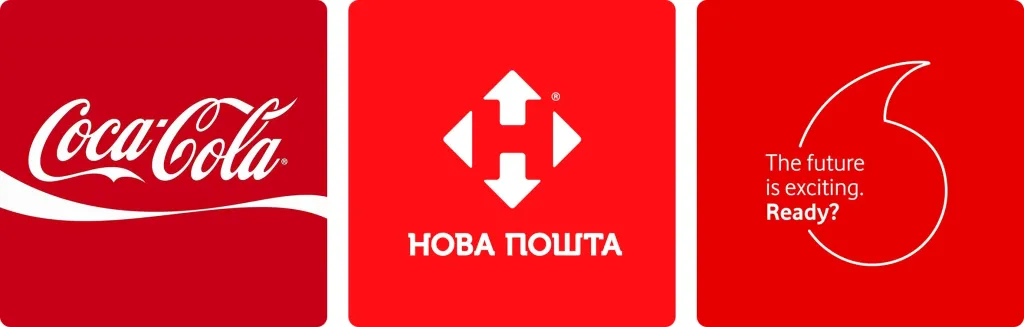
To some, the differences in the shades of red of these brands may seem insignificant. But compliance is for the companies themselves of the standards described in their brand books is fundamental. And, of course, color has a special place among these standards.
Sometimes getting into color is important for ordinary customers as well. They want to know for sure what they will get when they print the color they expect.
And not only when printing: imagine that you have just finished the renovation, and now the walls of the room have a pleasant peach or olive color Suddenly, due to a minor carelessness, someone from the household leaves a scratch on the wall. If you don’t get into the same color as last time, the fix may become more noticeable than the problem itself.

One of the reliable ways to avoid such problems both during printing and when painting walls is to use the so-called Pantone color matching system (abbreviated, PMS — Pantone Matching System).
History of Pantone
The company that created this system is called Pantone. This name could also be translated as “all colors”, because in fact it consists of the English prefix pan- (an analogue of the Ukrainian prefix “vse-“) and tone (English “tone”, “color”).
This company originates from New York.
In the 1950s, brothers Mervyn and Jesse Levine founded the advertising company M&J Levine Advertising. In 1956, to the company Lawrence Herbert, a graduate of Hofstra University, came to work.
Herbert’s task was, using his knowledge of chemistry, to optimize the production process of colored paints. Then it was a significant problem. After all, colors had to be mixed manually and the results of such mixing were often difficult to predict. Sometimes the typography, receiving an order from a client, worked with rather abstract tasks - “soft pink color”, “the color of the sea” or “the color of the evening sun”.
During his work, it occurred to Herbert to create a unified “color language”, more objective and predictable. Such, in to which the description of each individual color in different parts of the earth would give the same result.
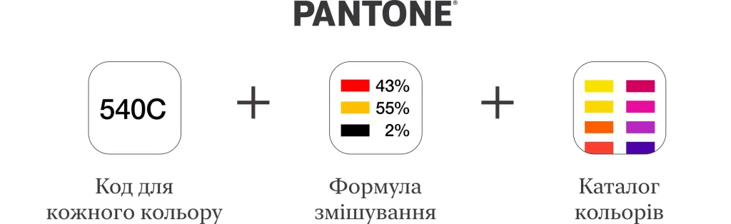
After some thought, Herbert decided to create a catalog of colors and their shades. Each of them was assigned a certain code and mixing formula that would guarantee an accurate result. Thus, the client got the opportunity to choose colors from the catalog and be sure of the printing result. This system was named the Pantone Matching System.
Later, this implementation turned out to be so successful that the ink and printing department, which Herbert managed, became the most profitable in the company However, in general, things were not good at the company: the commercial department had a debt of 50,000 dollars. But Herbert sensing the significant potential of his developments, he bought the company from the Levin brothers and renamed it Pantone.
Because of its significant relevance, Herbert’s system quickly became popular. It began to be used in advertising, textiles industry, architecture. But the field of use of the system did not end there. Herbert pointed out that hers too used for the analysis of blood samples, the description of varieties of walnuts and strawberries, as well as for compiling catalogs goldfish
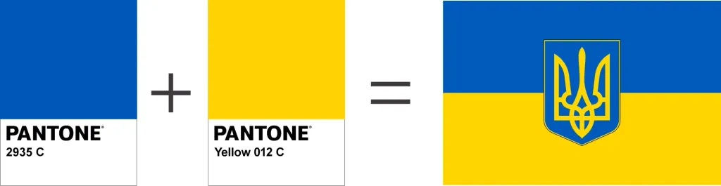
Also, Pantone colors are used for state flags.
For example, the Ukrainian flag has its own colors in the Pantone system: Pantone Coated 2935 C (azure) and Pantone Coated Yellow 012 C (gold).
How does Pantone work?
So, the basis of the Pantone system is the unification of colors through the standardization of their mixing formula.
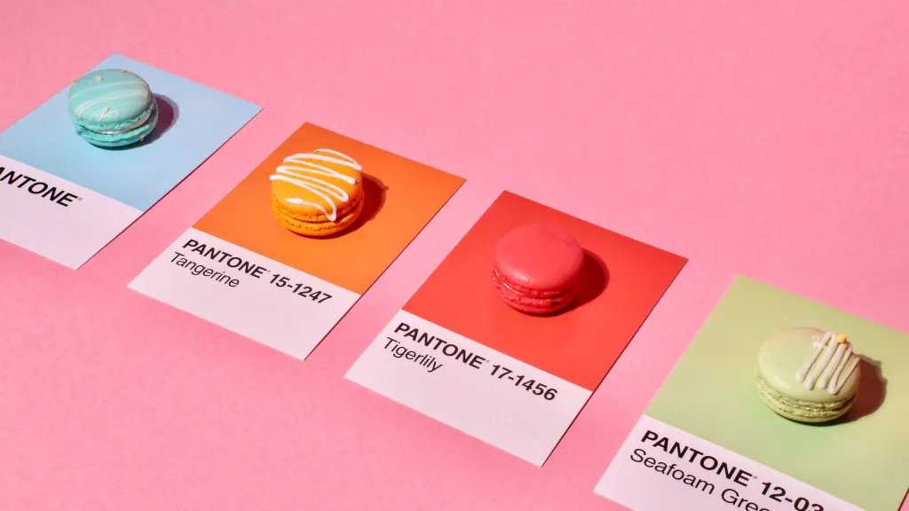
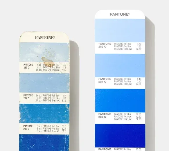
One of the components of the system is the Pantone color catalog. They are produced in the form of so-called pantone fans. The first catalog appeared in 1963.
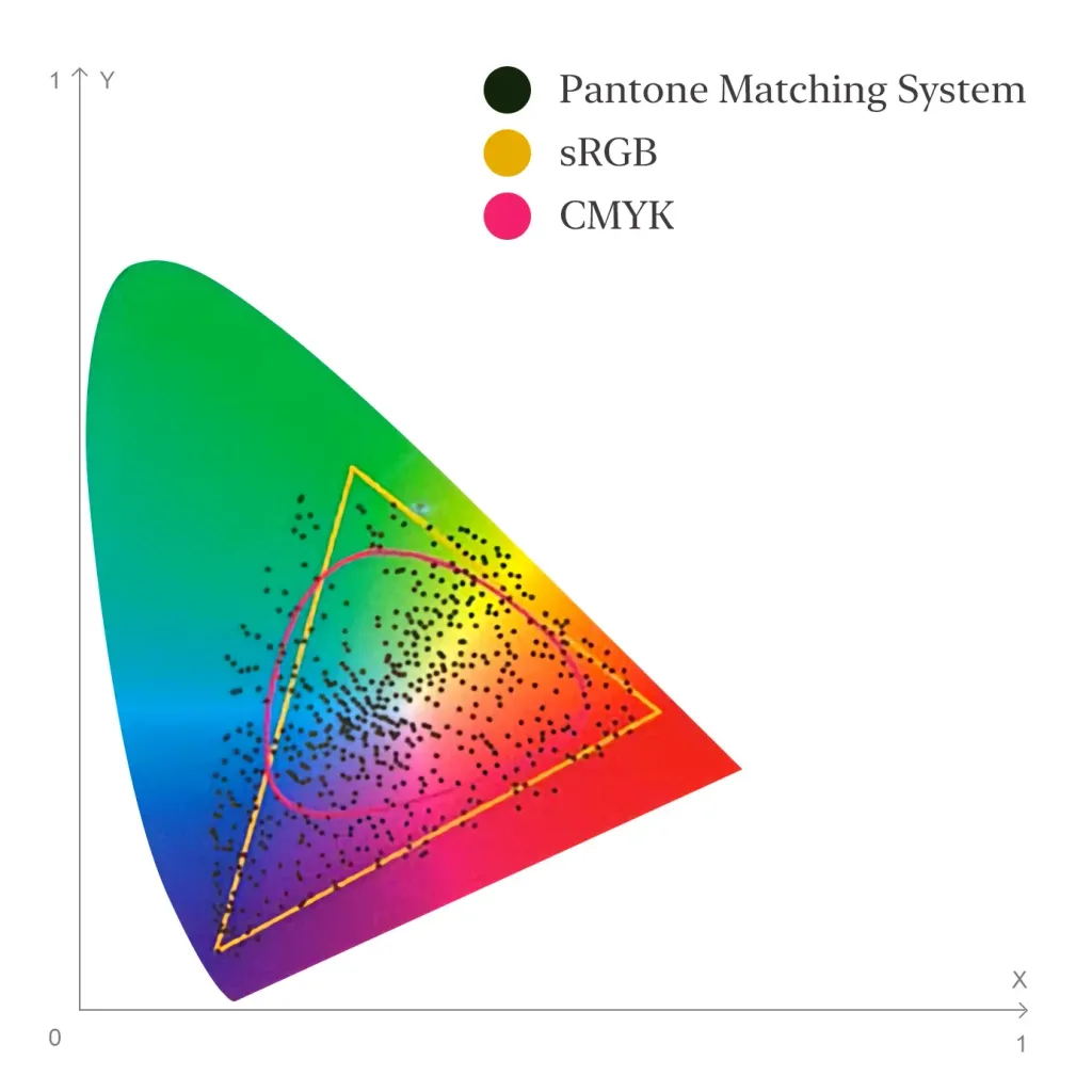
In the Pantone system, as in the CMYK system, colors are obtained by mixing. But if four basic colors are mixed in CMYK, then in the Pantone Plus system of 18 basic colors.
As a result, the color space of this system is much wider than that of CMYK, and even wider than that of the sRGB system.
The Pantone catalog itself is often called a Pantone fan because of its shape.
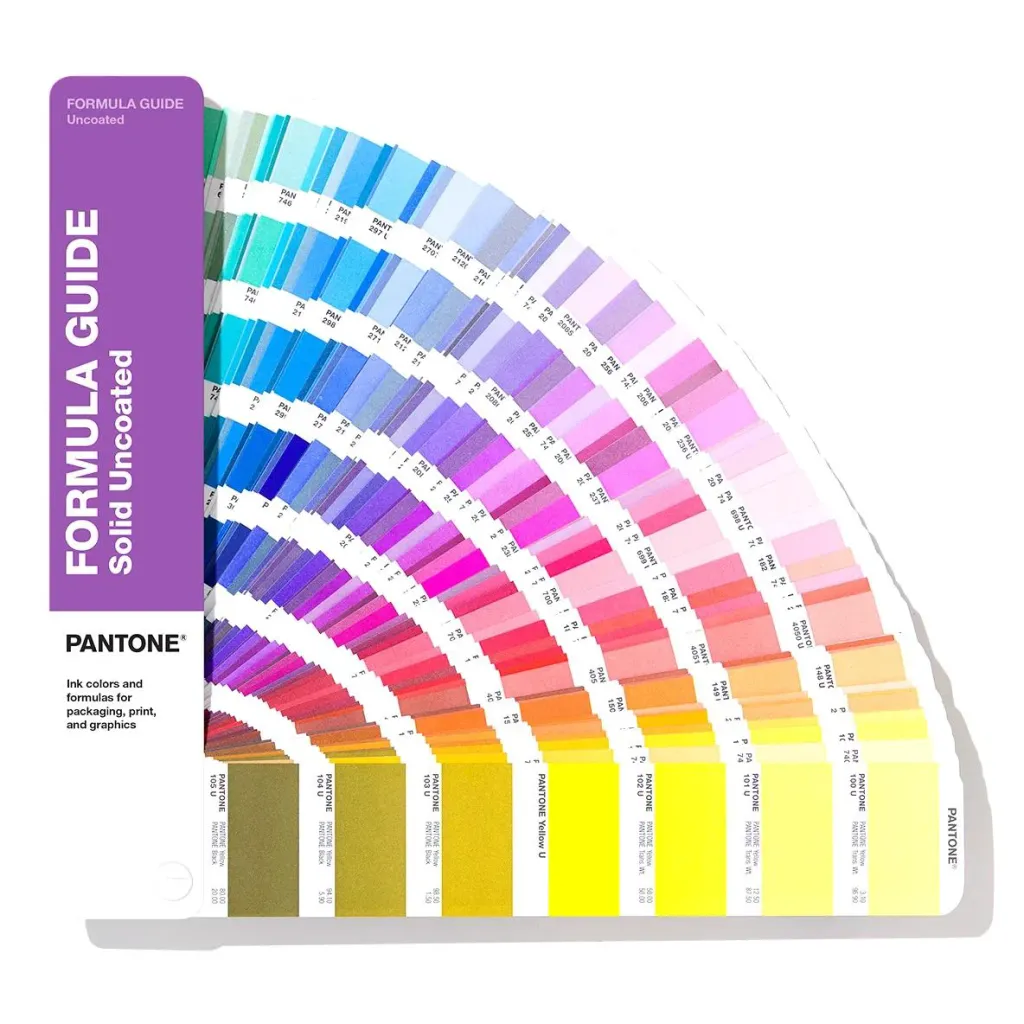
The catalog begins with a list of basic colors. And then there are the colors obtained by mixing them.
All pages of the catalog are numbered. Most of them have 7 colors. Each color has a code and a formula mix. Moreover, the organization of colors has a certain logic: the main color is located in the middle of the page. The top three the colors are the corresponding light shades obtained by mixing PANTONE White. The bottom three are dark shades To get them, PANTONE Black paint is mixed.
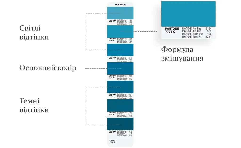
Some pages, especially those that have been added in recent years, may have the main color positioned differently, but the logic of light and dark shades is preserved.
Spot colors
In the article about CMYK, we explained that a color image during printing is formed by applying four layers of paint, applied to special printing plates.
At the same time, paints that are applied in separate layers are called spot colors. That is, cyan, magenta, yellow and black colors are spot.
Spot colors are also often called various non-standard colors that cannot be obtained by mixing these four colors — for example, colors with a metallic sheen or fluorescent.
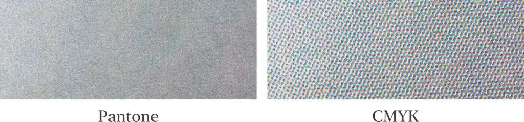
For the use of pantone paints, separate plates are also used for their application. They can be printed in one layer, if the pantone color is the only one on the layout, or to be added to other plates.
Due to the fact that one color can be obtained not as a result of applying 4 layers of paint, but only one layer, during pantone printing inks manage to achieve a denser filling of the printed area with ink, avoiding the graininess characteristic of CMYK.
But if Pantone provides such high color accuracy and has so many advantages, why not always use it?
Firstly, printing with Pantone inks is more expensive. Secondly, the Pantone paints you need are not always available. And thirdly - the use of pantone colors is not always justified. It is appropriate to use it when the paint is applied to a separate area with a solid layer.
Pantone and CMYK
For a number of colors in the Pantone system, there are similar colors in the CMYK system. That is, you can choose a pantone color from the fan and print it through color mixing in the CMYK system.
Of course, in this case, the probability of getting into the color decreases somewhat, and the density of paint application will be lower than in full filling with pantone paint. But the cost of printing will also decrease significantly.
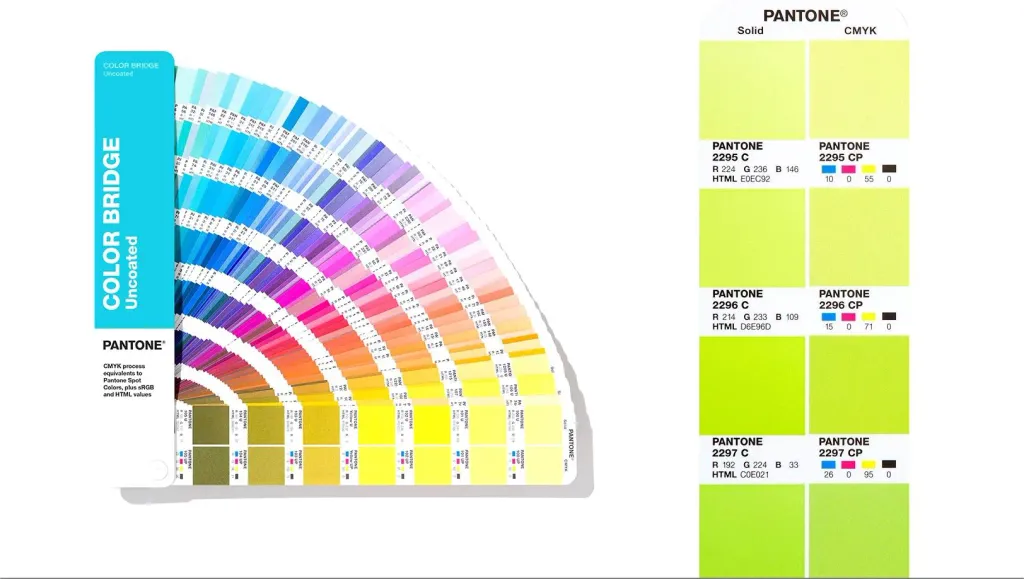
For such cases there is a separate fan known as CMYK Guide. Its pages depict Pantone colors and their formulas reproduction in the CMYK system.
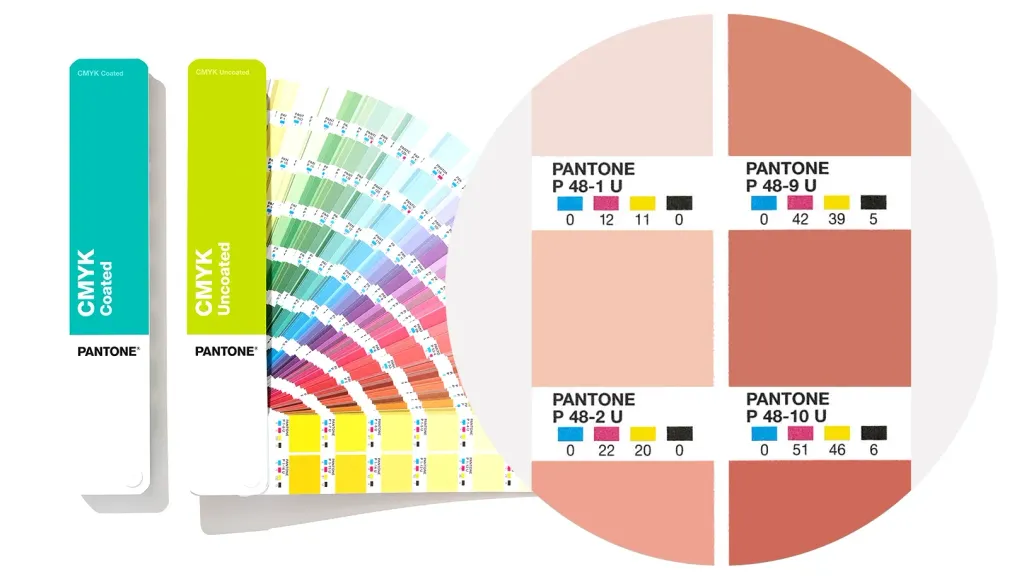
In addition, there is a Pantone Color Bridge catalog, which describes color analogs in several systems at once — CMYK, RGB and Hex.
Development of the Pantone system
At the time of its appearance in 1963 in the PMS system, all color codes were three-digit. The first in the system was color 100. The last one is 587. It is still the most common. At the same time, numbers from 100 to 399 were considered “classic”. These were bright, pure, saturated shades. Many brands immediately began to use them as signatures. Colors from 400 to 587 were neutral and dark, and intended for supporting elements of logos and corporate styles.
Over the years, the system has been constantly expanding. In 1991, an edition called “1000” appeared, and it already had 1012 colors. In 2000, 147 more colors were added to the system. In 2010, there were 224 more colors. Then the Pantone Matching System reorganized and named Pantone Plus. And in 2012, a new group of 336 colors appeared - the so-called “migrants” from the system Pantone Goe, which the Pantone company created in the 2000s, and which never gained popularity.
Thus, in 2012, the Pantone Plus catalog already had 336 pages, and the total number of colors was 1,677.
But despite the fact that during the more than 50-year history of the Pantone company, the structure of the catalog was supplemented and changed, the general principles and numerous colors in it have remained unchanged since the 1960s.
It should be noted that different types of paper provide different interactions with paint. For example, the paint looks on glossy paper brighter than on matte.
And since the original task of the pantone color catalog is precisely to ensure the expected result, there are separate fans for glossy coated paper, matte coated paper and uncoated (offset) paper.
Color of the year
Another interesting fact, for which the company Pantone is known, is the tradition of determining the title color every year. This issue is taken care of Pantone Color Institute (Pantone Color Institute).
This tradition is relatively young, it was started in 2000.
Twice a year, the company holds a secret meeting of representatives of color standardization groups from different countries in Europe. After two days of presentations and discussions, they choose the next year’s color. For example, the color for the summer of 2013 was elected in London in the spring of 2012.
For example, Pantone 19-4052 “classic blue” (Classic Blue) was announced as the color of 2020. CEO Pantone’s Leatrice Eisman called it a symbol of constancy and trust and added that the modern world needs faith and confidence.