Why do we round corners?
Rounded corners everywhere. From software interfaces to device design. Rounded in appearance there is something intrinsically satisfying about corners. Designers use them so often that they’ve actually become an industry standard, and not a design trend. But why are rounded corners so popular?
Rounded corners seem less noticeable
We can all appreciate the aesthetic beauty of rounded corners. But can we explain where exactly this beauty comes from? The answer to this question is literally in our eyes.
Studies have shown that rectangles with rounded corners are less irritating to the eyes than rectangles with sharp edges, so that their visual processing requires less cognitive effort. The central fovea on the retina processes circles the fastest. Processing the edges of an object engages more “neural imaging tools” in the brain. Thus, rectangles with rounded corners are easier to work with because they are closer to a circle than a regular rectangle.
Scientific studies of angles by the Barrow Neurological Institute have shown that “the perceived salience of an angle varies linearly depending on the angle itself. Sharp corners stand out more strongly than gentle ones.” In other words, the sharper the corner, the it looks brighter. And the brighter the corner, the harder it is to look at it.
Which figure is easier to look at?
We are used to rounded corners
We are taught from a young age that sharp corners are dangerous. For this reason, we avoid them in the physical world and seek them out instead rounded, organic, safe objects.
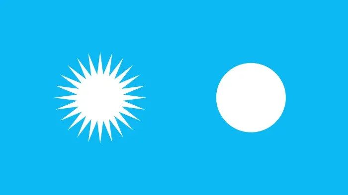
When a child plays with a ball, most parents are not afraid. But if the child starts playing with the fork, the parents will take the fork away, fearing that the child might get hurt. Neurobiologists call this phenomenon the “avoidance response”, which is rooted in our of the brain as it matures.
What object would you let your child play with?
Rounded corners are easier to process
Rounded corners are more effective for maps and charts because they make it easier for our eyes to follow the lines. Sharp corners distract attention from the path of the line, so there are sudden pauses when the line changes direction. But with rounded corners our gaze glides along the line along each corner to smoothly continue the path.
Which diagram is easier for you to perceive?
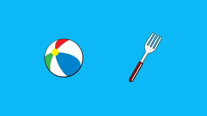
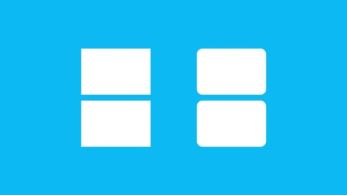
Rounded corners are also effective containers for content. This is due to the fact that the rounded corners are directed inward to the center of the rectangle. This places the focus on the contents of the rectangle. Also, when two rectangles are next to each other with one, you can easily see which side belongs to which rectangle.
Sharp corners are directed outwards, which reduces attention to the content inside the rectangle. They also make it difficult to tell which is which from two sides belongs to which rectangle when two rectangles are next to each other. This is because each side is a rectangle is a straight line. The sides of a rectangle with rounded corners are unique because the lines turn towards the rectangle, to whom they belong.
Which pair of rectangles is easier to distinguish?
Problems with rounding
After such considerations, it is easy to think: let’s use rounded corners everywhere!
This is clearly not the best approach, because rounded corners are not always the best solution. To get the right user experience, designing a product, we must think about its purpose and tasks. The rounding of one corner in itself may be insignificant, but if you do it at scale (for example, on the entire interface), it can dramatically change the appearance of the product.
To understand such an effect, let’s go to the basic level. All design elements can be reduced to basic shapes and lines, subconsciously conveying different identities to the audience.
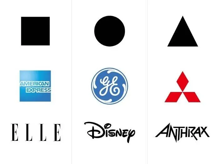
Let’s take a look at some logos:
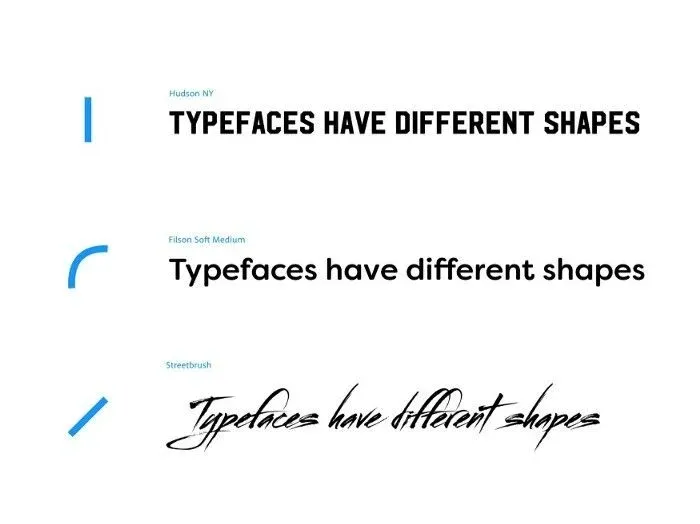
Now take a look at some headsets:
It is quite obvious how these logos and fonts evoke different reactions. And it all boils down to the psychology of forms:
- Square shapes are usually considered reliable, uniform, traditional and professional.
- Round shapes are usually considered charismatic, attractive, harmless and benevolent.
- Triangular shapes are usually considered dynamic, energetic and powerful.
Therefore, when designing a design, it is very important to think about the goals of our brand or product, because the shapes we choose for basic design elements, can have a big impact on user perception. Rounding the corners may be appropriate, if we want to achieve a friendly, innocent appearance, but this is not always the case.
Another important thing to keep in mind is the similarity of design elements. When designing interfaces, sometimes we want to highlight a specific button, link, or tag to direct the user to an important action. This cannot be achieved if we use only rounded shapes.
The MaterialDesign framework has some great guidelines for using shapes in an interface. The key conclusion is because “shapes direct attention, define components, communicate status, and express brand.”
Let’s round up
There are certainly reasons and reasons why we like rounded corners in both physical and digital products. The passion for roundness is deeply rooted in our development from an early age and is based on the fact that everything in the surrounding natural world is rounded.
However, as we have seen, this does not mean that we should blindly apply rounded corners in our designs. Different forms cause different reactions from users, and rounding corners can cause our design to create an unintended effect perception and will affect the overall user experience. We also need to diversify forms when designing interfaces, to direct the user to the correct actions and convey the hierarchy of the interface.
Rounding the corners may seem like a trivial design decision, but in the end, it makes a big impact.
And what do you think about rounding the corners?