Selection of colors for the site

Selecting colors for a website is an important part of the web design development process. Colors can influence user perception site, mood and associations they have with the product or brand. In this article, we will look at several steps that will help you choose a color scheme for your site.
1. Determine the target audience
First of all, you need to understand who your site is for. What group of people are you trying to attract and what is the mood do you want to transfer For example, if you are developing a site for children, it makes sense to use bright, saturated colors, while darker and more subdued colors may be suitable for a financial company’s website.
Website color scheme for a financial company:

Coloring of the site with the theme of children’s skin care:

Colors of the site on the topic of startups:

Website coloring in the beauty industry:

2. Use a color palette
If you have no previous experience with color selection, using a color palette can help you. The palette is a set of colors that are harmoniously combined with each other. Some websites like Adobe Color or Coolors can generate palette for you based on the selected starting color or using algorithms based on color theories.
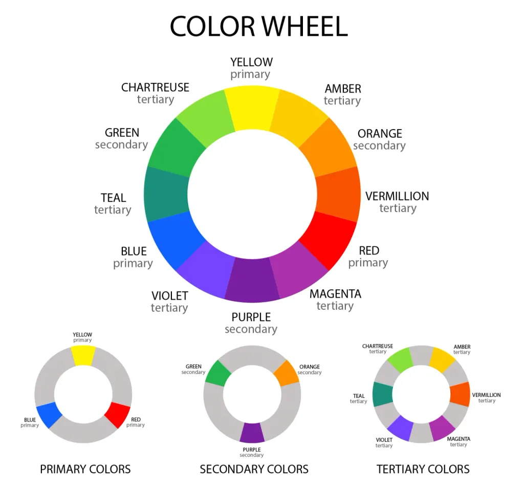
3. Use color theories
There are many color theories that can help you choose a color scheme for your website. One of the most common is a color wheel theory based on the relationship between colors on the wheel. For example, a harmonious color scheme can include colors that are on opposite sides of the color wheel, such as blue and orange, red and green, an analog color scheme is a scheme that uses colors that are next to each other on the color wheel wheels, for example red, orange and yellow. The “triad” color scheme uses colors that are on equidistant from each other on the color wheel, for example red, yellow and blue.
4. Use brand colors
If you already have a registered brand, it makes sense to use its colors on your website. It can help create a unified style for your brand and facilitate easy recognition of your brand by users.
5. Use contrast
Contrast between colors can help make your site more attractive to users. Use of colors with great contrast can help make even the simplest website design more attractive and dynamic.
6. Test the colors
Finally, before you finalize your site’s color scheme, it’s important to do some color testing. check the how your colors look on different devices and in different lighting. Also pay attention to what associations are evoked your colors, and change colors if they don’t convey the desired mood or match the brand identity.
Conclusion
Choosing colors for your website is a complex process, but using the steps above can help you make the process easier more simple and effective. Do not forget that colors can affect the mood and impressions that users have with of your site, so it is important to choose colors that convey the right mood and promote a positive perception of your site users.
Finally, remember that colors are only one element of site design. The design should be balanced and harmonious, using not only colors, but also fonts, sizes and structure. Use colors to highlight other designs, but don’t let them overpower other aspects of the design.
As a result, the right colors can make your site attractive and attract the attention of visitors by providing a more positive impression of your brand and product.