The rule of internal and external

The essence of the rule
The rule is often formulated as follows:
internal ≤ external
A more detailed rule may sound like this:
The outer margin of the element must be equal to or greater than the inner margin.
So far, it is probably not very clear. But don’t worry, we’ll fix it now. And for this we will have to find out what we call an element what a group and, accordingly, what is internal and what is external.
Elements, groups, “internal” and “external”
In general, the rule of internal and external is a special case of the law of proximity, which we talked about in the lecture about gestalt According to the law of proximity, we perceive the relation of objects to common groups due to the distance between them.
For example, let’s take five squares and place them in space.

With such an arrangement, these elements are perceived as independent and unrelated to each other. After all, they are located far away one from another.
Let’s now consider another example, with a slightly different organization of elements:

Here we see that the elements have a common axis. But despite this, their perception as a group is not yet clear.
Let’s consider four more cases of elements approaching each other.
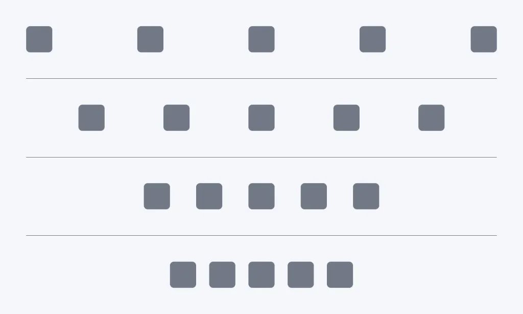
In the given example, we gradually reduced the distance between the squares. In the first two lines, the elements belong to joint group felt not clear enough. But in the third and fourth lines it became obvious.
Why did this happen? At what point do individual elements form a common group?
To understand this, we should add an extra parameter to our element, an external field.
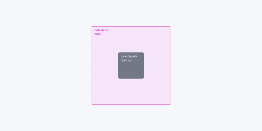
This external field is what is called external in the rule. Accordingly, the width and height form the inner field element — internal.
That is, the rule “internal ≤ external” defines the following principle: an element is independent when in its external field there are no other elements. At the same time, the size of the outer field must be equal to or greater than the size of the inner field. If in another element appears within this field, a group is formed.
Let’s now look at the illustration with four rows of elements, but this time we will show the outer fields, and the action of the rule will immediately become more noticeable.
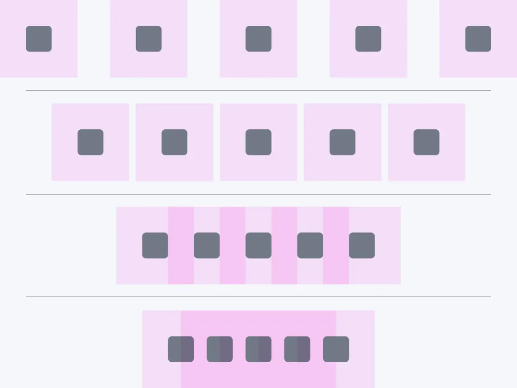
So, we perceive elements as groups when the distances between elements are equal to the size of these elements or smaller than them.
Moreover, each group has its own field. Accordingly, the two groups interact with each other in a similar way. The smaller the distance in within the limits of this field, the tighter the connection between the groups.
This rule is quite important when composing texts. Let’s consider how it works with several examples!
Applying the internal and external rule when composing texts
One of the contexts of the application of the rule of external and internal is the composition of texts. Here, the basic element is, as a rule, are letters, and the minimal group, respectively, is words.
For example, in the phrase “Fundamentals of design” there are two groups at once.
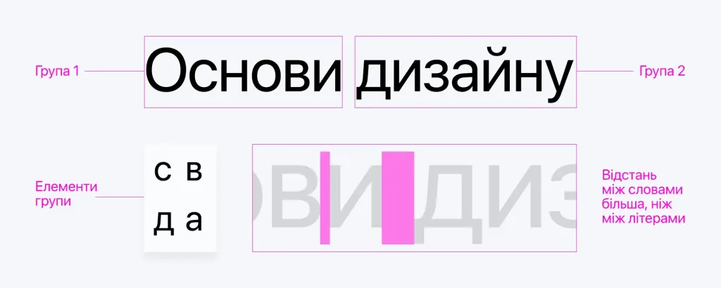
The space between individual letters is insignificant (it is also called kerning, by the way), so the relationship between the letters is obvious. The distance between the individual words is slightly larger, but still insignificant, and therefore we also combine the two words into a common group.
Let’s add another line to this text and write “from Creative Practice” in it. And immediately another one - “details on website creativepractice.com.ua”.

Now the illustration has the same indentation between words on one line and words on the next. And such a text is for us to perceive somewhat uncomfortable. This happens because subconsciously we perceive a row as a separate group.
Everything that belongs to a single row becomes internal, and its field becomes external. So we adjust the distance between individual lines so that each line is perceived separately. Accordingly, the distance between lines should be greater than the distance between words.
We adjust this distance using a parameter called spacing. Interlining is, in fact, the space between lines, the vertical distance between two row baselines. In some computer programs it is called interline space (English line spacing).
Like the pin, the lead is measured in points, and for comfortable reading, the lead is set from 1.2 to 1.6 points (or 120-160% of the font size).

It got better. But there is a problem: the first two lines form a complete sentence, while the third line is perceived as somewhat incoherent. So, in terms of content, the first two lines form a common group, which would be appropriate to separate from the third line. And since the meaning of what is written in the third line is less important, its size can be slightly reduced.

Now we can clearly see how the elements are grouped together.
Similarly, the rule works for larger text arrays. Just in the texts that have subsections, these same subsections form separate groups, which should be clearly shown according to the following hierarchy:
letters → words → lines → paragraphs → subsections → sections
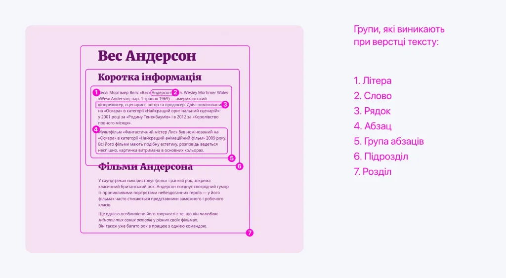
It should also be noted that in design compositions, this rule applies not only to textual content, but also to illustrations and other layout design elements.
At the same time, texts, as a rule, do not exist in an abstract space, but within the limits of one or another form. About her, grouping elements and adjusting the distances between them, designers often forget. And for nothing.
The rule of internal and external in the context of working with the form
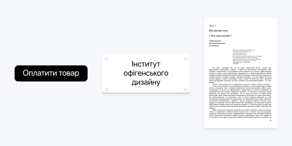
The form can be anything: a poster, a button or a sign.
And when placing this or that content within the limits of this form, one should not forget about the rule of external and internal.
Look at these cases:

When you look at the given examples, you notice a certain inconsistency in each of them. Sometimes when we see a similar design, we understand that something is wrong with it, but we cannot explain what it is.
The problem is in the outer fields. Let’s show them:
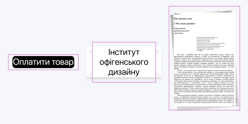
As you can see, in each of the examples given, the external field of content simply does not fit into the given form, it goes beyond it.
To correct the situation, it is necessary to either increase the size of the form itself (when possible and appropriate) or change the size elements so that the external fields change proportionally with them.