The main trends of the year in logo design
A logo is usually the first branding element a potential customer sees. He must make an impression and establish himself in memory, causing the right associations and interest. A small logo carries a lot of information: it can convey meanings, lay down the necessary idea or broadcast values. Giant companies understand why you should not underestimate the importance of a logo, therefore, considerable funds and efforts are invested in its development.
Today we will talk about what are the main trends in logo design in 2023, what current features are worth take into account what distinguishes an amateur logo from a professional one.

Quality logo design - what is it?
Let’s start with why logo design is so important. Thousands of brands and every company are fighting for the consumer’s attention you need to figure out a way to stand out from the crowd. This effect is achieved due to corporate style — a number of elements that together create a unique brand image in the user’s mind. Corporate style covers all areas of the company’s life: from employee uniforms to the logo — the business card of the brand.
The main function of the logo is to identify the business in the user’s mind. And if this element plays such an important role, it is worth making sure that it is created according to all the rules. When developing a logo, it is important to pay attention to typography, colors and embedded message.
Developing a really high-quality logo design is not always easy. The process consists of thorough market research, in-depth audience analysis and adherence to basic design principles. Often, specialists need to create many variations of the same logo, before receiving the same.
Colors
A harmonious combination of colors is an important aspect of any logo design element. You can pick up the shades using color wheel or services such as Adobe Color CC, Paletton, Khroma. But in the case of the logo, additional actions should be taken:
-
Think of combinations with different backgrounds. You don’t know exactly where your logo design will be used and what colors it will be will be surrounded, therefore it is worth choosing the most universal shades. For example, the white Coca Cola logo looks great on most background options.
-
Use the 60/30/10 rule. The optimal ratio of shades on the logo palette is considered to be the following: 60% — the main one color, 30% — additional, 10% — accent or shadow color.
-
Start with black and white. Many designers prefer to build the “skeleton” of the logo in the form of a discolored sketch, to think through the structure, form and relationship between elements as best as possible.
When we look at any object, we first evaluate only two parameters: shape and color. If they keep ours attention, we concentrate on details and continue to consider the object. The designer’s job is to be as capacious as possible demonstrate the brand idea by choosing a shape and color that will win this race for the audience’s attention.
Font
Logo typography is a separate stage of its creation. If the brand logo is made in the form of the company name or contains it in itself, it is worth considering many details:
- Font. It should emphasize the nature of the product and reinforce its message.
- Optimal distance between letters. Not too big so that the logo elements look cohesive, but with enough quantity free space
- Colors. Shades corresponding to the character of the brand, which are combined with each other.
- Combination of text and icon — in the case when they are located next to each other on the logo. It is worth considering the size ratio and the optimal distance between elements.
One of the largest collections of fonts is presented in the MyFonts service. Designers will also find Fontface Ninja useful to to learn competitor font names, WordMarkIt to see one phrase in the execution of all previously downloaded fonts, and Emotype to search for fonts by the emotion they convey.
Contents
Every little logo design tells its own story. It should clearly correlate with the main idea of the brand — that’s it professional designers strive for when they spend hours creating a single icon.
The content of each logo is unique. Every company wants to put something unique in its logo. There is a universal algorithm which makes it easier for designers to start working on a logo:
-
Step 1. Create a legend. It can be a real story of the brand or a fictional plot on which the creation of the product is based. You should find the answer to the question why the company decided to release this project.
-
Step 2. Write about 10 words associated with the brand. Focus on your emotions or use services like Thesaurus.com. The words can and should be associated with the company’s legend as well - the first step of the algorithm.
-
Step 3. Mentally create word images that best represent the brand. Some of them may form the basis of the future logo.
Grab a pencil and paper and start sketching every idea that comes to mind. Let the concepts develop on their own. If you don’t like the first results, develop and improve them. The truth is near.
TOP 10 Logo Design Trends 2023
Trends are the foundation on which a company can build its future strategy. This is a fresh look, new trends and non-standard approach to ordinary things. It is the ability to quickly identify (and even to some extent predict) trends, competently implementing their in life characterizes a professional designer. So what are the current trends in logo design? Let’s analyze several of them lower.
Playful typography
Escapism is one of the design slogans of recent years. Users want to see more original details and are eager to see each product has its own highlight. Brands have picked up on this trend by applying it to typography. Meet the new trend — playful text as a logo.
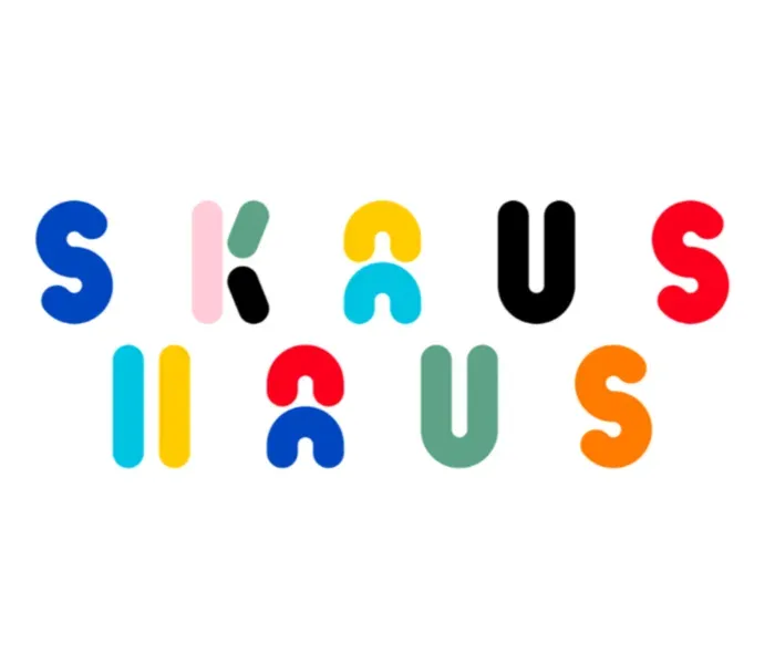
This year, designers add a touch of casual humor and wit to their work, creating playful line drawings. For some, this style resembles the doodles that children draw in boring lessons at school. Someone sees in playful fonts irony and a certain message In any case, the brand name alone in the original font is enough to get noticed these days on himself
There is an opinion that playful typography began to be actively used during the corona crisis, when designers sought to entertain the audience But it’s still relevant, so consider this optimistic way to beat the brand name.
Glitch effect
You’ve probably seen this logo design more than once lately. At least, this effect is in its icon now use TikTok. A mistake or glitch adds to the appeal of a design and makes a trendy logo more futuristic. In 2023, companies and brands are using this technique to attract the attention of younger consumers - it works on this group especially effective.
In addition to the logo, such a chip will look organically as an element of the website. The glitch effect can be added to icons, letters, an image or a whole phrase. It is likely that this trend will continue next year. Creating a glitch effect in bright, contrasting colors, brands draw attention to design and stand out in their industry.
And this has a positive effect on brand recognition. So far, the glitch effect is a fresh and untested solution, so it’s fast attracts attention and remains in memory. This chip is suitable for companies working in the field of entertainment, music or advertising best.
Gradients
Gradients quickly entered the top trends in logo design: they are used when creating the design of sites, banners and, of course, logos. The most striking examples of brands that actively used the gradient in their logos even before how it went mainstream—Instagram and Adobe Creative Cloud.
Here are some ideas of gradients from the shades relevant in 2023:
- #2193b0 → #6dd5ed light blue
- #de6262 → #ffb88c pink-peach
- #56ab2f → #a8e063 green-yellow
- #eecda3 → #ef629f beige pink
- #eacda3 → #d6ae7b nude
- #43cea2 → #185a9d blue-green
- #ffd89b → #19547b beige-blue
- #3a1c71 → #d76d77 → #ffaf7b violet-yellow-hot
The advantages of gradients are obvious - they look harmonious on many backgrounds, attract attention and look aesthetically pleasing. Everything indicates that this trend is with us for a long time. Use gradients to highlight key design elements and communicate to consumers the main idea.
Retro red
Starting from 2022, monochrome red flashes more and more often in design projects. And not just classic red, and a slightly muted retro shade that was previously used in traditional Eastern culture. It is believed that red brings good luck and causes pleasant emotions. Modern designers adopted this and began to create monochrome logos in retro style using red.
This is especially true when the logo features a character, because sketches and icons fit perfectly into this style. With the help of this move, you can emphasize the individuality of the brand and create pleasant, nostalgic associations for consumers.
Today, the creators of such logos draw inspiration from comics. This can be seen in two-dimensional line drawings, hyperemotionality of the depicted heroes, use of speech bubbles. Referring to a style that many associate with childhood, the designers encourage the audience to relax and enjoy the memories.
Minimalism
In contrast to bold and futuristic trends, the list of main design trends for 2023 still includes minimalism. The world will not soon move away from the concept of simplicity, because it is a truly universal and win-win approach. As they say less means more.
Here are a few examples in which industries this tool looks most organic:
- Photo
- Technologies
- Real estate
- Construction
- Fitness and SPA
- Beauty industry
- Jewelry
Minimalism should be used in the design of logos if you are faced with the task of telling about the brand with a clearly defined mission and task. The company must have a bright feature that sets it apart from its competitors. And it would be good to emphasize this detail in a minimalist logo.
Geometry
The idea of using geometric shapes in logos and other design elements is far from new. But she is in the trends of 2023 confidently takes its place. Today, both classic clear shapes and a mixture of geometry with abstraction are relevant - about it we will tell below.
This year, you can add a symbol, initials or brand name to geometric shapes in logos. Most popular all triangle, square and rhombus are also used. They can be combined with a sketch pattern or stripes to create a unique look pattern and add playfulness. Geometry in logos is used by such companies as HSBC, Mitsubishi and Adobe — like this in this way, they create a sense of stability and reliability in the audience.
What about twisted geometry? This is an offshoot of an established trend, which is used by more and more creative people today brands By twisting, breaking and stretching shapes in new ways, designers distort the restrained nature of assumed geometry. They express a rebellious spirit, deliberately breaking the norms of design. One of the vivid examples of the tandem of geometry and abstraction — logo design of the Norwegian company Renteradar.
Muted shades
This year, logo designs will increasingly feature neutral, soft shades inspired by nature. Muted colors are often used by beauty brands and organic food companies in their logos. This is explained by the fact that such shades have the property of calming and relaxing - and this is exactly the effect to which strive for eco-companies.
Today, muted colors look especially harmonious in the campaigns of brands from the fields of health care and retail trade and travel. By choosing natural colors such as pale blue or green, light brown and pale pink, you create a stylish logo that will remain relevant for many years.
Soft shades have a magical property - they hold the viewer’s attention. Unlike the same neon, pastel does not cut the eye and allows you to explore the product or service in more detail. The colors of this palette fit well into almost any design logo and make it more refined and elegant.
Sci-fi
What seemed like a movie plot yesterday has become our reality today. Digital world, space, artificial intelligence — everything it ceased to be something unreal, gradually entering our routine. However, the audience has not yet had time to get used to these attributes, so in 2023 they can safely be used in logos.
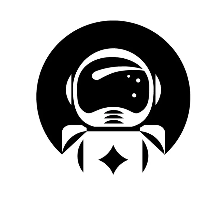
The main elements of science fiction in the logo design should be borrowed from steampunk and futurism. Use more often cold shades of gray or dull brown, choose effective fonts and do not neglect metallics.
Art deco
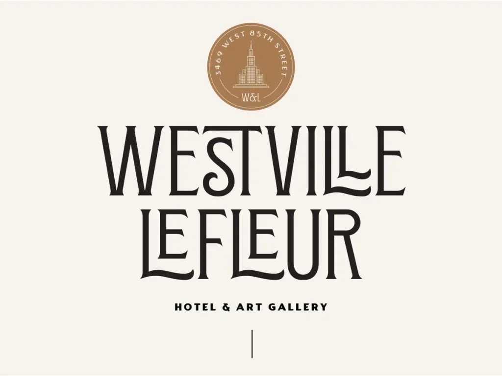
Originating back in 1910, Art Deco is experiencing its revival in 2023. And, like any cyclical trend, today this style somewhat updated. You can create a logo based on the key elements of art deco:
- a strict regularity
- bold geometric lines
- ethnic patterns
- design in halftones
- lack of bright colors in the design
- colorful ornaments
- luxury and chic
You can dilute the logo design with futuristic or digital elements, comparing the 20th and 21st centuries and reminding that that every past trend can be rethought and actualized. The old dissolves into the new: the romanticized past is transformed to the technological future.
Mythology and mysticism
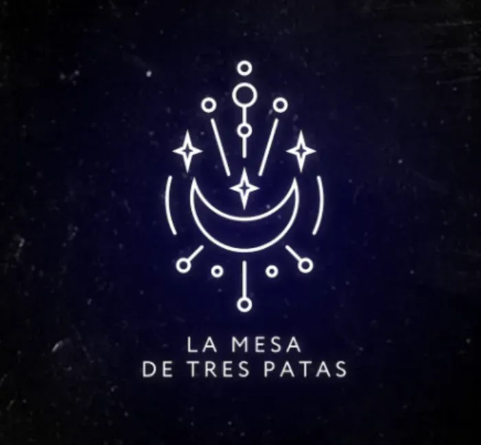
Another way in which Generation Z resists established norms is the use of elements of the esoteric in design and spirituality. Astrology, crystals and tarot cards are more popular today than ever before. Each of us sees something in mysticism its own, but more often than not it is a strategy for finding meaning and connection in a world that seems ever more disconnected.
This logo design trend reflects the need for calm and natural styles, colors and techniques. The key driver the force behind the popularity of mystical elements in design was the idea of “taking back your power” — a certain rebellious spirit inherent in the young generation.
Designers rely on this concept and use in their logos the visual language of such practices as astrology, tarot, crystals and other esoteric directions. As a rule, this language includes images of planets, eyes, astrological symbols and motifs, inspired by nature.
Tips that are always relevant
Trends in logo design allow us to introduce relevant features into the project, distinguish it from others and attract attention the audience But the key secret to an effective logo is still the base — following the basic design rules.
We mentioned a few universal tips that will always be useful: they were relevant 10 years ago, they remain so in 2023 and will no doubt help you in the future. Take note of them to improve your logos and make them even more professional.
Don’t be too literal
A logo design doesn’t necessarily have to show what the company does. In fact, it even hurts. Quality logo should not directly show the brand’s products - it should create associations that are fixed in the memory.
Why? Let’s return to the main task of the logo. Its purpose is to convey the values of your brand, standing out from the competition. If you just give a literal representation of the company’s products, you will not touch the consumer.
How would it be better:
- Create a unique image that would reflect the tastes, values and preferences of the target customer
- Reflect the individuality of your brand and embed a certain link in the logo
- With the help of a logo, tell customers about what characteristic feature your brand has
For example, Apple has done a great job of not being literal. The company logo features an apple, although the brand creates technological products. Their simple trendy logo is memorable and conveys the company’s values.
Bring your design to life
The modern design market is so large and highly competitive that sometimes a high-quality static logo is not enough for achieving the goal. The digital age has brought many innovations, and today the customer wants to be surprised by high-tech solutions. You should think about how to adapt your logo for digital applications.
Many designers today work together with motion specialists, creating moving design elements. See how it looks logo of the Helsinki University of the Arts. The laconic logo bends, twists and contorts to show off the struggle of classics and innovations.
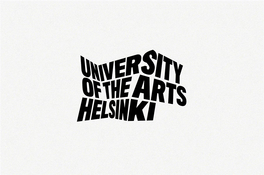
As virtual reality evolves, branding agencies are trying to incorporate more and more into their projects more interactive elements. It’s not easy, but it’s always good to be open-minded and experiment with new things chips
Each decade, the way to “revive” the created logo is perceived differently. The key idea here is one - arm yourself technology and innovation to excite and amaze your audience.
Use empty space
Coco Chanel said: “Before you leave the house, look in the mirror and remove one thing.” This advice can be applied in logo design.
We hear a lot about minimalism, but the restraint and modesty of design can play into your hands much more than you think at first sight.
Designers often use negative space—the empty space between, inside, or around elements—to:
- Make the logo more understandable and memorable
- Facilitate the client’s further work with the logo (for example, its use on objects with different backgrounds as part of branding)
- Make the logo design more aesthetic and stylish
If you fill the logo with all the trends at once, there is a big risk of creating a difficult-to-perceive design that will not stick in the minds of the audience.
Do several rounds of revisions
Even if you’re generally happy with your logo, brainstorming and revisions never hurt. Take the initial idea design and modernize it by introducing it in several new variants.
Regular revisions allow you to experiment with different design elements, expand your horizons and get material for further A/B testing. It is what determines a really successful version of the logo in the eyes of your audience.
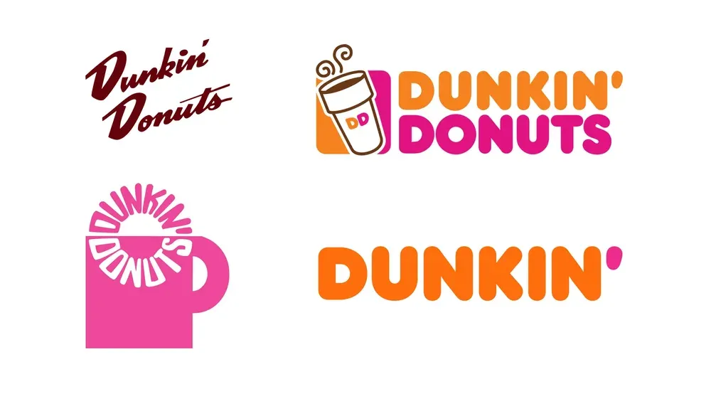
For example, the well-known trendy logo of Dunkin’ Donuts has undergone several cycles of changes, during which the font became larger, the image coffee cups changed, and the combination of colors became more and more playful.
