The most popular types of logos and how to choose the best option?

To understand how important the role of a logo is in the representation and promotion of a business, it is enough to remember that 75% of people recognize the brand precisely by the logo. This key element of visual identity helps to attract the audience, to shape image of the company, distinguish it from competitors, improve customer loyalty and more.
Today, a successful brand cannot be imagined without an effective logo. But what is his secret? At first glance, it may seem that most logos are a simple combination of lettering and images. But in fact, there are many approaches to creating a logo. In this article, we will look at the most popular types of logos and share tips on how to choose the best option for yours business and effectively use it for promotion.
The most common types of logos
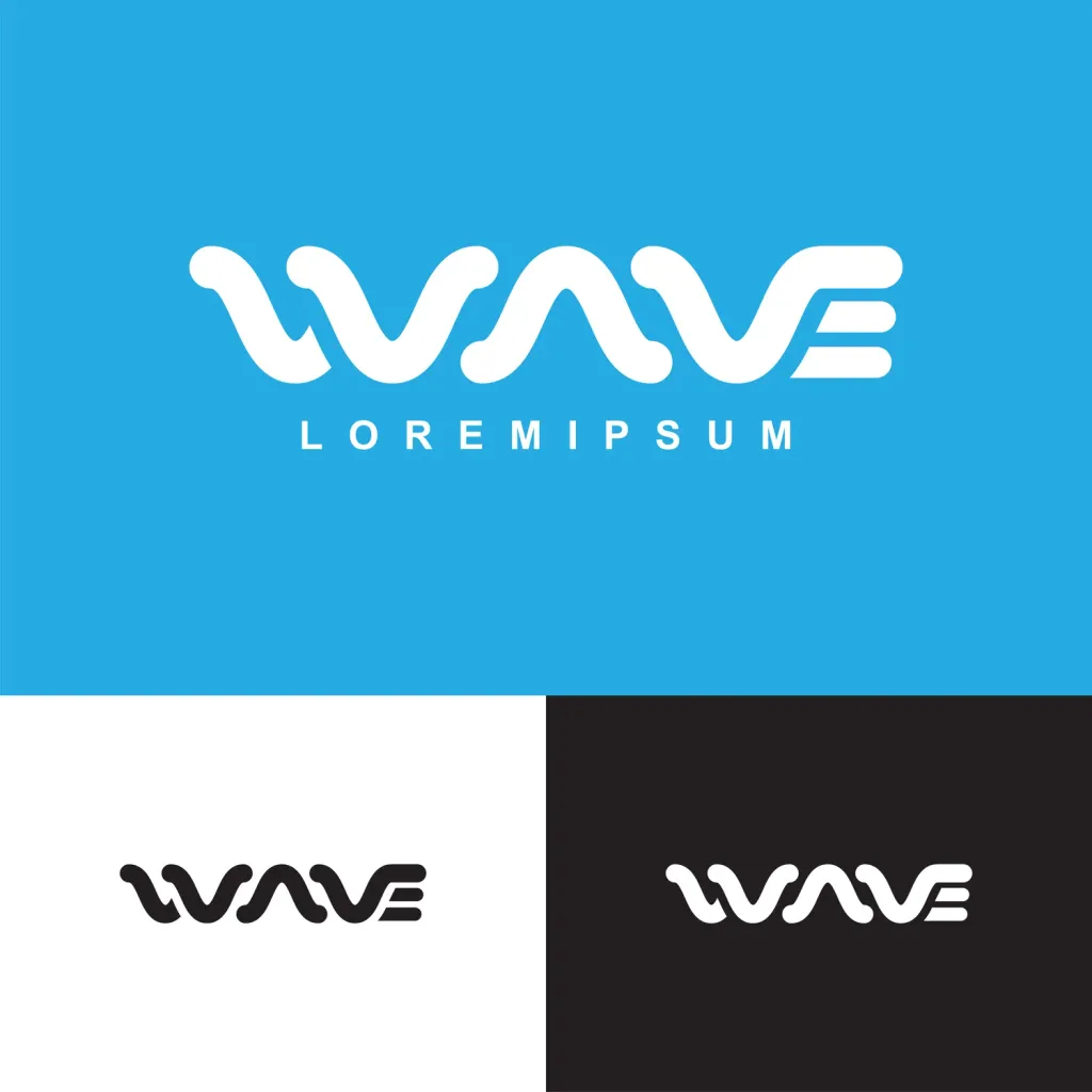
1. Text logos
Text logos contain inscriptions (most often brand names) designed using company fonts and colors. The absolute advantage of this type is clarity and recognizability, because at the first glance at such a logo, it is clear which brand it represents. Other key features of text logos include minimalism and versatility, because they perfectly integrate into any brand communication formats.
Meanwhile, the idea that creating a text logo is easier because you don’t need other visual elements is wrong. Moreover, in this case, you can rely only on the font, which must be both attractive and legible so that the viewer could easily read it. Choosing the right font can be a real challenge. It is not surprising that the leading brands on like Coca-Cola bet on custom fonts that accurately reflect the individuality of the business.
Brands with text logos: Google, Coca-Cola, eBay, FedEx, LEGO
Text logos are best for:
-
Brands with short names. Text logos are a win-win for companies with short (usually one word) names, regardless of the field of business. The logos of both the representative of the luxury segment Dior and the carrier FedEx look effectively and immediately attract attention.
-
New brands. For companies that are just starting to do business, it is important to be remembered and gain the trust of the audience. Among all types of logos, it is the text logo that allows you to improve recognition as much as possible, so new brands should consider this option.
-
Brands for which versatility is important. It is about the fact that minimalism and the absence of additional elements in the text logos allow you to easily adapt it to different platforms and formats, which significantly simplifies the design process.
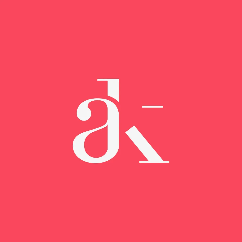
2. Logos-abbreviations
The basis of this type of logos is also typography, but already in a shortened version of abbreviations or monograms. Simply put, is a graphic image in the form of several capital letters that represent the name of a company (for example, HBO or IBM) or convey its abbreviated version (for example, YSL at Yves Saint Laurent). The main advantage of logos-abbreviations is their elegant and concise look and, as with the text variants, excellent adaptability, because they fit perfectly for any marketing materials.
Monograms are usually associated with luxury and status. It is not surprising that logos in this format are often chosen by luxury brands. It is worth mentioning at least the iconic logo of the French fashion house Louis Vuitton in the form of the letters L and V superimposed on each other for one This is a vivid example of how you can create an effective and recognizable symbol thanks to an interesting combination and non-standard drawing In logos-abbreviations, the shape acquires even greater importance, because it is precisely from it, as well as the choice of color, it depends on how much your logo will convey the character of the brand and find the response of the audience.
Brands with logos-abbreviations: MAC, DKNY, Yves Saint Laurent, HBO, BBC
Abbreviation logos are best for:
-
Brands with long names. If your company name consists of several words, it is unlikely that you will be able to spell them well in the logo. In this case, it is better to limit yourself to the capital letters of the name, having thought over the original form or drawing so that give the logo a unique character and look.
-
Luxury brands. Companies for which it is important to emphasize their high status and elitism can also win by making a bet on the logo-abbreviation. An exquisite monogram will attract the attention of a discerning audience and create an image of exclusivity.
-
Brands focused on the international market. Not all companies have names that are equally easily perceived at any point the world If you serve multiple markets,
consider creating a universal acronym logo that promotes better brand recognition and memorability.
3. Symbolic logos
In this case, the basis of the logo is a symbol or image that embodies the identity of the brand or the essence of its activity. As a rule, it displays objects from the real world. When choosing a symbolic logo, brands usually use two basic approaches. Some bet on literal images. Vivid examples are the Apple logo in the form of an apple and Shell in the form of a shell. Other companies follow the path of creating associative links. For example, Playboy made its logo the image of a rabbit as a symbol of playfulness. And the social network Twitter (now X) until recently had a logo in the form of a bird, which symbolized freedom and unlimited possibilities.
Symbolic logos are a powerful visual identity tool. However, the development of a corporate image that would convey the essence of the brand, was both original and easy to remember, requires creativity, experience and time. Besides it is important that the appearance of your logo does not lose relevance over time and it does not have to be redone, because in this case there is a risk of reduced recognition.
Brands with iconic logos: Target, Apple, Dropbox, Instagram, Starbucks

Symbol logos are best for:
-
Famous brands. Symbolic logos are not the best choice for companies that are just entering the market, because the audience it will take time to remember them and even more so to build an associative connection between the logo and the brand. At the same time, it is perfect an option for companies that are already well known to consumers. A symbolic logo will allow you to further strengthen the connection with them.
-
Brands that can convey the essence of their activity in an image. Remember the YouTube logo in the form of a Play button or Instagram in the form of a camera. These simple recognizable images perfectly convey the specifics of the activities of both companies. If your business has a clearly expressed specificity, think about how to embody it in a symbolic icon.
-
International brands. The same logic works here as with logos-abbreviations. If your company name is difficult to adapt to different markets, you can consider the option of a universal symbol that will be equally perceived everywhere.
4. Abstract logos
The basis of these logos, like symbolic logos, is an image. But, unlike the previous view, it is not about the image real objects, and abstract symbols, usually geometric shapes. Since in this case there are no restrictions in choosing visual elements, you have the opportunity to create a unique logo that will conceptually represent your brand.
Abstract logos allow you to convey the values and philosophy of your business, as well as establish an emotional connection with the audience. For example, one of the most recognizable and expensive logos in the world, Nike’s swoosh, depicts the wings of the Greek goddess of victory Niki symbolizes the sound of speed, movement and motivation. Abstract logos can also metaphorically represent a company and its products. For example, the Windows logo of four squares of different colors embodies the brand’s services designed for different people goals: blue - the main color of the Windows interface (symbolizes stability), red - Office (work), green - Xbox(entertainment), yellow - Bing (optimism).
Brands with abstract logos: Pepsi, Nike, Toyota, Mastercard, Audi

Abstract logos are best for:
-
Brands with history. An abstract logo is not just a pretty image. It should convey a certain message or story. For example, the Audi logo in the form of rings symbolizes four car manufacturers that have formed a single corporation. think about what you can tell with a logo.
-
Brands with complex products. Sometimes it can be difficult to visualize what your company does. Advantage The thing about abstract logos is that they allow you to do this metaphorically. The main thing is to decide on the message you want convey to your audience.
-
Creative brands. Since abstraction does not imply any limitations, such logos are an ideal choice for companies that for whom it is important to emphasize your creativity.
5. Character logos
This type is also called mascot logos. A mascot is any character (anthropomorphic or not) that is a symbol of a brand or organization. Characters can represent the company’s products or services to customers (example — Ronald McDonald’s) or be the basis of its logo, as in this case.
The main advantage of character logos is that they appeal directly to people’s emotions and evoke positive associations, because they resemble cartoon characters. Creating a mascot allows you to personalize your brand and build stronger relationships with clients. In addition, it is a great way to develop a legend around the brand, which makes it possible to broadcast its mission and value and improve audience engagement. But to find feedback from consumers, the character must have individuality and history.
Brands with character logos: Michelin, Mailchimp, KFC, Android, Pringles

Character logos are best for:
-
Brands with a legend. Example - KFC and Colonel Sanders: he was the founder of the chain, and since the late 50s his image has not changed present on the company logo. If the story of your business is also connected with a unique personality, consider that reflect this in the logo.
-
Brands that prioritize personalization. Character logos allow you to show the human face of your brand, to make make it closer and more understandable to the audience and connect with customers on a more personal level.
-
Brands that seek to establish friendly communication. Character logos are usually associated with fun and evocative positive emotions. They easily attract attention, because they appeal to the child that lives in each of us. No wonder this one the option is often chosen by companies focused on children and families.
6. Logos-emblems
Logos-emblems most often take the form of text (sometimes with visual elements) located in a frame. There are emblems both minimalist like a simple inscription on a colored background, and more complex with many decorative details. Such logos resemble family coats of arms and, like monograms, are usually associated with prestige and power.
Also, due to their classic appearance, emblem logos create a sense of professionalism and commitment to tradition. Not surprisingly, they are often chosen by government agencies and universities and car manufacturers. The advantage of emblems is that they are well remembered and help create the image of a reliable company that has been on the market for a long time and will not disappear anywhere in the future. At the same time, these logos also have disadvantages, because they are less universal compared to other options and go far not for all types of branding.
Brands with emblem logos: Nissan, Stella Artois, Warner Bros., Harley-Davidson

Emblem logos are best for:
-
Brands that want to be associated with reliability. Emblems often contain the image of a circle or a shield. These figures create a sensation protection and security. That’s why emblem logos are a great choice for law firms, banks, and car manufacturers.
-
Brands with traditions. Emblems are ideal for companies with a history that need to emphasize a long-term presence on the market, commitment to tradition and high standards. It’s also a good way to earn audience loyalty.
-
Brands that seek to create a community. Because emblems have much in common with family coats of arms, they also evoke a sense of kinship. Consider this logo option if you want your customers to feel part of the community.
7. Combined logos
Combined logos are the most popular type of logo (selected by 61% of Fortune 500 companies) characterized by combination of image and typography. You can combine any text-based logo with symbolic, abstract, character or emblem. At the same time, the inscription can be next to the image or be an element of it. In this case they work as a whole, complementing each other.
A combined logo is a universal choice for improving recognition, as it makes it easy for viewers to remember brand and associate its name with a corporate image. If the design solution is successful, it is quite likely that in the future you can use the visual part of the logo separately, because the audience will already know it well. Many famous brands choose exactly this approach, that is, apply the name or image separately depending on the communication format or platform.
Brands with combined logos: Burger King, Depositphotos, Adidas, Slack, Red Bull
Combined logos are best for:
-
New brands. Companies that are just starting a business should stop at the option of a combined logo, because that’s what they are will have a greater chance of being remembered thanks to the use of two visual cues at once - the name and the brand.
-
Brands looking for a universal solution. Combined logos give more opportunities for design experiments. In addition to the already mentioned separate use of the text and visual part, you can easily adapt such a logo for different marketing needs.
-
Brands that seek to maintain integrity. Combined logos help companies make a powerful statement about themselves and work in favor of branding. Combining name and image in a logo can help create a cohesive brand image.

What are the key characteristics of an effective logo
Since the logo is a branding tool, it must perform specific tasks, including attracting the attention of the audience, to make a strong impression, strengthen the company’s image and improve loyalty to it. This can be achieved when everyone aspects of the logo are well thought out and meet the requirements listed below.
1. Simplicity
Given that consumers can make decisions in a split second, brands must do everything they can to avoid complicating things interaction with the audience. This primarily applies to logo design. Therefore, the first priority is to make sure that he clearly and easily presents the brand.
2. Relevance
According to statistics, 42% of consumers believe that the logo helps to understand the individuality of the brand. Relevant logo, which reflects the essence of business, gives an opportunity to create a clear image and win the trust of the audience.
3. Attractiveness
Of course, a logo should attract attention and improve brand memorability. Therefore, it is important to approach its creation in all seriousness. The main elements that you need to think about, apart from the actual look of the logo, are the choice of color and font, if plan to use text.
4. Versatility
Since the logo is intended to be used in a variety of online and offline formats, it should be easily scalable, that is, to decrease and increase without loss of quality.
5. Durability
Considering that the logo is a visual representation of your business, it is important to choose a solution that will not lose its relevance over time. Of course, a future upgrade is possible and, most likely, inevitable, but if you have from the beginning a powerful logo, it can serve for decades with only minor changes (a striking example is the Coca-Cola logo).

Where you can use the logo
Consistent use of the logo contributes to successful branding and the creation of a coherent company image. To get the maximum result of the effort spent on logo design, make sure it is present in key channels of interaction with your the audience These include:
-
Website or blog. A logo on the website and blog helps to improve the recognition of your brand and strengthen its credibility. Make your logo visible by placing it at the top of the page. Also, don’t forget to set the site icon, so that the logo is visible when multiple tabs are open in the browser.
-
Business cards. Do not underestimate the power of business cards. They allow you to establish contact on a more personal level and get things done good first impression. At the same time, the logo plays an important role, because the design of the business card reflects your professionalism, and the quality of your products or services.
-
Products and packaging. If you’re in any doubt about the importance of packaging, consider how popular unboxing videos are on YouTube. This is a great way to improve the customer experience. And placing the logo on the packaging is the key to recognition, which allows to increase loyalty.
-
Communication with the audience. As a powerful branding tool, your logo should be present in all communication formats with by customers, including emails, marketing campaigns, advertisements, etc. This will help the audience understand who she interacts with and will improve her level of trust in you.
-
Social networks. Using a logo in social networks allows you to create a coherent, coherent image of your brand on different platforms. That’s why it’s important that your followers see the logo in their feeds every time you post content.
-
Banners and signs. Outdoor advertising and signs usually attract a lot of attention. If these formats are relevant to your business, be sure to complement them with a logo that is large enough to be easily seen.
-
Merch. Branded products bring essentially free promotion. Just imagine that someone can walk around every day with a bag of your logo. This is the perfect way to improve your visibility and gain trust.
Discover our collection featuring the logos of the most popular species. Maybe this is where you’ll find the perfect one logo option for your business.
Conclusion
It’s easy to create a logo that accurately reflects your brand’s personality, grabs your audience’s attention, and is easy will be remembered - a difficult task. It requires a thorough approach with market and audience research and lots of experimentation. Start this journey by choosing a logo that best matches the specifics of your business. Bet on simplicity, appeal and versatility and consider where and how you will use your logo.