How to increase the emotional involvement of the application? Live interface and mascots.

Holly Health is a mobile app for healthy habits from League Design Agency. Let’s learn about useful ideas designs that help create an emotional connection with the user.
According to the research data of the authors of the application, 50% of people try to lose weight and, unfortunately, in 90% of cases, such attempts are unsuccessful. People tend to give up on sports, diets and various healthy habits halfway through. They lack motivation.
Holly health acts as a trainer-companion who supports and motivates: it helps to gradually, in small steps, form good habits and achieve results. The entire design of the application is aimed at ensuring that a person does not stop halfway.
Why do you need a mascot?
Persona in branding is not a trend, but rather a tool needed to achieve greater emotional engagement. The presence of an animated character shows the desire to be together with the user: to help, remind and encourage. A person should not feel alone on his path.
Emotional involvement was one of the main tasks for us during development. After all, the purpose of the application is to support a person in the process formation of useful habits. Mascots make branding livelier, attract attention, and are memorable. Besides, it’s good a way to stand out from the competition.
It is important that the character truly reflects the philosophy of the brand. Therefore, it is necessary to study his image in detail.
How the Holly bird appeared
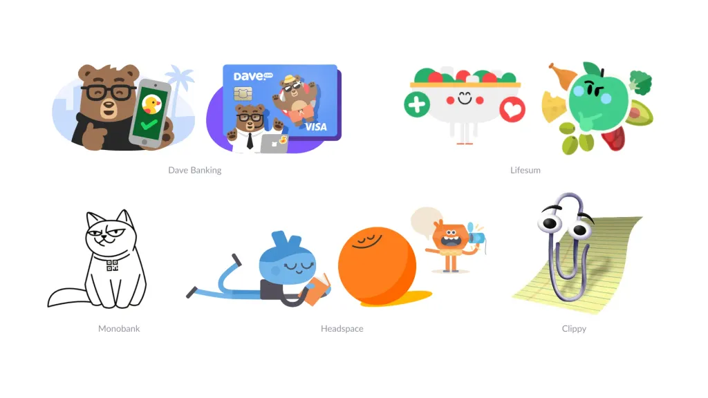
Creative searches are greatly facilitated by preliminary research of competitors. We have seen that in applications for a healthy way the lives of mascots are generally rarely used, so we considered a bunch of applications in a different direction.
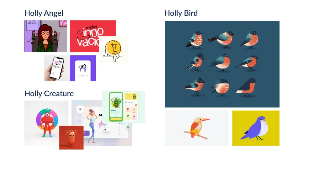
I wanted to choose something non-trivial. They thought about an angel, a hedgehog and even abstract creatures.
Work on illustrations
We agreed in advance not only on the bird character, but also on the references, which helped to save time and resources. We found an illustrator and he painted according to the stylistic references previously approved with the client.
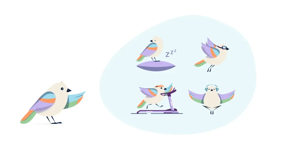
The first sketch looked like a fat, unattractive and very detailed pigeon.
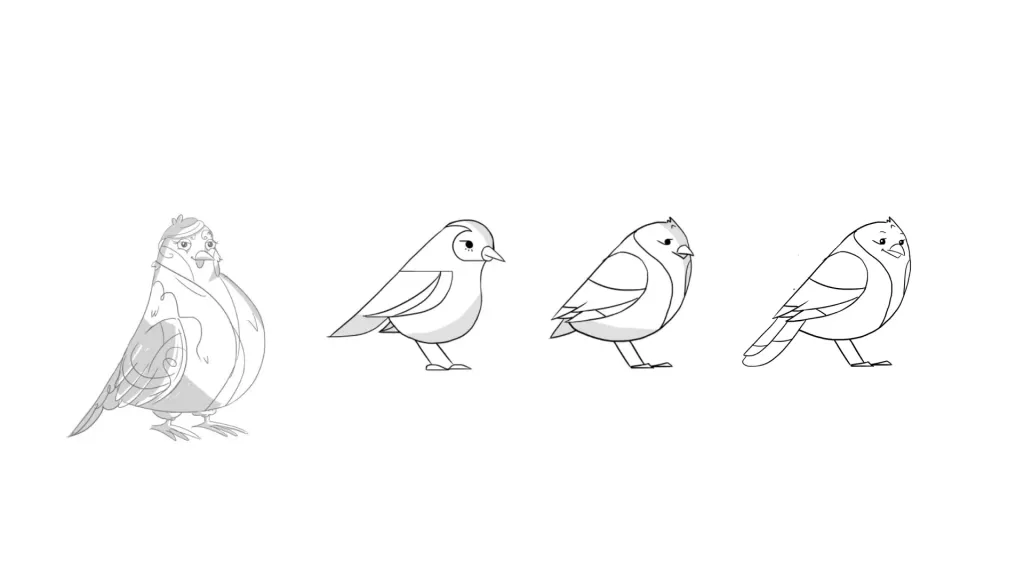
We decided to simplify the concept of the drawing. This option was made in color.
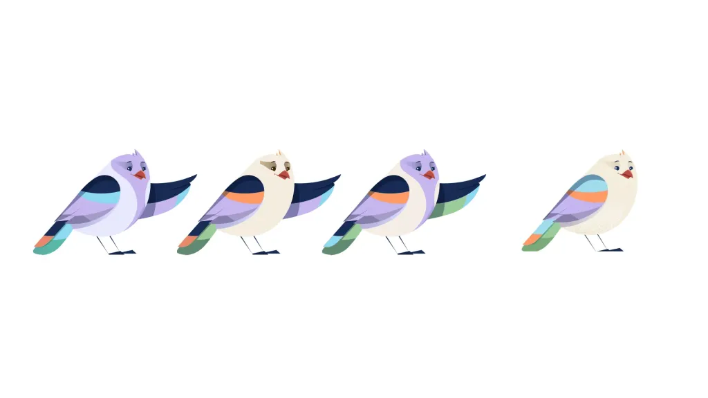
However, he seemed too humanized to the client, precisely because of the presence of eyebrows. Therefore, the final version is as simplified as possible illustration. A cute, simple and pleasant image of a bird.
Live interface
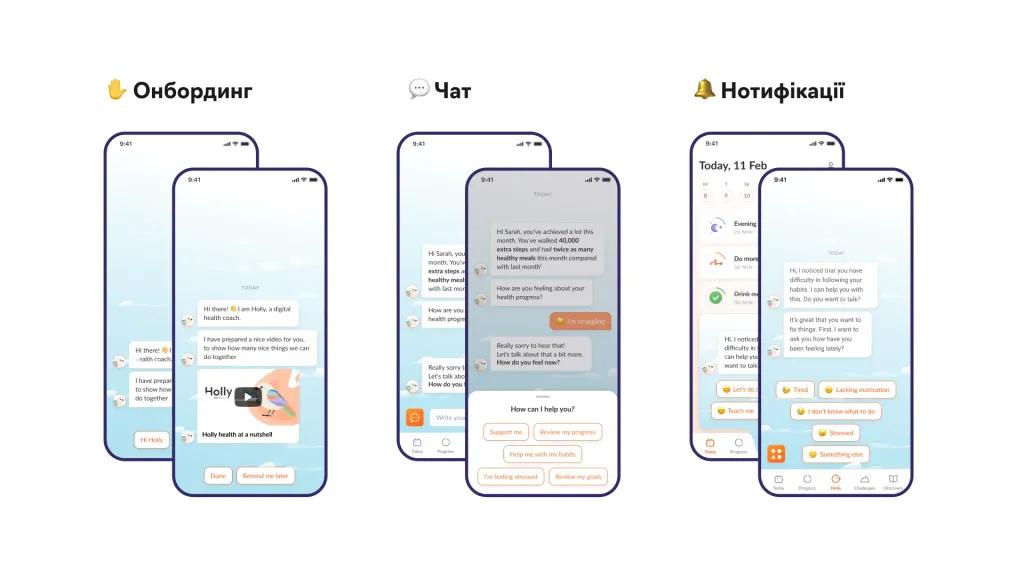
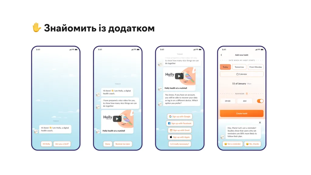
Despite all the advantages of a mascot, it will not be enough for high engagement in the application. It must be provided to the user long emotional interaction. For this project, we will develop a conversational interface. That is, the design of our application imitates conversation - the character constantly communicates with the user.
Typically, users spend 90% of their phone time on messengers and e-mail. Accordingly, imitation of communication with the application creates a feeling of familiarity and security.
We applied this approach to different sections of the application:
- Our bird instructs the user all the time — prompts at various stages in a dialogue format.
- Support is designed as a chatbot - the character will help you find the necessary function, adjust the plan, downgrade or vice versa increase the load.
- Unlike a regular chatbot, our character can initiate the conversation himself: ask questions to track activity, advise, remind, praise, explain something.
- Even the knowledge test in the educational section takes place through a dialogue with the bird — it starts asking questions after how the user read the material.
When the majority of interactions take place in the chatbot, it also saves us resources during the development phase. In general, the entire application consists of 5 sections:
- Homepage
- Chat
- Progress
- Challenges
- Materials (learning)
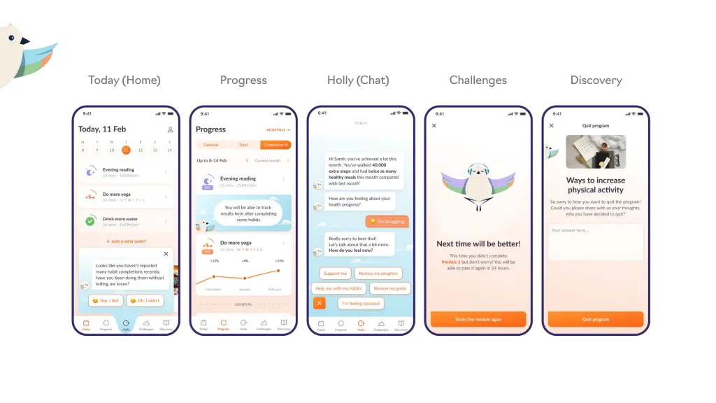
In each of these sections, the character helps the user, directs him. If you are developing a conversational interface, you should be especially careful with working out the dialogues. Communication with the character should be logical and realistic. Otherwise the mascot will not perform its function.
Motivation
Support and motivation are the main goals of our application. Therefore, it is important for us that the motivation is diverse and not fed up
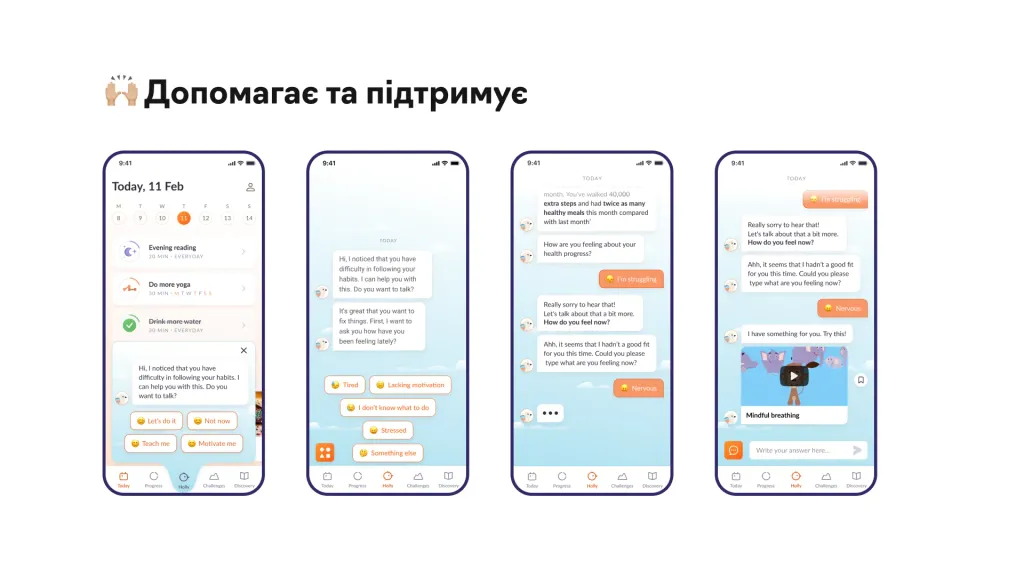
For this, we have developed various forms of motivation:
- Small banners
- Message from the character
- Welcome screens
- A separate section with achievements
Our achievements page contrasts strongly with the rest of the app, with a darker blue background and achievements highlighted in gold yellow Such a solution should evoke visual associations in the user. Achievements in our app should be a value.
Another solution that helps motivate the user is graphs with predictions, in particular about weight loss. Usually fitness apps plot your weight change based on the metrics you enter. Instead, the chart at Holly health shows also when approximately you can reach your goal. This also motivates a person not to give up halfway.
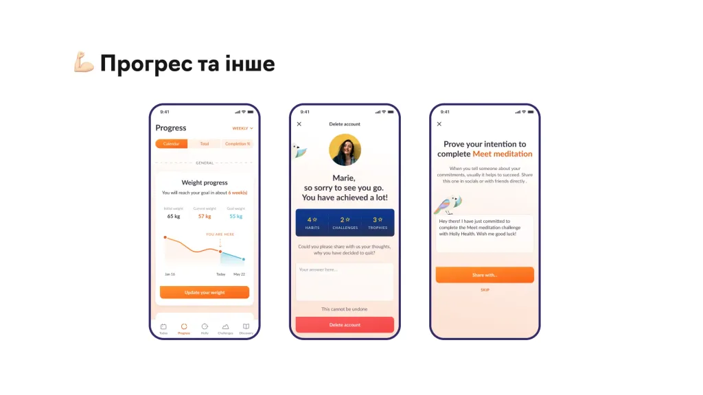
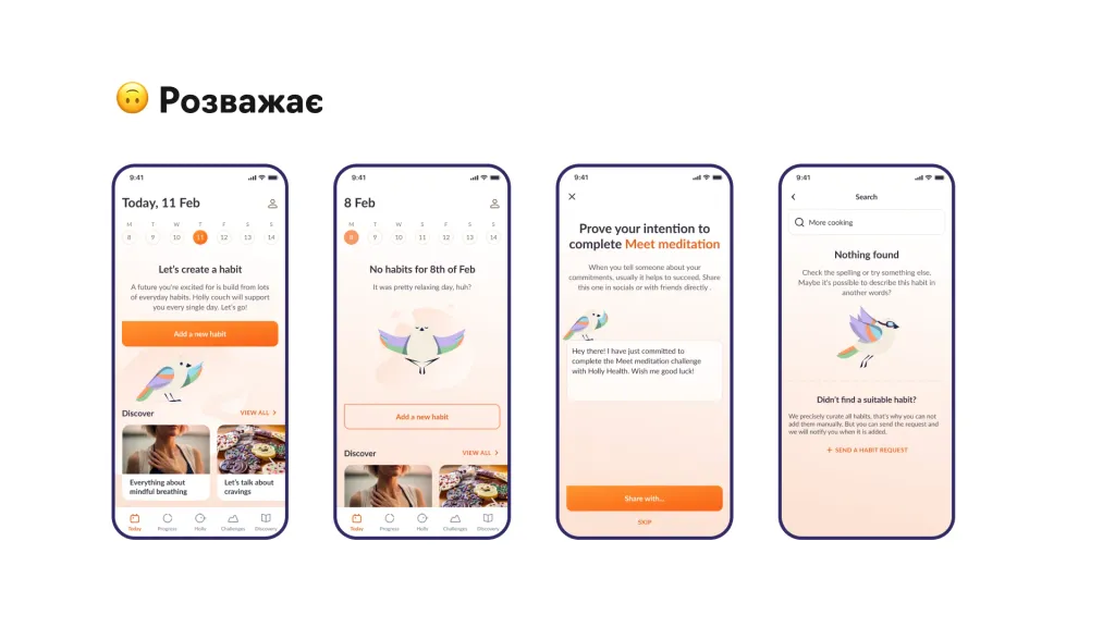
We also built in another motivator — the ability to share the promise on social media. When a user decides to form a new habit, our mascot suggests telling your friends about it for an extra incentive. At the same time, this is also a promotion of the application.
Finally, even if the user chooses to unsubscribe in the app, Holly will try to unobtrusively opt out: will show the achievements screen and ask if you are sure you want to stop?