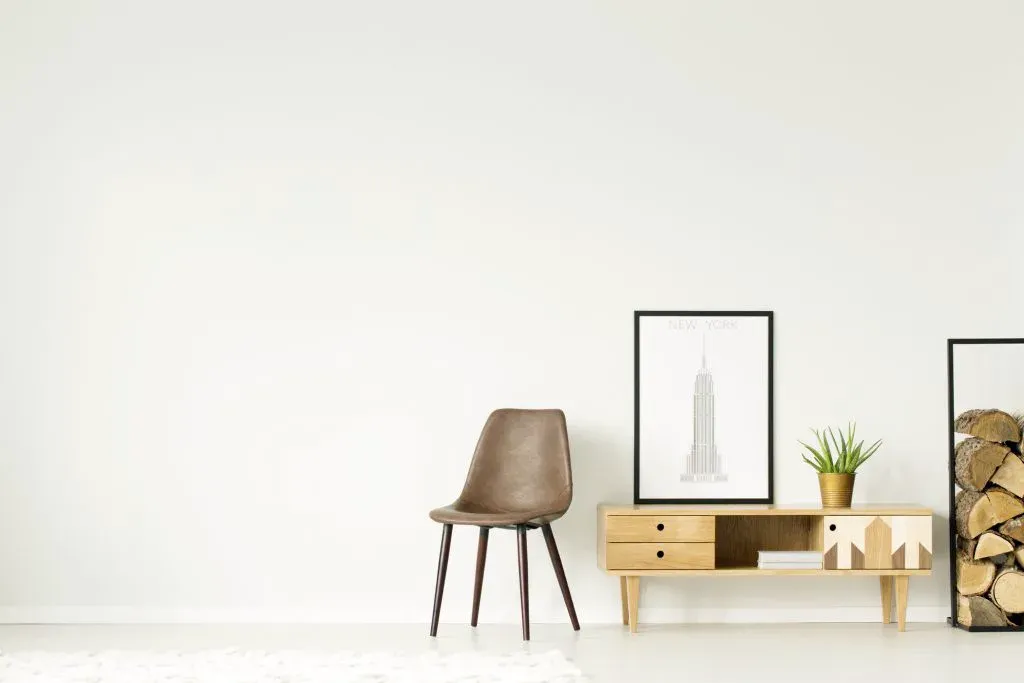
White space in web design

Creating an effective design consists in maintaining a balance between different elements. While designers pay the main attention color, shape, and typography, white space is often overlooked, even though it can dramatically improve any graphic. Understanding different types of white space and how to use it effectively will help you create a design that will appeal views and will deliver the right message.
Whether you’re working on website design, marketing materials, or a logo, this article will help you master it the art of white space and take your projects to a new level. So let’s get down to business!
What is white space
White space, also known as negative space, is the part of a design or layout that remains empty. In essence, it is a space that surrounds or separates design elements such as text, images, and graphics. White space may be used deliberately or arise accidentally, but in any case it plays an important role in the design, determining its overall appearance and perception.
When used effectively, white space creates a clear visual hierarchy where important elements stand out and less important strengthen them. This can help draw the viewer’s attention to key parts of the design and make the message easier to understand. which you are trying to convey. In addition, white space allows you to create balance, give clarity and order to your images.

Types of white space in graphic design
There are different types of white space that designers use to create a certain effect. Let’s consider the most common:
1) White micro- and macrospace
White microspace is the space between individual characters, lines of text, and words. It affects the clarity of the design. Designers often adjust it to make the text more readable. For example, you can change the line spacing to blocks of text to create more white microspace and facilitate perception.
Macro white space is the space between design elements such as paragraphs, images, and headings. It affects the general design composition and helps create visual balance and hierarchy. White macrospace can separate headings from the main text or secondary elements from the main design components.
2) Active and passive white space
Active white space is purposefully left empty to create a specific effect. Designers use it, to draw attention to a certain part of the graphic, to give movement and energy to the image or to highlight the main message. Active white space can be a powerful tool to make your design more attractive and dynamic.
Passive white space occurs randomly between design elements. It can appear when items are not properly ordered in a way that creates a confused design. You should be aware of passive white space and try to avoid it if you want to create elaborate graphics.

What are the advantages of using white space in design
White space is an important component of design that can be used to achieve a variety of goals. Let’s consider some of them:
1) Creating a visual hierarchy
Visual hierarchy is essential to effectively convey a particular message. White space can create a clear separation between different design elements and order them in order of importance.
2) Directing the viewer’s attention
Effectively directing the viewer’s attention to an object or graphic element is often a key component of any design. White space can create visual contrast and draw the viewer to the most important elements, such as a call-to-action button to the action or image of the product.
3) Better understanding
When it comes to text-heavy design, readability is critical. White space can improve perception text thanks to larger spacing between lines and paragraphs. This reduces visual clutter and makes the text easier to read and understanding, which in turn creates a more enjoyable experience for users, encouraging them to interact with the content.

4) Combination of individual elements
A successful layout is unity and harmony between individual design elements. White space can combine individual elements, enhancing the overall aesthetic. Thanks to him, each element is perceived as part of a single whole.
5) Creation of certain aesthetics
White space can help you with a variety of aesthetic solutions, from minimalist to dynamic. Thanks to white space in design can create a visual tone that will reinforce your brand message and resonate in the target audience.
Top tips for integrating white space into design
In order to successfully use white space in design, it is important to remember the key points. Let’s consider some tips from him effective application:
1) Define the goal
Before starting work on a project, it is important to understand the purpose of creating a design. You want to sell a product, convey information or just to attract the attention of the viewer? Depending on your goals, you may need more or less white space. Understanding the purpose you can use the white space as efficiently as possible.
2) Look at the design as a whole
When creating a design, it is important to look at the project as a whole, and not just at individual elements. Take a step back and think how the finished work will be perceived. Is there enough white space to maintain balance? Are there any pieces that seem overloaded? By looking at the design as a whole, you can see if the use of white space will work to your advantage.

3) Think over the composition
Think about the placement of text, images and other important design elements, and use white space to harmonize combine them. Create a clear separation between different elements to make the design more readable and visually appealing.
4) Balance positive and negative space
When working on a design, it is important to consider the balance between positive and negative space. When there is too much white space, the design will look sparse and empty, and when not enough - complex and unclear. You need to find a balance to create an attractive and effective design at the same time.
5) Take care of legibility
While white space helps improve legibility, it’s important that the text remains easy to read. make sure that there is sufficient contrast between the text and the background, and avoid using fonts that are too small or hard to read.
6) Experiment with different levels of white space
When it comes to white space, there is no one-size-fits-all solution. Some designs may require more white space, to create a minimalist layout, while others may benefit from less of it. Experimenting with different levels white space, you can find the combination that will best convey the desired message to your audience.

7) Do not be afraid of asymmetry
Although symmetry can be visually pleasing, it is not always necessary for effective design. Asymmetry can add visual intrigue and draw the viewer’s attention to different parts of the design. Use white space to balance asymmetric elements and create more attractive graphics.
8) Use white space purposefully
It’s important to remember that white space is a conscious design decision, not a lack of effort. It should be used purposefully and meet design goals. Avoid random white space and make sure that white space is a consistent approach in the design.
9) Be consistent
Consistency is a key factor in design, and this also applies to the use of white space. Make sure it is consistent with the design and matches the overall aesthetics and style. Avoid using different levels of white space in different parts design as it can create confusion.
Conclusion:
White space is an important element of effective design. This is the secret tool that will help you achieve the perfect visual harmonies and convey the message clearly. By following simple white space tips, you’ll be able to create a fascinating design that will stand out from other works.
