Current trends in graphic and web design
AI surrealism
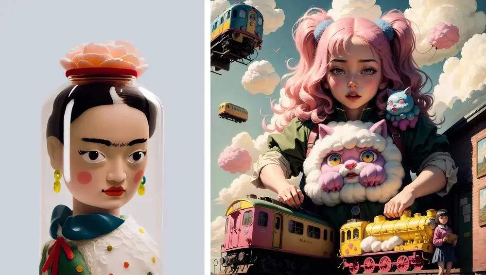
Designers have mixed feelings about artificial intelligence. However, whether you like it or not, generative AI tools are likely to stay with us for a long time. Even Adobe is actively developing in this direction, regularly integrating AI functions into its programs on a regular basis.
In 2025, we will see more and more graphics created with the help of artificial intelligence, which will lead to the emergence of new specific styles. One of them is AI surrealism. Some are already calling it the “future of AI art”.
Previously, artistic skills or complex photo manipulations were required to create such images. But with the advent of new capabilities, the process has become much easier. You have probably already seen similar visual elements in advertising materials of various brands. This is undoubtedly an interesting trend to watch.
Neo-brutalism
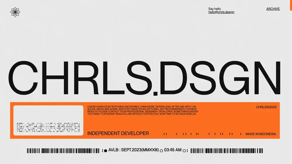
Sometimes it’s okay to break the rules, think outside the box, and create projects that ignore traditional design principles. of design. One of these rebellious trends is neo-brutalism. Although this style is not new, it has gained particular popularity in recent years.
Designers can realize the boldest ideas by creating unusual layouts, combining bright colors, and experimenting with typography.
Retrofuturism
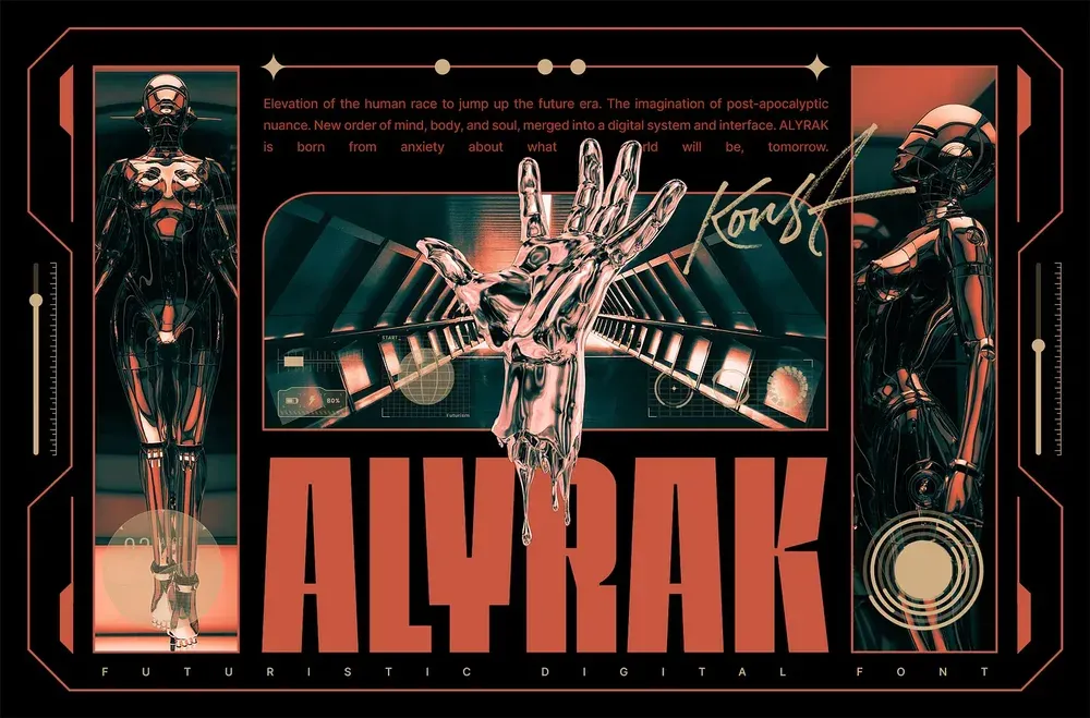
It’s amazing how classic science fiction novels and old movies were able to predict many modern technologies. Retrofuturism is the embodiment of these ideas, combining elements of retro design from the 1980s with innovative concepts.
It is a unique mix of nostalgia and images of the future. In such projects, you can often see images of arcade machines, neon signs, and color palettes that evoke associations with comic books. This is a great style for posters, labels, and marketing materials!
Geometric patterns
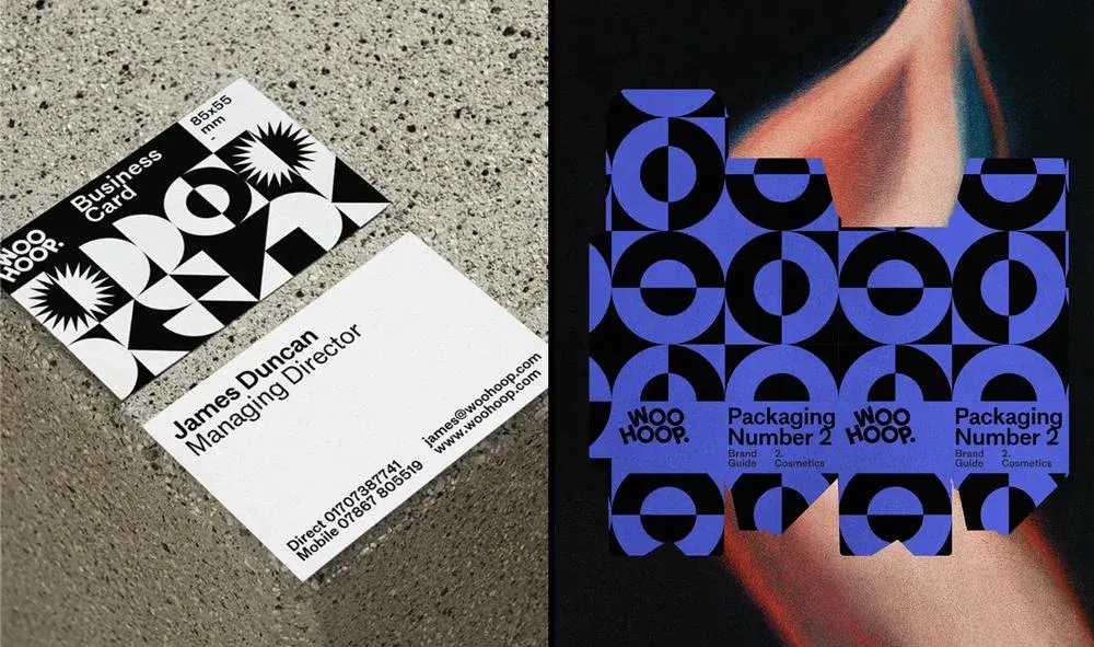
Geometry is still relevant in design. Many brands actively use geometric patterns in their identity. The shapes add to the brand’s identity and help to set the right accents. Sometimes these patterns are superimposed on other design elements, for example, images.
Art Deco
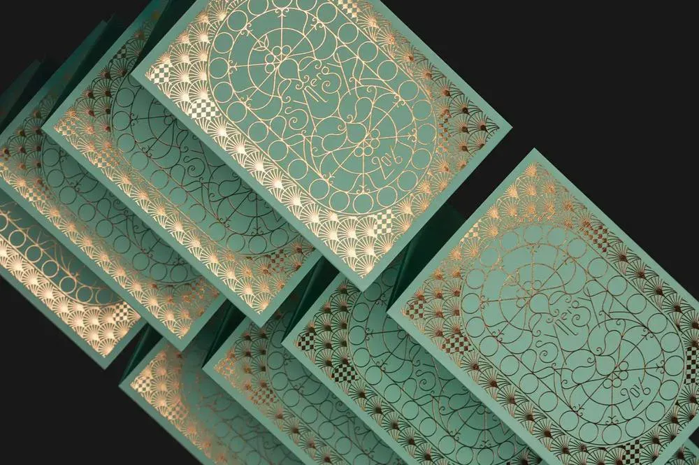
Art Deco is a trend in art that flourished in the 20s and 30s of the twentieth century. It is a style of the Jazz Age and the golden age of Hollywood. Hollywood’s golden age, which reflects freedom, luxury and exclusivity. The characteristic features of Art Deco are a combination of gold and classic symmetrical patterns, such as zigzags, shells, chevrons and other geometric shapes. Modern brands actively use these visual elements in their logos packaging, printing, and even in the design of their websites.
Responsive design
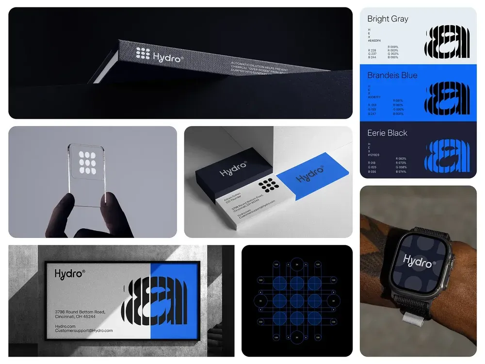
Corporate identities are becoming more and more adaptable and dynamic. Nowadays, one version of a logo is not enough; you need to provide for different scenarios and contexts. For example, a logo on a website may look completely different from one on a business card or billboard. Color schemes can also vary depending on the medium. The main thing is to maintain brand recognition and visual appeal of the brand for the audience.
Glitch
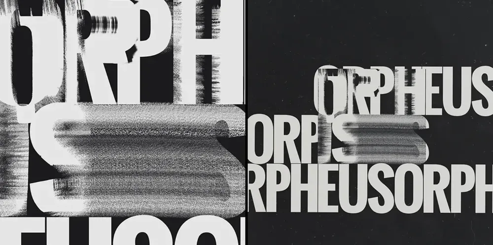
Glitch effects are nothing new, but they have become especially popular over the past few years. This is due to the growing interest in futuristic visual solutions and cyberpunk design.
A current trend is the use of the interference effect in fonts. Such distorted letters are perfect for projects dedicated to technology, artificial intelligence, and science, adding a touch of rebellion to the design.
Algorithmic patterns
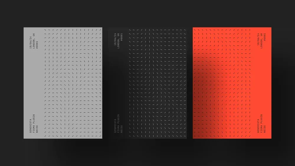
Algorithmic design is visual compositions created with the help of various technologies. It is not necessarily artificial intelligence; sometimes it is about patterns generated by programs, such as JavaScript, that randomly place vector elements. Sometimes these elements overlap, creating aesthetic chaos in the design.
Deep gradients
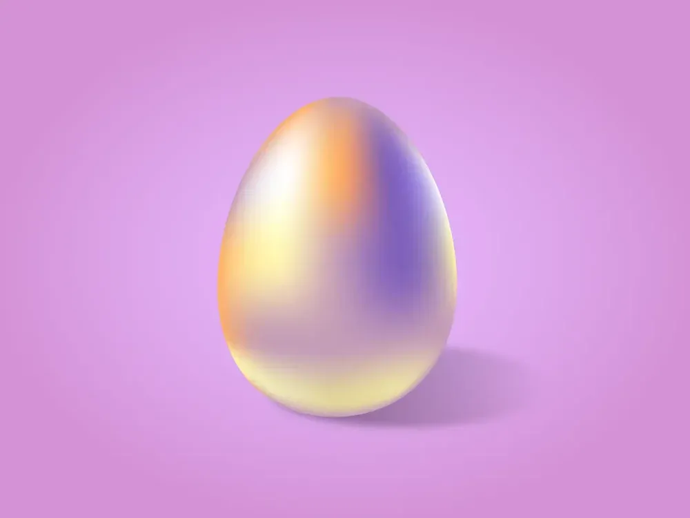
Gradients add depth to visual compositions and allow you to emphasize the main elements. They make images more interesting and dynamic. Gradients can be used to create original three-dimensional objects that always attract attention. Don’t be afraid to experiment!
Mythical creatures
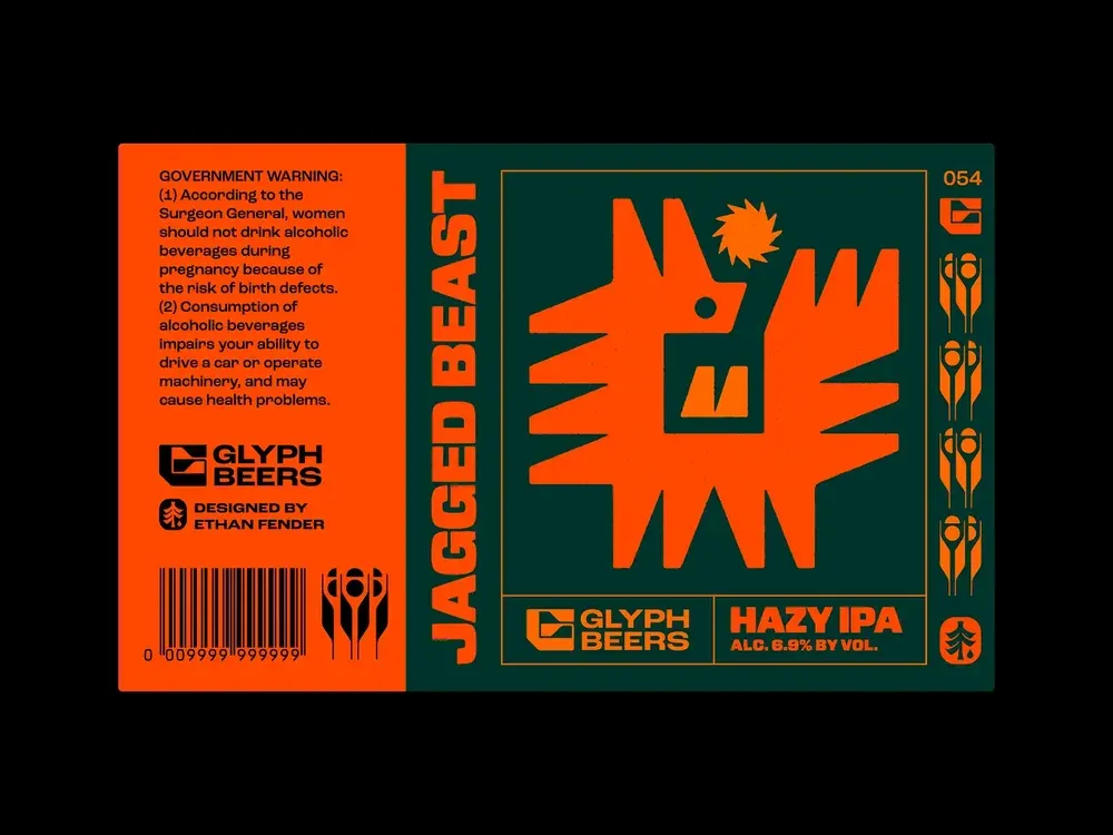
Using images of mythical creatures, shapes and elements from legends in design is one of the trends that has been gaining popularity in recent in recent months. Such a visual style looks more complex and original, evoking strong emotions in viewers.
Vintage textures
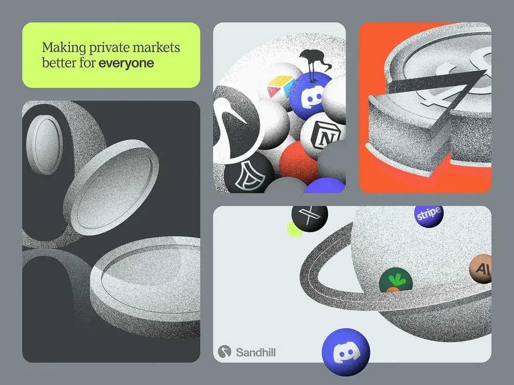
Vintage textures are a great way to give your design a nostalgic, authentic look and make it look more three-dimensional. Different roughnesses look great in logos and are suitable for other corporate identity elements. Try them to apply them in your projects.
Bubble typography
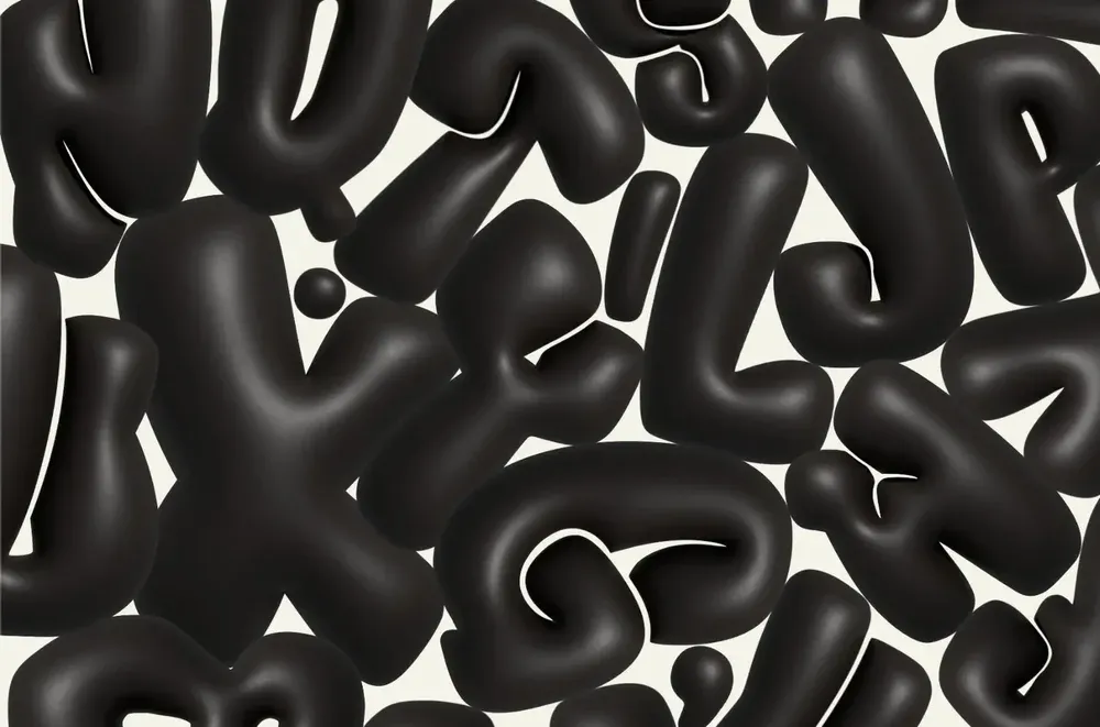
People like bold, three-dimensional fonts because they instantly make text look casual. Bubbly headlines are often found on creative posters and promotional materials, but today this typography is increasingly becoming an important element of corporate identity. Although it’s not always the best choice in terms of readability, many brands love bubble fonts for their expressiveness and character.
Dark shades
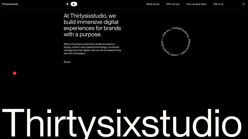
Dark shades remain a relevant trend in both graphic and web design. Many users are used to using dark mode on their devices, so the contrasting combination of a dark background (not always black) and light typography looks more comfortable and natural for them. In modern interfaces, you can often find a special toggle switch to switch between light and dark themes, allowing users to customize the experience to their needs.
Text overlay effects
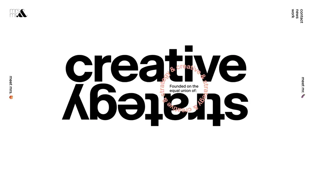
Layered text has long been used in graphic design. Overlapping text layers can change color, size, or trigger animation effects. This approach instantly turns typography into the dominant element of a of the composition.
Large accent elements
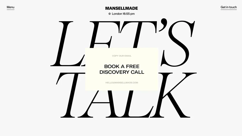
Large accent elements - from images to typography - are one of the most popular trends. In digital projects, such elements are often accompanied by animations and scrolling effects. Due to their surprising size, they remain visible and legible even if they are partially overlapped with other design elements.
Experimental typography
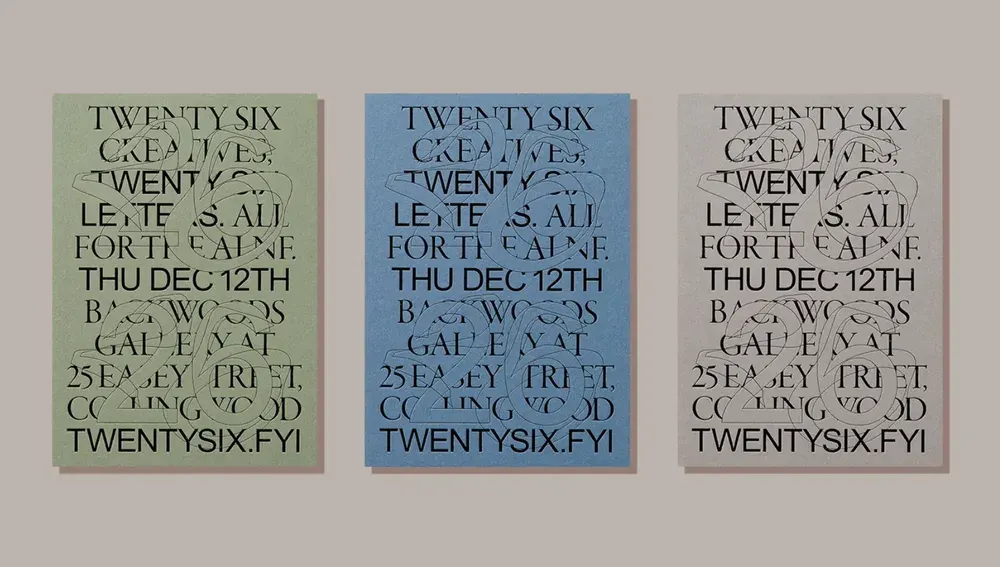
Experimental typography is fonts that break traditional rules and standards, opening up new possibilities for creativity. They can be three-dimensional, distorted, with non-standard strokes or animations, colored and illustrative. each font has its own unique personality.
Environmentally friendly and natural
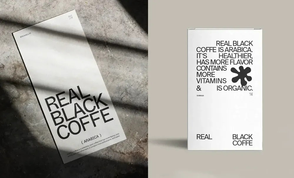
In recent years, many brands have focused on creating more authentic and natural designs that inspire trust and helps to strengthen the connection with the audience. This style looks fresh and aesthetically pleasing, and sometimes even resembles “design without design” - minimalist logos, no unnecessary decor, use of eco-friendly materials, simple typography, and a limited color palette. All this creates the impression of purity and naturalness, without unnecessary elements.
3D effects
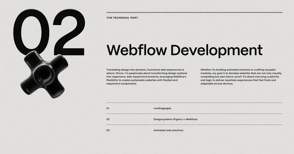
Design is increasingly intertwined with reality: three-dimensional shapes jump out at us from the screen, and this trend seems to be gaining momentum. This is a kind of reference to skeuomorphism, but this time the graphic elements look much more realistic. In the digital space, 3D effects are often combined with animation, which makes them even more “alive” and impressive.
Bright colors
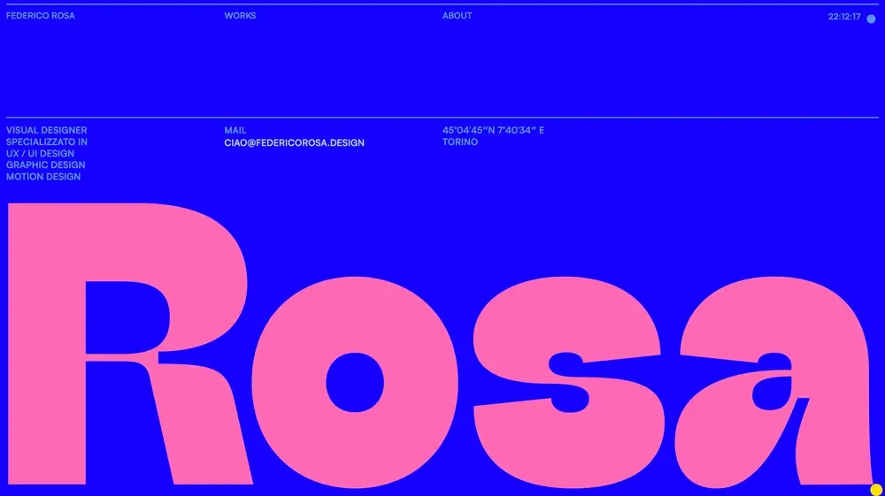
Projects with bright color accents always attract increased attention. Today, such combinations can be seen not only only on the Internet, but also on packaging, advertising materials, and printing. Some designers break the rules and use more than 2-3 active shades at the same time. The key is to find the right balance.
Realistic product visualization
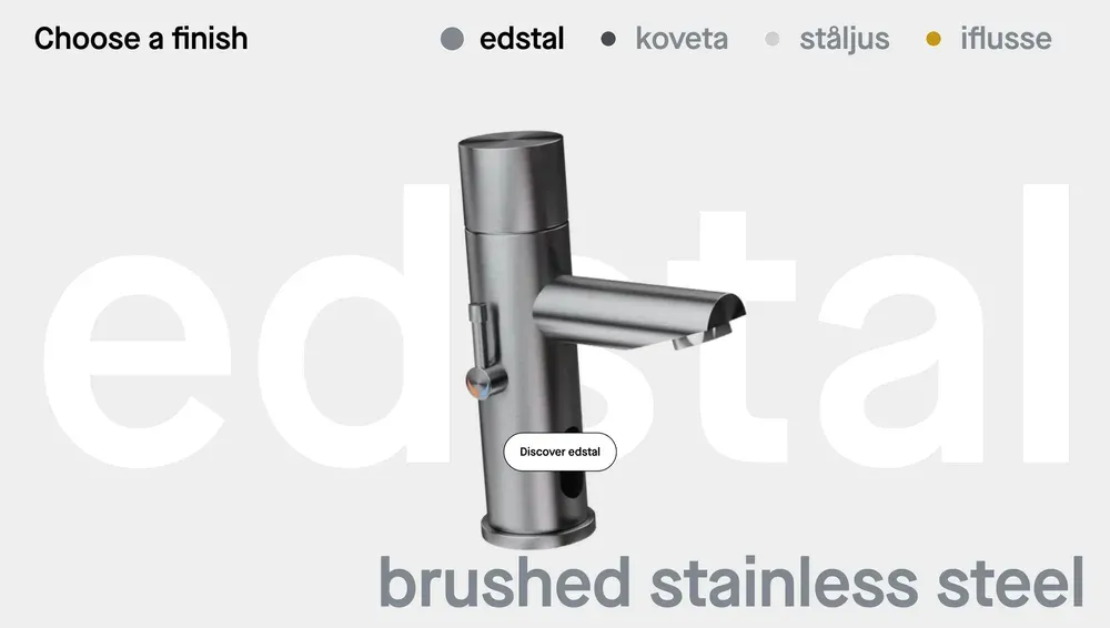
3D visualization is a great way to show users a product from all angles and allow them to “touch” it. It creates an impression of reality and depth that has a significant impact on the audience.
