Why UI designers should understand Flexbox and CSS Grid
Most designers are familiar with responsive design - a column-based layout with fixed breakpoints for all screen sizes. However, we can go beyond this rigid structure with modern CSS layouts to create flexible and dynamic designs that smoothly adjust to different screen sizes.
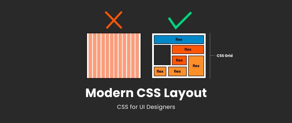
Traditional design based on column frameworks
Let’s first understand where we start. As a UI designer, you’re probably more familiar with the classic a classic column-based modular grid that consists of columns, padding, and boxes where you place your elements. This grid serves as the foundation of your design, providing a structured framework.

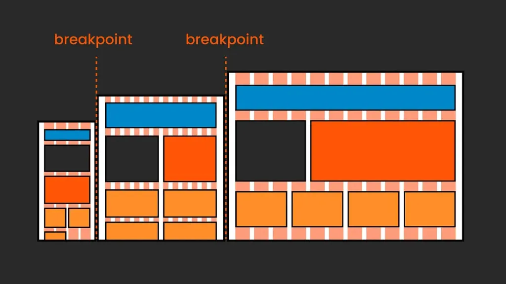
Understanding breakpoints in classic grid layouts
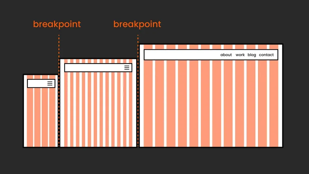
The essence of this approach to responsive design lies in breakpoints, which are defined using CSS media queries and are are crucial for adapting the layout to different screen sizes. The structure of the site dynamically adjusts at these predefined points: elements can be rearranged, the compact navigation menu can be expanded, and the size of text size can be changed to improve readability. This flexibility ensures that the design remains functional and aesthetically pleasing across all devices.
Frameworks
CSS frameworks such as Bootstrap or Foundation are popular for implementing such designs, and you may have heard of about Tailwind. They provide pre-designed components and grid systems that simplify the process of creating responsive responsive web layouts.

Today, many frameworks use Flexbox and/or CSS Grid under the hood, becoming more flexible than the original rigid column-based layouts.
So, in short: in a traditional responsive modular grid, design changes for different screen sizes are realized by reacting to a set of fixed breakpoints. In other words, it involves looking outward and adapting to external factors, such as resizing the viewport.
Modern CSS layout
Сучасні CSS-макети з Flexbox і CSS Grid можуть застосовувати більш внутрішньо орієнтований підхід, який іноді називають внутрішнім дизайном. Це означає, що наші дизайни адаптуються не лише до розміру області перегляду, але й до самого контенту та доступного простору.
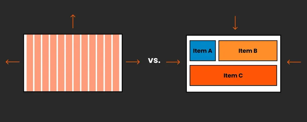
So, instead of placing elements in a static grid defined in the viewport, this internal approach gives us more control over how content behaves in a changing space. It combines fixed and flexible elements, offering ample room for fine-tuning, such as defining minimum and maximum sizes, etc.
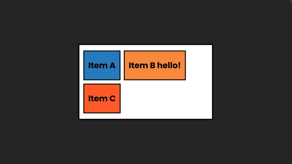
It may take some time for designers to intuitively understand this concept, as it requires a basic understanding of CSS. So, let’s do just that!
What tools do we use?
Our main CSS tools here are Flexbox and CSS Grid. They can be used separately or combined. We can use them to customize components as well as general layouts.
How CSS Flexbox works, explanation for designers
With Flexbox (officially called CSS Flexible Box Layout), we can neatly arrange elements in a specific sequence and control their alignment, as well as fine-tune their behavior and size to fit the available space and to accommodate changes in content. We can use Flexbox to customize our components and entire groups or pages, it’s all about the nesting.
CSS Flexbox works with two main elements: a parent container and its children.
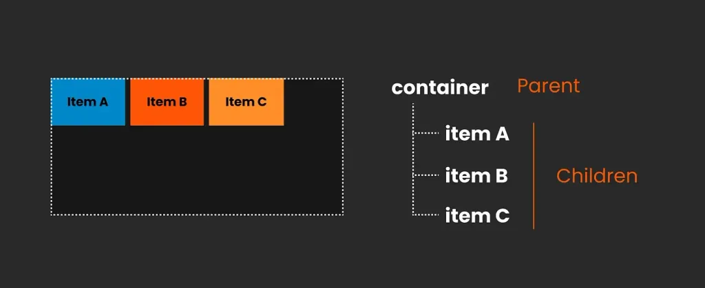
Parent container (Flex Container)
This is the outer wrapper to which you apply display: flex;. This declaration turns a container into a flex container and its direct children into flex elements. Within a flex container, you can control the direction of the flex elements (row or column), the way they wrap, and whether they are aligned (along the main axis) or aligned (along the cross axis). In other words, the parent controls the general rules, so all child elements follow the same rules.
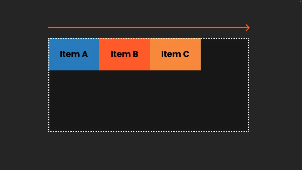
Child items (Flex Items):
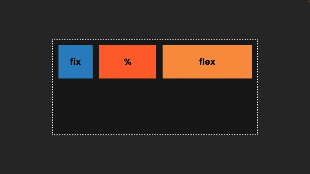
These are elements inside a flex container, direct children of the container. Although they still follow the general rules of the of the parent element, they have some individual freedom. We can control their expansion (to fill the container), their shrinkage (when there is not enough space) and their base (their default size before growing or shrinking). There are also some more advanced settings, such as aligning individual elements differently from the rest.
Nested flexbox
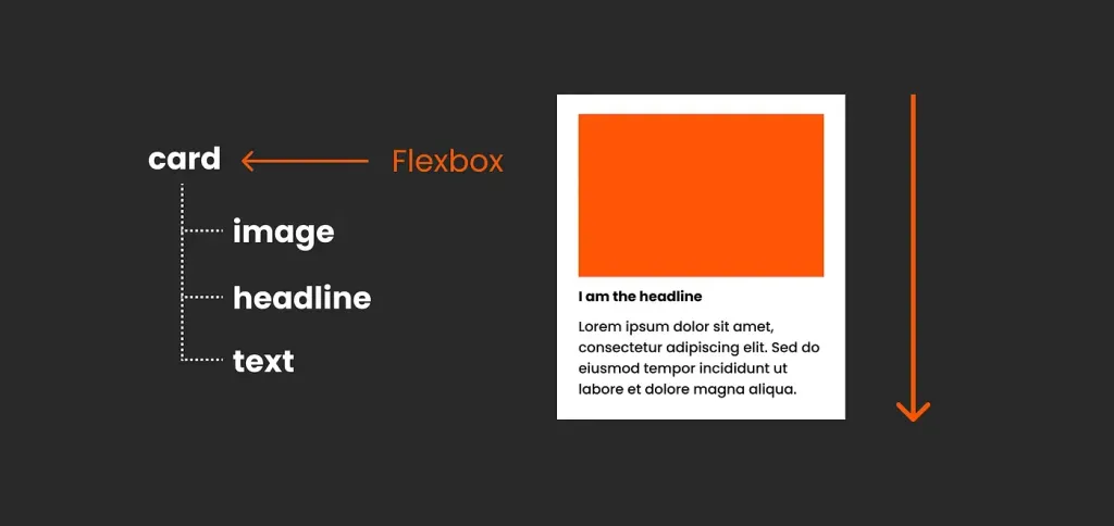
So, with a simple setup like the card below, you can see that it’s a regular flexbox; the card is the parent, and inside of it, there are three children, the image, the title, and the text, all moving in the same direction, with the same distance between between them, which is very simple.
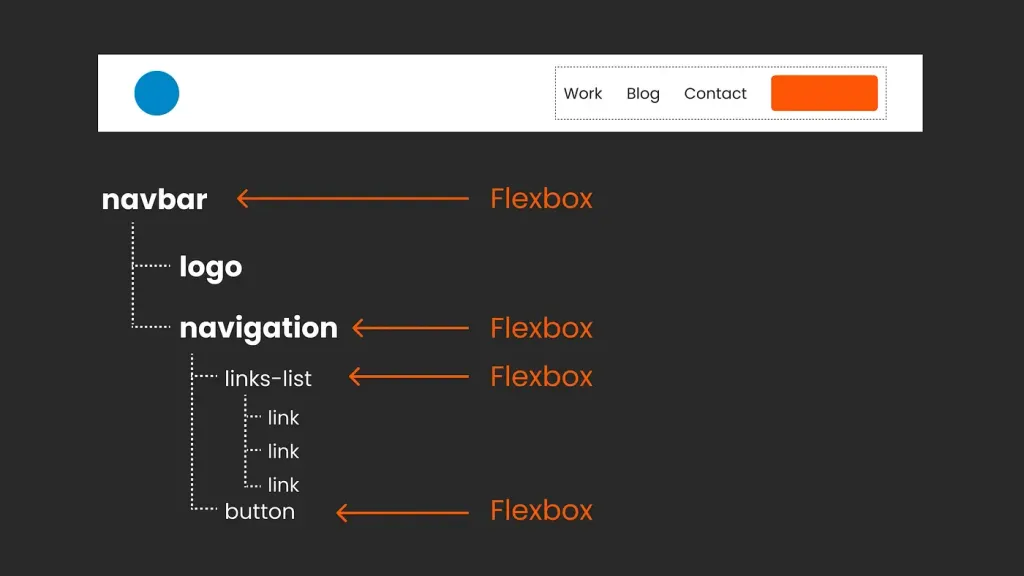
But for more complex designs, like the navigation below, with different elements grouped together, with different distances, directions, and behaviors, we need to nest flexboxes. Thus, each nested flexbox is a child of its direct parent, which gets a common position at the top (e.g., the navigation bar), but also dictates new rules to its direct descendants… just like in any family, really.
One-dimensional or two-dimensional layouts?
Sound familiar? It’s the same as using autolayout in Figma or flexible layout in Penpot, because they both essentially mirror Flexbox. The direct correlation becomes apparent when you explore developer mode or use the the inspection tool. To delve deeper into this topic, I created a free video (eng) exploring how the auto-markup in Figma compares to Flexbox, including areas where we run into limitations.
One-dimensional or two-dimensional layouts?
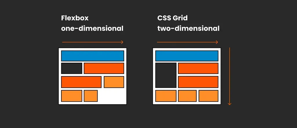
It’s important to understand that Flexbox is a one-dimensional approach to design, where each element is placed in a single line.
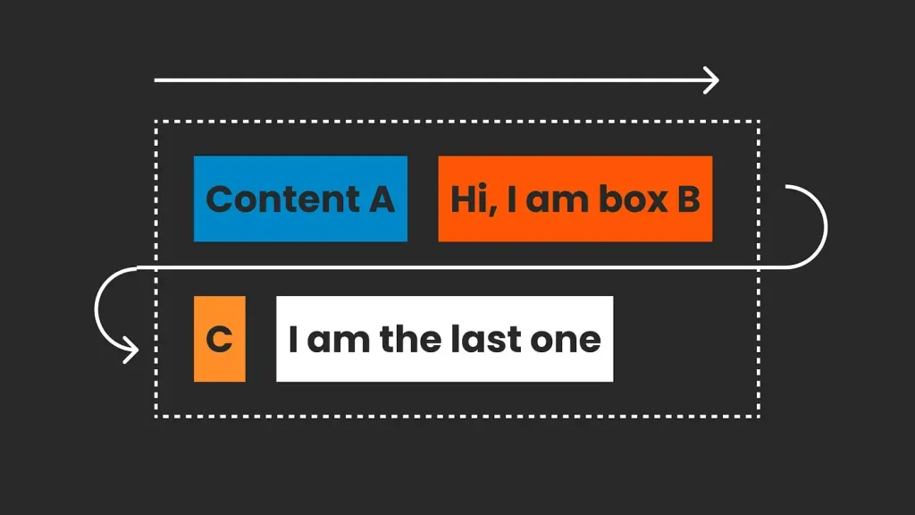
In many cases, this is perfectly fine, but it doesn’t give you control over a grid with rows and columns. If you need control over your grid design, you’ll need a two-dimensional layout approach, such as CSS Grid.
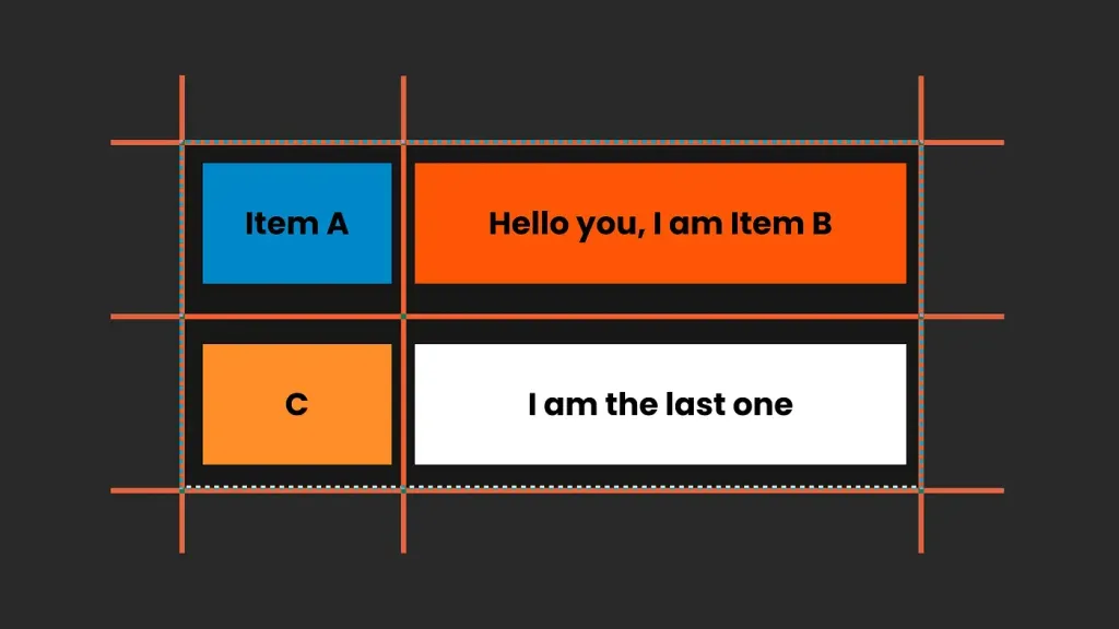
There is no right or wrong; it depends on what you are trying to build. They work well together.
CSS Grid layout
I love Grid CSS; it’s amazing and you can potentially build anything with it. Yes, really anything - overlaps, sub-grid alignment, or even without defining anything, it will magically create everything for you. It’s crazy. However, it can also be very overwhelming, and 90% of the time we don’t create super fancy artistic layouts (but you can!!!). Grid CSS is also great because we can create the simplest layout structures, such as the classic column grid, and open up our layouts with more flexibility to structure composition and size, up to creative designs that that go beyond the standard perception of a grid. CSS Grid will help you with this.
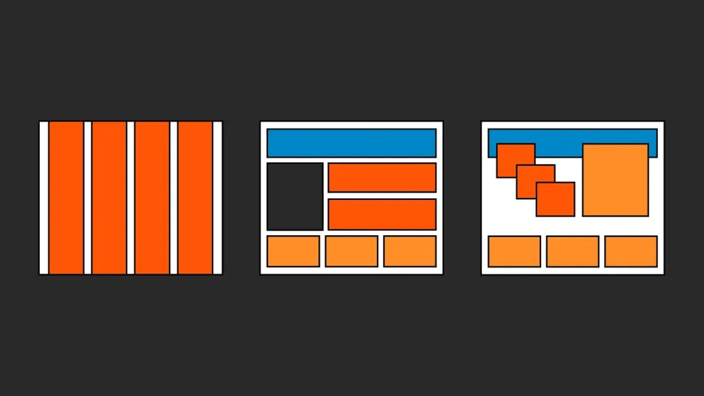
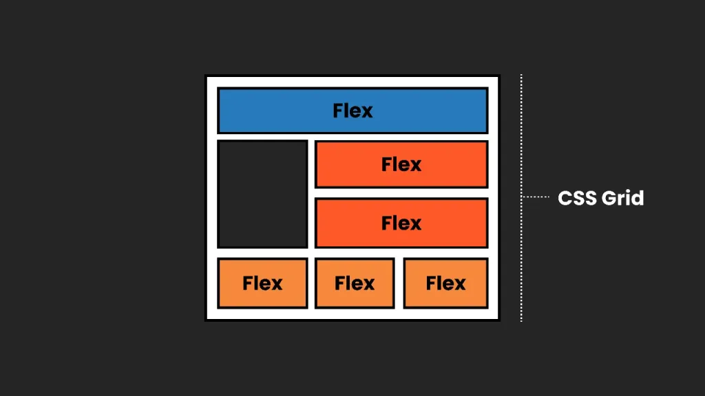
If you imagine Flexbox as beads on a string, arranged horizontally or vertically. Then CSS Grid is like taking the beads and putting them in a bento box where we can freely arrange them in any row or column. And it looks like one of those cool bento boxes where you can move the dividers and connect the compartments. It even expands automatically.

Let’s understand the CSS Grid structure a little better step by step:
Thinking in grid lines, not columns
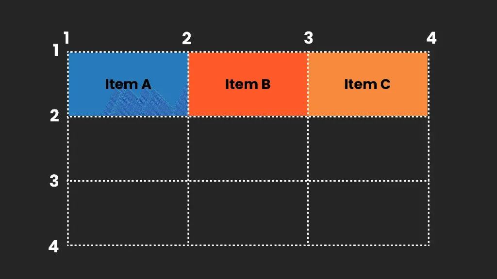
As UI designers, we typically think of a layout grid as a container with columns, and then we place our elements in those columns. But with CSS Grid, things are a little different. We still have a container, but the grid itself is made up of lines that create the grid cells. By default, grid elements are placed sequentially, according to their order in HTML. However, we can control their exact horizontal and vertical placement with the help of CSS Grid coordinate-like lines.
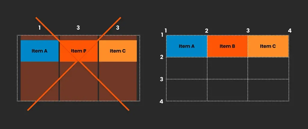
This allows you to create grid areas, which allows you to create overlapping effects and more complex layout structures. In addition, we can of course add margins to the container and line spacing.
FR or fractional units
Our columns and grid cells don’t have to be the same size; we can customize them however we like. This includes fixed sizes or using “fr units” which are fractional units that divide the available space.
By using fr units, we can evenly distribute the rest of the available space or change the proportions - for example, 2 fr for one cell and 1 fr for another.
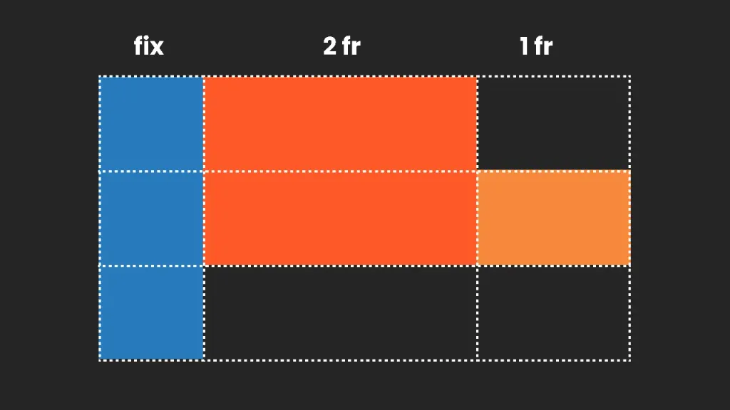
When resizing, everything adapts perfectly: our fixed elements retain their size, and fr-blocks redistribute the remaining space accordingly. redistribute the remaining space accordingly.
Explicit and implicit grids
So far, I’ve talked about the explicit grid, where we, as designers, clearly define the rows and columns. However, CSS Grid also works when we don’t define each cell; the browser automatically generates a grid based on the content. This is called an implicit implicit grid, and it’s especially useful when we’re dealing with dynamic or unknown content, such as a list of blog posts or products that change over time.
The explicit approach is more natural for us as UI designers, while the implicit approach is mostly seen in the the browser. Therefore, we need to think outside our software and collaborate as designers and developers.
Nesting
CSS Grids can also be nested. For example, if you have a general layout with a header, sidebar, and content area and you want to structure that content, you can easily nest another CSS grid within it. Depending on your requirements, this nested grid can be either implicit or explicit.
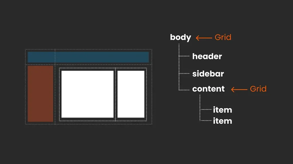
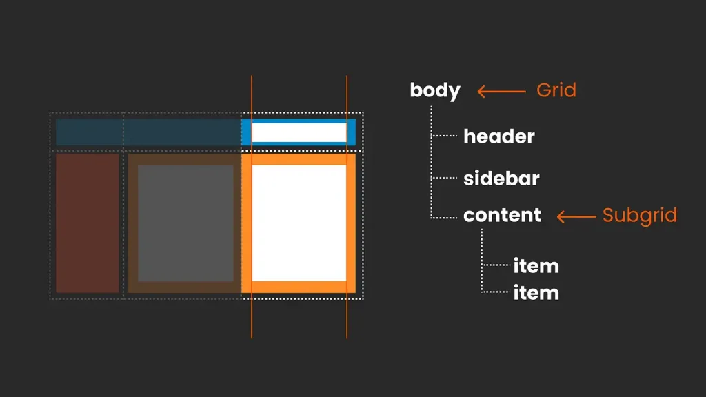
To achieve a perfectly aligned design, the CSS Grid feature allows you to create a consistent grid structure throughout your layout.
The world is in your hands
We’ve covered the basics of CSS Grid, but there are even more possibilities in its alignments and the ways you can combine and nest its elements. So, have fun delving into its intricacies.
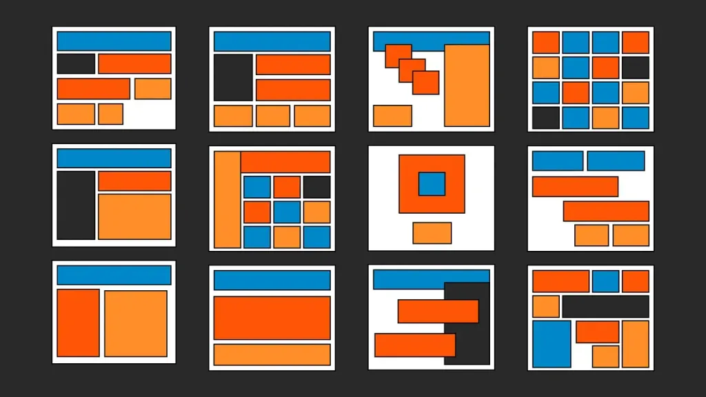
But I want a simple grid!
While CSS Grid opens up endless possibilities, it’s important to stay focused and keep things as simple as possible to create maintainable and scalable products, which is what we need in most cases. That’s why in many projects you can limit yourself to a basic column grid and that’s absolutely fine! We can use the simplest settings with the help of CSS Grid. However, when creativity calls, you now know where to go.
Do I need to choose between CSS Grid and Flexbox?
It’s not about one of them, Flexbox and CSS Grid are part of the CSS family and work in great harmony.
For the most part, components are customized with Flexbox, while CSS Grid manages the overall layout. However, if necessary, it’s perfectly possible to use Flexbox for the entire page. You can mix and match; sometimes both approaches work well, while in other cases one of them may be a better solution. There is no right or wrong choice; they complement each other seamlessly, depending on whether a one-dimensional or two-dimensional layout works better in your particular case.
As a UI designer, you can leave the nitty-gritty decisions to your front-end developers. Your focus is on understanding why a particular choice was made and designing with the potential and limitations of modern CSS in mind. Remember that what what you envision in Figma or Penpot may not always be rendered directly in the browser. You are not doing anything wrong; it’s just part of the creative process. Collaboration between design and development is key!
Do you need breakpoints? Let’s take a closer look
In a traditional column-based design
The “old” way, with an adaptive grid with predefined columns, provided for fixed points at which our design would transition to the to the new version. At these points, the grid layout itself could change, ranging from a different number of columns to changing indents or margins. We can also change the location of elements in the grid or show or hide certain elements. In addition, we can choose to display different versions, for example, the burger menu changes to a link menu, and the size of text size can change at these breakpoints.
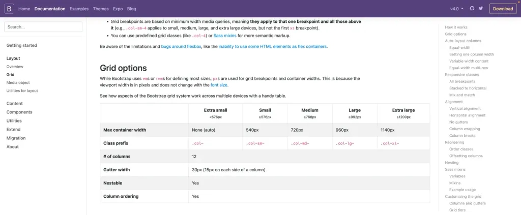
This more rigid approach to responsive layout often uses a framework, which usually comes with supporting documentation that contains important information. For example, in a framework such as Bootstrap, the documentation will include detailed information about the number of columns, padding widths, and breakpoints. This makes it very easy for us, UI designers, to work with such tools in Figma or Penpot.
Modern CSS and breakpoints
Thanks to modern CSS layouts, our approach to design can become more intuitive, allowing the design to seamlessly adapt without the constant need for breakpoints. This means that the layout can effectively reorganize itself automatically most of the time.
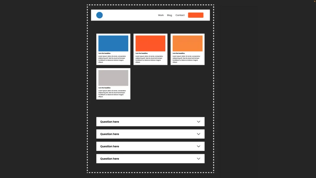
However, there will still be times when you may need to use breakpoints. Instead of relying on a set of fixed points (although you can still do that), you can analyze your project and define breakpoints with much more flexibility.
So you might want to add breakpoints to your modern CSS layout for:
- Change the layout
Although modern CSS does a great job on its own, you can set breakpoints for more more “radical” changes to the layout, such as changing grid settings, displaying or hiding elements, or distributing them.
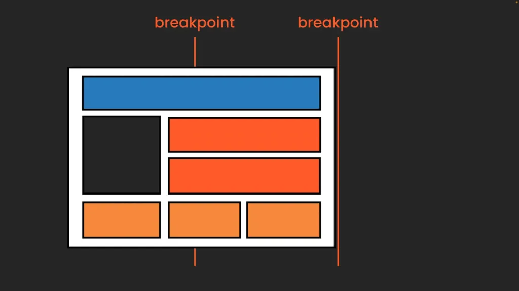
- Change the layout of a component
An example is changing the navigation from the burger menu to the links menu. This way, we can find the “golden mean”, where we want to set the breakpoint.
- Change of printing house
Typography is a more complicated area. In short, theoretically we can just set individual breakpoints here, but usually it makes more sense to go back to a fixed set of breakpoints for your headset. This approach simplifies the process, while ensuring that our typography remains consistent and readable across screen sizes.
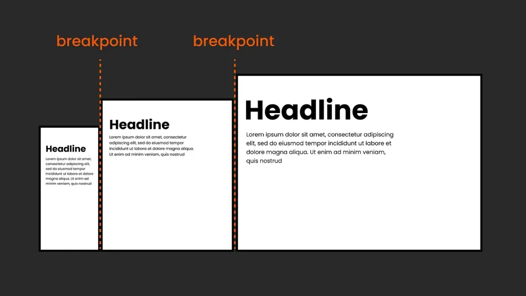
- Other approaches with CSS Clamp:
In addition to breakpoints, we can also use the clamp() function in CSS to allow our typography to scale smoothly within a specified range, ensuring its responsiveness. This method allows you to change the size of the text between minimum and maximum based on the total width of the viewport, regardless of breakpoints.
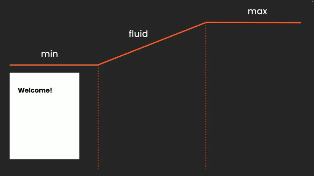
However, using clamp() requires close collaboration with the development team, as performance and availability issues need to be taken into account performance and availability issues, as well as more testing. So, it’s a great tool to understand, but it should be tailored to your specific setup and project.
In search of balance: Between design freedom and structure
One of the challenges I faced was organizing the wide range of possibilities and freedom that CSS layout provides. I found that it was very important to first sit down and think carefully about the project and its scope.
Artistic design for one-off projects or sections
Are we creating a unique, super trendy, artistic page? Then you probably want to use all the magic of CSS layout. Jen Simmons’ amazing creative examples demonstrate what you can achieve with modern CSS layouts. You can completely abandon traditional breakpoints, letting the browser dictate the layout, or carefully consider each breakpoint for each element.
Keep in mind that this approach is not applicable to the entire site, but only to the home page or section where you want to revitalize the graphic design.
In this case, I would create several fixed screens in Figma or Penpot as a graphical representation. Then you need a very skilled front-end developer (and a corresponding budget!) to work closely with. The emphasis is on a quick transition to the browser; too much detailed behavior planning in Figma or Penpot will not make much sense.
Balancing flexibility and structure in scalable projects and design systems
Flexibility is the key to a scalable product, but structure is just as important. While modern CSS layouts allow you to create a smoother design by letting the browser dictate the display, creating a scalable design often requires establishing clearer rules to keep things manageable. Imagine putting a little magic into a structured framework - not to make the design not to make the design dull, but to provide a solid foundation.
Brad Frost’s article on how to work with the grid in a design system to create grid components is absolutely fantastic. I truly believe that this is something we can work with very well, as this approach to using layout templates works just as well in Figma (with some limitations due to the lack of CSS Grid) or Penpot as it does in CSS. Personally, I would also prefer some fixed breakpoints for the general layout and typography to simplify life. The important thing is that we can still still be able to easily exit this system when needed.
It’s not about coding by designers
Let me be very clear: this article is not about what designers should code. The decision on how this will be will be implemented in CSS is not and should not be made by the designer; it will always rest on the shoulders of the front-end developer, the expert in this field! So, it’s not about providing a code solution in design at all. But if we design with an understanding of the possibilities and limitations of CSS, we can much better and more understanding cooperate and, most importantly, talk with development… and it’s a lot of fun to play with!
